15 Landing page best practices to get more conversions
By Sean Tinney July 9, 2024
You sit down at your desk fired up and ready to create a killer landing page. No doubt, this page is the thing that will make your email list sprout faster than flowers in May.
You stare at a blank canvas, willing the words flow through your keyboard.
But all you see is a blank screen.
You know a landing page can be a powerful marketing tool, but getting started from scratch can feel daunting.
Thankfully, having some tried-and-true landing page best practices to follow will help you overcome the blank screen to create a landing page that converts visitors to subscribers without hesitation.
Read on for 15 tips, tricks and landing page best practices to help you create a high-converting landing page.
1 – Write a benefit-focused headline
A headline is the first thing a visitor sees, so you need to make sure it grabs their attention immediately. Your headline should clearly communicate the value you offer; visitors need to know what’s in it for them if they’re going to sign up or buy from you.
Did you know that about 80% of your visitors will read your headline, but only 20% will read the rest?
How do you get all those visitors to read on?
Easy: spend more time writing your headline than any other part of your page. Test different headlines to see which works best.
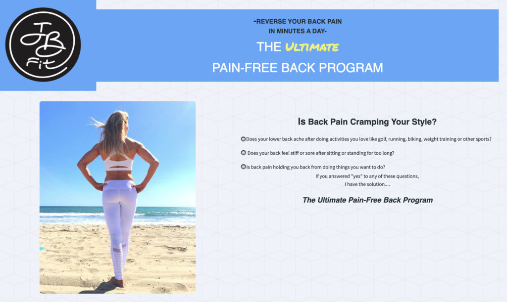
Check out the example below from JB Fit – “The Ultimate Pain-Free Back Program.” See how she uses a benefit-driven headline to draw people in.
2 – Ask your visitor to do one thing
The old adage “Jack of all trades, master of none” applies to landing pages. Don’t overwhelm your readers by asking them to take multiple actions.
The ultimate goal of your landing page is to get people to take one desired action. Whether it’s selling an ebook, signing up for an event, or capturing an email address, keep your main goal in mind.
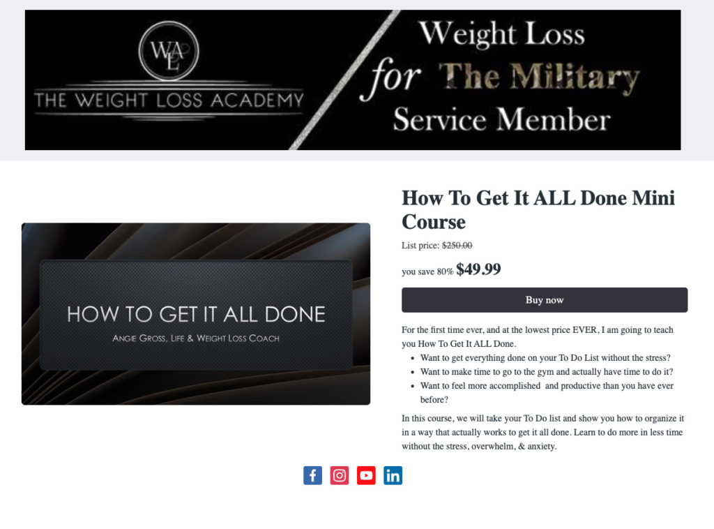
Check out this landing page from The Weight Loss Academy. The goal of the page is obvious: to sell a mini course for $49.99. There’s very minimal navigation, and the social media buttons at the bottom of the page are there to provide validation.
3 – Use images that match your messaging
They say a picture is worth 1,000 words, so it follows that pictures evoke emotions easier than words alone.
Include images that showcase your fantastic product or illustrate the feeling you want your audience to experience.
If you can show the transformation a customer will experience with your product or service, they’ll be more likely to purchase.
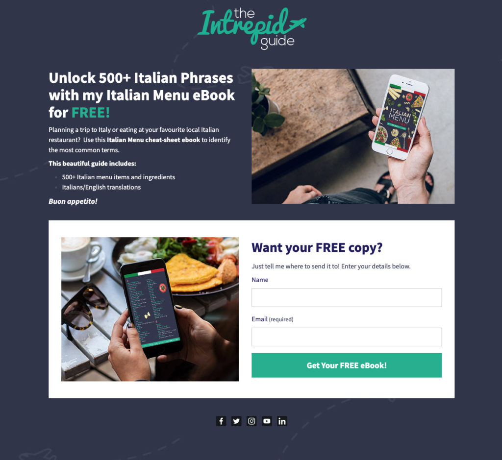
The Intrepid Guide does a great job showcasing how users will experience their Italian menu ebook through the images on their landing page.
4 – Create a strong call to action button that stands out
Your call to action (CTA) button is one of the most important elements of your landing page. The headline gets them in the door. The CTA closes the sale.
Your CTA button needs to stand out and clearly communicate the value of your offer.
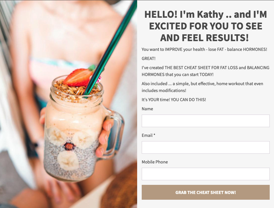
See the powerful call to action on this landing page. “Grab the cheat sheet now!” is a clever way to differentiate the call to action from standard language like “sign up” or “download”.
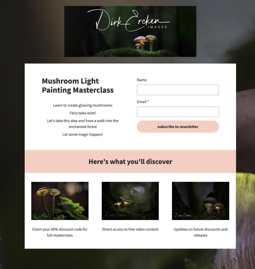
5 – Keep the most important information above the fold
2.7 seconds. That’s all the time you have to grab a visitor’s attention.
With such limited time to convince someone to continue reading, you need to put your best foot forward and put the most crucial information at the top of the page where it’s immediately visible.
“Above the fold” is the portion of your landing page that can be seen without having to scroll. If the information you include above the fold isn’t captivating, readers won’t continue scrolling down your page.
Dirk Ereken Images puts the most important information he wants readers to see strategically at the top of his page.
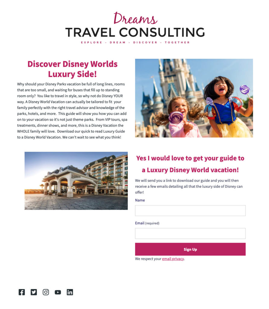
6 – Do not include top navigation
Unlike a website, a landing page should have a singular focus, and including a top navigation bar can be distracting.
By removing the top navigation, you simplify the path to conversion and keep your visit’s attention on your CTA.
Check out how Dreams Travel Consulting limited the top navigation and focused instead on driving visitors to sign up for a guide.
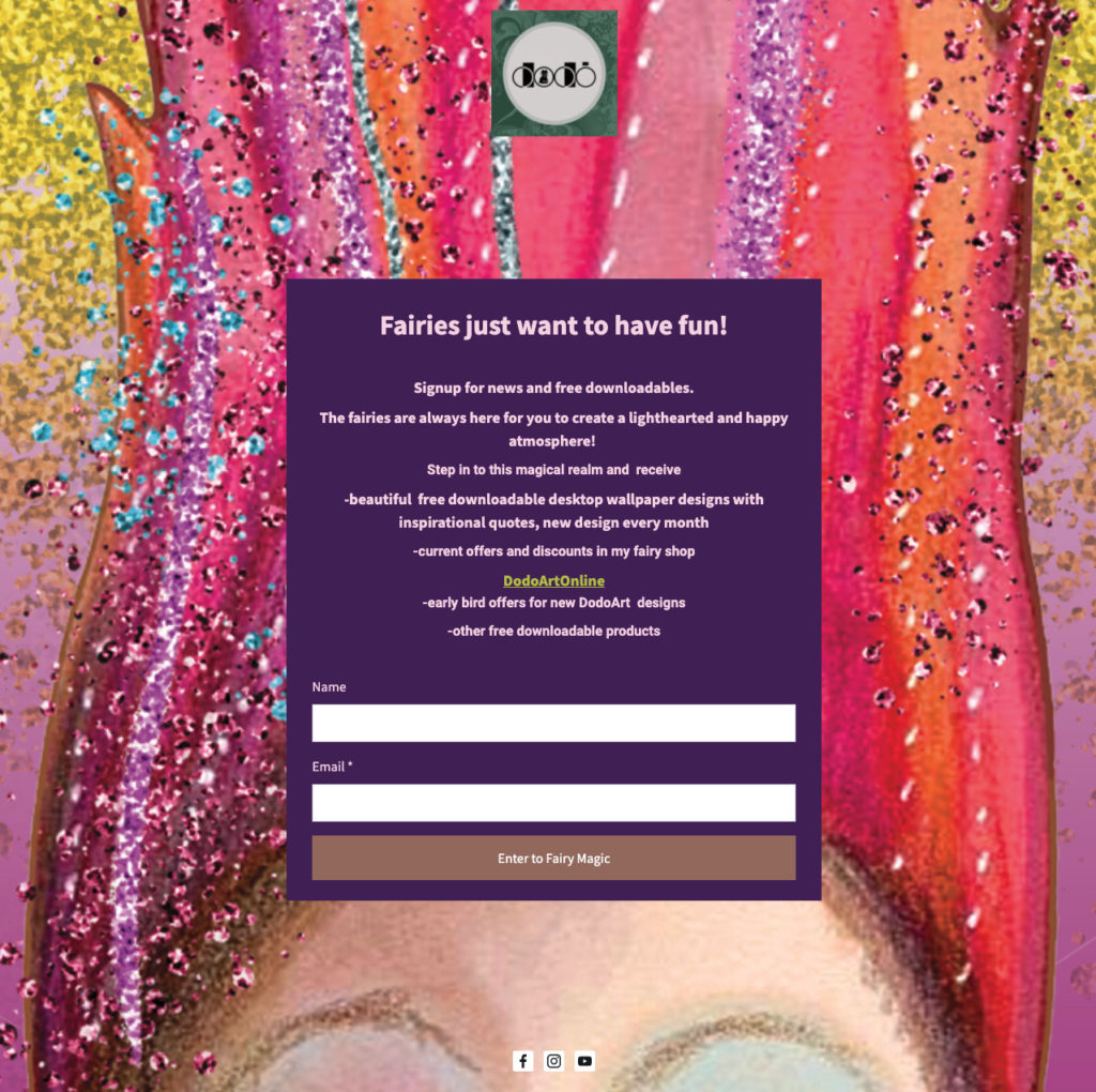
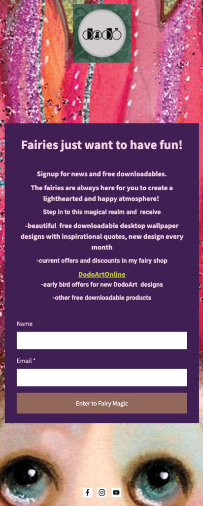
7 – Optimize your page for every device
This is really best practice for any website or landing page you create: make sure your page is optimized for mobile, desktop, and tablet use.
We’ve all had this experience: you open a web page on your phone, and you have to zoom in just to read some text. Poor mobile experiences like this turn potential customers away; most users browse and make decisions on the go. A responsive landing page with elements that adapt to different screens and devices is crucial.
Check out how Dodo Art Online uses a mobile-responsive landing page to ensure visitors have a great experience on their site, no matter the device they’re using.
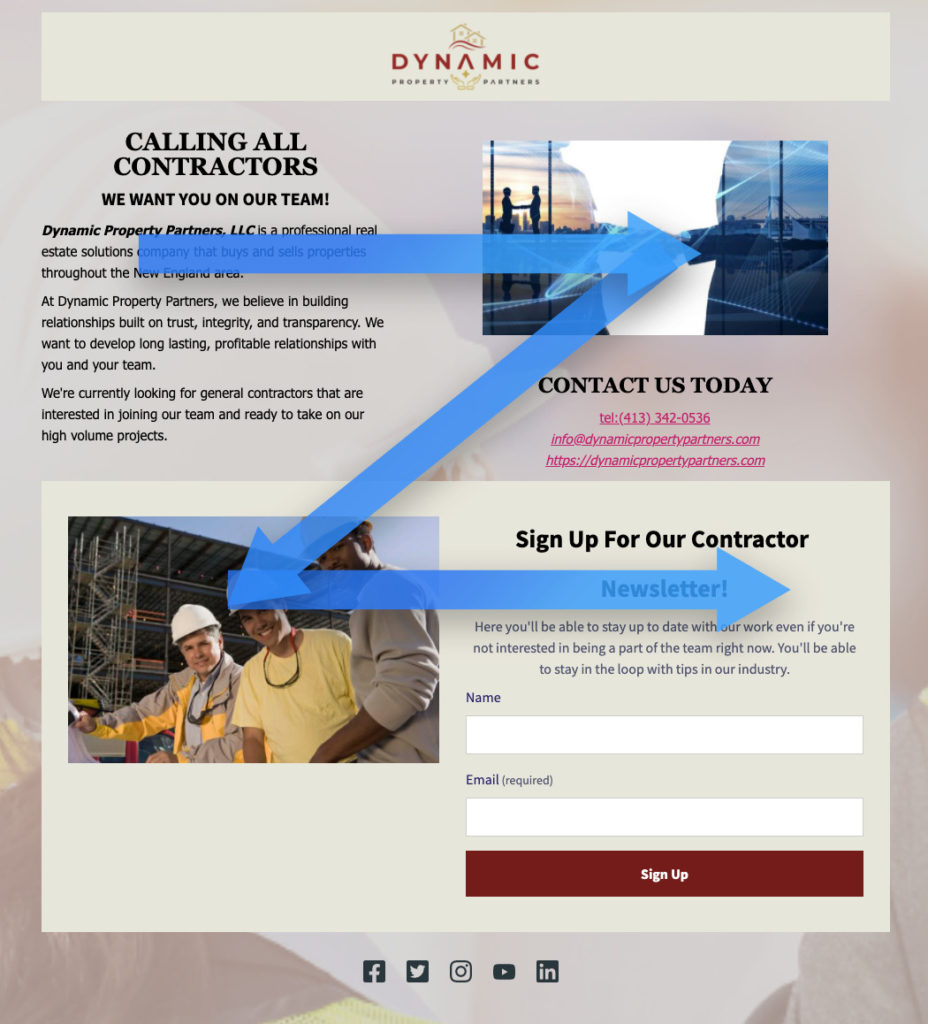
8 – Direct the readers’ eyes
Understanding the visual hierarchy and how visitors view your landing pages makes creating effective pages that boost conversion rates much easier.
Studies on eye-tracking have shown that visitors follow specific patterns like the Z-pattern, where the eyes start from the top left, move their way across the page, down to bottom left then across again — forming a Z-pattern.
Keeping this in mind, Key elements like the headline, images, and CTA should be strategically positioned to guide the viewer’s eyes naturally through the page.
Also, you can use directional cues like arrows or images of people looking at your CTA to guide their attention to where you want it. Strategic use of white space can also help draw attention to certain elements.
Here’s a great example from Dynamic Property Partners. They positioned the page with the Z-pattern in mind so readers view the headline first.
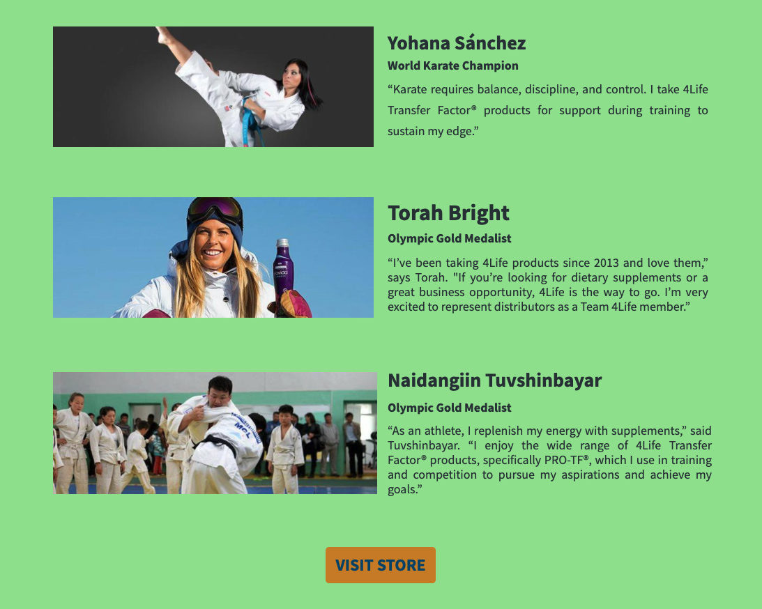
9 – Include social proof
Building trust and credibility with your visitors by showing them testimonials, reviews, and user-generated content can help visitors feel more comfortable with your brand. Showcasing real names and photos adds authenticity and relatability to your social proof.
Check out how 4Life uses quotes and photos of real customers to reinforce their value:
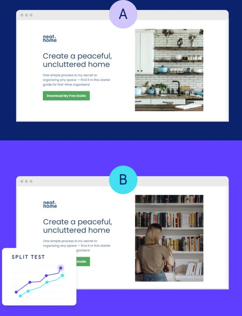
10 – Leverage A/B testing
If you’ve ever been torn between a design decision about your landing page, take it as an opportunity for testing! If you’re not sure which headline to run or which image to use, that’s where A/B testing, or split testing, comes in.
By creating two versions of your landing page with slight differences, you can see which one does better. Testing different headlines, images, or CTAs helps you hone in on strategies that work best.
Check out these two versions of the same landing page from Neathome. See the difference? By collecting data on which version performs better, the one with the woman and the books or the one without the person in the kitchen, they can recreate their most successful elements in the future.
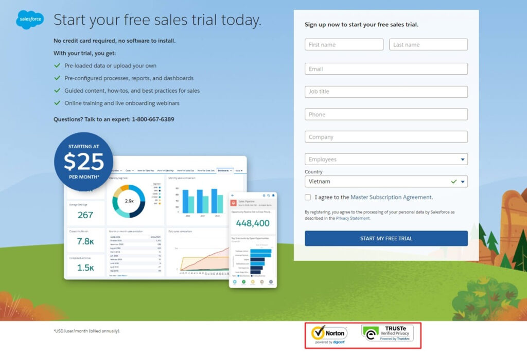
11 – Incorporate trust signals
Incorporating trust signals like security badges, certifications, and privacy policies helps reassure your visitors that their information is safe. This is especially important if your landing page asks for sensitive information like their credit card info.
Adding a simple security badge from Norton or McAfee shows them that their data is safe. In the example below, Sales Force requests quite a bit of personal information from their viewers, but reassures them that their information is secure through the Norton and TRUSTe badges at the bottom.
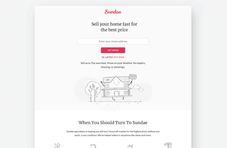
12 – Reduce page load speed
How annoying is it when a page takes forever to load? A slow-loading page can turn visitors away.
Make sure your landing page loads fast by optimizing images, minimizing code, and using browser caching. Ideally, you should have a load time under three seconds.
Not sure how fast your landing page loads. Use a tool like PageSpeed Insights to test your page load time.
Leaning into minimalist designs like Sundae does on this landing page is a great way to ensure fast load times.
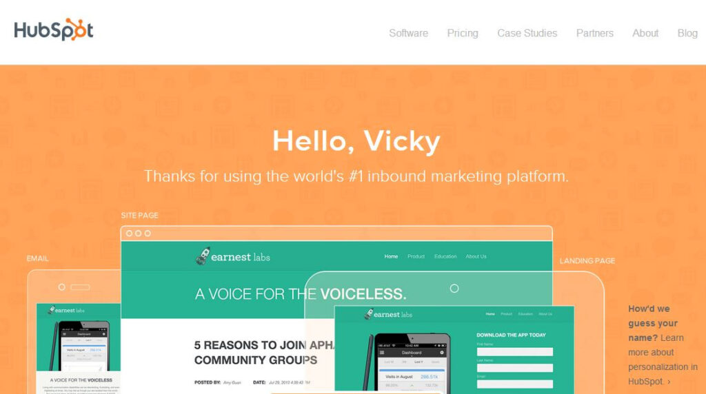
13 – Personalize your content
Personalization can really make your landing page stand out. Personalized content makes visitors feel special and more connected to your offer and brand. You can use dynamic text replacement to personalize headlines and copy.
For example, your landing page could greet returning visitors with a message like “Welcome back!” or “Continue your journey today!” See how HubSpot uses dynamic text to insert the viewer’s name into the content of the landing page?
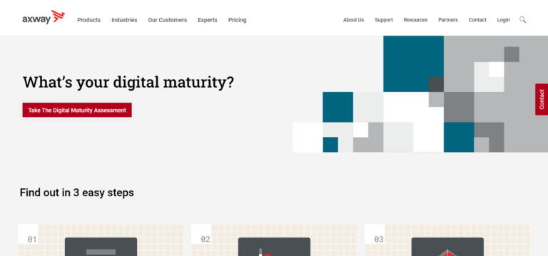
14 – Use interactive elements
Fun, interactive elements like quizzes, surveys, and calculators can help keep visitors on your page longer.
When they’re designed well, they can be both engaging and also offer valuable insights and information about your offerings.
Axway does a great job integrating a quiz into this landing page. They ask an intriguing question that naturally draws you into taking their short quiz.
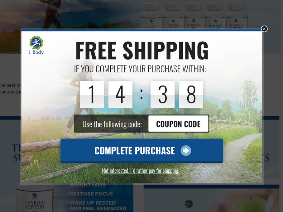
15 – Create urgency and scarcity
Want to motivate visitors to act now? Limited-time offers, countdown timers, and low-stock alerts can push visitors to take action before it’s too late.
Language that emphasizes urgency, like “Limited Time Offer,” “Only a Few Spots Left,” or “Register Now Before It’s Too Late,” results in faster conversions.
In this example, 1 Body hits you with a big countdown timer for free shipping. It’s a not-too-subtle but highly effective way of encouraging quick actions.
Put your knowledge of landing page best practices to work
Now that you’ve got these 15 proven landing page best practices up your sleeve, it’s time to put them into action. Remember, creating a high-converting landing page doesn’t have to be scary, time-consuming, or expensive.
Need a starting point? Use a custom-built template and start optimizing today!
Edward
6/11/2021 6:37 amI would like you to help me to access a website. Teach me step-by-step how to open my website
Sean Tinney
6/11/2021 9:48 amNo problem. You can access a website by linking your landing pages together. To get started creating landing pages, you can following these step by step instructions.