How to Create a Landing Page in 8 Steps
By Kelsey Johnson June 11, 2021
Creating a landing page is easier than ever these days, but it can still be intimidating to get started. Like most entrepreneurs, you may be concerned about time.
“How long is this going to take? Will it even be worth it?”
Answers: It can take less than an hour. And yes, it’s worth it.
But let’s start with why you want a landing page in the first place.
High consumer expectations and increased competition makes sales hard. Larger companies have been using targeted marketing for years now, changing how your customers expect to be treated.
In fact, “80% of consumers are more likely to make a purchase when brands offer personalized experiences.”
But now, using targeted landing pages, small businesses can live up to these expectations (and increase sales). Landing pages are easy and affordable, they can be built quickly — with or without pre-built templates — and they are surprisingly effective.
So start creating a landing page now — I bet you can do in less than an hour and start getting more sales fast.
In this article, I’ll go over why you should use landing pages to grow your small business and the 8 simple steps it’ll take you to set one up.
But first, what is a landing page?

A landing page is a web page that serves a single purpose or goal. Most often, the goal will be to sell a product or service, capture an email address or drive signups to an event or webinar.
A landing page usually targets a specific audience. In that case, it’ll include a header, imagery and text that speaks directly to the people you want to target.
Or, you might want to sell a specific product. Let’s say you’re an author looking to tell your brand new book. You could build a landing page focusing on sales of that one book. It could include an image of the cover art, a short description and a link to buy it.
Ultimately, the best landing pages are…
- Simple — with clean imagery and headlines
- Direct — leading visitors to a clear action
- Focused — without distracting links back to a website
The visitor who lands on your page should know exactly what you want them to do in seconds. In less than a minute, they’ll decide whether they want to act — so keep your page short and to the point.
Related: Landing Page Best Practices to Help You Get More Conversions.
How do landing pages help build your business?
Do you already have a website? If so, you probably spent plenty of time and money building it. So why should you build landing pages, too?
Quite simply: they work.
The average landing page conversion rate is 26%, over 10X higher than the average website conversion rate of 2%.
The numbers don’t lie — you can increase marketing results tenfold with this one simple step. Talk about a return on your investment!
But there are a few other reasons to start using landing pages for your business:
- They’re easy to set up. You don’t need design or coding skills to set one up. Using platforms like AWeber, you have access to drag-and-drop tools and beautiful templates to guide your way.
- They’re affordable. You can set one up for free or at a very low cost. You don’t need expensive website software or hosting.
- They’re good for testing. Once you’re an expert builder, try creating two landing pages and compare them to see which product, audience or marketing tactic works better for your business.
Okay, hopefully I’ve convinced you by now that you need a landing page. But how do you actually set one up?
How to create a landing page that converts in 8 steps
Follow these essential steps to get your landing page up and running in less than an hour.
Related video: How to create a landing page in 8 steps.
1. Start with a goal
Don’t skip this step! The reason landing pages have such high conversion rates is that they are goal-oriented. But that means you need to start with a very specific result in mind.
If you don’t know exactly where to start, try answering these questions:
- Who is this for? Are you targeting a specific group of people or your whole market? Who are your ideal customers? What do they want to accomplish? Can you identify their pain points?
- What do you want them to do? Whether it’s “buy a product,” “sign up for an event” or “fill out a form,” make sure you have one — and only one — action you want the visitor to take.
- How does it benefit them? The visitor isn’t going to do what you want just because you tell them. Have 2 or 3 reasons why yours is the best solution for their pain points.
Once you’ve determined the goal, write it down in one sentence only, following this formula: This landing page will use BENEFIT to have AUDIENCE take ACTION.
For example: This landing page will use a price discount to have college students purchase my yoga classes.
Following this exercise will give your page direction and help you write in a way that drives your visitors to take action.
2. Choose a template (or build a landing page from scratch)
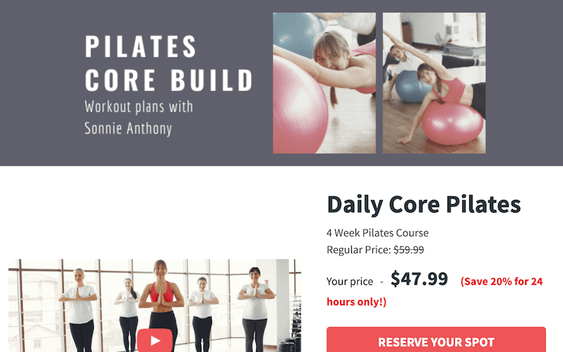
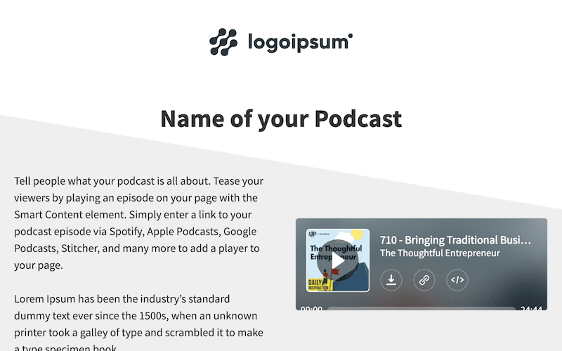
Most platforms will offer you templates — already built and ready to use. You can find templates that match your industry, like some of these landing pages examples:
Encourage sign ups for a fitness course
Capture contact information in exchange for a free home services quote

Drive podcast streams and subscriptions
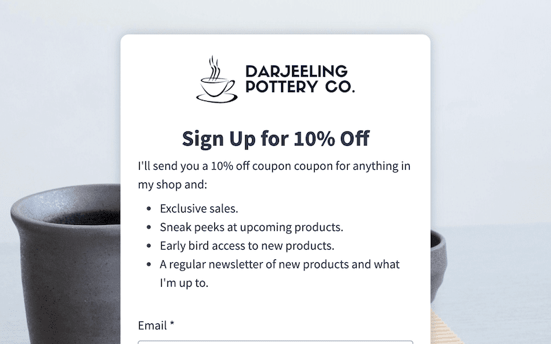
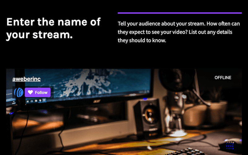
Templates can also be industry-agnostic, built to drive the action you want visitors to take, like these examples:
Sell a specific product or service

Get more subscribers on your email list
Promote an upcoming livestream or webinar
Templates include sample colors, images, logos and placeholder text. If you like the general layout of a template, you can always adjust everything else so it matches your brand and goal.
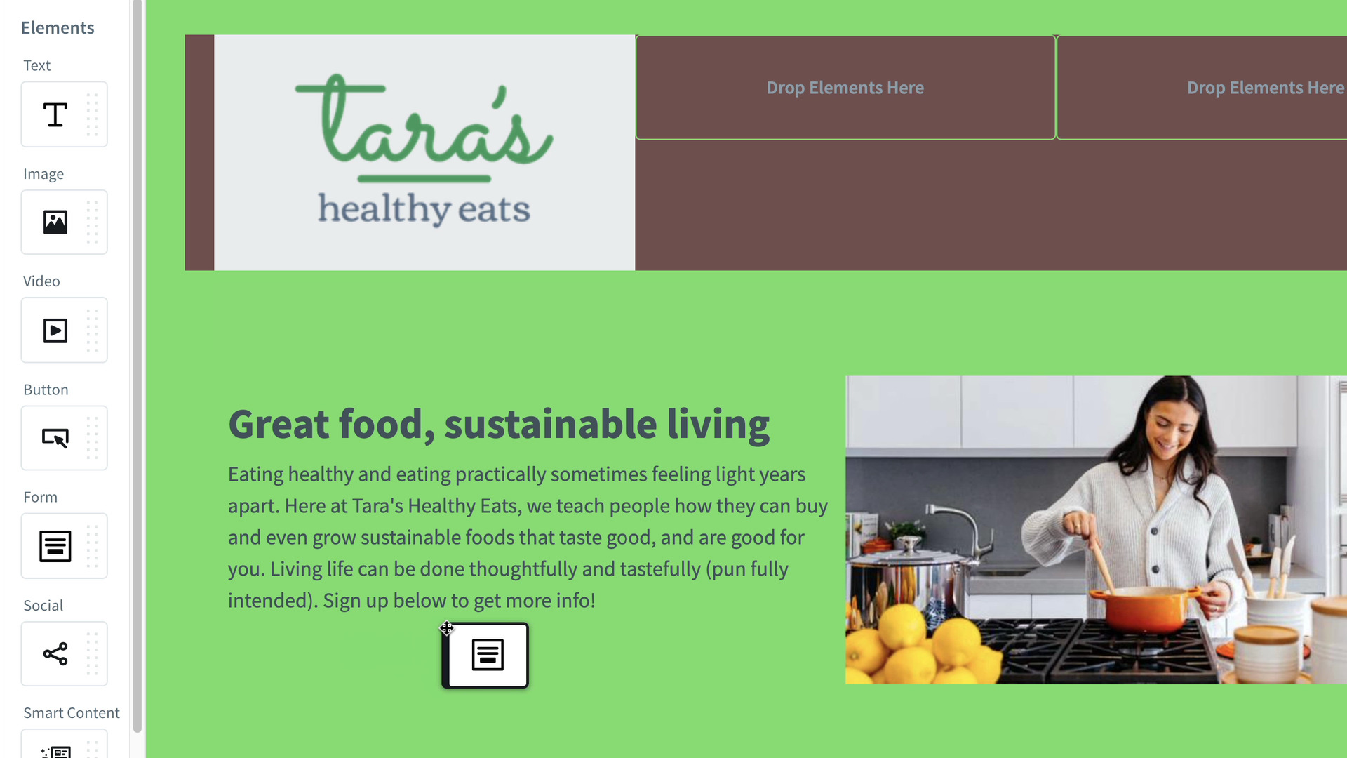
You can also build your landing page from scratch instead of using a template. Most platforms these days have drag-and-drop editors, like ours shown below.
3. Write conversion-focused headlines and text
80% of your visitors will read your headline, but only 20% will read the rest of your site, so focus your time on your headline.
Think about your target audience — what is their key issue you’re offering the solution to? Call out a specific audience directly like this:
“Hey students”
Additionally, you can focus on your solution to their pain point, like this:
“Custom 30-minute workouts you can do on your lunch break”
Write out a couple of headlines, then send them to a few friends and colleagues for feedback. The more eyes you get on your headline, the better you can make it!
Focus the rest of your text on the benefits readers receive from your offer, keeping sentences short and using bulleted lists to your advantage.
Even though only 20% of people read past your headline, it should still be benefits-driven and able to be scanned in a minute. And, every piece of text should direct visitors towards the goal you set in step 1.
When you’re done, review and edit all your writing. Unfortunately, small typos can lead to lost conversions and, even worse, reduced brand trust.
4. Create a compelling call to action (CTA)

A call to action (CTA) is simply a button or link that invites your potential customers to take an action (achieving step 1’s goal).
You don’t need to reinvent the wheel here — you can use a common CTA phrases like:
- Download now
- Sign up
- Learn more
Or get more creative, stirring up a sense of urgency and fear of missing out:
- Don’t miss out
- Snag the discount
- Join the tribe
Once you have your CTA copy, set up a button and make sure it does what you want — whether linking to a page, completing a purchase, or signing them up for a list.
Make your button stand out from the background of your site using bold colors and size. Remember, it’s driving the one purpose for your landing page — having visitors take this action.
So make your CTA noticeable.
5. Stay on brand with your colors and logo
Your landing page doesn’t have to completely match the style of your main website (if you have one) but it should be similar.
Whether you use a template or a drag and drop builder, make sure the background, colors, and other elements are true to your company’s look and feel.
Add a high-resolution logo to the header and footer of your landing page, too. Everything you create online is an extension of your brand — build it to be proud of it.
6. Add compelling imagery
A picture sets the tone of your landing page just as much as your header. Choose one that tells a story about your offer.
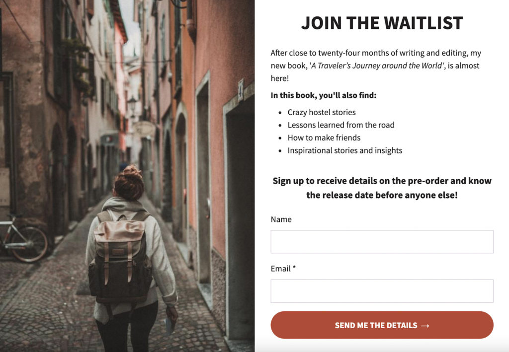
Include imagery of the product or service you’re selling. Or, you could include a picture of the feeling your viewer will feel when they click your CTA. After they take you up on your offer, how are they going to feel?
For instance, the image in the landing page above makes me feel happy, content, peaceful and adventurous.
Imagery won’t speak for itself, however. So put your image next to or directly above your headline and CTA.
By now, your landing page should really feel like it’s coming together.
7. Publish your page
You’re almost done! Click to preview your landing page and review it once last time for typos, formatting, and to make sure your CTA works properly. Then, hit publish.
A landing page isn’t like an email. You can still edit it once it’s live, so don’t obsess too much over making it perfect.
At this step, you may also want to connect your domain. If you use a platform like AWeber to build your landing page, you can publish it to an auto-generated URL which will look like this:
https://mybusiness.aweb.page/p/11795bab-9662-424e-8290-2742f25394e1
However, you may want your landing page’s URL to match your domain name, like this:
https://mybusiness.com/download-ebook
Depending on the platform, the directions for adding your domain will be different. Here’s how to add your domain to an AWeber account.
8. Promote your landing page
Your beautiful, soon-to-bring-in-business landing page is live. Yay!
But that doesn’t mean you’re done. If you want people to see your page, you need to promote it. Use one or more of the following promotion tactics to drive traffic to your landing page:
- Email marketing — Add your page to an email campaign or broadcast promoting a discount or targeting a custom segment of your subscribers.
- Social media — Link your landing page to your social media bios on Twitter, Facebook, Instagram or even TikTok — it’ll work great on a mobile device.
- Paid advertising — Match the target for your PPC advertising with the perfect landing page and get more conversions from your investment.
- Sponsorships — Whether you advertise on a podcast or a local news site, you can set up a landing page just for their audience.
- Partners and affiliates — Work with people or companies in your network to give your mutual audiences something of value.
Increase conversions with a landing page on AWeber
Now that you know how it’s done, it’s time to get started.
You can build a landing page (or 20) completely free on AWeber. Plus, you can grow your business even more with 2-step opt-ins, Ecommerce embeds, editing with Canva and a gallery of free templates at your fingertips.
Build a landing page with AWeber today.
 87% off ends soon!