87% off ends soon!
 Get More Sign Ups with 2-Step Landing Pages
By Kelly Forst May 28, 2021
To sign up, or not to sign up?
That is the question that everyone who visits your landing page will ask themselves.
And a few things will make or break their decision.
One thing that can scare them off? An overwhelming amount of information on your landing page.
It’s a fine line to walk. Too much, and your visitors could feel overwhelmed. Too disorganized, and they won’t understand what you offer them. Too little, and you may not state your case well enough to encourage the sign up.
Finding the right balance of content on your landing page is a crucial step to get more sign ups. And with 2-step landing pages — which include sign up form that pop up with a button click — finding that balance becomes a lot easier.
What is a 2-step landing page?
A 2-step landing page does not include a visible sign up form on the main page. The sign up form on a 2-step landing page will only appear when a visitor clicks a button with a call to action (CTA).
A 2-step landing page is also commonly referred to as 2-step opt-in or on-click pop up forms.
In order to opt-in with a 2-step landing page, visitors must take 2 steps:
- Click a button. This triggers a pop up form.
- Enter an email address into the form to subscribe.
It is another way of encouraging visitors to sign up for your email list by presenting the right information at the right time.
How does it work?

One thing to note: 2-step opt-in is often confused with the term double opt-in — or confirmed opt-in. With double opt-in, you must confirm your interest in subscribing to a list via a confirmation email. While you can certainly use double opt-in in addition to 2-step opt-in on your landing page, the two terms often get misused.
The main reason to use on-click pop-up forms? Psychology.
As we’ve already discussed, landing pages can feel overwhelming if there’s too much information on the page. If the page is too full, visitors are more likely to leave your page immediately because they perceive reading the page as too much effort.
So, not only does including a button with a strong CTA decrease clutter on the page, it makes you look more professional.
But a cleaner look isn’t the only reason to give 2-step landing pages.
Requiring 2-step opt-in reduces friction in the sign up process. Landing pages without visible sign up forms are easier to digest. It keeps readers focused on your offer without asking them for something right away.
Plus, as is the case with all marketing tactics, some psychology comes into play. Visitors who click on a button and then enter their details are more invested in your offer. This is a psychological tactic in marketing called “foot in the door technique.”
The foot in the door technique says that prospects who take a small step first are more likely to take to a larger, more desired action later on.
Clicking the button = having a foot in the door. A visitor who triggers the pop up form on a click is more likely to fill out the form when the pop up appears.
So what do 2-step landing pages look like out in the wild? Let’s take a look.
2-step landing page examples
Selling a product? Offering a service? Simply want to grow your email list?
No matter your goals, 2-step landing pages can help you optimize conversions.
Check out how these pros use 2-step opt-in to support their growth.
Grow your list with a free online course
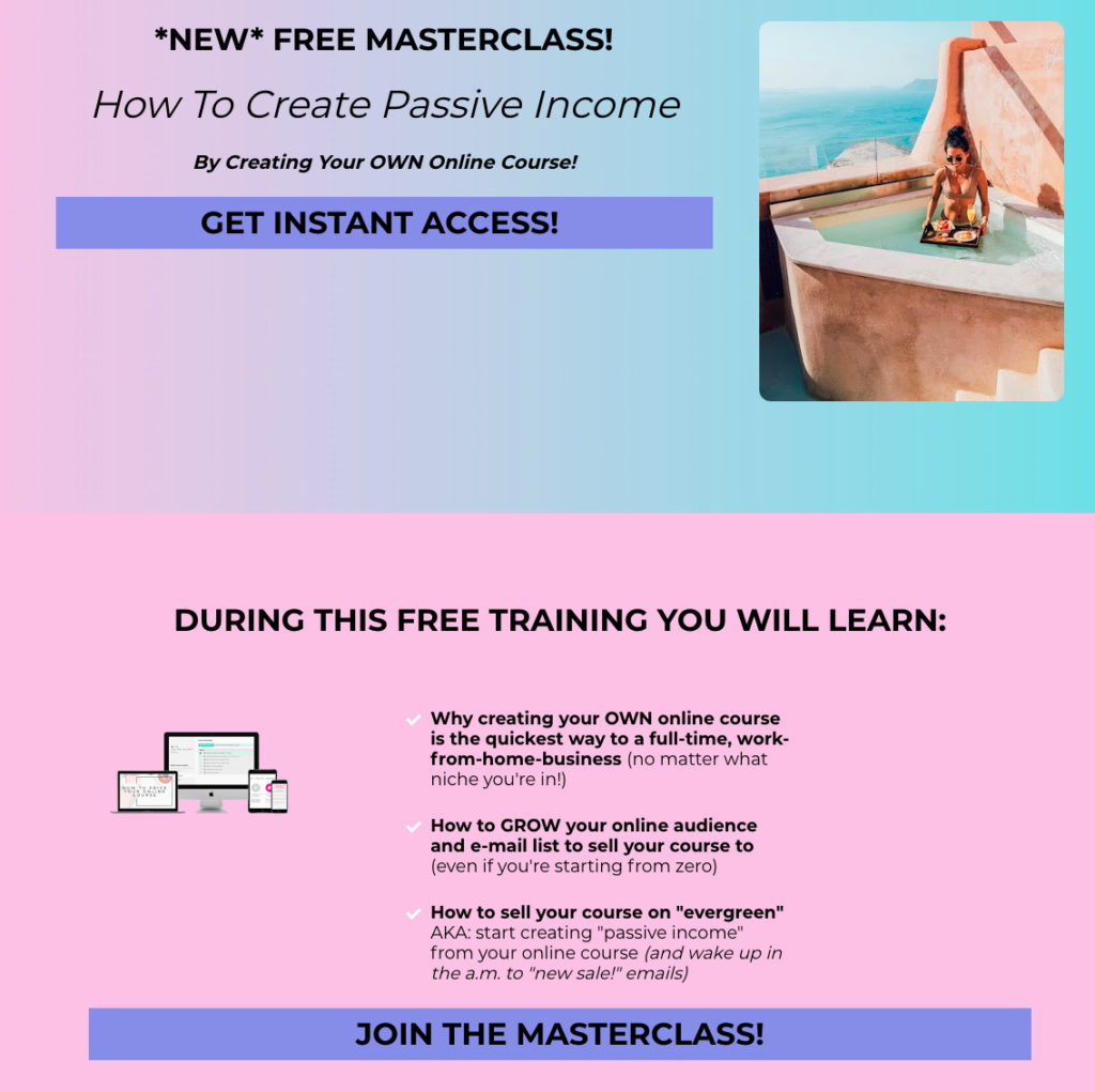
Amie Tollefsrud, Founder of Rebelle Nutrition, helps other nutritionists build their audiences by touting the value of course creation.
She practices what she preaches, and promotes a course to help her audience create passive income. By creating a landing page for this masterclass, she easily promotes it via email and social media to drive sign ups.
The page is clean, and it only displays the information that visitors need to know before being presented with an opt-in form. Ultimately, this is a friendlier approach and less intimidating to first time visitors.
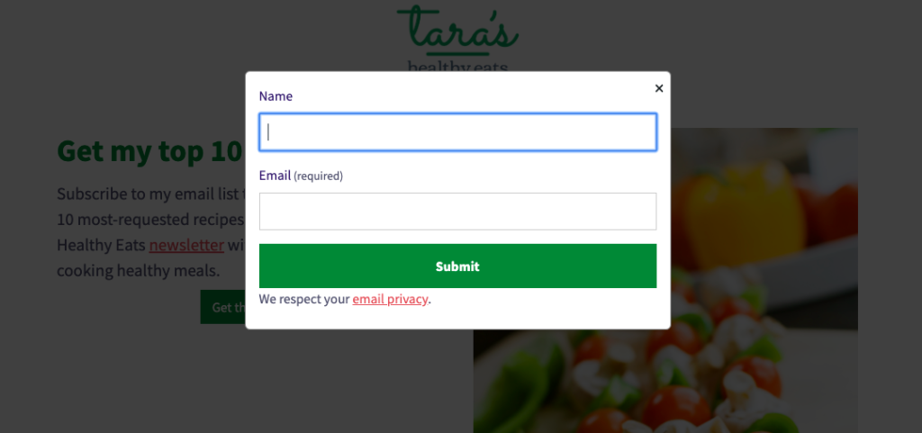
When visitors click either of those 2 buttons, the following on-click pop-up form appears:
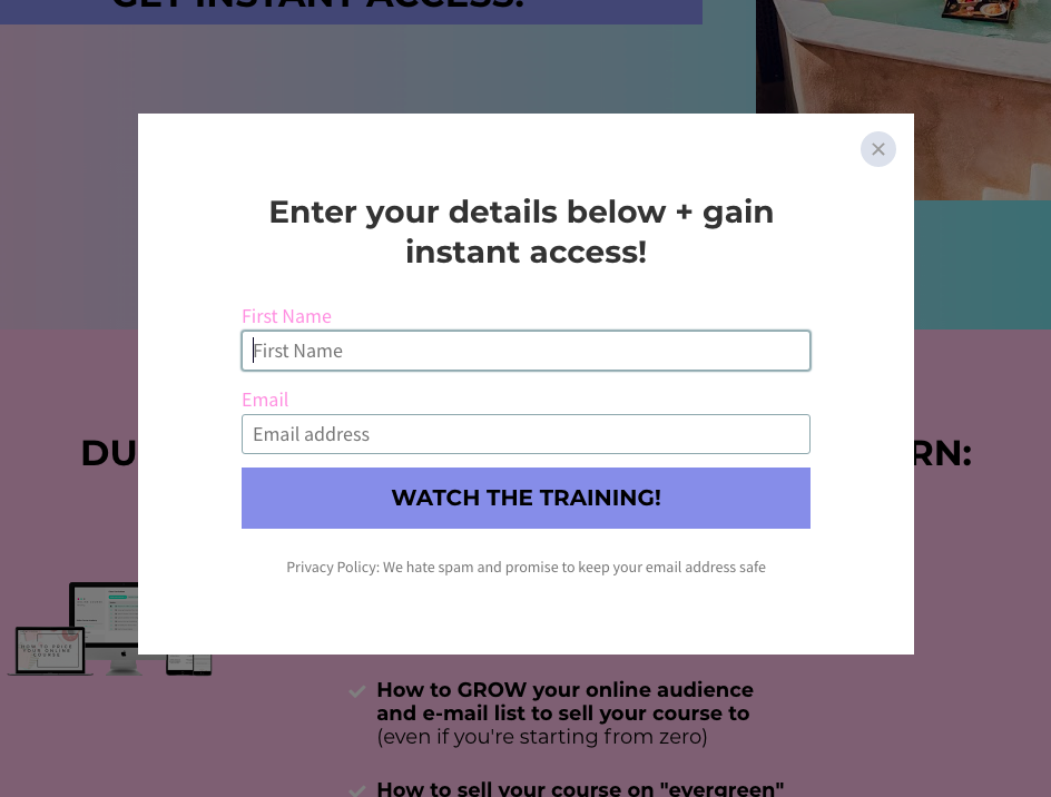
Using 2-step opt-in lets Amie keep visitors focused on the value of her course. It’s also more aesthetically pleasing than having multiple sign up forms littered across the page.
Sell a product
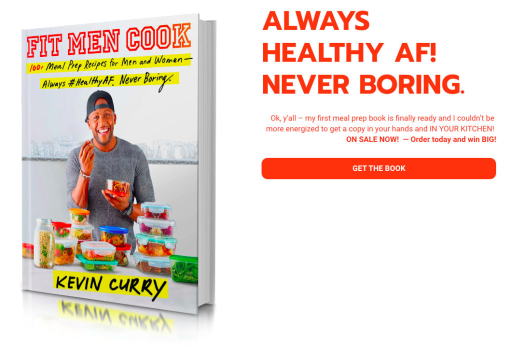
Kevin Curry — a fitness influencer and author — runs FitMenCook, a site dedicated to helping men prepare healthy meals that fit their lifestyle.
He uses a 2-step landing page to direct visitors to purchase his cookbook.
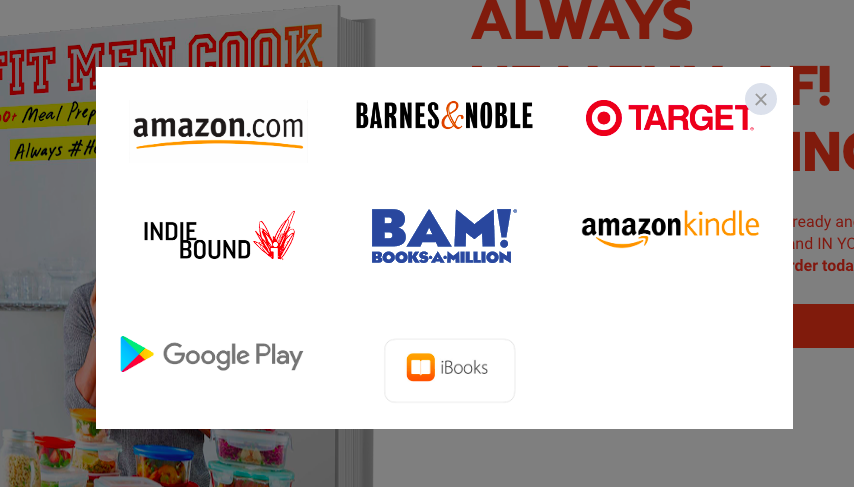
Clicking “Get the Book” triggers an on-click pop up form, making it easy for visitors to purchase at their preferred store:
Sign up for a newsletter
The Daily Stoic is a book written by Ryan Holiday and Stephen Hanselman. The book’s website includes a top bar navigation with a button to trigger a 2-step opt-in.

Clicking the yellow “sign up for daily email” button triggers the following pop up:

This process makes it easy for website visitors to sign up for daily updates. Plus, the pop up form sells the value of the newsletter without taking up precious real estate on the homepage.
How to create a 2-step landing page with AWeber
AWeber Landing Pages are now equipped with the ability to use on-click pop-up forms. So all customers — on any plan — can create a landing page they need with tools they already use.
To create a landing page with this type of form, complete the following steps:
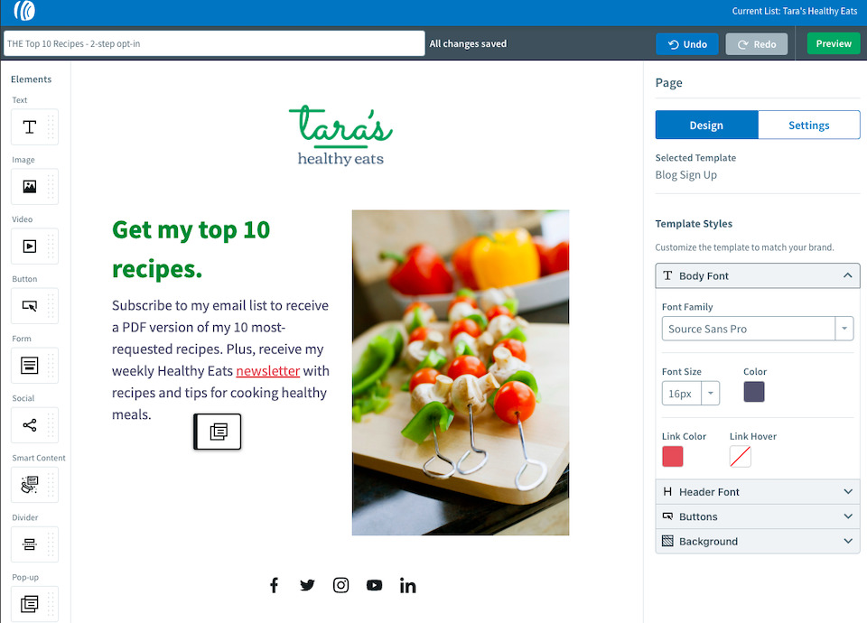
- Navigate to “Landing Pages” in your account. At this point, you can create a new landing page, or edit an existing one.
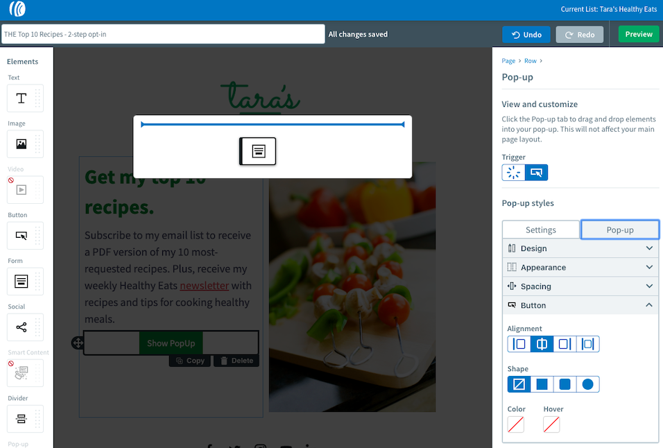
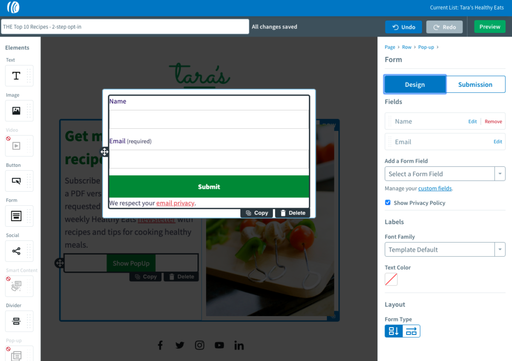
- Once your landing page is ready, drag the “Pop-up” element into the landing page creator where you would like your button to appear.
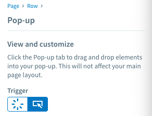
3. Set the pop-up element to trigger when clicked, on the right side bar.
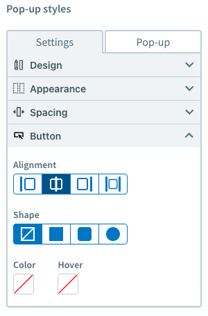
4. Customize the pop-up style you would like in the right side bar. You can change the background color, size of the button, how it appears, and align the button however you’d like.
5. Next, click the “pop-up” tab next to settings. You should see a blank box pop up. Drag in the “Form” element from the left side bar to utilize the pop-up space as a form.
6. Customize your form fields and submission settings using the right side bar.
7. Once your customizations are set, you’re ready to go!
Want to get more sign ups with your landing page?
Give 2-step landing pages a try with the “Pop-up” element in the AWeber Landing Page Builder today.
Not a customer? Sign up for free today.
Have more questions about landing pages? Check out the new Marketing Glossary. Quickly look up terms and get answers to all your marketing questions with ease.