10 great thank you page examples – and how to create your own
By Pam Neely July 26, 2022
Thank you pages are one of the biggest missed opportunities in digital marketing today. The moment after someone says “yes” to you – whether they’ve just placed an order, signed up for your mailing list, or whatever action they’ve taken – is an opportunity to show them they just made a great decision. It’s also an opportunity to get them to keep saying yes to you, and to make sure they follow through on the action they just took.
That’s a lot to ask of one page, but the best thank you page examples pull it off. They go way beyond just saying, “thanks for doing [whatever action they just completed].”
In this post, we’ll walk through all the things thank you pages can do and can include, and show you examples of thank you pages so you can see what’s working today. By the end of this post, you’ll know everything you need to know so you can start getting way more results from your thank you pages.
But first, let’s get on the same page. 😉
What is a thank you page?
A thank you page is the page that appears after someone has completed an action (or, in marketing lingo, after someone has completed a “conversion”).
Thank you pages typically appear on websites, but not always. Anywhere on the web where you ask visitors to take an action, and then the visitors are shown a new page after they’ve taken the action – that new page is an example of a thank you page.
Different types of thank you page examples
Thank you pages can appear after someone has:
- Placed an order
- Signed up for your email newsletter
- Requested a lead magnet
- Signed up for a webinar
- Sent you a message via a “contact us” form
- Scheduled an appointment with you
We’re going to focus on thank you pages used after someone signs up for a lead magnet or a newsletter here, but all principles and thank you page examples we’ll cover also apply to all the other types of thank you pages listed above.
You can do a ton of interesting things with thank you pages – as you’re about to find out!
10 ideas for thank you pages that rock with examples
Let’s work from the basics to the fancy stuff, with thank you page examples sprinkled in along the way.
1. Ask people to confirm their email address
Using “confirmed opt-in,” also known as “double opt-in” is an email marketing best practice. It does require subscribers to take an extra step to double-confirm that they want to get emails from you, but email lists that use confirmed opt-in get much higher opens, clicks, and sales. (There’s a reason why it’s a best practice!)
Here’s what the sequence of onboarding emails looks like for confirmed opt-in versus regular opt-in:
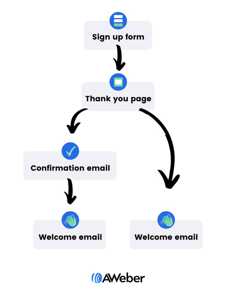
Find out more about confirmation emails, see our blog post, How to write confirmation emails your audience will love.
The one problem with double opt-in is that you have to get people to confirm their email addresses. Fortunately, this is the perfect job for a thank you page.
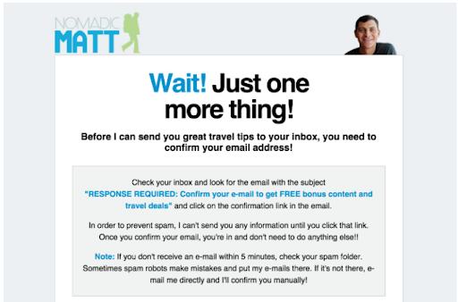
Here are two thank you page examples that do this well. One is from AWeber customer, Nomadic Matt. Matt tells his subscribers that they will only receive his great travel tips if they confirm their email address. He even tells them to check their spam folder if they don’t see the email within five minutes. He’s covering every possible scenario to make sure his subscribers see the confirmation email.
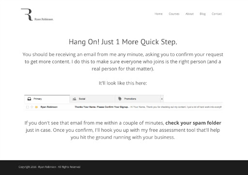
This thank you page example from Ryan Robinson’s thank you page goes one step further by showing new subscribers exactly what the confirmation email will look like in their inbox.
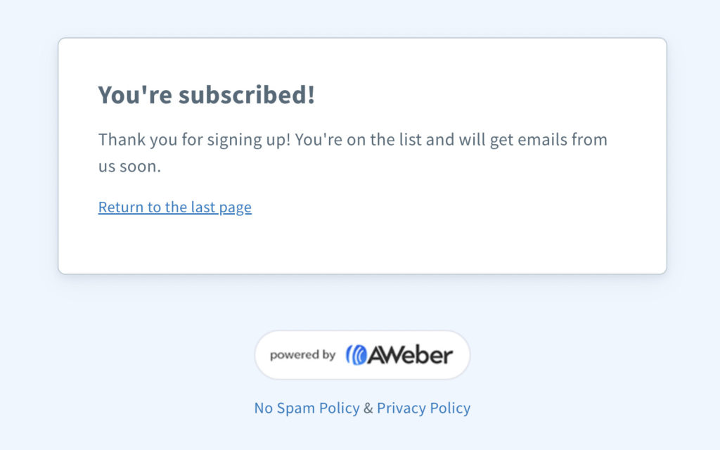
Want a thank you page like this, but don’t want to set it up? AWeber customers can use this default page for their lists.
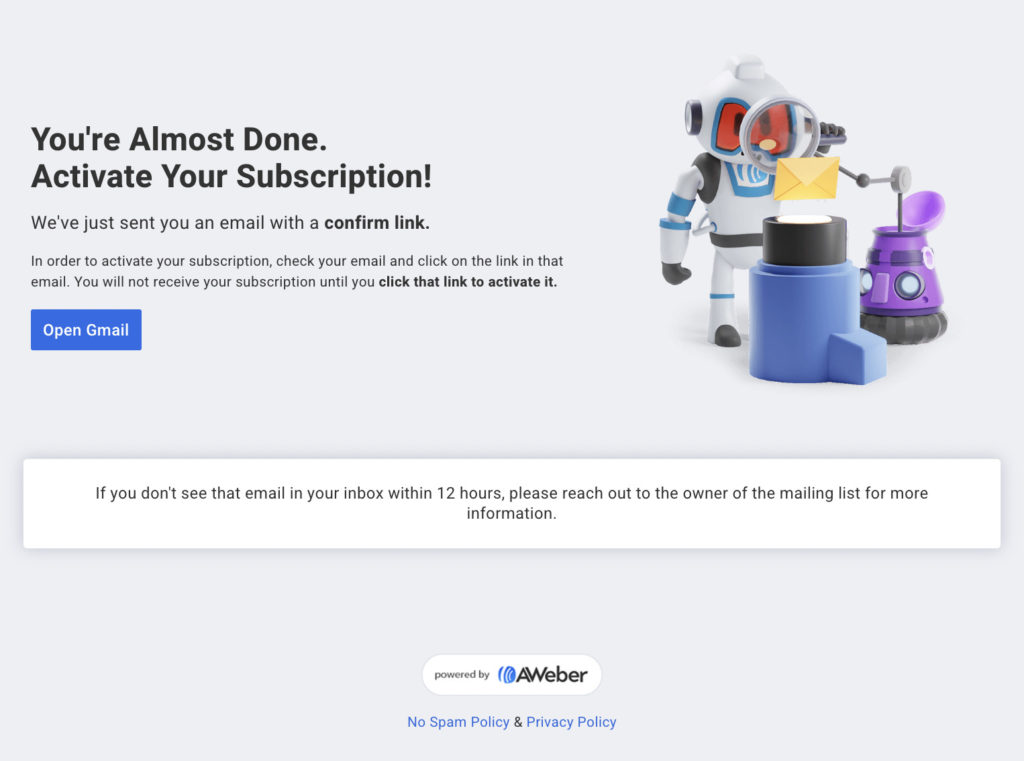
Pro tip: Also ask new subscribers to add your email address to their address books to make sure your emails make it into their inbox.
2. Set expectations
The moment someone subscribes, they’ll want to know “What happens now?”
You can’t assume that your subscribers are going to jump into their email inboxes right away to read your first email. Or that they’ll know what “from” address your emails will be coming from. Or that they’re going to do whatever you want them to do in that first email.
Don’t keep them guessing or let them jump to conclusions. Set the expectation up front on your thank you page to help your new subscribers take action and stay engaged over time. To do so, make sure you answer these questions for them:
- When do I get my first email?
- What “from” name and email address will it come from?
- What is the subject line going to say?
- What’s inside the email?
- How often will you email me?
- What type of information will you be sending?
Using a video is also a helpful way to answer these questions for your new subscribers.
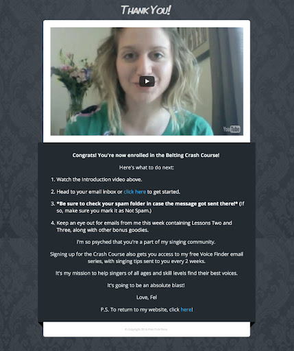
Here’s one of the best thank you page examples of this we’ve seen. Felicia Ricci, a vocal coach and AWeber customer, uses her thank you page to not only thank her new subscribers but to spell out what they can expect next. We love the bulleted format, too – it makes the text easier to read. And she also uses a video to provide a more personal feel.
3. Ask people to buy your book, or subscribe to your podcast or YouTube channel
When people first sign up for your list, they’re really interested in you. They want to see your work! So show them how they can do that, either by prompting them to buy your book/s or to subscribe to your podcast or YouTube channel.
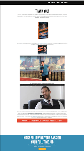
See it in action: Lewis Howes, an entrepreneurial coach, invites new subscribers to buy his book and to subscribe to his School of Greatness podcast. He uses images of the book and podcast as well as videos introducing his purpose for the School of Greatness.
4. Prompt people to follow you on your social media accounts
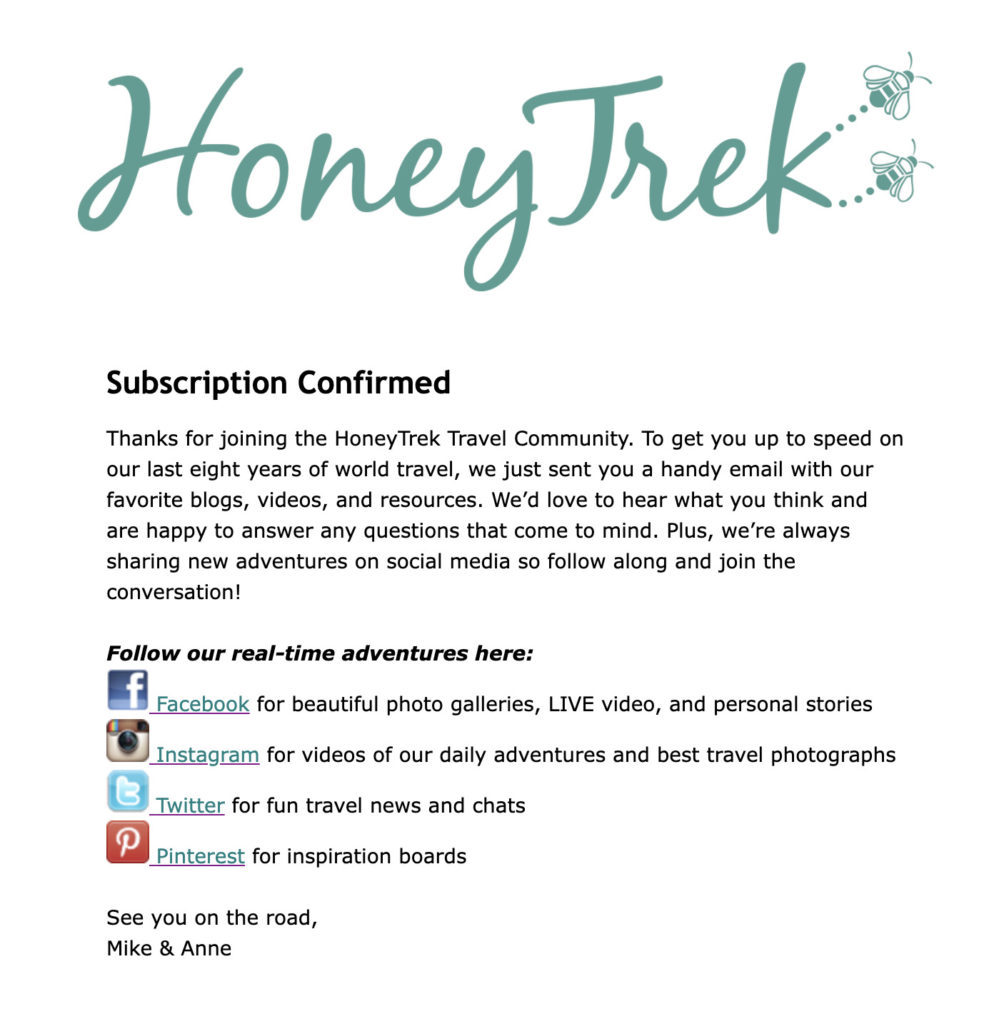
Social media is a lot of work – so here’s your chance to get more out of it. Boost your following on social media by asking new subscribers to follow you on social.
Here’s how HoneyTrek does this on their thank you page:
5. Move subscribers further down the funnel
Sometimes, offering something for sale right away won’t work. Some customers may take longer to make a purchase decision than others. Offering them an additional incentive helps them progress through your marketing funnel, better qualifying them as potential customers and moving them even closer to making a purchase.
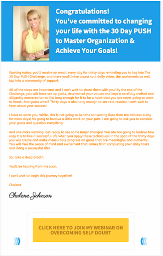
Chalene Johnson, a business and life coach, uses this principle on her thank you page. She encourages new subscribers to sign up for her free, on-demand webinar. This educational webinar provides her subscribers additional value, moving them closer to a potential sale.
6. Sell something
“The thank you page is a dead end on many businesses’ sites. However, when it’s used correctly to offer an upsell, it can be one of the highest converting pages on your site,” says AWeber’s CEO Tom Kulzer.
That’s because new subscribers display three characteristics that mean they’re ready to buy from you:
- They know and understand who you are.
- They understand the problem that you’re solving for them.
- They’ve already given you their email address.
Offering something additional that you can sell to them can generate a tremendous amount of new revenue. If you’re not using this page, it’s a huge missed opportunity.”
Here’s one of our favorite thank you page examples of this. This is email marketer strategist Meera Kothand’s website. She’s offered a nice lead magnet in one section on her site’s homepage. And immediately after people subscribe, she offers them a paid product.
Here’s what her opt-in sequence looks like:
Let’s break this down. She’s got:
- A standard lead magnet offer that takes up a full section of the home page on her site.
- A call to action (CTA) button for people to click to get the lead magnet (aka the “freebie” she’s offering)
- A pop-up sign-up form that appears once people have clicked the CTA button.
- The thank you page – which lets people know their lead magnet is on its way to their inboxes, but is also a full-fledged sales page.
7. Offer a discount
If you can offer something for sale on a thank you page, you can offer something for sale at a discount.
This simple, unexpected gesture may be what your new subscribers need to close the sale. The key is adding an expiration date. Make this an impulse decision, don’t give them too much time to think about it.
Meera’s thank you page example is doing just this: Note that the product is temporarily on sale; Meera is using a countdown timer to boost urgency so people will act immediately to get the discount.
Also note that she’s using a notification tool (it slides into the browser’s lower left-hand corner) to show that other people are buying this product, too. We’ve seen a lot of thank you page examples that are adding these type of “social proof” widgets.
8. Cross-sell
This is yet another play on the “sell something” thank you page: Sell a related or complementary product. For example, if someone signed up to your list because they wanted to get weight-loss tips, use the thank you page to offer a training video or related product.
Meera’s also using this principle on her sign-up sequence, too. Her lead magnet is for an “Online Marketing Roadmap.” The cross-sell on her thank you page is a “Content Marketing Template Pack.”
9. Embed a welcome video
Nothing pops like video. So if your message is clear and your videocam is nearby, make your thank you page into an embedded video. There are plenty of examples of thank you pages that use this format to sell all sorts of things.
Codie Sanchez of the newsletter Contrarian Thinking uses her welcome video as a way to introduce her paid membership.

10. Embed a survey
This can be especially helpful if you’re just starting out. A short embedded form placed on a thank you page is likely to have a high completion rate. So if you want to know a few things about who’s signing up for your list, consider embedding a survey. Just make it short — the shorter it is, the more likely it will be completed. Aim for three to five questions.
Ideas for what to ask:
- A pull-down menu question that lets subscribers categorize who they are (could be useful for list segmentation or personalization in your emails)
- An open-ended question like “what’s your biggest question about [topic x]?”
- A question about content formats, like “would you rather a) read a blog post, b) watch a video, or c) listen to a podcast”?
- The subscriber’s zipcode (helpful for brick and mortar businesses)
- “Which social media platform are you most active on?”
- “What’s your experience level with [topic X]: beginner, intermediate, or expert?”
How to make your own custom thank you page with AWeber
To convert subscribers into customers using the thank you page, you have to move beyond simply saying “thank you” (although that’s important too).
Many email marketing providers give you a basic thank you page. We offer one to our customers, too. This is what it looks like. 👇
But you also have the option to direct your new subscribers to a custom thank you page on your website or blog.
For the most part, creating a custom page on your website is pretty easy, especially if you’re using AWeber’s landing page builder, WordPress, or another hosted solution.
There are two main advantages of creating a custom thank you page on your own website or blog:
- It provides your new subscribers with a consistent experience because your thank you page looks like the rest of your website and has the same domain as the page where people are subscribing.
- You can control what content you put on your page. (This is the biggest benefit. I’ll tell you why in a minute.)
For an exact, step-by-step guide for how to create a custom thank you page in AWeber, watch this:
Want more sales, confirmed subscribers, leads, and other goodness? Thank you page examples to the rescue
If you’re serious about monetizing your email marketing, you need to start leveraging thank you pages so you can turn new subscribers into customers.
The examples of thank you pages we’ve shown you covered a lot of what can be done to get more out of your own thank you pages. But it’s only the beginning. Smart marketers are always coming up with new ways to use thank you pages. So now it’s your turn: How are you using your thank you pages to convert? Have you seen any great thank you page examples lately? Tell us about them in the comments!
 87% off ends soon!
