You’re spending hundreds — maybe even thousands — of dollars a month on Facebook ads.
That money is buying you a ton of impressions and clicks, but it isn’t delivering in the only area that really matters: conversions. What gives?
Most likely, the issue lies with your Facebook landing page.
Maybe there’s a disconnect between your landing page and what you’re promising in your ads. Perhaps your pitch isn’t persuasive enough. Maybe your landing page just doesn’t look credible or trustworthy.
Whatever the case, you need to fix the problem fast if you want to start generating some serious bang for your ad bucks.
Read on to learn how to create a Facebook landing page that converts (including plenty of real-world examples to inspire you).
What is a Facebook landing page?
A Facebook landing page is the first page someone sees after clicking the call to action (CTA) in a Facebook ad.
Facebook landing pages are different from other pages on your website because they’re designed to complement a specific ad and only exist for a single purpose: driving conversions.
They achieve this by replicating the theme and narrative of the Facebook ad, such as using a similar visual style, tone of voice, offer, and call to action.
Why do you need Facebook landing pages?
Facebook landing pages strip out unnecessary “noise” like navigation menus and internal links. Because their whole purpose is keeping visitors on the page until they convert, not persuading them to explore other parts of your website.
This makes them highly effective at convincing visitors to:
To understand why Facebook landing pages work so well, just imagine what would happen if you sent users to a different page on your site, like your homepage.
Rather than immediately being presented with the specific offer you referenced in the ad, they’d see a bunch of irrelevant information — links to random category pages; banners promoting your latest blog post or ebook; multiple CTAs for different products and services.
They’d be pretty confused, right?
By contrast, a dedicated Facebook landing page is immediately recognizable because it only includes specific information about the ad they clicked through from, thereby creating a totally seamless user journey from click to conversion.
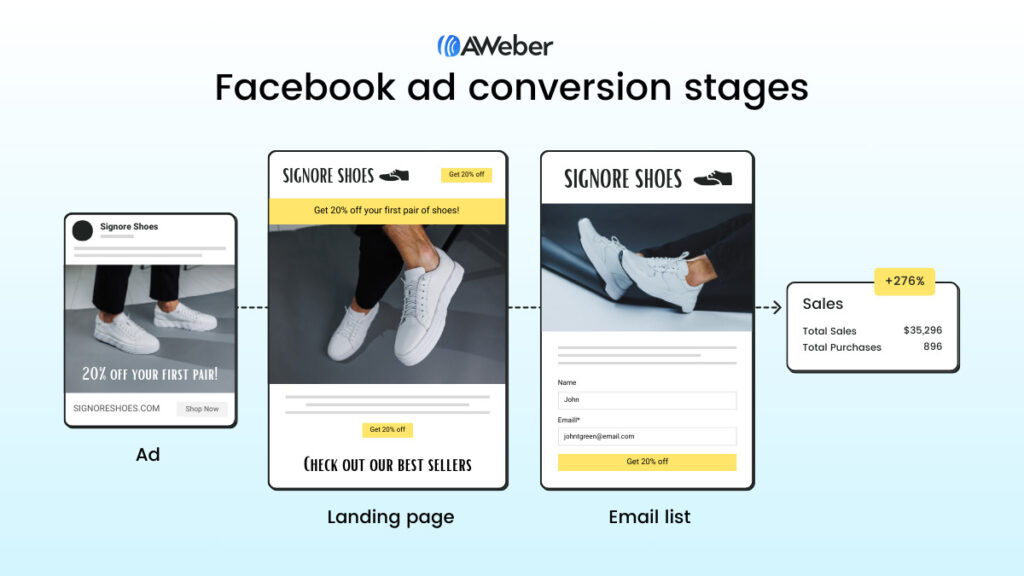
This helps to explain why the average conversion rate for a landing page is 9.7%, compared to just 2.9% for the average website as a whole. In other words: would-be customers are over 3X more likely to convert if they land on a dedicated Facebook landing page rather than some other random page on your website.
So if you want to boost your conversion rate, you can’t afford to live without Facebook landing pages.
How to create a Facebook landing page to maximize conversions
Building a dedicated Facebook landing page is no guarantee of success. You still need to get the basics right if your landing page is going to drive conversions.
Be sure to follow these best practices when creating your landing page…
Ensure a seamless user journey between your ad and landing page
You put a lot of time, effort, and money into building Facebook ads that people want to click.
So the last thing you want is for visitors to arrive on your landing page then bounce immediately.
That’s exactly what will happen if the “vibe” of your landing page doesn’t align with the ad they clicked through from.
In an ideal world, you want users to feel like they’re on a seamless journey, where the landing page clearly echoes the style, tone, and messaging of the ad they clicked.
To illustrate our point, let’s take a look at one advertiser that understood the assignment, and another that gets it all wrong.
👍 Good
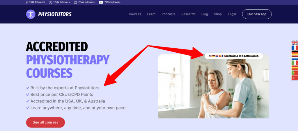
Online physical therapy course company Physiotutors goes to great lengths to spell out the benefits of its product in its Facebook ads, from the range of languages they support to the ability to learn at your own pace:
Well done, Physiotutors — you convinced me to click.
When I arrive on the Facebook landing page, it’s immediately obvious that I’m in the right place. Same logo, same color scheme, same USPs:
So there’s nothing here to put me off wanting to find out more.
👎 Not so good
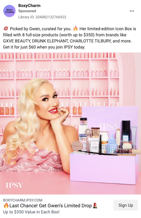
We hate to name and shame, but subscription box company BoxyCharm has created a user journey that feels more jarring than seamless.
The ad ticks a lot of boxes — a limited-edition offer to drive action; a bunch of high-profile brand names; a photo of everyone’s favorite third-wave ska lead singer:
When I clicked the “Sign Up” CTA button, I expected to be taken to a signup page, likely containing some review scores and other trust signals, all designed to persuade me to convert. Sounds obvious, right?
Instead, you end up on the first page of a “beauty quiz”:
Like the CTA promised, you’re expecting to sign up for something, not answer a bunch of questions about your makeup preferences. It honestly feels like they’ve accidentally redirected you to the wrong page.
If the quiz is an essential part of the path to purchase, they should have mentioned it in the ad copy to avoid this sort of confusion.
Focus on one key message
If you try to communicate too many different things in one place, you risk confusing your audience — and (most) people don’t buy when they’re confused. So focus on a single key message or selling point and refer to it throughout your ad copy and landing page.
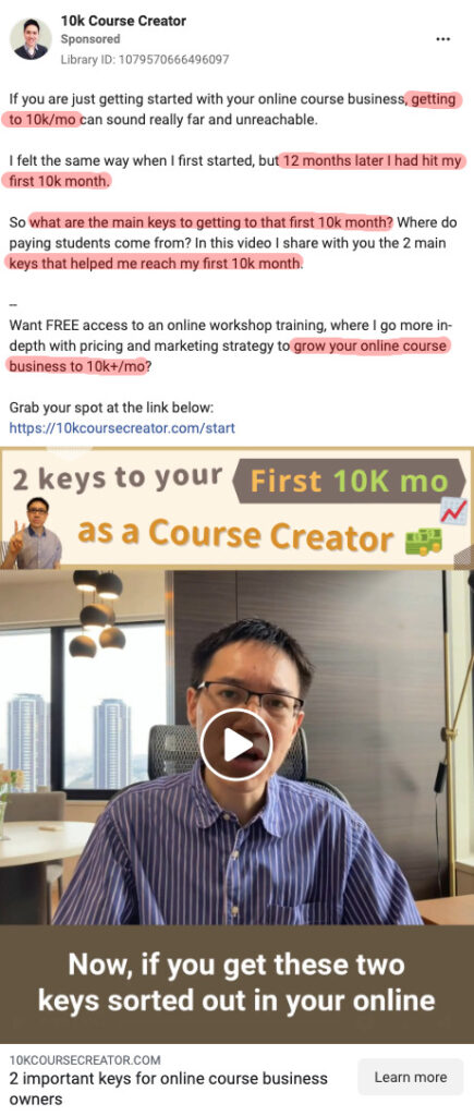
With 10k Course Creator, the key message is right there in the name: giving online course creators tools and strategies to build a $10,000+ per month revenue stream.
It’s a compelling pitch — every course creator wants to make money, right? — so their ads and landing page copy never veer far from it.
Look how often they mention building a $10,000 per month online course business in this ad:
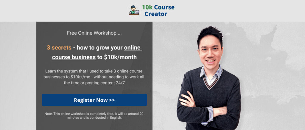
And, of course, it’s one of the first things you see when arriving on their landing page too. Just in case you needed reminding why you clicked the ad.
It’s also worth pointing out that this campaign doesn’t ask visitors for too much.
You’re not being encouraged to buy a course straight off the bat — instead, they just want you to sign up for a free, 20-minute workshop, with the promise of learning three secrets to reach that attractive-sounding $10k-per-month target.
Promoting this sort of low-friction offer is an effective way to improve the conversion rates of your ads and landing pages.
Once you sign up, you’re in their sales pipeline and they can target you with email sequences selling their paid courses.
Make it easy to convert
One of the most common issues we see with Facebook landing pages (or any landing pages, for that matter) is that they don’t make it easy for visitors to complete the desired action.
Like, they bury the call to action at the very bottom of the page, or don’t make the CTA button stand out.
Those sorts of basic errors cost businesses a ton of leads and sales — but fortunately, they’re easy to rectify.
Vegan meal kit delivery brand Purple Carrot shows us how it’s done.
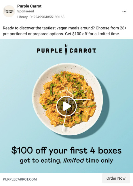
For starters, their Facebook ad is easy to understand and carries a clear message: if you sign up for this offer today, you’ll save $100 on your first four meal boxes.
The “Order Now” CTA button makes it crystal clear that they expect you to buy something if you click through from the ad.
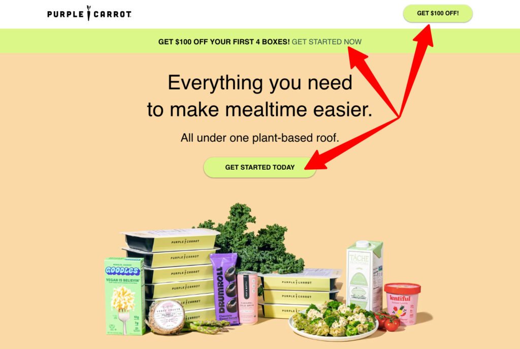
On the landing page, Purple Carrot repeats the discount message, making it immediately obvious that you’re in the right place. Best of all, the offer is surrounded by CTAs to get started:
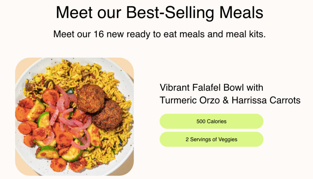
Below the fold, Purple Carrot showcases its latest meal kits…
…and builds social proof by highlighting some of the publications it’s appeared in:
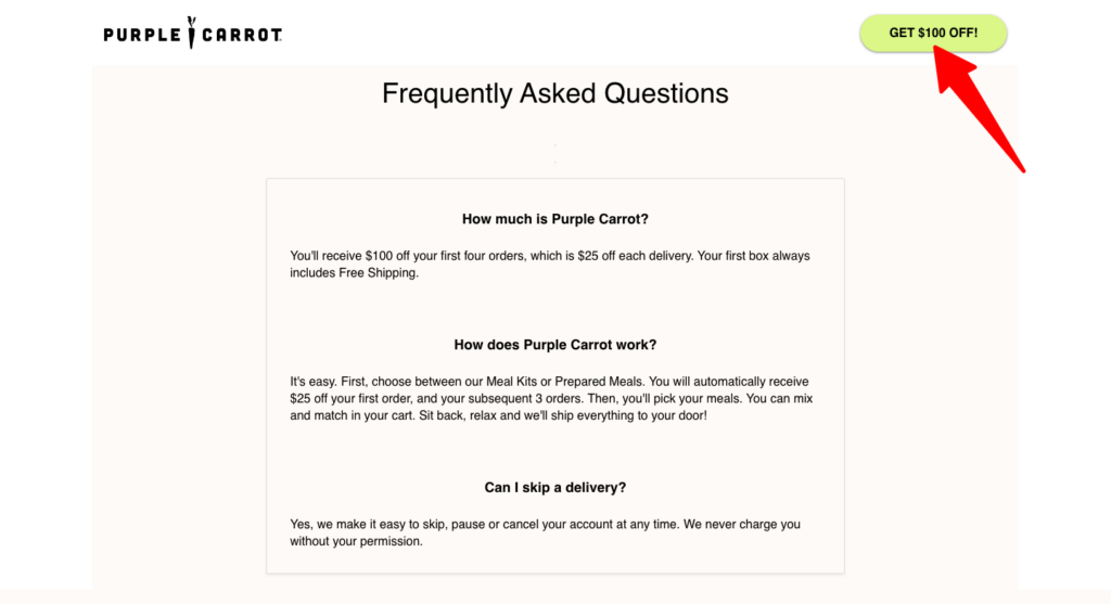
Importantly, however deep in the page you scroll, the green “Get $100 off” CTA button is always visible at the top-right of the screen…
…so you’re only ever a click away from converting.
Create campaign-specific landing pages
Building landing pages is rarely a one-and-done exercise.
You’ll almost certainly need to build more when you launch a new ad campaign — unless you plan to promote exactly the same offer or target the same audience forever.
Coworking space company THRIVE Coworking demonstrates the importance of personalizing your ads and landing pages to reach and attract different audiences.
Given that they run physical workspaces across six US states, it’d be almost impossible to convert would-be customers with a single Facebook landing page. Instead, they built dedicated ads and landing pages for each coworking space.
Here’s one of THRIVE’s ads for their location in Snellville, GA…
…which sends users to a dedicated Snellville landing page that explains the perks of being a member and the types of workspaces available:
Sure, this sort of personalization requires a little more effort than just relying on a single ad-and-landing-page combo, but it’s far more likely to generate leads.
Also, we like the way that the orange “Book a tour” button appears in both the Facebook ad and the landing page.
As one of the few colorful elements above the fold on the landing page, it naturally draws the eye, encouraging visitors to click and convert.
Sell, sell, sell
Facebook landing pages aren’t the place for the soft-touch approach — they’re all about driving immediate action.
If someone’s not going to convert, it makes no difference whether they spend five seconds or five hours on your landing page; the end result is the same. So you might as well use direct, action-oriented messaging to scare off the tire kickers and convince those who are ready to buy.
Online woodworking video training company the WoodWorkers Guild of America (WWGA) definitely knows its ABCs — “always be closing”, that is.
In this Facebook ad, it offers a massive discount to drive signups — presumably confident that customers will stick around and pay full price when it’s time to renew their membership:
Then we get to the landing page, which is a conversion-driving machine.
It stresses that this is a limited-time offer, so you’d better act fast if you don’t want to miss out:
And if you’re still not convinced at that ultra-low price, they hit you with an exit intent popup offering the same package for just $0.65:
It’s hard to imagine many people not being persuaded at that price point — even if WWGA’s content sucks, you’ve only spent the price of a pack of gum.
Anyone who doesn’t convert was most likely never going to.
Optimize your Facebook landing page for mobile
Four in five Facebook users only visit the social network via a mobile phone, while just 1.5% exclusively use a laptop or desktop computer.
So if you don’t have a mobile-optimized landing page, you’re alienating almost the entire audience of your Facebook ad campaigns.
This trend toward mobile browsing makes it harder than ever to capture and retain your audience’s attention. News feeds are busy — and if users don’t find instant gratification, they’ll just switch to a different app.
All of which means it’s vital your Facebook landing pages play nice on mobile screens. For instance, you should:
Make it easy for users to jump to the top or bottom of the page using sticky headers and footers
Prioritize single-column rather than multi-column page layouts
Okay, let’s take a look at an advertiser that gets it right.
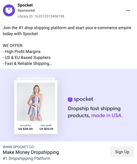
Dropshipping platform Spocket uses Facebook ads to drive signups for its 14-day free trial by discussing key benefits like access to US-based suppliers and fast shipping speeds:
The ad copy and “Sign Up” CTA make it clear that the whole point of clicking through is to join the platform.
When you visit the landing page on mobile, you’re presented with the same key messaging around the range and quality of suppliers, plus a simple, mobile-friendly email capture form:
By using a single-column layout, a single-field lead capture form, and a giant “Get started” CTA button, Spocket makes it super simple for mobile users to convert.
Add the Meta pixel to your landing page
Understanding how your audience reached your Facebook landing page (and what they did when they got there) is crucial to optimizing your campaigns.
To do that, you need to install a piece of code on your landing page known as the Meta pixel, which tracks the actions people perform — like completing a form or buying a product — when they click through to your website from Facebook or Instagram.
Build high-converting Facebook landing pages and email sequences with AWeber
For many brands, Facebook landing pages go hand-in-hand with email sequences.
You run ads to target potential customers, persuade them to hand over their email address on your landing page, then nurture them until they’re ready to buy through a steady stream of marketing emails.
Wouldn’t it be great if you could build high-converting landing pages and engaging email campaigns in a single platform?
Then welcome your new subscribers with pre-built autoresponders, use dynamic content to craft highly personalized emails, and run A/B split tests to level up campaign performance. Sign up for your free AWeber account today!
You’re spending hundreds — maybe even thousands — of dollars a month on Facebook ads.
That money is buying you a ton of impressions and clicks, but it isn’t delivering in the only area that really matters: conversions. What gives?
Most likely, the issue lies with your Facebook landing page.
Maybe there’s a disconnect between your landing page and what you’re promising in your ads. Perhaps your pitch isn’t persuasive enough. Maybe your landing page just doesn’t look credible or trustworthy.
Whatever the case, you need to fix the problem fast if you want to start generating some serious bang for your ad bucks.
Read on to learn how to create a Facebook landing page that converts (including plenty of real-world examples to inspire you).
What is a Facebook landing page?
A Facebook landing page is the first page someone sees after clicking the call to action (CTA) in a Facebook ad.
Facebook landing pages are different from other pages on your website because they’re designed to complement a specific ad and only exist for a single purpose: driving conversions.
They achieve this by replicating the theme and narrative of the Facebook ad, such as using a similar visual style, tone of voice, offer, and call to action.
Why do you need Facebook landing pages?
Facebook landing pages strip out unnecessary “noise” like navigation menus and internal links. Because their whole purpose is keeping visitors on the page until they convert, not persuading them to explore other parts of your website.
This makes them highly effective at convincing visitors to:
Buy a product or service
Fill out a lead capture form
Sign up for an online course
Register for an online event
Book a product demo
To understand why Facebook landing pages work so well, just imagine what would happen if you sent users to a different page on your site, like your homepage.
Rather than immediately being presented with the specific offer you referenced in the ad, they’d see a bunch of irrelevant information — links to random category pages; banners promoting your latest blog post or ebook; multiple CTAs for different products and services.
They’d be pretty confused, right?
By contrast, a dedicated Facebook landing page is immediately recognizable because it only includes specific information about the ad they clicked through from, thereby creating a totally seamless user journey from click to conversion.
This helps to explain why the average conversion rate for a landing page is 9.7%, compared to just 2.9% for the average website as a whole. In other words: would-be customers are over 3X more likely to convert if they land on a dedicated Facebook landing page rather than some other random page on your website.
So if you want to boost your conversion rate, you can’t afford to live without Facebook landing pages.
How to create a Facebook landing page to maximize conversions
Building a dedicated Facebook landing page is no guarantee of success. You still need to get the basics right if your landing page is going to drive conversions.
Be sure to follow these best practices when creating your landing page…
Ensure a seamless user journey between your ad and landing page
You put a lot of time, effort, and money into building Facebook ads that people want to click.
So the last thing you want is for visitors to arrive on your landing page then bounce immediately.
That’s exactly what will happen if the “vibe” of your landing page doesn’t align with the ad they clicked through from.
In an ideal world, you want users to feel like they’re on a seamless journey, where the landing page clearly echoes the style, tone, and messaging of the ad they clicked.
To illustrate our point, let’s take a look at one advertiser that understood the assignment, and another that gets it all wrong.
👍 Good
Online physical therapy course company Physiotutors goes to great lengths to spell out the benefits of its product in its Facebook ads, from the range of languages they support to the ability to learn at your own pace:
Well done, Physiotutors — you convinced me to click.
When I arrive on the Facebook landing page, it’s immediately obvious that I’m in the right place. Same logo, same color scheme, same USPs:
View Physiotutors full landing page
So there’s nothing here to put me off wanting to find out more.
👎 Not so good
We hate to name and shame, but subscription box company BoxyCharm has created a user journey that feels more jarring than seamless.
The ad ticks a lot of boxes — a limited-edition offer to drive action; a bunch of high-profile brand names; a photo of everyone’s favorite third-wave ska lead singer:
When I clicked the “Sign Up” CTA button, I expected to be taken to a signup page, likely containing some review scores and other trust signals, all designed to persuade me to convert. Sounds obvious, right?
Instead, you end up on the first page of a “beauty quiz”:
View BoxyCharm’s full landing page
Hey, where did Gwen Stefani go?
Like the CTA promised, you’re expecting to sign up for something, not answer a bunch of questions about your makeup preferences. It honestly feels like they’ve accidentally redirected you to the wrong page.
If the quiz is an essential part of the path to purchase, they should have mentioned it in the ad copy to avoid this sort of confusion.
Focus on one key message
If you try to communicate too many different things in one place, you risk confusing your audience — and (most) people don’t buy when they’re confused. So focus on a single key message or selling point and refer to it throughout your ad copy and landing page.
With 10k Course Creator, the key message is right there in the name: giving online course creators tools and strategies to build a $10,000+ per month revenue stream.
It’s a compelling pitch — every course creator wants to make money, right? — so their ads and landing page copy never veer far from it.
Look how often they mention building a $10,000 per month online course business in this ad:
And, of course, it’s one of the first things you see when arriving on their landing page too. Just in case you needed reminding why you clicked the ad.
It’s also worth pointing out that this campaign doesn’t ask visitors for too much.
You’re not being encouraged to buy a course straight off the bat — instead, they just want you to sign up for a free, 20-minute workshop, with the promise of learning three secrets to reach that attractive-sounding $10k-per-month target.
Promoting this sort of low-friction offer is an effective way to improve the conversion rates of your ads and landing pages.
Once you sign up, you’re in their sales pipeline and they can target you with email sequences selling their paid courses.
Make it easy to convert
One of the most common issues we see with Facebook landing pages (or any landing pages, for that matter) is that they don’t make it easy for visitors to complete the desired action.
Like, they bury the call to action at the very bottom of the page, or don’t make the CTA button stand out.
Those sorts of basic errors cost businesses a ton of leads and sales — but fortunately, they’re easy to rectify.
Vegan meal kit delivery brand Purple Carrot shows us how it’s done.
For starters, their Facebook ad is easy to understand and carries a clear message: if you sign up for this offer today, you’ll save $100 on your first four meal boxes.
The “Order Now” CTA button makes it crystal clear that they expect you to buy something if you click through from the ad.
On the landing page, Purple Carrot repeats the discount message, making it immediately obvious that you’re in the right place. Best of all, the offer is surrounded by CTAs to get started:
View Purple Carrot’s full landing page
Need more convincing?
Below the fold, Purple Carrot showcases its latest meal kits…
…and builds social proof by highlighting some of the publications it’s appeared in:
Importantly, however deep in the page you scroll, the green “Get $100 off” CTA button is always visible at the top-right of the screen…
…so you’re only ever a click away from converting.
Create campaign-specific landing pages
Building landing pages is rarely a one-and-done exercise.
You’ll almost certainly need to build more when you launch a new ad campaign — unless you plan to promote exactly the same offer or target the same audience forever.
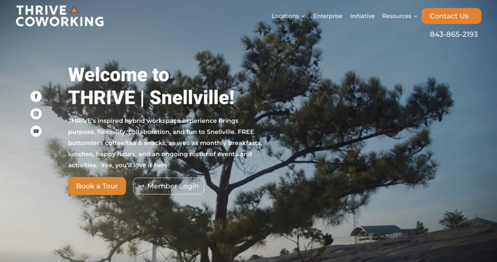
Coworking space company THRIVE Coworking demonstrates the importance of personalizing your ads and landing pages to reach and attract different audiences.
Given that they run physical workspaces across six US states, it’d be almost impossible to convert would-be customers with a single Facebook landing page. Instead, they built dedicated ads and landing pages for each coworking space.
Here’s one of THRIVE’s ads for their location in Snellville, GA…
…which sends users to a dedicated Snellville landing page that explains the perks of being a member and the types of workspaces available:
View Thrive Coworking’s full landing page
Sure, this sort of personalization requires a little more effort than just relying on a single ad-and-landing-page combo, but it’s far more likely to generate leads.
Also, we like the way that the orange “Book a tour” button appears in both the Facebook ad and the landing page.
As one of the few colorful elements above the fold on the landing page, it naturally draws the eye, encouraging visitors to click and convert.
Sell, sell, sell
Facebook landing pages aren’t the place for the soft-touch approach — they’re all about driving immediate action.
If someone’s not going to convert, it makes no difference whether they spend five seconds or five hours on your landing page; the end result is the same. So you might as well use direct, action-oriented messaging to scare off the tire kickers and convince those who are ready to buy.
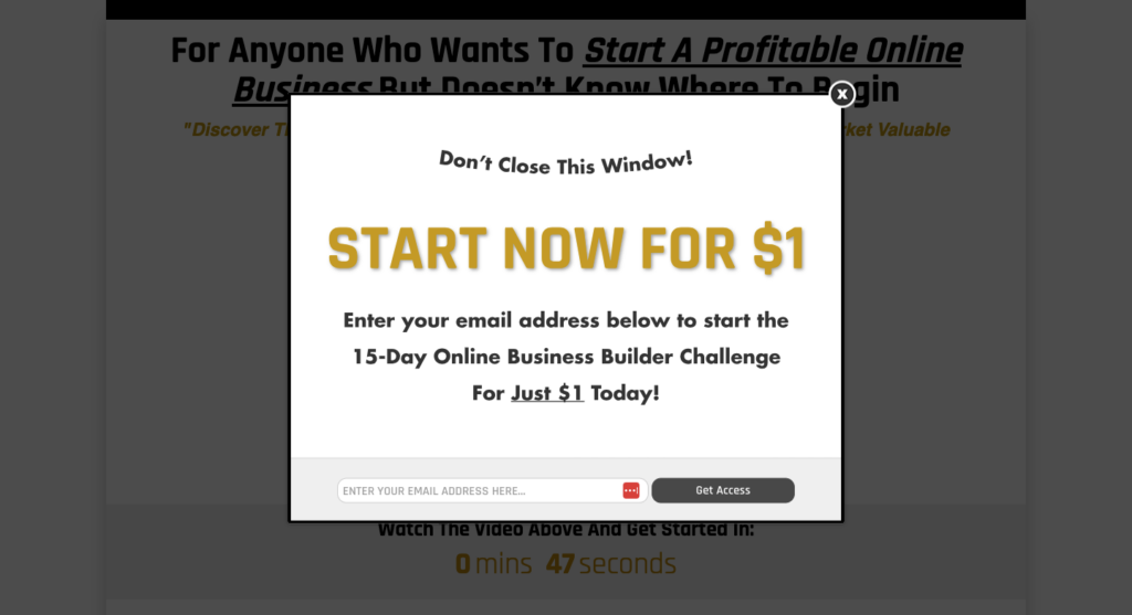
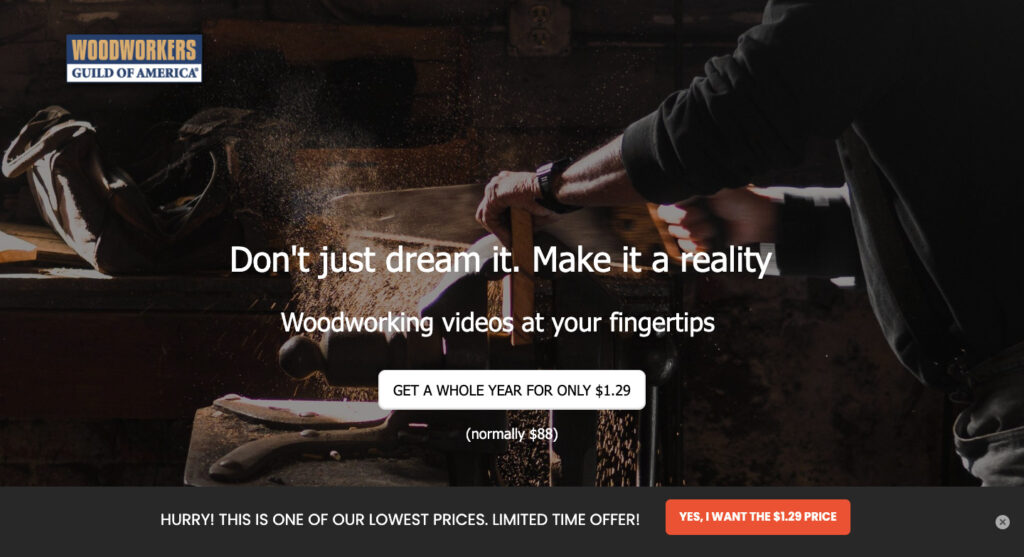
Online woodworking video training company the WoodWorkers Guild of America (WWGA) definitely knows its ABCs — “always be closing”, that is.
In this Facebook ad, it offers a massive discount to drive signups — presumably confident that customers will stick around and pay full price when it’s time to renew their membership:
Then we get to the landing page, which is a conversion-driving machine.
It stresses that this is a limited-time offer, so you’d better act fast if you don’t want to miss out:
View WoodWorkers Guild of America’s full landing page
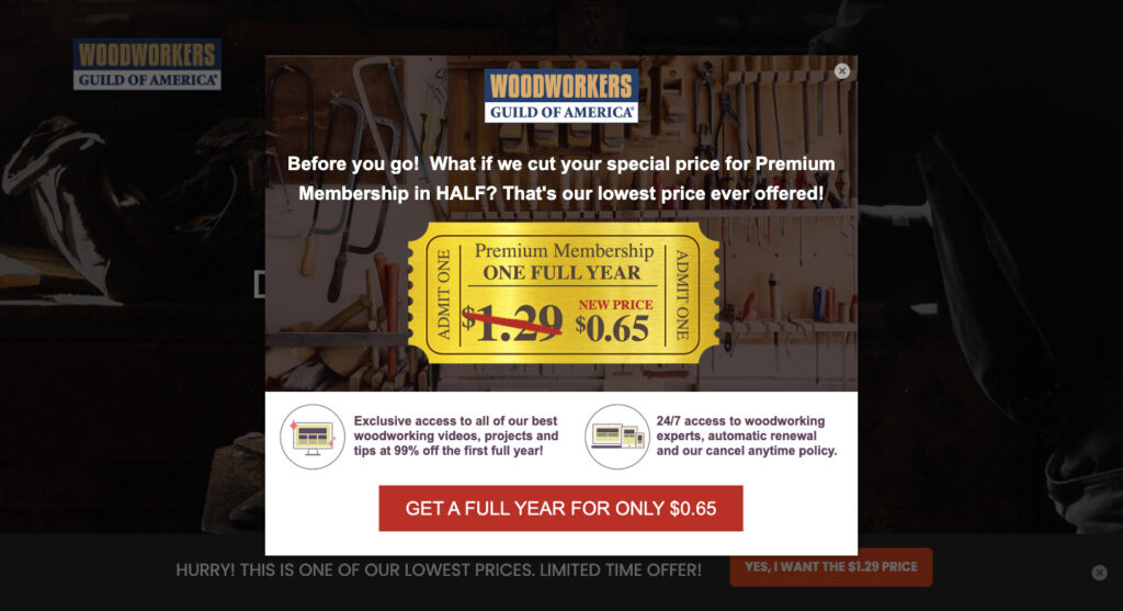
And if you’re still not convinced at that ultra-low price, they hit you with an exit intent popup offering the same package for just $0.65:
It’s hard to imagine many people not being persuaded at that price point — even if WWGA’s content sucks, you’ve only spent the price of a pack of gum.
Anyone who doesn’t convert was most likely never going to.
Optimize your Facebook landing page for mobile
Four in five Facebook users only visit the social network via a mobile phone, while just 1.5% exclusively use a laptop or desktop computer.
So if you don’t have a mobile-optimized landing page, you’re alienating almost the entire audience of your Facebook ad campaigns.
This trend toward mobile browsing makes it harder than ever to capture and retain your audience’s attention. News feeds are busy — and if users don’t find instant gratification, they’ll just switch to a different app.
All of which means it’s vital your Facebook landing pages play nice on mobile screens. For instance, you should:
A/B test CTA button copy, colors, and locations to find the combo that stands out best
Make it easy for users to jump to the top or bottom of the page using sticky headers and footers
Prioritize single-column rather than multi-column page layouts
Okay, let’s take a look at an advertiser that gets it right.
Dropshipping platform Spocket uses Facebook ads to drive signups for its 14-day free trial by discussing key benefits like access to US-based suppliers and fast shipping speeds:
The ad copy and “Sign Up” CTA make it clear that the whole point of clicking through is to join the platform.
When you visit the landing page on mobile, you’re presented with the same key messaging around the range and quality of suppliers, plus a simple, mobile-friendly email capture form:
View Spocket’s full landing page
By using a single-column layout, a single-field lead capture form, and a giant “Get started” CTA button, Spocket makes it super simple for mobile users to convert.
Add the Meta pixel to your landing page
Understanding how your audience reached your Facebook landing page (and what they did when they got there) is crucial to optimizing your campaigns.
To do that, you need to install a piece of code on your landing page known as the Meta pixel, which tracks the actions people perform — like completing a form or buying a product — when they click through to your website from Facebook or Instagram.
👉 Read our step-by-step guide on how to set up the Meta pixel on your Facebook landing page with AWeber.
Build high-converting Facebook landing pages and email sequences with AWeber
For many brands, Facebook landing pages go hand-in-hand with email sequences.
You run ads to target potential customers, persuade them to hand over their email address on your landing page, then nurture them until they’re ready to buy through a steady stream of marketing emails.
Wouldn’t it be great if you could build high-converting landing pages and engaging email campaigns in a single platform?
Turns out you can!
With AWeber, you can design beautiful landing pages using our intuitive drag-and-drop builder.
Then welcome your new subscribers with pre-built autoresponders, use dynamic content to craft highly personalized emails, and run A/B split tests to level up campaign performance.Sign up for your free AWeber account today!
Keep reading:How to use the psychology of color in marketing to increase your resultsLanding page vs website: which one does your business need?
 87% off ends soon!