How to design a newsletter in 5 quick and easy sections
By Dave Stys December 19, 2023
I don’t have a creative bone in my body. So when I first started creating newsletters, I would always second guess myself, which usually left me just giving up and going with a plain white background, black text newsletter.
I can’t tell you how many times I’ve tried to start writing only to quickly get discouraged that my newsletter doesn’t look all that great. It looks plain. It looks average. I am not afraid to admit – It would look boring and I wouldn’t read it myself.
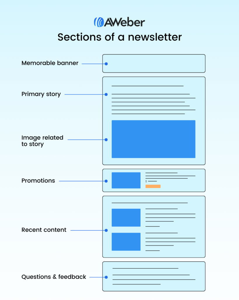
So I made it my mission to find out what makes a great looking newsletter that people could not wait to read. After countless hours of research I’ve listed the sections that appear most often in the most popular newsletters.
Section of a newsletter
- Memorable banner
- Primary story and images
- Promotion your reader’s won’t miss
- Recent content
- Requesting questions and ideas
How to design a newsletter
By breaking your newsletter into sections, designing a newsletter can be as easy as assembling each section in the right order.
A memorable banner
I’ve subscribed to so many newsletters that I often lose track of things. What I’ve started noticing is that some authors forget to remind me who they are, what they offer, and why I signed up in the first place.
Let’s not assume people remember us from our catchy email address. You need to begin every email by re-establishing your brand, identifying who you are and why it matters.
A memorable branded banner can be quite simple. It’s recommended to include your logo, brand colors, and most importantly, a statement as to why your newsletter exists and matters to your subscribers.
Check out this banner created for the RuhRoh newsletter:

As you can see the brand header section is strong with a dark background. The logo and newsletter name are on the left. And the thing that catches the eye is a reminder that this newsletter is here to help people avoid common problems of owning a new puppy.
Here’s a simple way you can design a branded newsletter header using Canva:
1 – Select Create a design
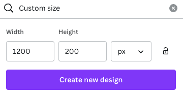
2 – Go to custom size and enter 1200 x 200 px, then select create new design
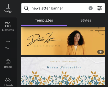
3 – The great thing about Canva is you don’t have to be a professional designer to create stunning visuals. You can choose one of their pre designed banners to get started. Change the colors to your brand colors, the text to your message and newsletter name, and replace the visual with your logo. And viola, a quick and easy newsletter banner.
Your primary story and images
Once your subscriber has opened the email and recognized your brand and purpose, it’s important to jump right into the topic of the day. Your subject line likely prompted the reader to open the message, so they’re looking for an immediate connection to the information you’ve promised. Let’s not make them hunt around to find what they’re looking for.
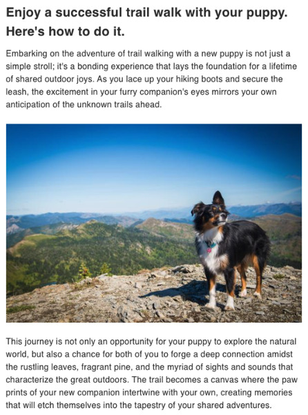
The primary story will be simply introduced by a title that helps the reader recognize it’s the story they’re looking for. Include an image in your newsletter design that illustrates the topic and appeals emotionally to your reader.
Check out the example below for the RuhRoh Newsletter, it explains how to have a successful trail walk with your dog. The image is aspirational in nature, helping the reader to imagine him or herself out on the trails with their pup.
A promotion your readers won’t miss
Let’s face it, your audience, large or small, trusts you. They read your newsletter for the information you provide and they see you as a valuable advisor on a topic they care about. Don’t miss the opportunity to share and promote offers, courses, and products to them.
Buying decisions are made so much easier when an expert recommends the exact thing that works for them.
In your newsletter design, make sure you promote other services you might offer, like a course, a 1-on-1 video coaching session, an e-book, or even just links to other creators you follow and want to help promote. If you’re an affiliate, you can easily include links to products you recommend and earn a few bucks when your readers buy.
Try to include at least one thing to promote in each newsletter.
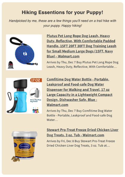
Here’s an example from the RohRoh Newsletter, since the content we shared above is writing about trail hiking with my dog. It’s a nice tie-in to promote a few essential products.
Here’s the result:
Recent content
As a newsletter author, it’s a trap to assume every reader opened each email you’ve sent let alone read everything. In reality, it helps to re-send links to content you shared in previous newsletters. Make sure you always have a spot to re-invite the user to click through and access that content.
The RuhRoh Newsletter does just that by sharing their four most recent blog posts.
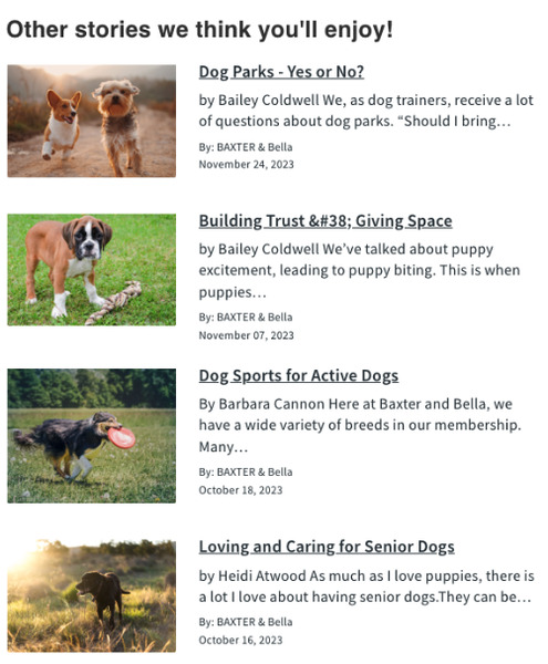
You manually add your most recent blog post in each newsletter or if you use an email provider, like AWeber, you can use an RSS feed element to have the image, title, description, and more automatically pulled into your newsletter.
Here’s how easy it is if you have an AWeber account.
1 – Drag the Feed element into your email.

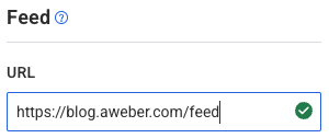
2 – Enter the RSS feed URL (here’s where to find it) into the “Feed URL” box.
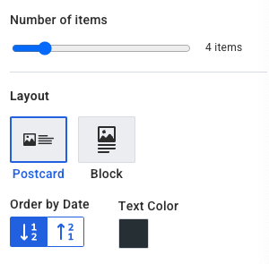
3 – Set your preferences such as the layout style, text color, and the number of items you want to appear.
Requesting questions and ideas
An often overlooked part of a great newsletter design is asking for feedback.
Email newsletters often feel like a one-way street. You write. The audience reads. So consider having a relationship with your audience, instead. Invite them to reply to your email, ask questions, and yes, have them recommend topics you should cover next.
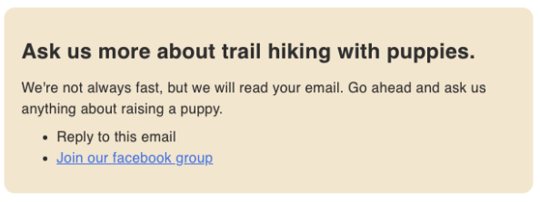
Here’s an example of how to ask your readers to engage with your newsletter. You can prompt for replies by asking if anyone has more questions about your primary topic. You can also link to our Facebook group where people can join the community and get more involved.
Put the final touches on your newsletter design
Once you have your newsletter designed, it’s time to make some last minute tweaks to get it just right.
You want to make sure your newsletter design is using your brand colors for any call to actions, background colors, or text links. Also ensure you’re using consistent font styles for your headlines and paragraphs.
In most newsletter builders you’re going to need to update these in each section. But if you’re using AWeber to send your newsletters, this can be done using Theme Settings.
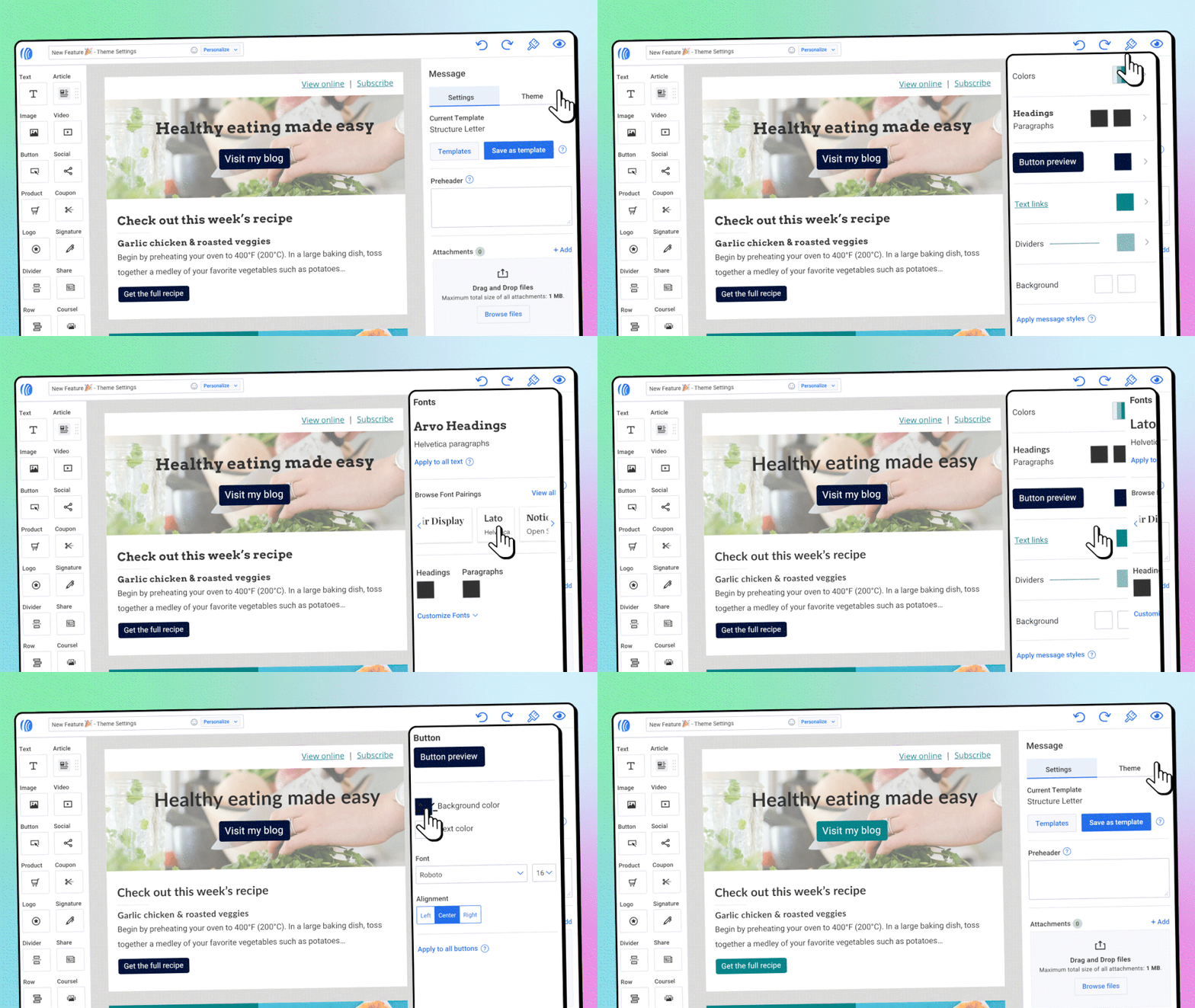
This feature brings all your style options into one convenient spot, making it easier than ever to consistently improve your email’s appearance. With the click of a button you can easily update your text, button, links and other styles to keep things consistent throughout your entire email.
{ “@context”: “https://schema.org”, “@type”: “VideoObject”, “name”: “Keep your email consistently beautiful and readable with Message Themes from AWeber”, “description”: “Message Themes brings all your design options into one convenient spot, making it easier than ever to manage how your email looks. It’s never been simpler to make sure your all your text, buttons, links and other visual elements look consistently great through your entire email.”, “thumbnailUrl”: “https://img.youtube.com/vi/54w-7uQcwcc/maxresdefault.jpg”, “uploadDate”: “2023-12-12”, “duration”: “PT5M55S”, “contentUrl”: “https://www.youtube.com/watch?v=54w-7uQcwcc”, “embedUrl”: “https://www.youtube.com/embed/54w-7uQcwcc” }Time to design an amazing looking newsletter
Designing a newsletter that looks like a work of art can be accomplished in no time with the right newsletter solution – like AWeber. Plus, once you’ve designed your new newsletter you can save it as a Template and use it over and over again.
 87% off ends soon!
Jer
12/28/2023 11:44 amCreating a Newsletter! THIS was invaluable for me. Thanks 🙏 Jer