Keep your emails consistent and beautiful with Theme Settings
By Dave Stys December 12, 2023
Picture this…you just wrote a Pulitzer worthy newsletter in a Google Doc that you’re ready to send to your audience. The only thing left to do is copy it into your email message editor. But when you do, you realize that a different font and headline color look better in the email. So you take the time consuming steps to update each block of text and headline one-by-one (🤮).
If only there was a way you could update the styling of your newsletter all at once, in one place.
Great news – now you can! AWeber’s new Theme Settings feature is just what you’ve been looking for.
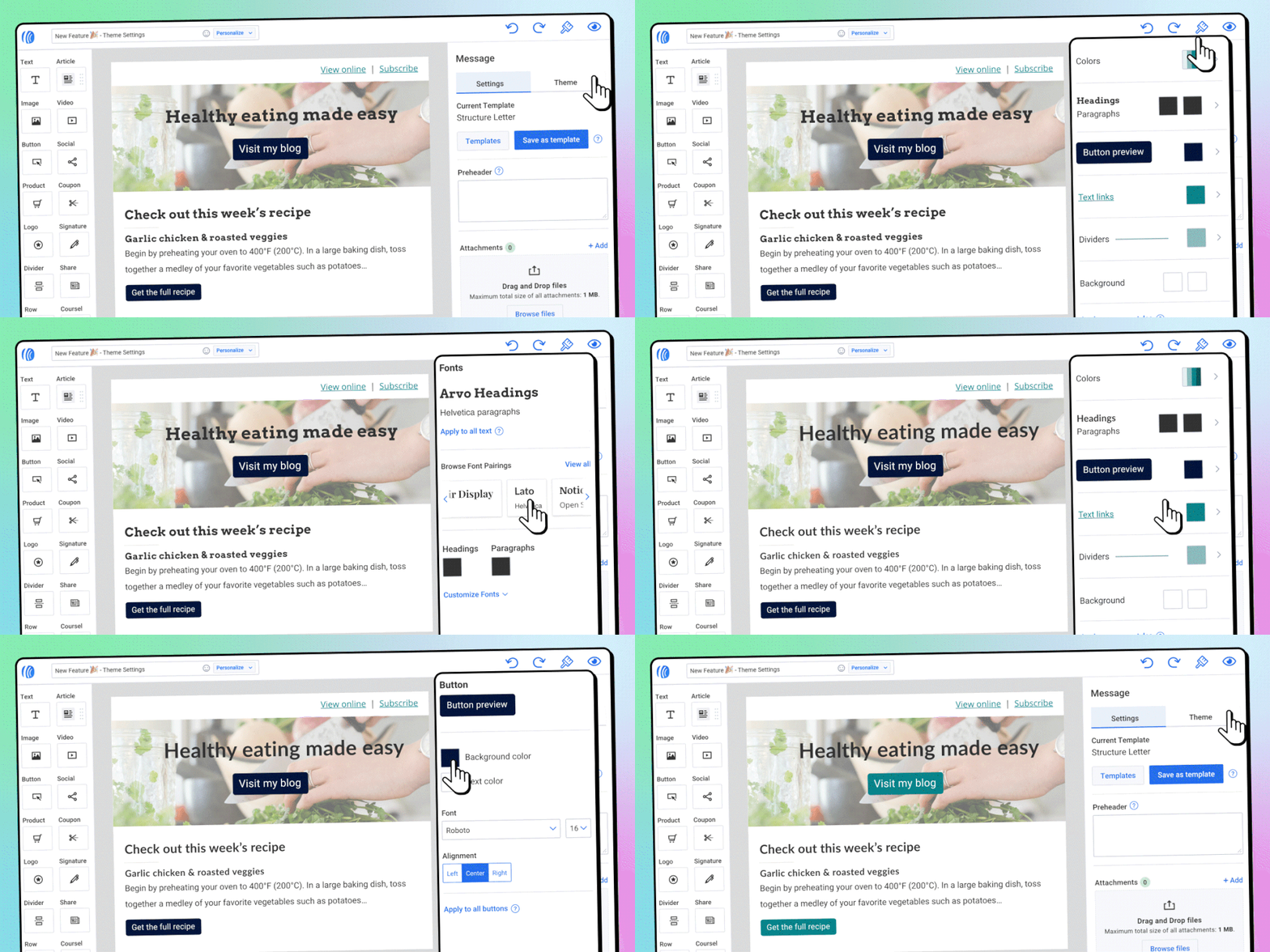
Theme Settings brings all your style options into one convenient spot, making it easier than ever to consistently improve your email’s appearance. With the click of a button you can easily update your text, button, links and other styles to keep things consistent throughout your entire email.
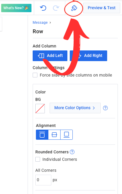
Where to access Theme Settings?
When you’re in your email message editor, look for the Theme Settings paintbrush icon in the upper right corner. Now you’ll be able to set your preferred, default styles for your message.
What can I change in Theme Settings?
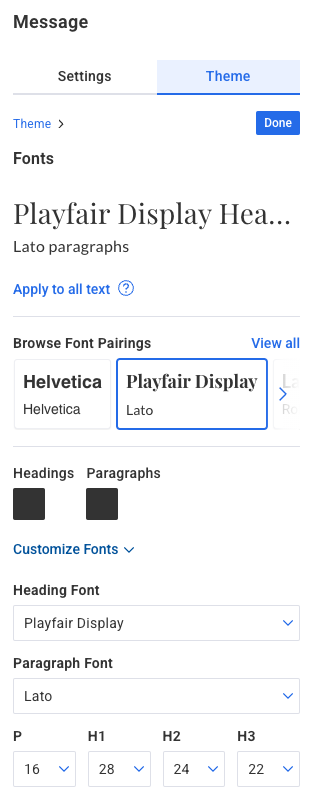
Headline and Paragraphs
Having consistent font styles and sizes goes a long way in making your email look polished, professional, and consistent.
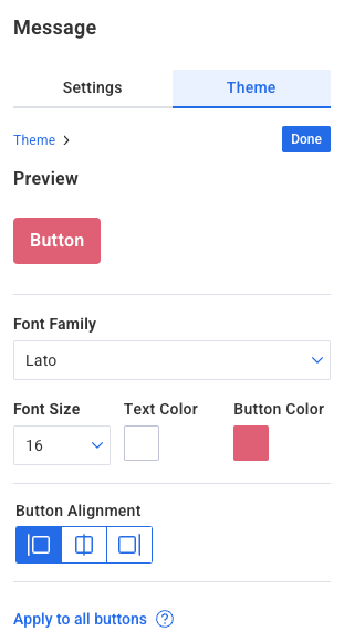
Buttons
Set your button background, text colors and default button alignment.
Dividers
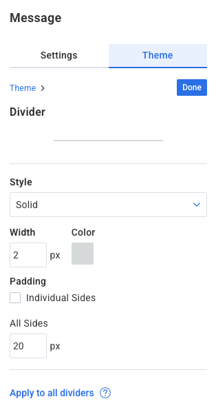
A rather subtle design element, Dividers do the important job of organizing your content and separating distinct sections of your document.
Text Link colors
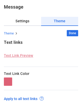
You’ve been asking for an easier way to update your link colors and here it is! Often linked text defaults to a system-blue color in an email message. There is no reason your links can’t be on-brand too for a nice touch.
Message background colors
Most people stick with a white message background, but it’s possible to stand out even more in the inbox by choosing alternative colors. Try light shades with dark fonts, or switch things up more and try a darker background paired with lighter font colors.

Built-in flexibility
Any changes you make in theme settings will be reflected throughout your message.
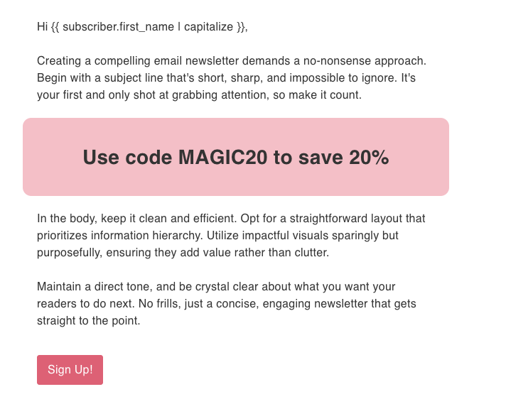
However, you can still make changes to those defaults where needed. For example, when you have a special call-to-action row that needs to stand out, go ahead and click it and change its specific background color.
Check out how we added a row, set its background color for contrast against the message background, and rounded its corners. It really stands out and draws the reader’s attention to an important section you don’t want them to miss.
Have some fun
Use Theme Settings to help you create an email that truly stands out. You’ll add an extra level of refinement and design consistency that makes your communications look polished and professional.
Login to your AWeber account now to see how quickly and easily it can be done. Check out the following video which shows how one user elevated their message design in under 5 minutes, and how you can do it too.
 87% off ends soon!
