87% off ends soon!
 How to Make Your Emails Look Professional in Under 2 Minutes
By Sean Tinney November 25, 2025
Your email content might be excellent, but if the formatting looks thrown together, subscribers notice. Mismatched fonts, inconsistent button colors, and random link styling make your business look disorganized even when everything else is professional.
The problem isn’t your design skills. It’s that most email platforms make you format every element individually. Change your button color? Click through every single button. Update your headline font? Go through every heading one by one. By the time you’re done, you’ve spent 15 minutes on formatting instead of strategy.
Here’s the better approach: centralized style controls that let you set formatting once and apply it everywhere.
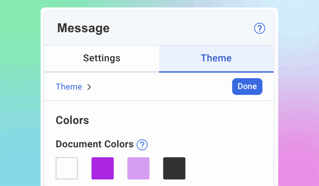
Theme Settings: Format Once, Apply Everywhere
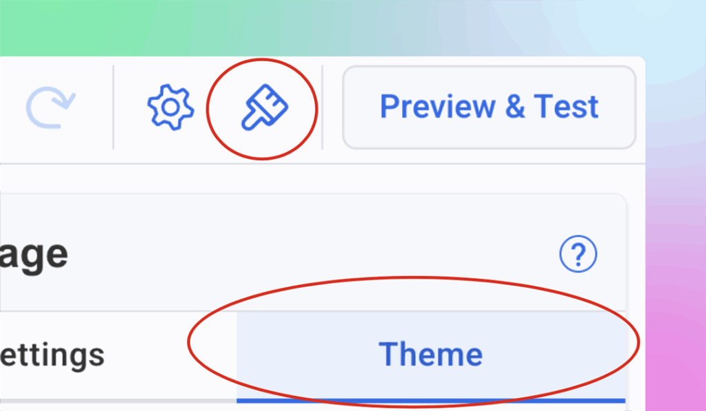
In AWeber there is a universal Theme Settings which allows you to format your entire message from one place. Open your message editor and click the Theme tab (paintbrush icon), and you’ll see controls for fonts, colors, buttons, links, and dividers.
Set your styling preferences once. Every headline, button, link, and text block follows those rules automatically. Change your button color? Every button in your email updates instantly. Update your heading font? Every headline adjusts automatically.
This is how you create consistently polished emails in under 2 minutes instead of 15.
Below are best practices for each element you control in Theme Settings – practical guidelines you can apply to make your emails look professional and drive action.
Headings and Paragraphs: Typography That’s Easy to Read
Your font choices affect readability more than almost anything else. Two rules matter most: use no more than two font families per email, and make sure body text is easy to read on mobile screens.
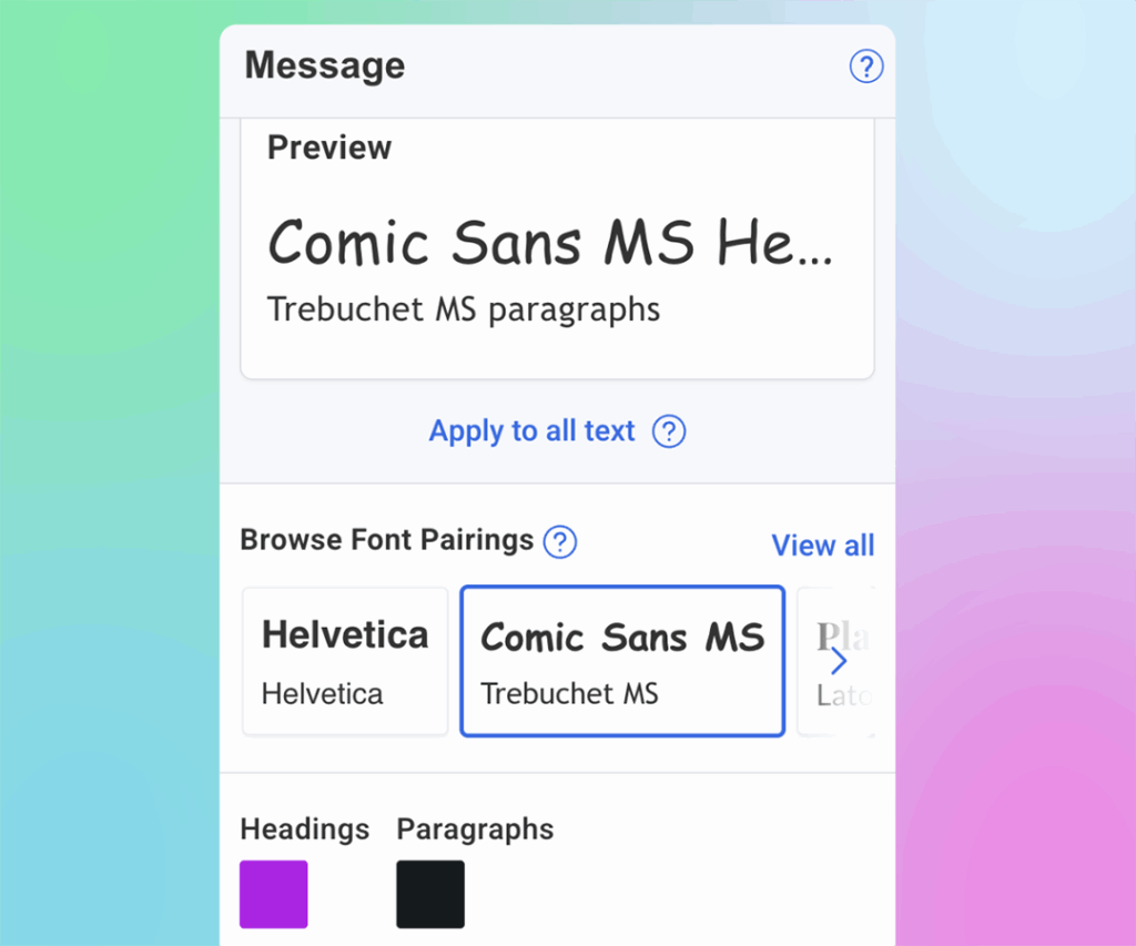
Headers: Choose a font that matches your business personality. Sans-serif fonts (Arial, Helvetica, Verdana) feel modern and clean. Serif fonts (Georgia, Times New Roman) feel traditional and authoritative. Pick one and stick with it for all your headlines – H1, H2, and H3 should all use the same font family.
Body text: Prioritize readability over style. Use 14-16px for body text (anything smaller is hard to read on mobile). Stick with standard web-safe fonts that render consistently across email clients. Avoid decorative fonts for paragraphs—they slow reading speed and look unprofessional in large blocks of text.
Colors: Your text needs enough contrast to be readable. Black or dark gray on white works best for body text—it’s easy on the eyes and works across all devices.
For headlines, you can use accent colors to add visual interest, but make sure the text is still easy to read. If you squint at your screen and struggle to read the headline, the color is too light. Darker shades of your accent colors work better than pastels or light tones.
In AWeber’s Theme Settings: Set your heading fonts (H1, H2, H3) and paragraph fonts once. Choose text colors for both headings and body copy. Every text block in your email follows these rules automatically – no clicking through individual sections.
Call-to-Action Buttons: Make Them Impossible to Miss
Your CTA button drives the action you want subscribers to take. Make it stand out without looking garish.
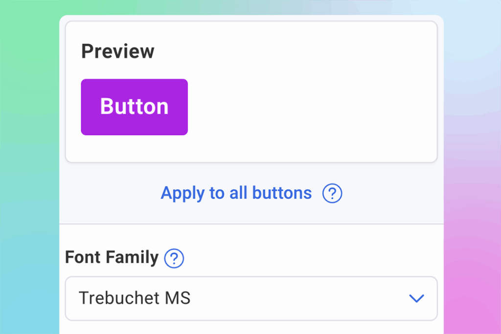
Size: Buttons should be large enough to tap easily on mobile – at least 44px tall. Too small and subscribers struggle to click. Too large and they look cartoonish.
Color: Use a button color that contrasts with your email background. If your email uses a white background, bright colors (blue, green, orange, red) work well. Avoid subtle colors that blend in, your button should be the most visually prominent element in that section.
Text: Button text should be action-oriented and specific. “Download the Guide” performs better than “Click Here.” Keep it short – 2-4 words works best.
Consistency: Every button in your email should look identical unless you have a specific reason for variation. Mixed button styles look unprofessional and confuse subscribers about which actions matter most.
In AWeber’s Theme Settings: Update button font, size, text color, and button background color from one place. Every CTA button in your message matches instantly, making your emails look intentional and increasing the chances subscribers take action.
Links: Make Clickable Text Obvious
Links need to be immediately recognizable as clickable without disrupting reading flow.
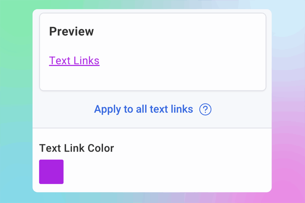
Color: Choose a link color that stands out from body text. Often, linked text defaults to system-blue, but your links can match your color palette instead for a more polished look. Just make sure they’re obviously different from regular text.
Underlines: Keep links underlined. Some designers prefer removing underlines for aesthetics, but underlines signal “this is clickable” universally. Don’t make subscribers guess what’s a link.
Consistency: All links in your email should use the same color. Switching between blue links and red links mid-email looks sloppy.
In AWeber’s Theme Settings: Set your link color once. Every hyperlink throughout your email updates automatically. Consistent link styling improves readability and helps subscribers immediately recognize what’s clickable.
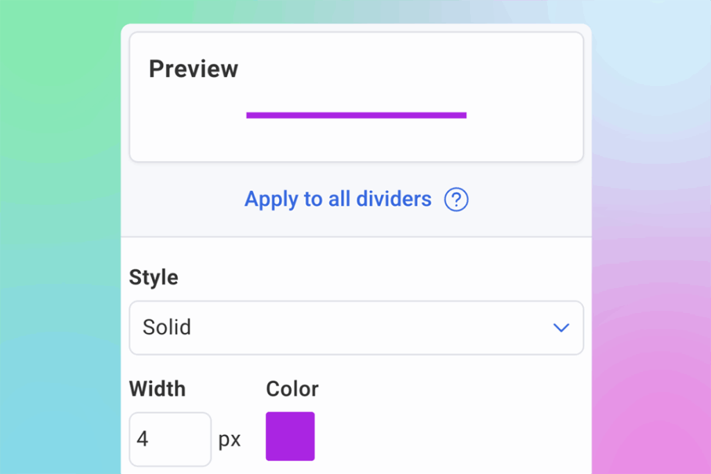
Dividers: Organize Content Without Distraction
Dividers separate sections and create visual breaks that make emails easier to scan. They’re subtle but important.
Style: Simple lines work best. Avoid overly decorative dividers, they distract from content. Solid lines are standard. Dotted or dashed lines can work for softer visual breaks.
Color: Dividers should be noticeable but not prominent. Light gray works for most emails. You can use accent colors if you want dividers to play a stronger role in your visual hierarchy, but keep them lighter than your text.
Width: Full-width dividers (edge to edge) create strong section breaks. Partial-width dividers (50-80% of container) create softer breaks. Choose based on how much separation you need between sections.
In AWeber’s Theme Settings: Change divider style, color, and width from one place. Every divider in your message updates consistently, making your email easier to scan and more organized.
Email Colors: Create Visual Hierarchy
Your color palette establishes mood and helps guide the reader’s eye through your content.
Background: Most emails use white or very light gray backgrounds because they’re easiest to read. Darker backgrounds can work but require lighter text colors and more careful contrast management.
Accent colors: Choose 1-2 accent colors for buttons, links, and highlights. More than that looks chaotic. Your accent colors should contrast with your background—if you’re using white, bright or saturated colors work well.
Consistency: Use the same colors throughout your email. Your buttons should all be one color. Your links should all be one color. Switching colors randomly looks unprofessional.
In AWeber’s Theme Settings: Update your document color palette—the core colors used throughout your email for text, backgrounds, buttons, and accents. Consistent colors make your emails look polished and professional instead of thrown together.
The Formatting Shortcut: Theme Settings
Here’s what separates efficient email creation from tedious manual work: centralized style controls.
Instead of clicking through every text block to update fonts, every button to match colors, and every link to stay consistent, you set your styling preferences once. Then every email element follows those rules automatically.
In AWeber, this is called Theme Settings. Open your message editor, click the Theme tab (paintbrush icon), and you’ll see controls for:
- Colors: The palette used throughout your email
- Fonts: Heading and paragraph fonts plus text colors
- Buttons: Font, size, text color, and background color
- Links: Link color across your entire message
- Dividers: Style, color, and width
Change any setting once and watch it update everywhere in your email. Need to test a different button color? One click. Want to try a different heading font? Updates every headline instantly.
This is how you create consistently beautiful emails without spending 15 minutes per message clicking through individual elements.
Put It Into Practice
Open your next email and apply these principles:
Choose two fonts: One for headlines, one for body text. Set them in Theme Settings.
Pick your colors: Select a button color that contrasts with your background. Choose a link color that stands out from body text. Set your accent colors once.
Format your buttons: Make them large enough for mobile taps (20px minimum). Use action-oriented text. Keep them consistent throughout your message.
Style your links: Make sure they’re underlined and use a distinct color. Set it once, applies everywhere.
Use dividers strategically: Add visual breaks between major sections. Keep them simple and consistent.
Your emails now look polished, professional, and intentional because everything matches automatically. Subscribers notice the difference, even if they can’t articulate why your emails look more credible than others in their inbox.
That’s the power of consistency. And now you know how to achieve it without the manual work.
Ready to create consistently beautiful emails? Signup for AWeber (or log into your account) and click the Theme tab in your message editor. Set your fonts and colors once – watch everything update automatically.