 87% off ends soon!
 How to Design a Newsletter: Design Elements That Make Readers Take Action
By Sean Tinney August 1, 2025
Newsletter design directly impacts engagement rates. With most subscribers now opening emails on mobile devices, newsletters must be designed with smaller screens, touch navigation, and varying email client capabilities in mind to ensure readability and usability.
The most effective newsletter designs use specific visual elements that psychologically guide readers toward taking action—whether that’s clicking a link, making a purchase, or engaging with content. The average person receives 121 emails daily, making standout design essential for breaking through inbox clutter.
Why Newsletter Design Matters
Newsletter design affects deliverability and engagement. When learning how to design a newsletter, understanding that emails with poor text-to-image ratios or “image-only” content often land in spam folders is crucial. Additionally, 33% of Gmail users have images blocked by default, making thoughtful design choices critical for message delivery.
What makes a newsletter successful from a design perspective:
- Action-driving visual hierarchy that guides readers toward CTAs
- Strategic color psychology that creates urgency and desire
- Mobile-responsive layouts with large, tappable action buttons
- Consistent branding that builds trust and reduces friction to action
The most effective newsletter designs balance visual appeal with functionality, ensuring accessibility across all devices and email clients.
Core Newsletter Design Principles
Optimize Text-to-Image Ratio
The ideal text-to-image ratio for newsletters is 60% text and 40% images. This balance prevents spam filtering while maintaining visual appeal.
Why this ratio matters:
- Image-heavy emails trigger spam filters in Gmail, Yahoo, and Hotmail
- Many subscribers have images disabled by default
- Text loads faster than images across all connection speeds
- Screen readers require text content for accessibility
Design for Mobile-First Experience
With mobile devices accounting for the majority of email opens, responsive design is non-negotiable.
Mobile design best practices:
- Keep paragraphs to 2-3 sentences maximum
- Use large, tappable buttons for calls-to-action (CTAs)
- Implement single-column layouts for easy scrolling
- Ensure minimum 14px font size for readability
- Test across iOS and Android email clients
Implement Visual Hierarchy
Visual hierarchy guides readers through your content systematically. Use these elements to create clear information flow:
- Large headlines (H1/H2) for primary messages
- Subheadings (H3) to break content into sections
- Bold text for key points and emphasis
- Bullet points for scannable lists
- White space to prevent visual overwhelm
Design Elements That Drive Action
Color Psychology for Conversions
Strategic color choices trigger specific psychological responses that influence reader behavior.
Action-driving color strategies:
- Red buttons: Create urgency and immediate action (best for limited-time offers)
- Green CTAs: Signal “go” and positive action (ideal for sign-ups and purchases)
- Orange elements: Combine urgency with friendliness (effective for engagement)
- Blue accents: Build trust while maintaining professionalism (good for B2B newsletters)
- High contrast combinations: Ensure buttons stand out from background content
Button Design Psychology
Button design elements significantly impact click-through rates.
High-converting button characteristics:
- Size: Minimum 44px height for mobile tapping
- Shape: Rounded corners feel more approachable than sharp edges
- Text: Action verbs that create urgency (“Get,” “Claim,” “Start,” “Discover”)
- Placement: Above the fold and at natural content conclusion points
- Surrounding space: Adequate white space to draw attention
Visual Flow Patterns
Strategic visual flow guides readers naturally toward desired actions.
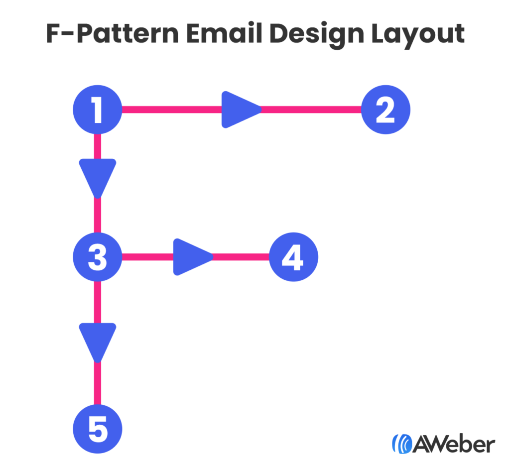
The F-Pattern: Readers scan left to right at the top, then down the left side—place key CTAs at these intersection points.
The Gutenberg Diagram: Eyes move from top-left to bottom-right—position your primary CTA in the bottom-right “action area.”
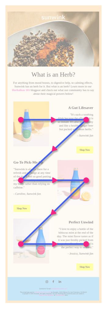
The Z-Pattern Layout: This layout mimics natural reading flow, alternating text and images in a zigzag pattern. This design technique helps readers move through content systematically while maintaining engagement.
Z-pattern benefits:
- Guides eyes naturally through content
- Creates multiple opportunity points for CTAs
- Balances text and visual elements effectively
- Works well for product showcases and announcements
Single-Column vs. Multi-Column Layouts
Single-column layouts perform better on mobile devices and ensure content displays correctly across all email clients.
When to use single-column:
- Mobile-first email strategies
- Simple announcements or updates
- Blog post summaries
- Event invitations
When multi-column works:
- Desktop-heavy subscriber base
- Product catalogs with multiple items
- Newsletter sections requiring comparison
Trust-Building Design Elements
Social Proof Integration
Visual trust signals reduce friction and increase action rates.
Trust-building design elements:
- Customer logos: Display recognizable brand partnerships
- Testimonial callouts: Use distinctive formatting to highlight praise
- Review stars: Include visual ratings for products or services
- Subscriber counts: “Join 50,000+ readers” creates social validation
- Security badges: SSL certificates and privacy assurances near CTAs
Scarcity and Urgency Visuals
Time-sensitive design elements motivate immediate action.
Urgency-creating techniques:
- Countdown timers: Visual countdowns for limited offers
- Stock indicators: “Only 3 left” with supporting visual elements
- Color-coded urgency: Red highlighting for time-sensitive information
- Progress bars: Show limited availability or completion status
- Exclusive labeling: “VIP Access” or “Members Only” visual treatments
Essential Design Elements
Header Design and Branding
Your newsletter header establishes brand recognition and sets expectations.
Effective header elements include:
- Company logo (optimized for mobile viewing)
- Newsletter name or tagline
- Clear brand colors consistent with your website
- Navigation links (optional, but useful for web versions)
Strategic Image Selection
Images should evoke emotion and support your message, not just fill space. Consider these image strategies:
Bold, contextual imagery: Like The North Face’s email showcasing waterproof gear in rain, images should demonstrate product benefits in real-world contexts.
Product photography: Show items clearly with sufficient lighting and multiple angles when relevant.
Lifestyle photography: Help subscribers envision using your products or services in their own lives.
Typography and Readability
Readable typography is fundamental to newsletter success. Follow these typography guidelines:
- Use web-safe fonts (Arial, Helvetica, Georgia) for maximum compatibility
- Maintain consistent font sizes throughout
- Ensure high contrast between text and background colors
- Limit font families to 2-3 maximum per email
- Test readability across different email clients
Technical Design Considerations
Alt Text Implementation
Alt text is critical for accessibility and image-blocked scenarios. With 33% of Gmail users blocking images, descriptive alt text ensures your message reaches all subscribers.
Alt text best practices:
- Write descriptive, concise alternative text for all images
- Include key information that images convey
- Avoid “image of” or “picture of” prefixes
- Keep descriptions under 125 characters
- Consider how alt text flows with surrounding content
Take a look at this email from Hotels.com where images were blocked, but the use of alt text was implemented.

And here’s what it should actually look like:

Color and Contrast
High contrast ratios improve readability for all users, including those with visual impairments.
Color guidelines:
- Maintain 4.5:1 contrast ratio minimum for normal text
- Use 3:1 contrast ratio for large text and UI elements
- Test colors in both light and dark mode email clients
- Avoid using color alone to convey important information
White Space and Spacing
Strategic white space improves comprehension and reduces cognitive load. Effective spacing includes:
- Margins around text blocks
- Padding within content sections
- Line spacing for improved readability
- Separation between different content types
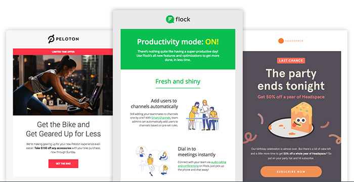
Take these newsletter examples from Peloton, Flock, and Headspace. All three newsletter examples use contrasting images and include enough whitespace to make for easy reading.
Template Selection and Customization
Choosing the Right Template
Template selection should align with your campaign goals. Different objectives require different design approaches:
Promotional templates: Feature large product images, prominent CTAs, and minimal text
Educational templates: Emphasize readability with clear hierarchies and content sections
Announcement templates: Use bold headers and concise messaging
Newsletter digests: Include multiple content blocks with consistent formatting
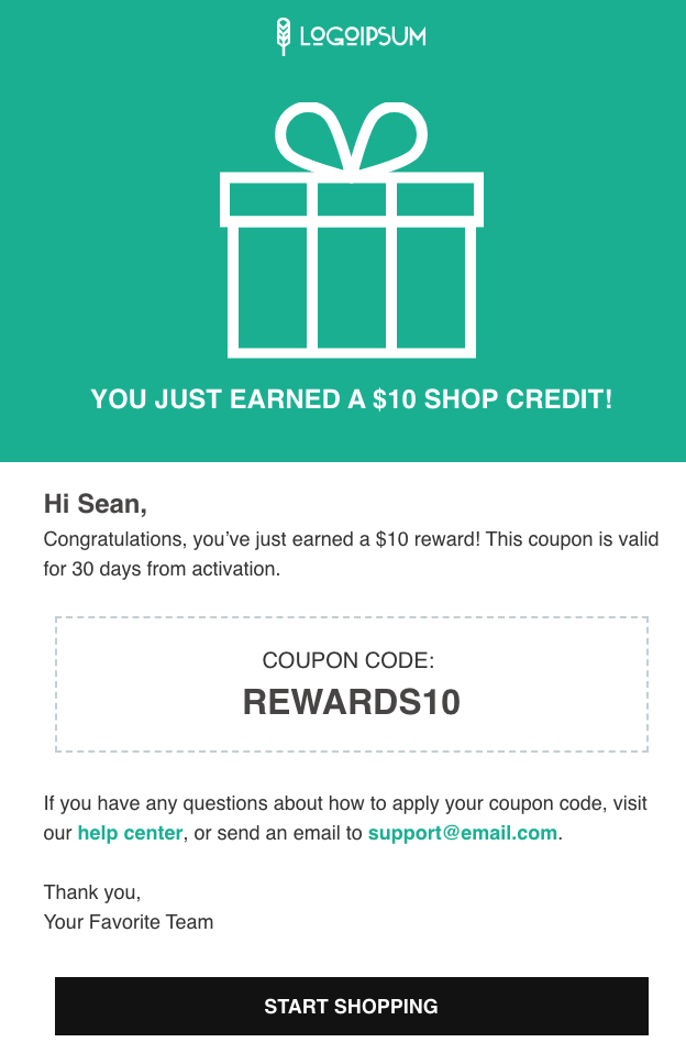
For example, if you’re an AWeber user who wants to send a new discount code to new subscribers to show your appreciation and to get them to try a product, you might want to select a template that clearly indicates your message. Here’s our “announcement” layout that you can customize for your business and brand.
Brand Consistency
Consistent branding builds recognition and trust. Maintain these brand elements across all newsletters:
- Logo placement and sizing
- Brand color palette
- Typography choices
- Voice and tone in visual elements
- Image style and filters
Advanced Design Techniques
Interactive Elements
While video doesn’t play directly in most email clients, you can create engaging interactive experiences:
Video thumbnails: Use compelling still images with play buttons linking to hosted videos GIF animations: Add subtle motion to draw attention to key elements Hover effects: Include CSS hover states for desktop users Progressive enhancement: Design base experience for all clients, add enhancements for capable ones
Personalization in Design
Visual personalization increases engagement beyond just using subscriber names. Consider these design personalization strategies:
- Dynamic content blocks based on subscriber preferences
- Location-based imagery and offers
- Purchase history-influenced product recommendations
- Behavioral trigger-based design elements
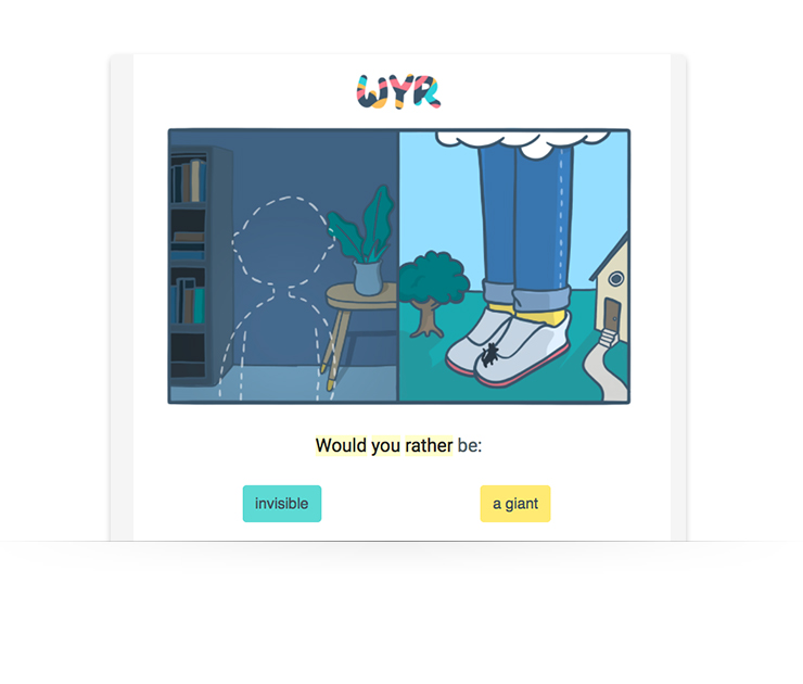
WouldYouRather (WYR) does this well by making every email engaging and interactive:
Psychological Design Triggers
The Power of Directional Cues
Visual elements that point toward CTAs increase click-through rates.
Effective directional techniques:
- Arrow graphics: Subtle arrows pointing to buttons or links
- Eye gaze direction: Photos of people looking toward CTAs
- Geometric shapes: Triangles and lines that create visual flow
- Image composition: Product photos that naturally lead the eye to action buttons
Cognitive Load Reduction
Simplified designs make decision-making easier for readers.
Load reduction strategies:
- Single primary CTA: Eliminate choice paralysis with one clear action
- Progressive disclosure: Reveal information gradually to prevent overwhelm
- Familiar patterns: Use conventional layouts that require no learning
- Consistent iconography: Standardized symbols reduce cognitive processing
Testing and Optimization
A/B Testing Visual Elements
Systematic testing reveals what resonates with your specific audience. Test these design elements:
- Subject line and preview text
- Header images and layouts
- CTA button colors and placement
- Overall color schemes
- Image vs. text-heavy approaches
Cross-Client Testing
Email renders differently across clients and devices. Test your designs in:
- Gmail (desktop and mobile)
- Outlook (various versions)
- Apple Mail (iOS and macOS)
- Yahoo Mail
- Outlook.com
- Mobile-specific clients
Common Design Mistakes to Avoid
Over-Reliance on Images
Image-only newsletters risk deliverability issues and accessibility problems. Avoid these common mistakes:
- Using images for all text content
- Missing alt text for important images
- Ignoring load times for image-heavy emails
- Assuming all subscribers can view images
Poor Mobile Optimization
Mobile-unfriendly designs significantly impact engagement. Common mobile mistakes include:
- Text too small to read without zooming
- Buttons too small for finger tapping
- Horizontal scrolling requirements
- Unreadable fonts on small screens
Inconsistent Branding
Brand inconsistency confuses subscribers and reduces trust. Maintain consistency in:
- Logo usage and placement
- Color palette adherence
- Typography choices
- Overall visual style
Design Tools and Resources
Email Design Platforms
Modern email platforms offer drag-and-drop designers that simplify newsletter creation:
- AWeber: Features mobile-responsive templates and intuitive design tools
- Mailchimp: Offers extensive template library and customization options
- Constant Contact: Provides industry-specific templates and design guidance
Design Inspiration Sources
Study successful newsletter designs from companies in your industry and beyond:
- Really Good Emails: Curated collection of email design examples
- Email Love: Inspirational newsletter designs across industries
- Litmus Community: Technical resources and design best practices
Measuring Design Success
Key Design Metrics
Track these metrics to evaluate design effectiveness:
- Open rates: Indicate subject line and sender effectiveness
- Click-through rates: Measure design’s ability to drive action
- Conversion rates: Show ultimate business impact
- Time spent reading: Gauge content engagement
- Unsubscribe rates: Identify design or content issues
Design Attribution
Isolate design impact by testing individual elements while keeping other variables constant:
- Single-element A/B tests
- Multivariate testing for complex changes
- Longitudinal studies tracking design evolution
- Heat mapping for web-based newsletter versions
Accessibility in Newsletter Design
Universal Design Principles
Accessible design benefits all subscribers, not just those with disabilities:
Visual accessibility:
- High contrast color combinations
- Scalable fonts and layouts
- Descriptive alt text for images
- Logical reading order
Cognitive accessibility:
- Clear, simple language
- Consistent navigation patterns
- Adequate white space
- Predictable layout structures
Screen Reader Compatibility
Optimize for assistive technologies with these techniques:
- Semantic HTML structure
- Descriptive link text
- Table headers for data presentation
- Skip navigation options
Future-Proofing Your Newsletter Design
Emerging Design Trends
Stay current with evolving design standards:
- Dark mode compatibility: Ensure designs work in both light and dark themes
- Interactive elements: Incorporate subtle animations and micro-interactions
- Minimalist aesthetics: Focus on essential elements and clean layouts
- Personalization at scale: Use dynamic content for individual relevance
Technology Considerations
Prepare for changing email client capabilities:
- CSS support improvements across clients
- Enhanced mobile functionality
- Privacy-focused design considerations
- Cross-platform consistency requirements
Email Newsletters Design Recap
Great newsletter design strikes the right balance between visual appeal and usability. By applying proven principles—like optimized layouts, clear visual hierarchy, and consistent branding—you ensure your message not only looks professional but drives real results.
Key takeaways:
- Prioritize clarity: Use a single-column layout, large buttons, and 14px+ fonts to ensure readability.
- Balance visuals and text: Stick to a 60:40 text-to-image ratio to improve deliverability and accessibility.
- Guide the eye: Use headlines, subheads, bullet points, and white space to create a natural reading flow.
- Stay on brand: Keep logos, colors, fonts, and image styles consistent to build trust and recognition.
- Make content accessible: Add descriptive alt text to all images so your message still lands if images are blocked.
- Test before sending: Check formatting across major email clients on desktop and mobile.
- Always be optimizing: A/B test layout, imagery, colors, and CTAs to see what performs best.