87% off ends soon!
 19 Best fonts for blogs: How to create eye-catching, readable content
By Phil Norris January 25, 2024
Online audiences have short attention spans, so it’s vital you make it easy for them to consume and retain the most content in the shortest possible time.
That’s why it pays to nail your choice of blog fonts.
Your chosen font should be stylish and align with your branding, while also being easy and enjoyable to read.
In this article, we’ll explain the importance of fonts, discuss key considerations for choosing the right font, and round up the 19 best fonts for blogs (plus which size to use).
And, as an added bonus, we’ll analyze the fonts used by some of the world’s top blogs.
Let’s get into it…
Why fonts for blogs matter
Fonts play a key role in the readability of your blog posts.
One study found that adjusting font style and size can increase reading speed while maintaining comprehension. Another revealed that picking the right font can increase a reader’s speed on a screen by 35%.
At this point, you’re likely thinking: “Why should I care about reading speed? I want people to stick around on my blog, not whizz through and bounce.”
But that’s the wrong way to think.
Fact is, if reading your content feels like a grind, people aren’t going to stick around anyway. Conversely, if you create a smooth, enjoyable reading experience, there’s a good chance visitors will come back for more.
So shouldn’t we all just get our heads together, choose the single font that works best for everyone, and stick with it?
Unfortunately, it’s not that simple, because researchers also found there’s no one-size-fits-all approach when it comes to font readability.
Factors to consider when choosing fonts for blogs
So if there’s no such thing as the “perfect font” for all readers, which should you pick? Here are some key factors to consider when choosing the right font for your blog:
Choose a font that aligns with your brand
Early 20th-century editor Beatrice Warde described fonts as “the clothes that words wear”.
Just like you (probably) wouldn’t wear sweatpants to a wedding or a tuxedo to a bowling alley, different fonts work best in certain contexts — and you should choose one that aligns with your brand and niche.
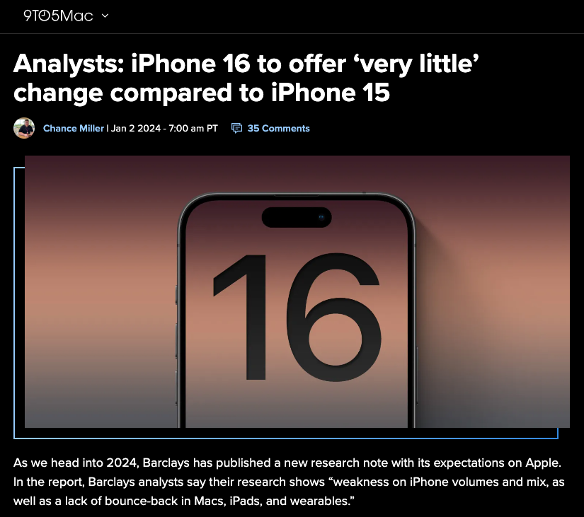
For instance, tech blogs typically use slicker, more futuristic-looking fonts, like 9to5Mac’s choice of Proxima Nova…
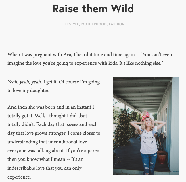
…whereas mommy bloggers tend to favor fonts that are friendlier and more traditional, such as Minion Pro, the font of choice for The Overwhelmed Mommy:
Consider font accessibility
Another important factor in choosing the best font for your blog is accessibility.
Accessible fonts are those that don’t impair or exclude website visitors, including those with visual impairments and reading disorders.
The best fonts for accessibility have:
- Widespread adoption. Popular fonts tend to be easier to read because we recognize the shapes they use.
- Distinct characters. With certain fonts, it’s hard to distinguish some characters (like a capital “I” or lowercase “l”) from one another. Fonts with distinct, defined shapes for each character are more accessible.
- Unmirrored characters. With some fonts, certain characters mirror one another when flipped horizontally (e.g. “p” and “q”), which can pose problems for some readers. Unmirrored fonts are more accessible.
- Sufficient spacing. Fonts vary in width, and some have less space between characters than others. The more tightly packed your text looks, the less accessible it is.
Pick the right font category
The majority of popular fonts fall into one of two categories:
- Serifs: These fonts have decorative “tails” that make individual letters more distinctive and lend your content a more traditional feel. Examples include Garamond and Times New Roman.
- San-serifs: These fonts don’t have the fancy “tails” of their serif counterparts, creating a more contemporary look. Examples include Arial and Helvetica.
Both font categories can be applied to a wide range of use cases.
However, sans-serifs have cleaner lines and are typically best for titles and shorter text, while serif fonts — with their distinctive design flourishes — tend to be better for longer passages.
What font size is best?
It goes without saying that larger font sizes are easier to read.
Unfortunately, they also tend to look clumsier.
Plus they take up more space, which can impair other elements of your blog design.
Say your blog theme looks a little like the below Medium example, with all the copy appearing in a narrow central column:
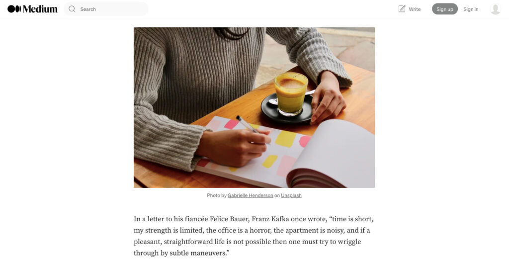
If your font is too big, you could end up with just 5-6 words per line, which would almost certainly look bad.
So where’s the sweet spot between tiny and unreadable and huge and ugly?
In its guide to health literacy online, government agency ODPHP gives the following advice:
“Choose a font that’s at least 16 pixels, or 12 points. If many of your users are older adults, consider using an even larger font size —19 pixels or 14 points.”
But for text-heavy pages like blogs, it might make sense to go larger still.
After all, most people would say Medium is an attractive site, and it uses a default article text size of 21 pixels (or 16 points).
19 best fonts for blogs
Enough theory; let’s take a look at 19 of the best fonts for blogs, plus a brief explanation of what makes each so great.
Arial
Arial is the classic sans-serif font. It’s familiar to everyone — in part because it’s the default font for Google Docs, Gmail, and other Google apps. It’s professional, easy to read, and won’t distract from any other design elements on your blog. On the downside, it arguably lacks a little wow factor.

Helvetica
Think of Helvetica as a trendier version of Arial. As a sans-serif font with smooth lines, it has a smart, contemporary feel, while its tall x-height — the distance between the baseline and the average top line of lowercase letters — makes for easier distance reading. However, the letters are a little tightly spaced, which could get a little wearing in longer blog posts.

Nunito
Nunito is another attractive and widely used sans-serif typeface. Available under the Open Font License, it’s featured on over 3.7 million websites, so it’s not exactly a unique look. Nunito is a good fit for bloggers seeking a clean, modern feel. And while it was primarily designed for use in headings, pull quotes, and other eye-catching elements, it doesn’t look out of place in body copy.

Tahoma
Tahoma is a sans-serif font that was designed specifically for on-screen use, as opposed to print. To the untrained eye, it looks near-identical to another popular sans-serif font, Verdana. But on closer inspection, it has a narrower body and tighter spacing than Verdana, which makes it look cleaner — but also a little less readable for longer passages of text.

Calibri
Until recently, Calibri was the default font for Microsoft Word. As such, it has similar strengths and weaknesses to another of its sans-serif peers, Arial: it’s extremely recognizable, but perhaps a little safe. Don’t discount Calibri, though. Its rounded edges make it highly readable in both headings and body text, plus it has a pleasingly warm feel that’s lacking in some sans-serif fonts.

Gotham
Yet another sans-serif font, Gotham was designed exclusively for GQ magazine, before being released for public use in 2002. Since then, it’s been used by a wide range of brands, from Coca-Cola to Netflix to New York University. This speaks to the font’s versatility and elegance.

Verdana
Verdana is another example of a sans-serif font that thrives in digital environments. With its distinctive letter shapes and wide spacing, it’s highly readable — even in longer chunks of text. The one downside is that Verdana maybe feels a little dated, likely because it was so heavily used in the noughties.

Times New Roman
Designed for the Times of London back in 1931, Times New Roman is arguably the world’s most recognizable font. As a serif font, it’s easier to read than most sans-serif fonts, especially in longer blog posts. Its tight spacing also allows you to squeeze a lot of text onto the screen without sacrificing legibility. However, it can feel a little dated.

Century Gothic
Century Gothic was created to replicate a popular font from the first half of the 20th century, making it a good fit if you’re looking for something classic. While it’s definitely usable as the main font for your blog, Century Gothic is mostly used in headlines and advertising copy.

Roboto
Roboto is a sans-serif font designed for high readability and content density. As Android’s default system font, it’s instantly recognizable to literally billions of web users. So it’s no surprise that Roboto is one of the most popular fonts for blogs, especially in the tech and electronics niches.

Open Sans
As its name suggests, Open Sans is a sans-serif font designed to be used anywhere and everywhere, from print to blogs to mobile apps. It’s compatible with pretty much every browser, device, and application, which makes it a solid choice for bloggers. And it’s highly legible, too, even when used as white text against a black background.

Montserrat
A common alternative to the ever-popular Gotham, Montserrat is a sans-serif font that feels both professional and friendly. It’s more characterful than the likes of Arial and Helvetica. As an added bonus, its geometric letters look fantastic in all-caps headings.

Trebuchet
Trebuchet was commissioned by Microsoft and is one of the tech giant’s “core fonts for the web”. It’s highly legible on-screen, thanks in part to the tall x-heights and short cross-bars of its characters. As such, Trebuchet is a solid font choice for everything from blogs to spreadsheets to user interface design.

Raleway
Raleway is routinely described as an “elegant” font. It can certainly bring an air of refinement to your blog, with its thin weight and sharp styling. Raleway works well in the body copy of a blog and is also well suited to standout features like headlines and logos. A real all-rounder.

Garamond
Back to the serifs. Garamond is a traditional, formal font that adds a feeling of authority and sophistication to blog content. It’s also extremely readable, with one study discovering it has the highest average reading speed of any font, at 312 words per minute.

Franklin Gothic
While Garamond might have the highest average reading speed, the same research found that Franklin Gothic had the highest speed rank — meaning more readers achieved their fastest reading speeds with Franklin Gothic than any other font. That could be because this solid sans-serif font is a better choice for weaker readers. Whatever the case, it’s clearly highly readable.

Georgia
Georgia is a serif font designed for its legibility, even at smaller font sizes. You’ve likely seen it used in books and newspapers, but it’s a popular choice online too — especially for anyone who wants their content to look authoritative and reputable.

Cambria
Designed for Microsoft Office in 2007, Cambria is easy to read and looks elegant, especially at smaller sizes. It’s a classic example of a transitional serif typeface: one that occupies a halfway house between traditional and contemporary fonts. As such, it’s highly versatile, although a little neutral for some tastes.

Palatino
Palatino was created in the 1940s and has a sophisticated, timeless feel. It’s a perfect choice for bloggers who like the style of Times New Roman but want something less generic. The only real downside of Palatino is that the bold version lacks a little impact, making it a better fit for body copy than blog headlines.

Futura
Futura is one of the most adaptable fonts. It looks fantastic in body copy — partly due to the uniformity of its stroke width, which ensures Futura remains easy to read at smaller sizes. But it’s also a fantastic fit for standout text elements and appears in countless brand logos, including Best Buy, FedEx, and Supreme.

Which fonts do the world’s top blogs use?
With tens of thousands of options available, it’s easy to get overwhelmed when choosing blog fonts.
That’s why it can help to get inspiration from top blogs in your niche — because they’re clearly doing something right.
Once again, we’ve done the hard work for you by analyzing some of the world’s most popular blogs across various niches to see which fonts they use for titles and body text…
Greatist: Circular Pro and Tiempos Text
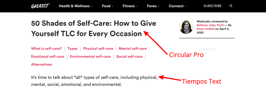
Health and fitness blog Greatist uses the sans-serif font Circular Pro for titles and pairs it with Tiempos Text, a serif font, for the body copy of its articles. This creates a pleasing contrast, where the title font looks contemporary and youthful, while the body text feels traditional and trustworthy — a perfect fit for a serious niche like health and fitness.
NerdWallet: Chronicle Display and Gotham
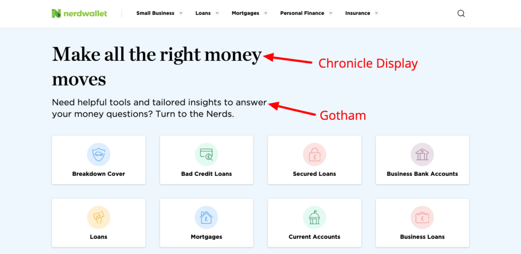
NerdWallet goes the opposite way to Greatist, using a traditional serif font — Chronicle Display — for its blog titles and the sans-serif font Gotham in the body copy. Serif fonts look stylish and highly readable at larger sizes, and combining them with a sans-serif font lends some attractive visual differentiation to your blog posts.
The Penny Hoarder: Roboto
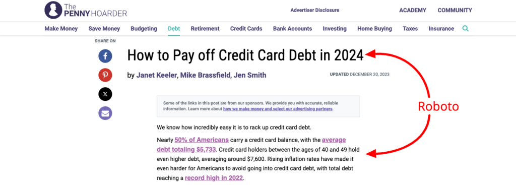
Of course, there’s no reason why you have to choose contrasting fonts for body copy and titles. The Penny Hoarder goes a different way by using a single font, Roboto, for both. This creates a more consistent feel, but it’s not necessarily the most visually exciting approach.
Final thoughts on the best fonts for your blog
For many bloggers, choosing a font is an afterthought. Nothing more than clicking a drop-down menu in their CMS and picking the prettiest option (or just sticking with the default font of their blog theme).
But, as you can see, fonts have a huge role to play — not just in the readability and accessibility of your content, but in the overall design and visual appeal of your blog.
Get it right and people are more likely to keep reading.
Once you’ve picked the best font for your blog, check out our guide to the best fonts for emails to help your copy stand out in the inbox.