Not everyone reads emails in the same way. Some people may use dictation or magnification to consume your email, while others may only see grayscale or certain colors.
So when you’re putting together your email, it’s important to make your emails accessible so anyone can read them, regardless of disability.
Good news. It’s easy to make your emails accessible. And I’ll help walk you through the process.
But first, let’s examine why accessibility in email marketing matters and some best practices for making all your emails accessible.
What is email accessibility?
Email accessibility means structuring your email so that people with disabilities can understand and interact with it.
Accessibility for differently-abled customers is a smart strategy you should be adopting to implement diversity and inclusion practices in your email marketing strategy.
What to consider in your email
To create accessible emails, you first need to understand the disability conditions that need to be considered when writing your email:
Vision
Make the content accessible for blindness, low vision, and color blindness.
Auditory
Making the email content accessible for deaf or hard of hearing individuals.
Motor
People who are unable to use a mouse can use a keyboard to access the email.
Cognitive
Making email accessible to learning disabilities, distractibility, and inability to remember to focus on large amounts of information.
This may seem a little overwhelming but don’t worry with a couple of quick tips, you can easily ensure that you are following email accessibility best practices.
Email marketing accessibility best practices
According to web content accessibility guidelines (WCAG), in order for content to be accessible, it must be perceivable, operable, understandable, and robust. That way, people with disabilities like hearing and vision impairment, physical immobility, and other disabilities can interact with it.
Here are a checklist of items you can implement to ensure email accessibility best practices:
1 – Don’t use flashing GIFs
You should not include GIFs that flash too frequently. GIFs of flashing “sale” or other images may seem tempting to catch people’s attention; but they can be disruptive, or even harmful for certain people. As a minimum, do not use GIFs that flash more than 3 times a second.
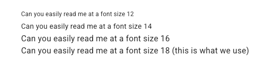
2 – Use larger fonts
The goal is to have people easily read your email. If the font is too small, then you’re making it difficult for people with a vision impairment to read it.
My recommendation is using a font of 16 – 18. This will ensure your readers will be able to consume the content on any device.
Just take a look at this example and see for yourself:
We created this list of different font sizes in our newsletter to compare the differences.
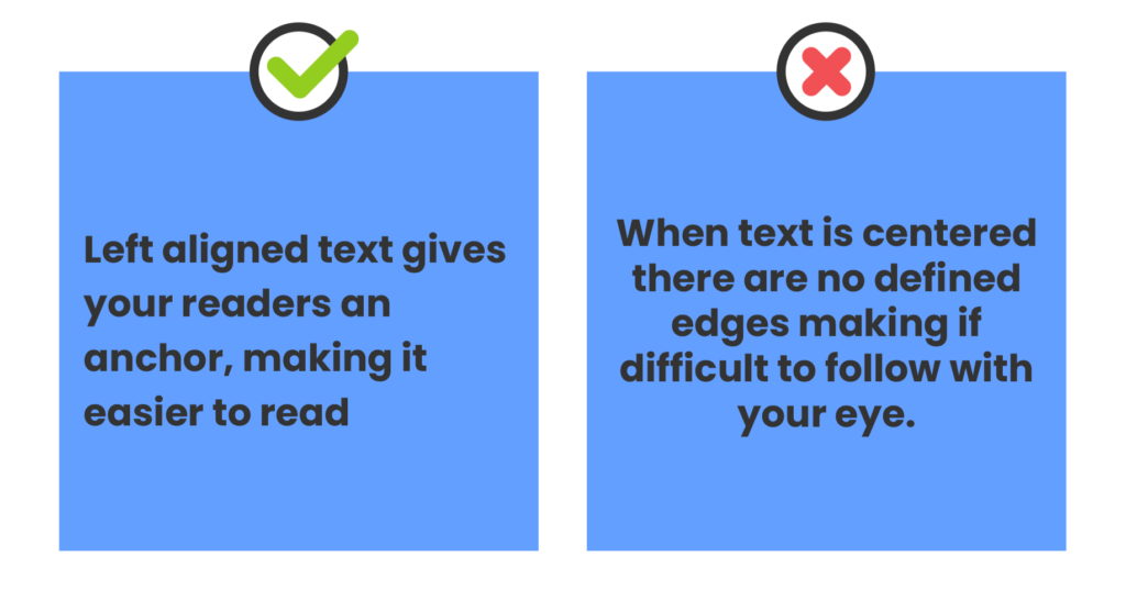
3 – Align copy to the left
Screen readers are better at reading left-aligned text in a comprehensible way.
4 – Avoid including important text in images
Don’t add important text to your videos or images — many screen readers won’t be able to read it. Then the person consuming your content via screen reader will miss out on something potentially important.
Would you want to miss a sale because your sale code was hidden on an image?
5 – Use image alt text correctly
But if you do have to include text in an image it’s important to use image alternative text (ALT text) that clearly explains what the photo/GIF is about. This way assistive technologies can accurately describe what’s being shown.
Your image alt text in the copy that displays when an image doesn’t load when the email is open. For example:
But the image alt text is needed for screen readers, which is a tool that reads the email aloud.
So it’s important to clearly articulate what the image is about.
Let’s look at an example, suppose you’re an Etsy seller and you just sent an email promoting your newest coffee mug. What image alt test going to sell this mug more:
A – Mug with cat
B – White coffee mug with black handle with image of cat at a laptop and text “Purr my last email”.
I know sometimes we’re working to get our emails out as quickly as possible, but taking the time to accurately describe the image is important for email accessibility.
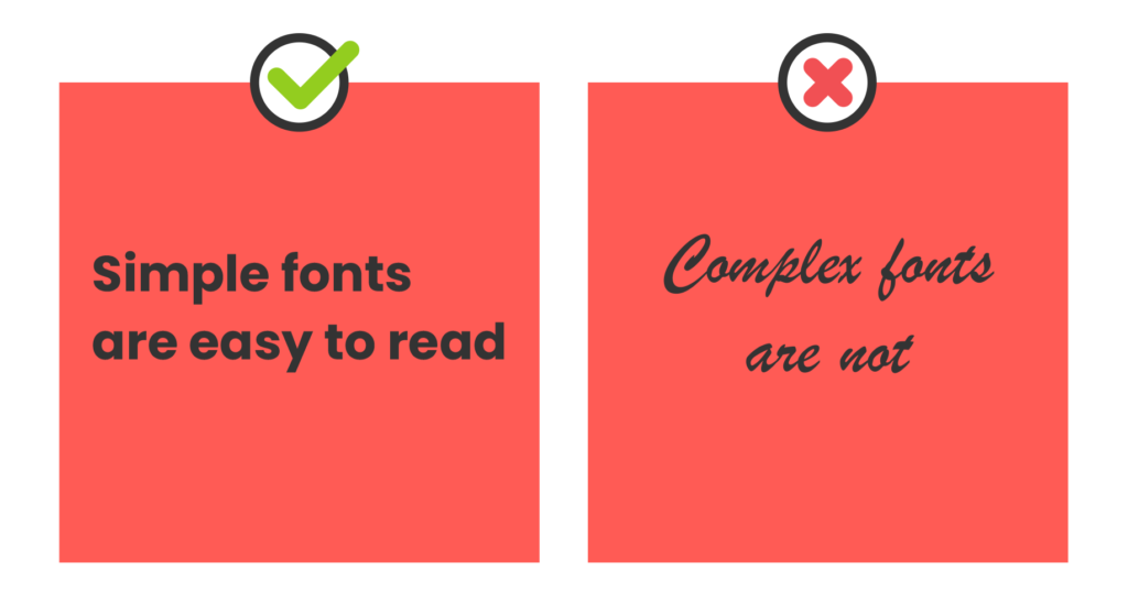
6 – Use readable, simple fonts
Readability should be your primary goal. So don’t use decorative fonts for your main copy or headers.
Stick to easy to read, accessible fonts for email such as Tahoma, Calibri, Helvetica, Arial, Verdana, and Times New Roman.
7 – Be aware of image file size
Don’t include images with HUGE file sizes in your email. This is an accessibility issue because it can make your emails more difficult to read for people on slow connections, and it unnecessarily uses your readers data when they may be on plans with limited data.
A good rule of thumb is to keep your images <200KB. Some email marketing providers, such as AWeber automatically creates an optimized version of any image you upload.
Steer clear of using “click here” as link text. People who use screen readers often navigate by tabbing through content to scan emails quickly. Providing descriptive link text helps these users decide whether they want to click on the link or not.
For example, if the Etsy seller I referenced above wanted to drive traffic to their shop where they had more mugs, their copy could be “Go to my Etsy shop to check out more funny mugs”. That whole statement should be hyperlinked.
9 – Give copy space
Reading dense paragraphs and text blocks with closely spaced lines can pose challenges for some individuals. Adjusting the line height of text can enhance readability for everyone.
It’s never really a good idea to use links in headings and subheadings, but especially not from an accessibility standpoint. It can be difficult for screen readers to understand, and that information could end up getting left out.
11 – Consider background colors
Colors are often used in marketing materials to convey certain meanings, but not all people can distinguish between colors or see color at all.
Color blindness affects 300 million people worldwide, so it’s important that marketers don’t rely too much on color to convey their message. Instead, you can place more emphasis on the font and font size.
Other things to consider
Avoid giving instructions that must be seen or heard in order to be followed
Provide clear, direct call to actions and simplified explanations for complicated terms
Follow a logical structure to optimize readability, where each point you make clearly and logically leads to the next point
Create descriptive and specific subject lines
Email accessibility test
There are many tools available for marketers to test email accessibility, which becomes even more important once you start messing with different customization options.
Testing your email for accessibility can help you and your developers learn how to improve future email campaigns and create more accessible content.
Why is email accessibility important?
It’s important to make your emails accessible to every current and potential customer. Here’s why:
1 – Ecommerce is likely an important source of sales for your business. In fact, ecommerce makes up 40% of retail sales — how much of your business depends on online sales?
2 – Email marketing is an integral part of growing and facilitating these online sales. After you make a sale, your customers expect order and delivery confirmation emails.
3 – All of your customers need this information, but they won’t all read your emails in the same way. That’s why you need to make them accessible in every way someone may consume the email content.
Be email accessible friendly
In the US there are 61 million adults living with a disability — that’s about 26% of the population. If your email marketing isn’t accessible, then you could be mis-serving a large portion of their customer base.
Crafting accessible email marketing campaigns can help increase your ROI by allowing you to reach a more diverse audience.
However, email accessibility is about more than just money. It’s about creating a brand that is focused on inclusive practices and improving user experiences for all of your visitors and contacts.
Not everyone reads emails in the same way. Some people may use dictation or magnification to consume your email, while others may only see grayscale or certain colors.
So when you’re putting together your email, it’s important to make your emails accessible so anyone can read them, regardless of disability.
Good news. It’s easy to make your emails accessible. And I’ll help walk you through the process.
But first, let’s examine why accessibility in email marketing matters and some best practices for making all your emails accessible.
What is email accessibility?
Email accessibility means structuring your email so that people with disabilities can understand and interact with it. Accessibility for differently-abled customers is a smart strategy you should be adopting to implement diversity and inclusion practices in your email marketing strategy.
What to consider in your email
To create accessible emails, you first need to understand the disability conditions that need to be considered when writing your email:
Vision
Make the content accessible for blindness, low vision, and color blindness.
Auditory
Making the email content accessible for deaf or hard of hearing individuals.
Motor
People who are unable to use a mouse can use a keyboard to access the email.
Cognitive
Making email accessible to learning disabilities, distractibility, and inability to remember to focus on large amounts of information.
This may seem a little overwhelming but don’t worry with a couple of quick tips, you can easily ensure that you are following email accessibility best practices.
Email marketing accessibility best practices
According to web content accessibility guidelines (WCAG), in order for content to be accessible, it must be perceivable, operable, understandable, and robust. That way, people with disabilities like hearing and vision impairment, physical immobility, and other disabilities can interact with it.
Here are a checklist of items you can implement to ensure email accessibility best practices:
1 – Don’t use flashing GIFs
You should not include GIFs that flash too frequently. GIFs of flashing “sale” or other images may seem tempting to catch people’s attention; but they can be disruptive, or even harmful for certain people. As a minimum, do not use GIFs that flash more than 3 times a second.
2 – Use larger fonts
The goal is to have people easily read your email. If the font is too small, then you’re making it difficult for people with a vision impairment to read it.
My recommendation is using a font of 16 – 18. This will ensure your readers will be able to consume the content on any device.
Just take a look at this example and see for yourself:
We created this list of different font sizes in our newsletter to compare the differences.
3 – Align copy to the left
Screen readers are better at reading left-aligned text in a comprehensible way.
4 – Avoid including important text in images
Don’t add important text to your videos or images — many screen readers won’t be able to read it. Then the person consuming your content via screen reader will miss out on something potentially important.
Would you want to miss a sale because your sale code was hidden on an image?
5 – Use image alt text correctly
But if you do have to include text in an image it’s important to use image alternative text (ALT text) that clearly explains what the photo/GIF is about. This way assistive technologies can accurately describe what’s being shown.
Your image alt text in the copy that displays when an image doesn’t load when the email is open. For example:
But the image alt text is needed for screen readers, which is a tool that reads the email aloud.
So it’s important to clearly articulate what the image is about.
Let’s look at an example, suppose you’re an Etsy seller and you just sent an email promoting your newest coffee mug. What image alt test going to sell this mug more:
A – Mug with cat
B – White coffee mug with black handle with image of cat at a laptop and text “Purr my last email”.
I know sometimes we’re working to get our emails out as quickly as possible, but taking the time to accurately describe the image is important for email accessibility.
6 – Use readable, simple fonts
Readability should be your primary goal. So don’t use decorative fonts for your main copy or headers.
Stick to easy to read, accessible fonts for email such as Tahoma, Calibri, Helvetica, Arial, Verdana, and Times New Roman.
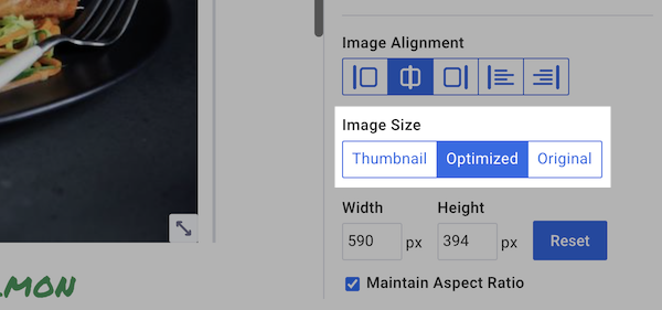
7 – Be aware of image file size
Don’t include images with HUGE file sizes in your email. This is an accessibility issue because it can make your emails more difficult to read for people on slow connections, and it unnecessarily uses your readers data when they may be on plans with limited data.
A good rule of thumb is to keep your images <200KB. Some email marketing providers, such as AWeber automatically creates an optimized version of any image you upload.
Once your image is uploaded in your email, just select the “optimized” image size.
8 – Avoid using “click here”
Steer clear of using “click here” as link text. People who use screen readers often navigate by tabbing through content to scan emails quickly. Providing descriptive link text helps these users decide whether they want to click on the link or not.
For example, if the Etsy seller I referenced above wanted to drive traffic to their shop where they had more mugs, their copy could be “Go to my Etsy shop to check out more funny mugs”. That whole statement should be hyperlinked.
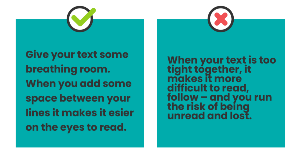
9 – Give copy space
Reading dense paragraphs and text blocks with closely spaced lines can pose challenges for some individuals. Adjusting the line height of text can enhance readability for everyone.
I recommend line height should be 1.5 times the font size.
10 – No links in headers
It’s never really a good idea to use links in headings and subheadings, but especially not from an accessibility standpoint. It can be difficult for screen readers to understand, and that information could end up getting left out.
11 – Consider background colors
Colors are often used in marketing materials to convey certain meanings, but not all people can distinguish between colors or see color at all.
Color blindness affects 300 million people worldwide, so it’s important that marketers don’t rely too much on color to convey their message. Instead, you can place more emphasis on the font and font size.
Other things to consider
Avoid giving instructions that must be seen or heard in order to be followed
Provide clear, direct call to actions and simplified explanations for complicated terms
Follow a logical structure to optimize readability, where each point you make clearly and logically leads to the next point
Create descriptive and specific subject lines
Email accessibility test
There are many tools available for marketers to test email accessibility, which becomes even more important once you start messing with different customization options.
Testing your email for accessibility can help you and your developers learn how to improve future email campaigns and create more accessible content.
Why is email accessibility important?
It’s important to make your emails accessible to every current and potential customer. Here’s why:
1 – Ecommerce is likely an important source of sales for your business. In fact, ecommerce makes up 40% of retail sales — how much of your business depends on online sales?
2 – Email marketing is an integral part of growing and facilitating these online sales. After you make a sale, your customers expect order and delivery confirmation emails.
3 – All of your customers need this information, but they won’t all read your emails in the same way. That’s why you need to make them accessible in every way someone may consume the email content.
Be email accessible friendly
In the US there are 61 million adults living with a disability — that’s about 26% of the population. If your email marketing isn’t accessible, then you could be mis-serving a large portion of their customer base.
Crafting accessible email marketing campaigns can help increase your ROI by allowing you to reach a more diverse audience.
However, email accessibility is about more than just money. It’s about creating a brand that is focused on inclusive practices and improving user experiences for all of your visitors and contacts.
Keep reading:14 Types of landing pages: What each one does and when to use itHow to use the psychology of color in marketing to increase your results
 87% off ends soon!