87% off ends soon!
 How to use the psychology of color in marketing to increase your results
By Sean Tinney June 16, 2026
Psychology of color in marketing can be one of the most powerful tools a marketer can work with.
Color instantly sets the mood. It evokes emotion and sparks a psychological reaction. It can support or detract from the value of what you’re offering. In fact, 90 percent of a subscriber’s first impression of an email message — or a website — is based on color or visual cues alone.
Let’s take a look at how colors can have an impact on your marketing performance. Plus how to use color psychology for your website, landing pages, sign-up forms, and emails.
How to use the psychology of color in marketing
If you want to use color psychology in marketing, it helps to understand why it’s important.
So here’s why: 84.7% of consumers surveyed believe color is important when buying a product. And color increases brand recognition by 80%. That makes it an incredibly important part of your brand identity.
Research also shows that there is a connection between the use of color and how it affects customer perception of a brand. Think of your favorite brand for a second. What color do you associate with them?
Now take a look at the color meanings chart below. Does it match up with your perception of the brand?
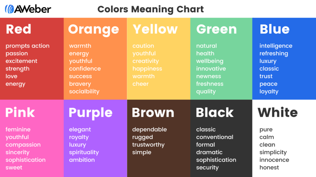
Now that you know how color affects your own perceptions of your favorite brands, it’s time to ask yourself how you can leverage this information in your marketing strategy.
Let’s take a look at each of the different colors listed above, identify why it elicits certain emotions and feelings and how you can best incorporate this knowledge into your future marketing efforts.
Color Meaning of Blue
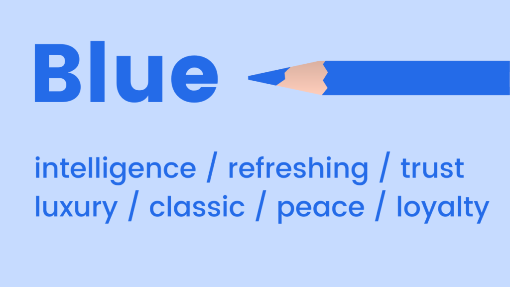
Blue is often used to represent feelings that are cool and calm. That’s because blue has mood-boosting properties that signal the body to produce chemicals that are calming and promotes a feeling of positivity.
Light blue can be a refreshing splash of color.
By contrast, dark blue is a classic choice for brands who want to emphasize luxury, without the formality of black.
When to use blue in your marketing
- Studies have shown that 57% of men said blue is their favorite color, so consider using blue when men are your target audience.
- Use when you want to promote trust in your product or brand.
- Studies have shown that blue appeals to a wide range of people. So you can never go wrong with blue in your marketing.
Color Meaning of Pink
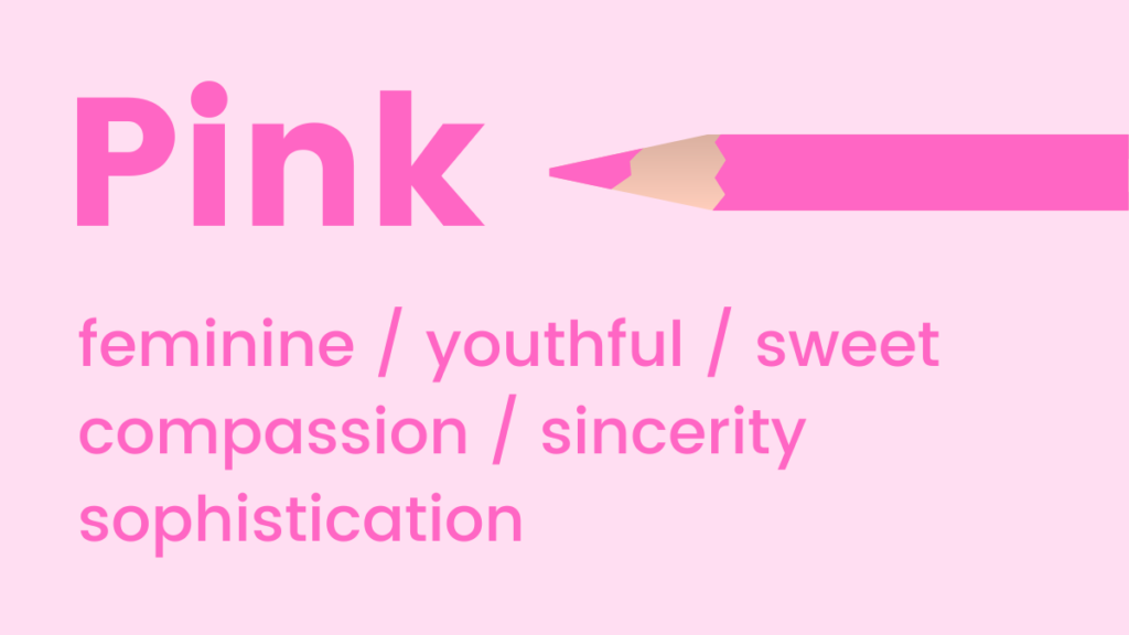
Pink tones are youthful, fun and exciting. It’s a great choice for emphasizing femininity or something sweet. (The color actually makes us crave sugar!)
When to use pink in your marketing
- Pink is traditionally associated with feminine brands so use it when marketing traditionally-feminine products.
- Most brands don’t use pink in their marketing, this makes it a good color if you want to stand out and grab a consumers attention.
- Add shades of pink to your welcome email for a friendly first impression.
Color Meaning of Green
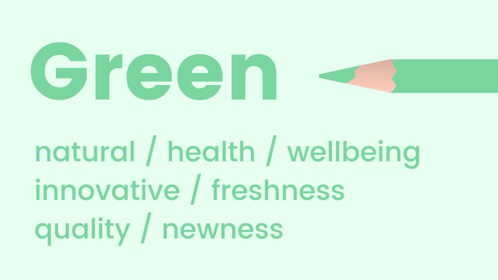
Green tones are reminiscent of natural elements, health and well-being. It’s a soothing choice, and promotes feelings of relaxation and harmony. It’s also the color that the human eye is most sensitive to and able to discern the most shades of.
Since it feels very fresh, green is a great color to use to promote a new product or feature.
When to use green in your marketing
- When helping your customers increase their sales.
- Promoting environmentally-friendly products or services.
- Launching a new product or feature. A splash of green can help emphasize its newness.
Color Meaning of Orange
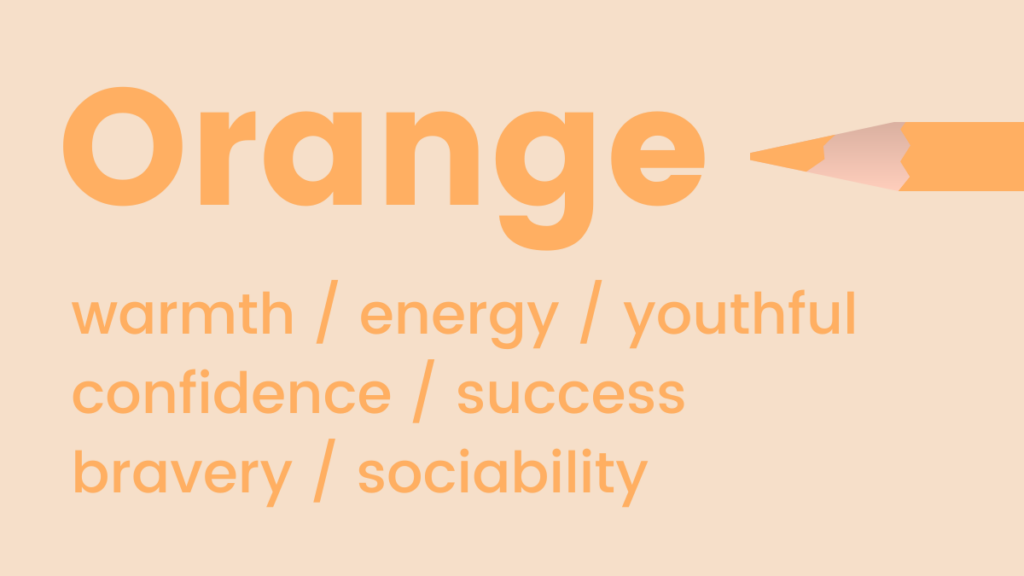
Orange represents warmth and energy. Fun and flamboyant, orange is often used to represent positivity and optimism.
Another cool thing about orange? We naturally associate it with trust and safety.
When to use orange in your marketing
- As your call to action button
- Use in signage or display ads when you want to stand out from the crowd
Pro Tip: Orange is a very bold color choice that can easily intimidate most marketers. Slowly ease your way into using orange by adding images featuring the sunny shade.
Color Meaning of Yellow
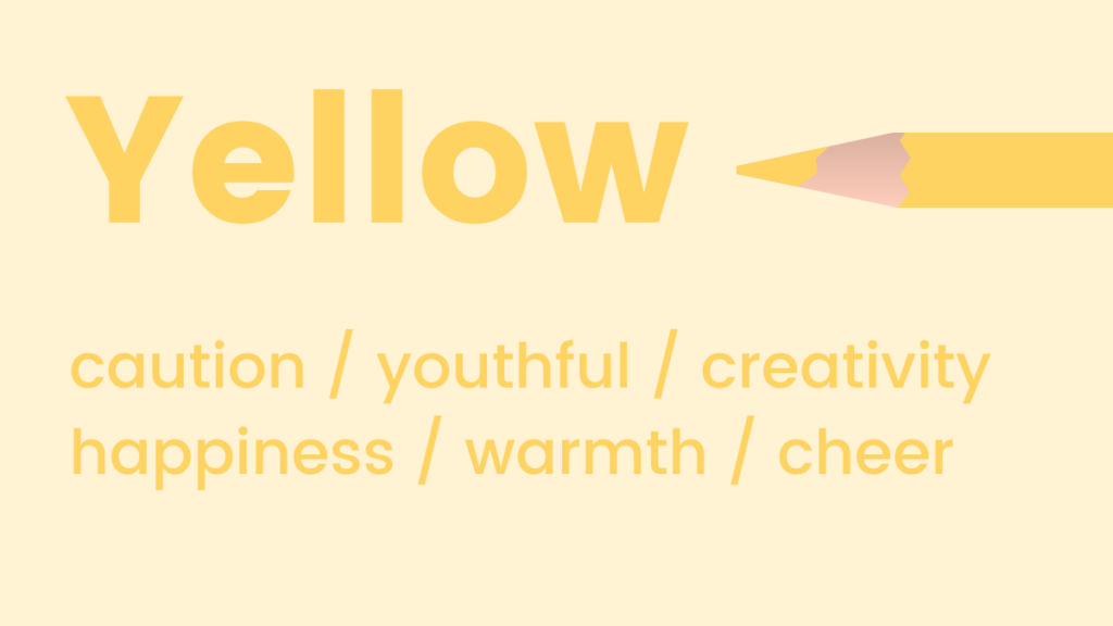
Like orange, shades of yellow can symbolize positivity and optimism. In fact, it’s known as the happiest shade in the color spectrum.
Yellow is also known for activating memory, stimulating mental processes and encouraging communication.
When to use yellow in your marketing
- Use when promoting children’s products.
- Yellow helps spark memory. If you have something important that you want subscribers to remember, keep yellow in mind.
Color Meaning of Black
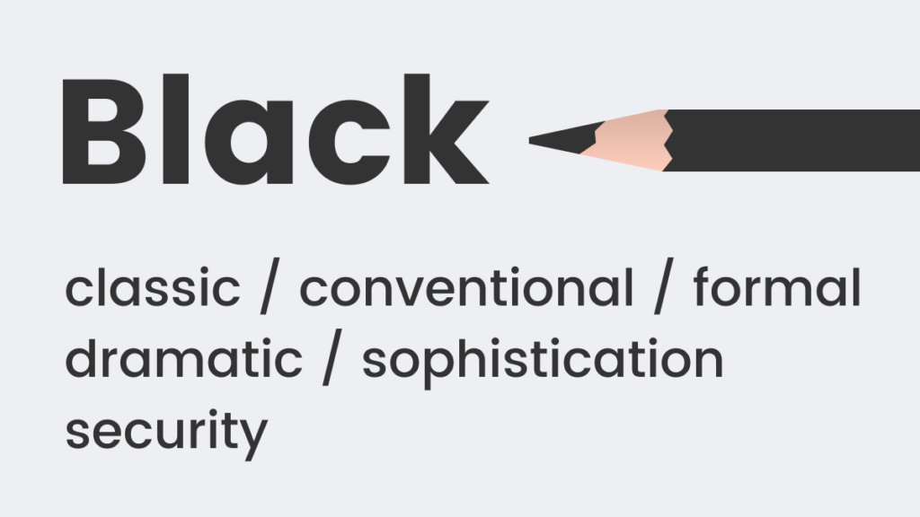
Black is a classic color choice that never goes out of style. It’s often used to represent formality (think “black tie”).
It also implies weight. For example, people assume a black box weighs more than one that’s white.
When to use black in your marketing
- Associated with power and strength, use when promoting weight-training.
- Use as a background color when you want to draw attention to an image.
Color Meaning of White
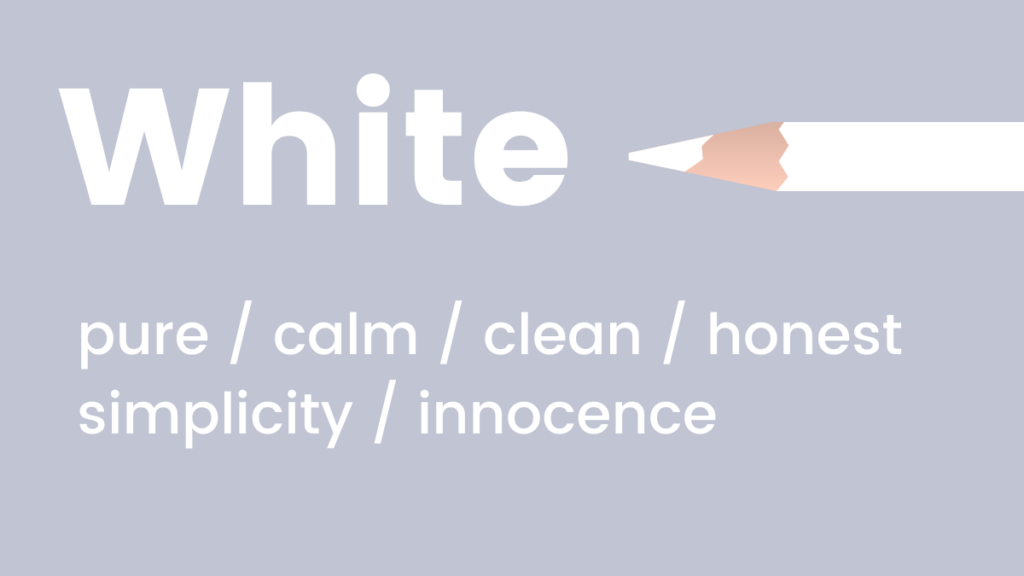
White is cool, calm and serene. It’s a great choice for brands that want to feel modern and fresh.
When to use white in your marketing
- Use white when you want to convey safety, cleanliness, or elegance in your marketing. Use to offset bolder colors such as red and black.
- Can be used as a call to action button if the surrounding color is bold.
- Use to create breathing space in your marketing campaign.
Color Meaning of Purple
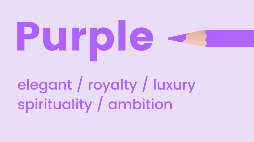
Purple is luxe and elegant. It’s that in-between shade that uplifts, while still maintaining a sense of calm. It’s also known to encourage creativity!
When to use purple in your marketing
- Purple is a great choice for a luxury brand to help convey the value of their products and services.
- Often used with anti-aging products.
Color Meaning of Red
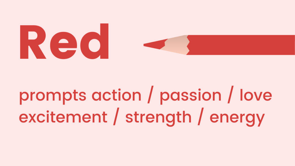
Red tones represent passion, adrenaline, and action. As a high-energy color, it can boost your energy levels and get your heart pumping. If you want your customers to feel the urgency of your message, red is a good color choice.
When to use red in your marketing
- As your call to action button.
- Use when promoting a sale.
- High-energy color (combined with yellow) when promoting to children.
- Use as an accent color in signage or display ads when you want to draw attention but not be too aggressive.
- Add a splash of red to an element that you want to draw attention to, but not too much as red can be overwhelming.
How to choose the best color scheme for a website or landing page
Color often trips up “non-designers” when they’re trying to figure out how to implement multiple colors on a website or landing page. It can lead to confusion, doubt and, often, poor color combinations.
But here’s the good news: You can easily avoid website design color mistakes. With a basic understanding of how colors relate, a design novice can create beautiful color combinations that catch people’s attention.
There are seven different types of color theories, we will discuss the two best color schemes for website design.
Analogous colors
Colors are called “analogous” if they are adjacent, or next to each other, on the color wheel. Depending on how many color segments you break the wheel into, this could be blue, green, and yellow or even three shades of any one color.
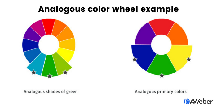
This makes the color picking process a little easier. If you find one color you like, you can quickly identify the other two colors you should use just by looking at adjacent colors on the color wheel.
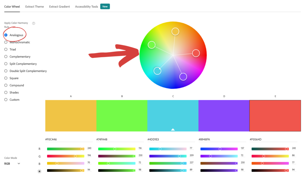
How to find analogous colors
If you’re not sure how to find analogous colors, you can use the free tool Adobe Color CC to easily identify them. Choose the analogous option and move one of the circles around the color wheel to find the perfect color combination.
Complementary colors
If you’d like to make your website color scheme more interesting, consider a complementary color arrangement.
Complementary colors are on opposite sides of the color wheel from each other. For instance, blue and orange, green and red or purple and yellow.
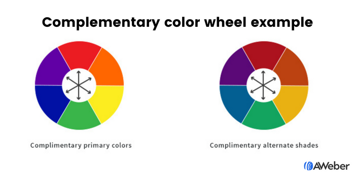
These pairings make for beautiful arrangements, especially when moving away from the primary colors. They are visually appealing and add contrast.
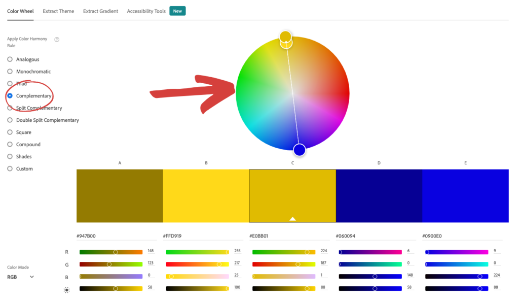
How to find complementary colors
If you’re not sure how to find complementary colors, use the free tool Adobe Color CC to easily identify them. Choose the complementary option and move one of the circles around the color wheel to find the perfect color combination.
Choose the best colors for sign-up forms
If you want people to complete your sign-up forms, they’ll need to notice them first. And color plays a big role in whether or not visitors see a form on your site.
When choosing your color combinations, you could use the same approach as we discussed for your website. Here’s a few examples of how a form would look using the analogous or complementary color theories.
Analogous colors
Here’s an example of what an analogous shade approach using three shades of green would look like:

And here’s another example of an analogous family using shades of yellow and green:

Complementary color
Here are some (non-primary) examples of how this could look on a signup form:


Contrasting colors
You can also use contrasting colors.
When you use contrasting colors, your forms will silently scream “Look at me!” And isn’t that the point of your forms — to draw attention to them so people take an action?
Life would be pretty boring without contrast in it. We’d be stuck in a bland world with limited exposure to life-giving diversity.
When the principle of contrast is applied to sign-up forms, your visitors pay attention to what you want them to. This is powerful, as it can lead to something as simple, yet important, as more people noticing your call-to-action button and clicking on it.
There are two ways to use contrast in sign-up forms:
1. Contrast between the form and the site itself
Make the sign-up form’s background a contrasting color from the site itself. This draws the eye to the form naturally. Here’s an example of what that could look like:
2. Contrast within the form
Once you have their attention on your form, your visitor should know exactly what they need to do next: Complete the form! To make this more likely, both the form fields and the button should be very noticeable. Contrast has a lot to do with this.
Notice how the form below uses contrasting shades of black, yellow, and white to draw the eye to the form, the fields, and the button all at once:

If you use complementary colors, you can also make your button and form’s backgrounds both complement and contrast against each other. There’s no quicker way to say “click here” than with color!
Choose the best colors for emails
The colors you use in your marketing emails should be chosen based on the purpose of the email you’re sending.
For example:
Email newsletter: These types of emails are typically used to send your subscribers regular updates with news, information, or educational content.
Use a lot of white in these emails with just a splash of your brand colors. The idea is to get your subscribers to read the content, so you don’t want secondary colors drawing their attention away. The only exception to this principle is if you want your newsletter readers to click a link in the newsletter, say to read a blog article or watch a video. In that case, use a call to action button that will draw their attention and make them click.
Welcome email: This email is usually one of the first interactions a customer will have with your brand, so use your brand colors to reinforce your company’s visual identity.
Sales email: The colors used in your sales emails will vary depending on your offer. Follow the ways to use psychology of color in marketing we mentioned above to help guide your color choices.
Simplify your marketing with AWeber
Start or switch today to get started with the easiest-to-use email marketing platform for small businesses.
Email color schemes examples
Let’s take a look at how some brands use colors in their email efforts.
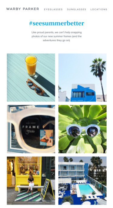
Blue
Warby Parker’s use of a pale shade of blue helps to emphasize the lighter, more refreshing vibe they’re going for:
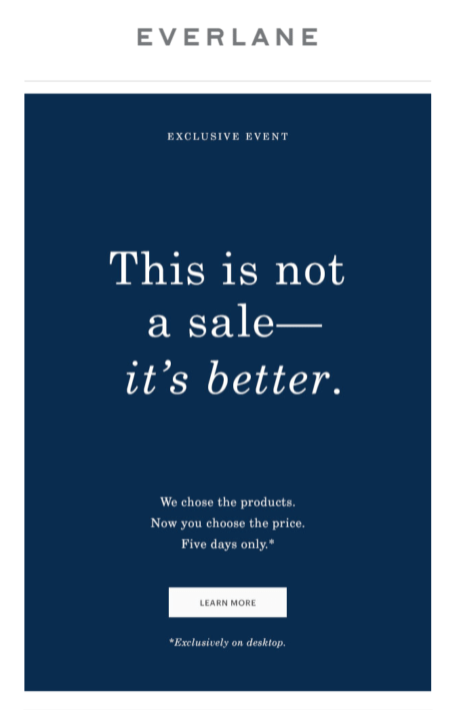
By going with a classic, dark blue email, Everlane is going for a more luxurious, sophisticated look:
Pink
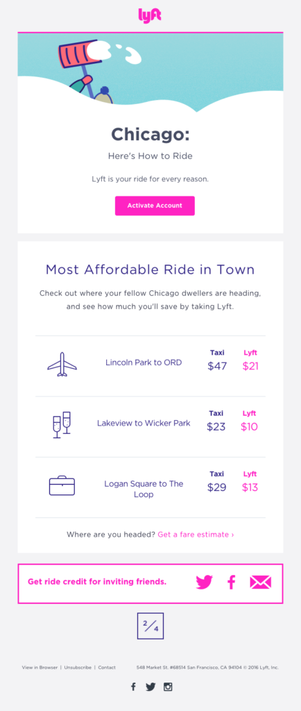
Shades of pink are perfect for a welcome email, as they encourage friendliness. Take a look at this example from Lyft:
Green
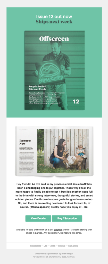
Since it feels very fresh, green is a great color to use to promote a new product or feature. This example from Offscreen is a perfect example of how to create a feeling of relaxation by using a green color palette to promote a product emails:
Yellow
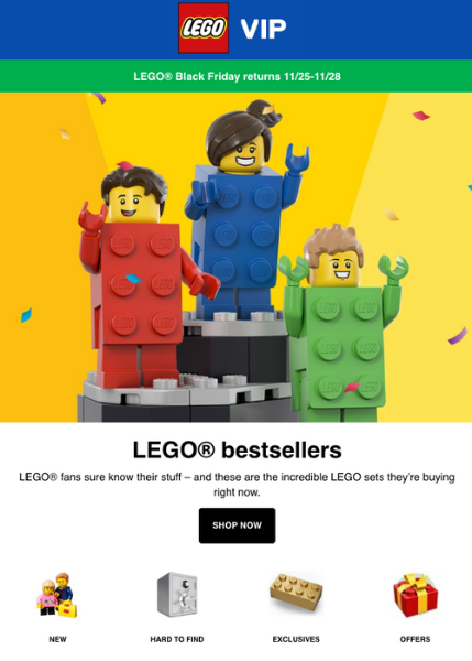
Yellow is a key part of the Lego brand, because it appeals to children. Lego often uses yellow as a background color for their products, as is the case in this email.
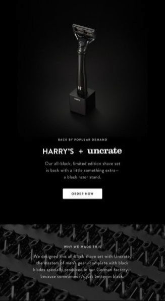
Black
Harry’s did a great job of positioning their product as classic and sophisticated with an all-black email. By putting the call to action button in white, they made sure the action they want their customers to take does not get lost.
Pro Tip: If all black is too much for you, go for the no-fail combo of black on white.
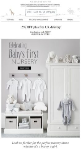
White
This campaign from The Little White Company is a great example of using white to portray a calm, pure, clean brand.
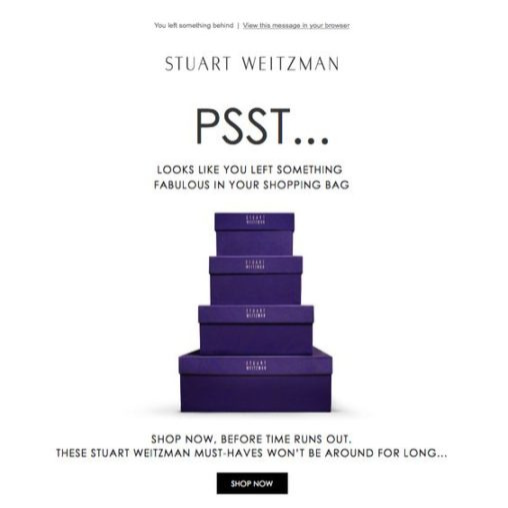
Purple
We love how Stuart Weitzman incorporated its signature purple shoebox in this abandoned cart email.
But what about your brand color and their meaning?
That’s a great question! When it comes to applying these concepts to an existing brand aesthetic, there may be hesitation or misunderstanding on how the two can coexist.
Don’t worry if you already have established brand colors. The most complex and simplest brand color schemes can apply these principles. How? By accepting that sometimes you’ll need to break free of a brand color to choose the right colors.
Or, you may realize that a new color should be added to your brand to adapt to the way your site is growing and changing.
Picture a brand as a person. Over time, people change. There’s nothing inherently wrong with that. I don’t wear the same styles today that I did five or 10 years ago, but people still know who I am.
In the same way, your brand should be flexible enough to evolve over time. Adding a new color on your website outside of your brand standards document might just begin a new, better era for your business.
If you’d like to use new colors that work with your brand colors but you’re not sure how to choose them, try the online color palette tool, Coolors. With Coolors, you can add your brand colors to a palette and the tool will choose colors that work with them.
Unlock the designer within
All of this still holds. But here’s what’s changed: you no longer have to figure out every color decision alone.
Not sure what colors will work for your signup form? Ask AI.
Use AWeber’s AI Signup Form Builder to describe what you want — the look, the feel, the vibe — and it builds the form. You can upload a screenshot of a form you like and it recreates it with your branding. You can type something like “I want a dark background with an orange button that pops” and it handles the rest. No drag-and-drop. No blank canvas. Just describe it.
If you know from this article that orange signals trust and action, or that blue builds credibility, put that knowledge directly into your prompt. The AI understands color intent. You’re not choosing from a template, you’re building something specific to your audience.
Coming soon: AI-powered email and landing page builders. The same describe-it-and-build-it experience is coming to AWeber’s email builder and landing page builder. Tell it you want a clean, white newsletter layout with a red CTA. Or a purple, luxury-feel landing page with gold accents. The color principles you’ve learned here become the input. The AI does the design work.