87% off ends soon!
 Learn about Email Marketing
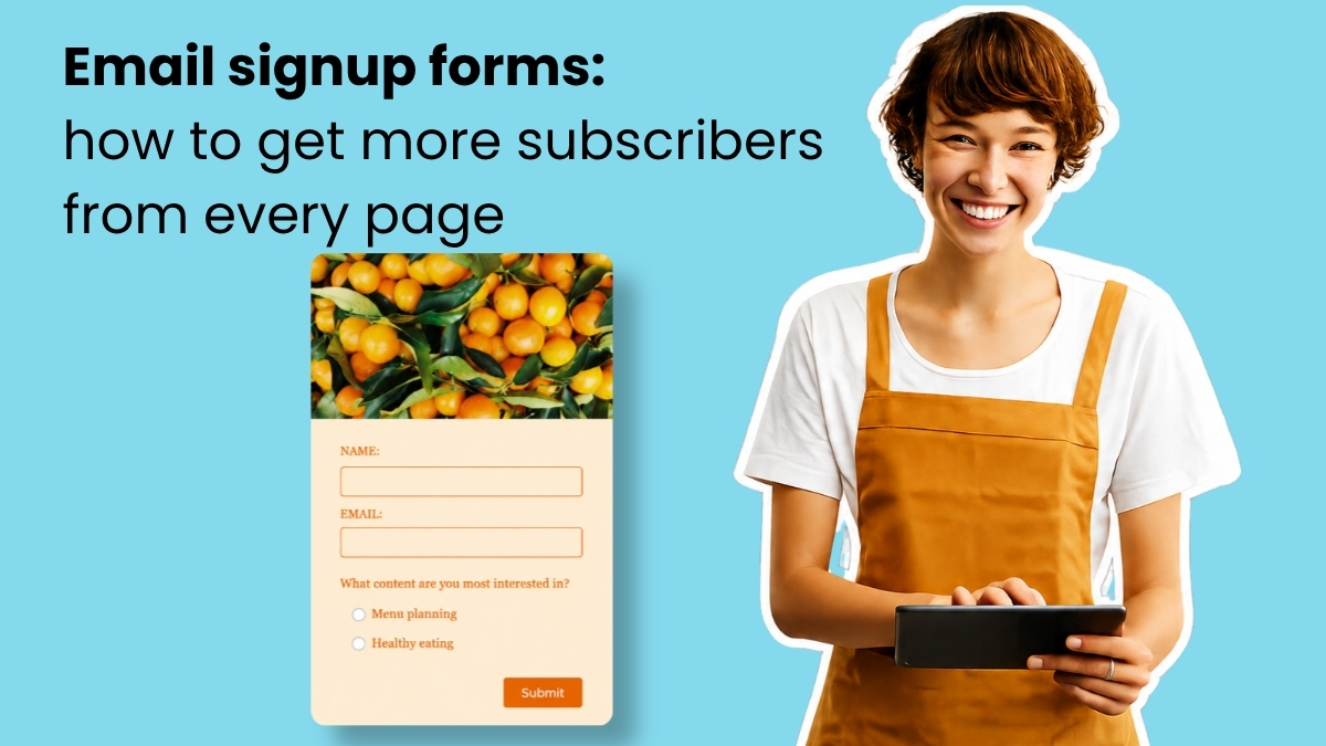
Email signup forms: how to get more subscribers from every page
Learn how to create a sign up form that stands out and helps you build an email list of engaged subscribers.
15 Email Marketing Best Practices High-Performing Small Businesses Follow
Discover proven ways to improve email performance and increase revenue with our guide
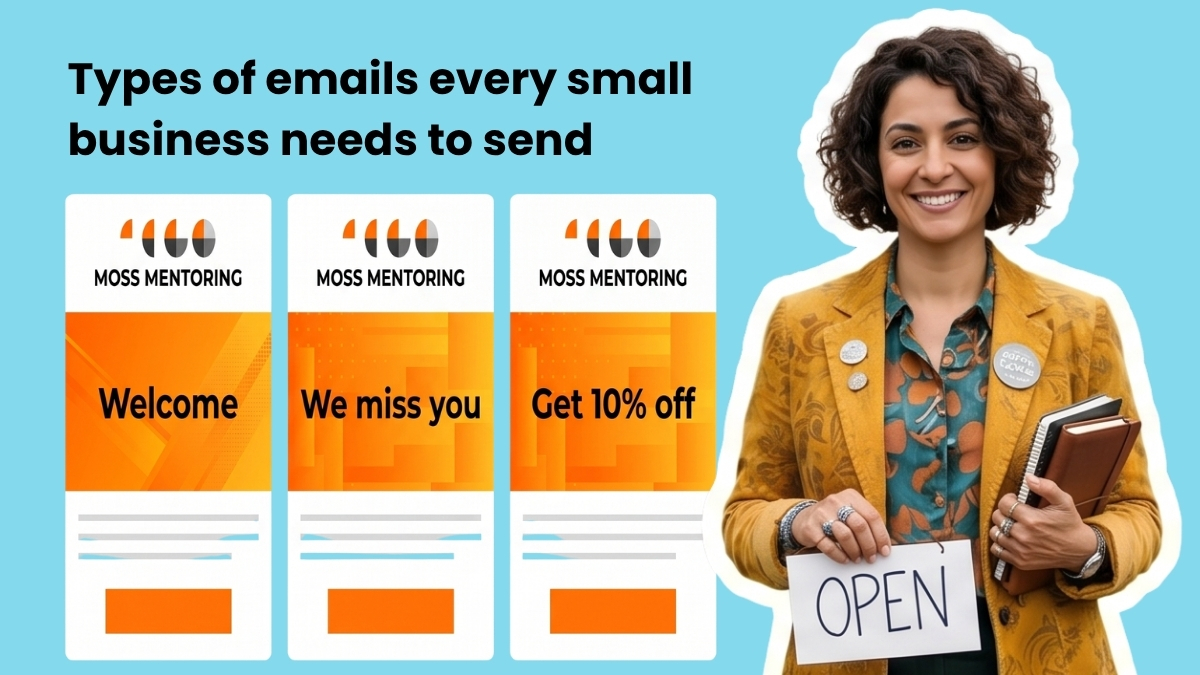
Types of emails every small business should be sending
Here are the types of emails that convert subscribers, recover lost sales, and keep your list healthy.
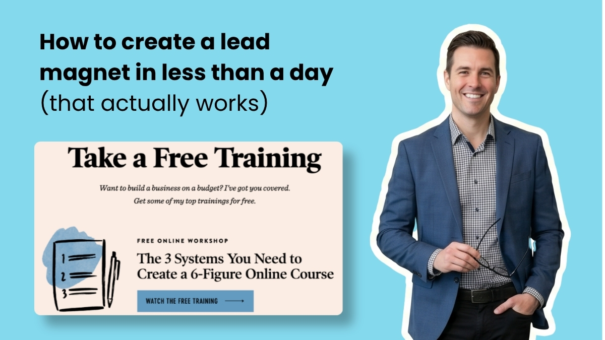
How to create a lead magnet in less than a day (that actually works)
Learn how to create an effective lead magnet that actually grows your email list

How to Create a Welcome Email Series for Your Small Business
Here’s what to include, how many to send, and how to write one that gets a reply.
Email Marketing for Beginners

14 Email Subject Line Best Practices to Get More Opens
Your subject line can make or break your email open rates. Here are 14 best practices to write a good one.

How to Get Started with Email Marketing: Your Complete First-Timer’s Guide
Everything you’ve every wondered about email marketing: answered.
15 Email Marketing Best Practices High-Performing Small Businesses Follow
Discover proven ways to improve email performance and increase revenue with our guide
How to Get Started with Email Marketing: Your Complete First-Timer’s Guide
Everything you’ve every wondered about email marketing: answered.

Email Analytics: 12 Email marketing metrics to evaluate your success
In order to ensure your email marketing campaigns are the best they can be, it’s important to assess and analyze key email metrics.
Learn more with these videos:
How to Get Started with AWeber
How to Use Welcome Emails and Campaigns
How do I Import a List of Subscribers?
How to Create a Landing Page in 8 Steps
Grow Your Email List
Email signup forms: how to get more subscribers from every page
Learn how to create a sign up form that stands out and helps you build an email list of engaged subscribers.
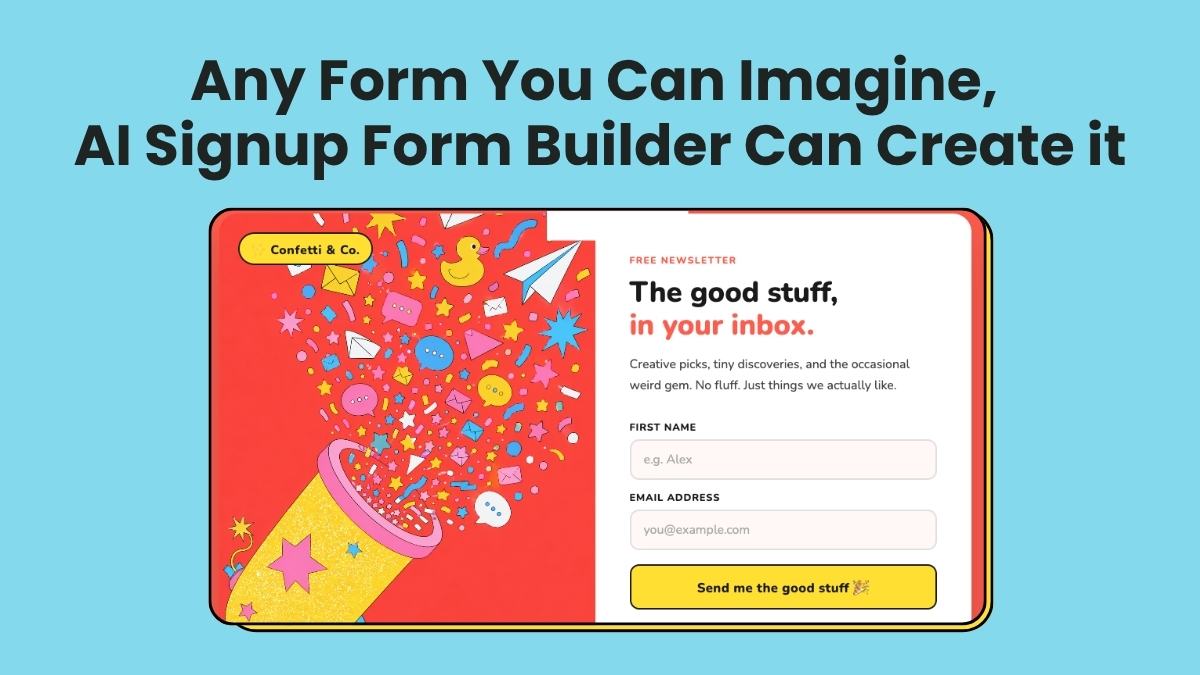
Any Form You Can Imagine, AI Signup Form Builder Can Create it
Dream up any signup form. Describe it in a sentence. AWeber’s AI Signup Form Builder creates it in seconds.

How to Collect Email Addresses: 22 Expert-Tested Methods for Rapid Growth
Wondering how you can get email addresses to build your email marketing campaign? Try these easy email marketing tips from AWeber.
Learn more with these videos:
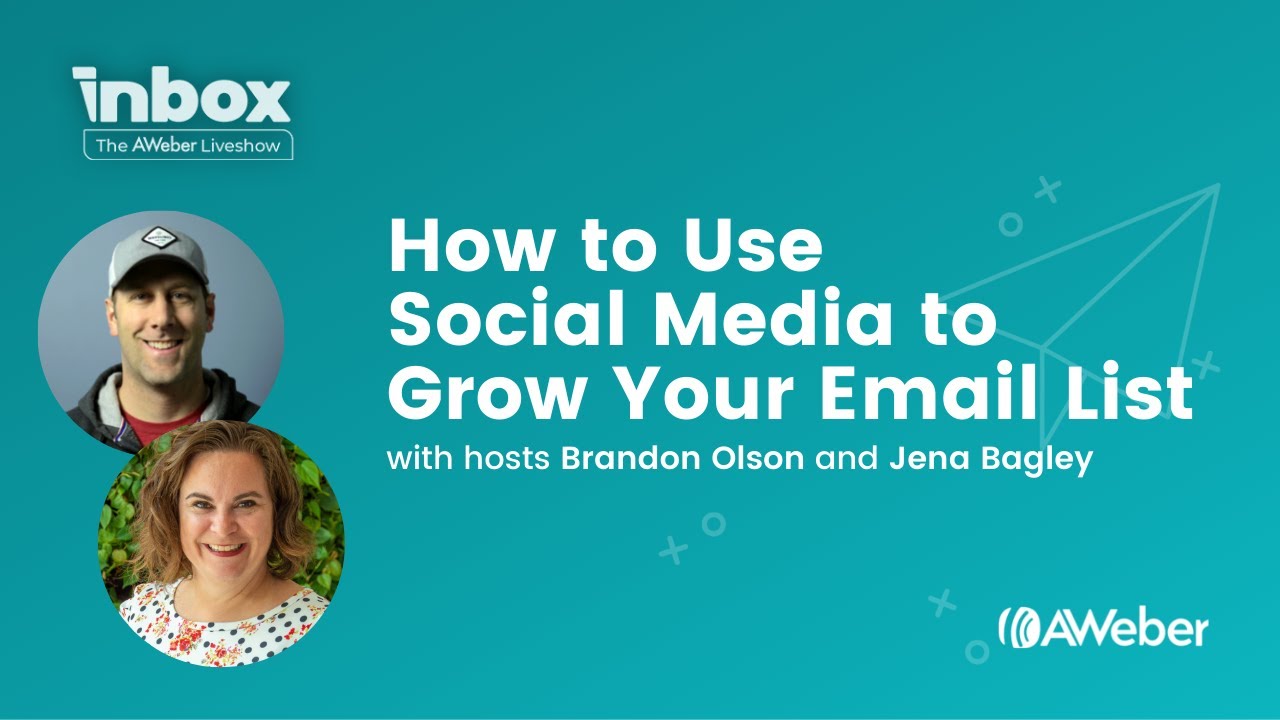
How to Use Social Media to Grow Your Email List
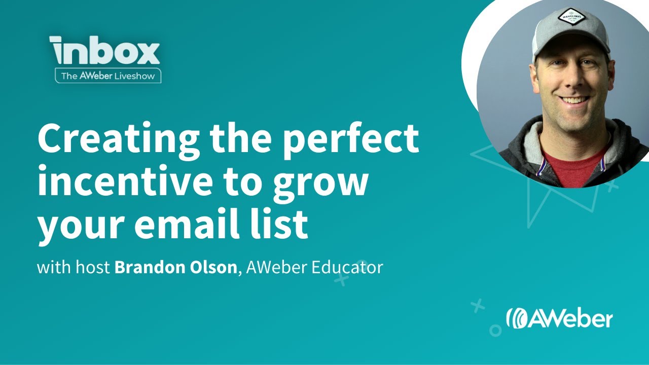
Creating the Perfect Incentive to Grow Your Email List
How do I Import a List of Subscribers?

Building a Landing Page from Scratch in AWeber
Increase Your Opens and Clicks
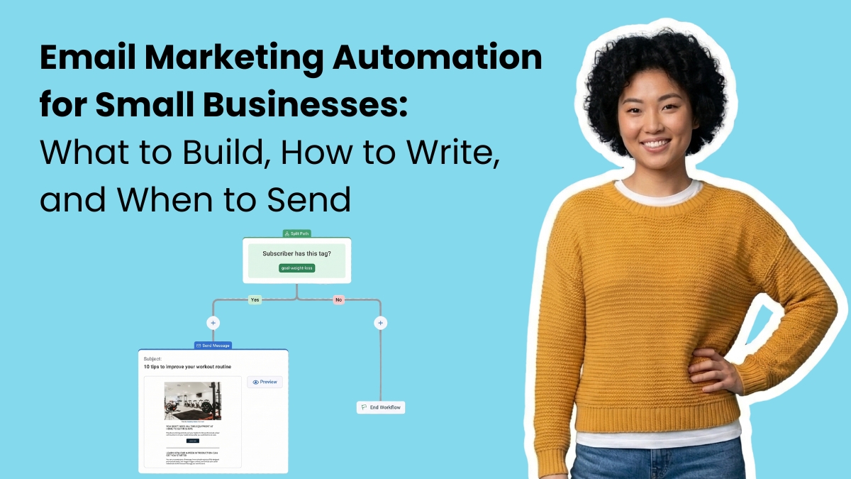
Email Marketing Automation for Small Businesses: What to Build, How to Write It, and When to Send It
Email automation structures, timing, and setup steps you can follow today.
14 Email Subject Line Best Practices to Get More Opens
Your subject line can make or break your email open rates. Here are 14 best practices to write a good one.
14 Email Subject Line Best Practices to Get More Opens
Your subject line can make or break your email open rates. Here are 14 best practices to write a good one.

100+ Amazing subject line examples that will make your emails stand out
The subject line is a first impression. Put your best foot forward. Here are over 100 subject line examples to help improve your open rates.
Learn more with these videos:
4 Tips to Improve Your Email Click-through Rates
Email Subject Line Best Practices
Get Emails Delivered

Improve email deliverability with 6 best practices
Understand what affects email deliverability, how to engage subscribers, & keep your emails out of spam folders.

How to avoid emails going to the spam folder – words to avoid and more
Here are 10 simple steps to help you avoid emails going to the spam folder.

The Ugly Truth about Buying Email Lists
Buying email addresses might seem like an inexpensive shortcut to growing your list. But it’ll cost you in the long run.

Meet the Anti-Spam Laws From Around the World
Do you know where your country stands in the fight against email spam? Read on the learn more about anti-spam laws from around the world and how to comply.
Learn more with these videos:
Get Your Emails Delivered
How Can My Subscribers Safelist Me?
Make Email Easy
How to Create a Welcome Email Series for Your Small Business
Here’s what to include, how many to send, and how to write one that gets a reply.
Email Marketing Automation for Small Businesses: What to Build, How to Write It, and When to Send It
Email automation structures, timing, and setup steps you can follow today.
Learn more with these videos:
What Can I Personalize in My Emails?
Automating Email Campaigns
AWeber's Email Campaign Marketplace
Become an Email Expert
Email signup forms: how to get more subscribers from every page
Learn how to create a sign up form that stands out and helps you build an email list of engaged subscribers.
15 Email Marketing Best Practices High-Performing Small Businesses Follow
Discover proven ways to improve email performance and increase revenue with our guide
The Best Email Marketing Strategies for Small Businesses
Follow these four stages: build a permission list, engage early, protect list health, and send based on behavior.

Stop guessing and start testing: Improve your emails with A/B split testing
Want to get better results from your email marketing? Then you need to A/B test your messages. Here’s everything you need to know!
Learn more with these videos:
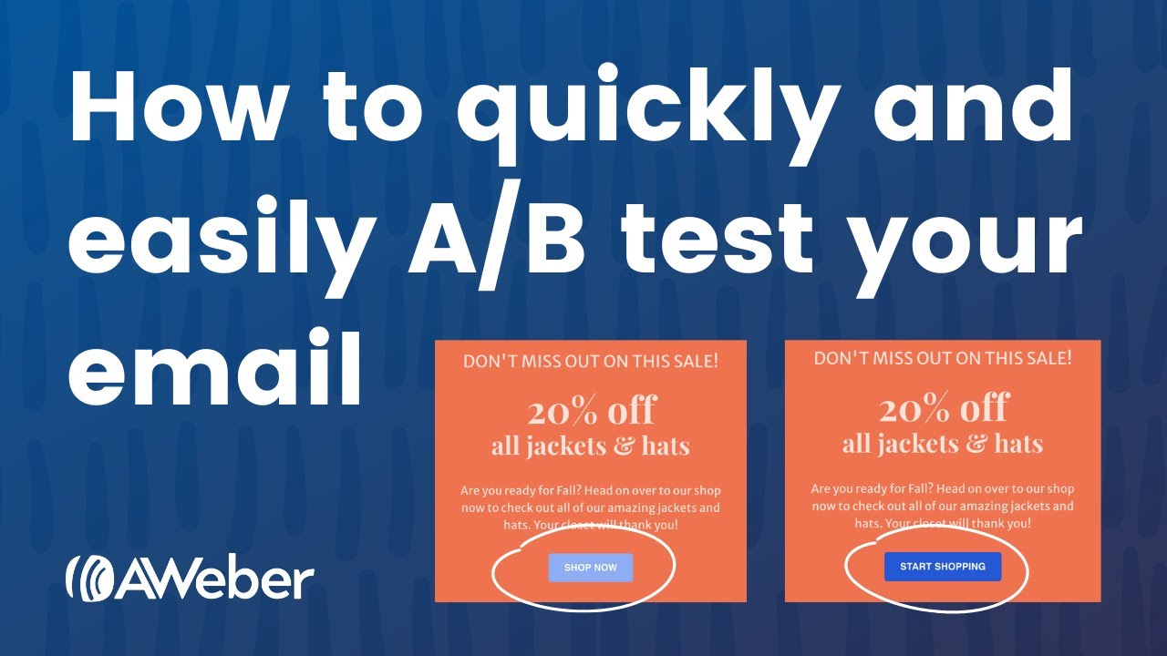
How to Quickly and Easily A/B Test Your Emails
Email Subject Line Best Practices
How Do I Split Test My Sign Up Forms?
Stay in the loop
Get best practices and advice to help you grow your business in our weekly newsletter.