6 Reasons to Use A Dark Background in Your Email Design
By Kelsey Johnson September 10, 2021
Dark backgrounds are far less common than light ones in the world of the internet today. But, with the increasing popularity of dark mode and attention on dark mode from designers, don’t write off black and dark emails because you’ve never done one before.
Dark colors can imply anything from elegance and sophistication to nighttime and spookiness. Plus, intense lighter colors are starkly visible on a dark background.
And a dark email is almost guaranteed to grab attention in a world of white in inboxes — resulting in better click through rates from people who opened your email.
So, to help you get started, here are six reasons to use a dark background for your next email. Each is paired with one version of our newly-designed “Fresh” email template, ready to use in your AWeber account.
1. Highlight colors
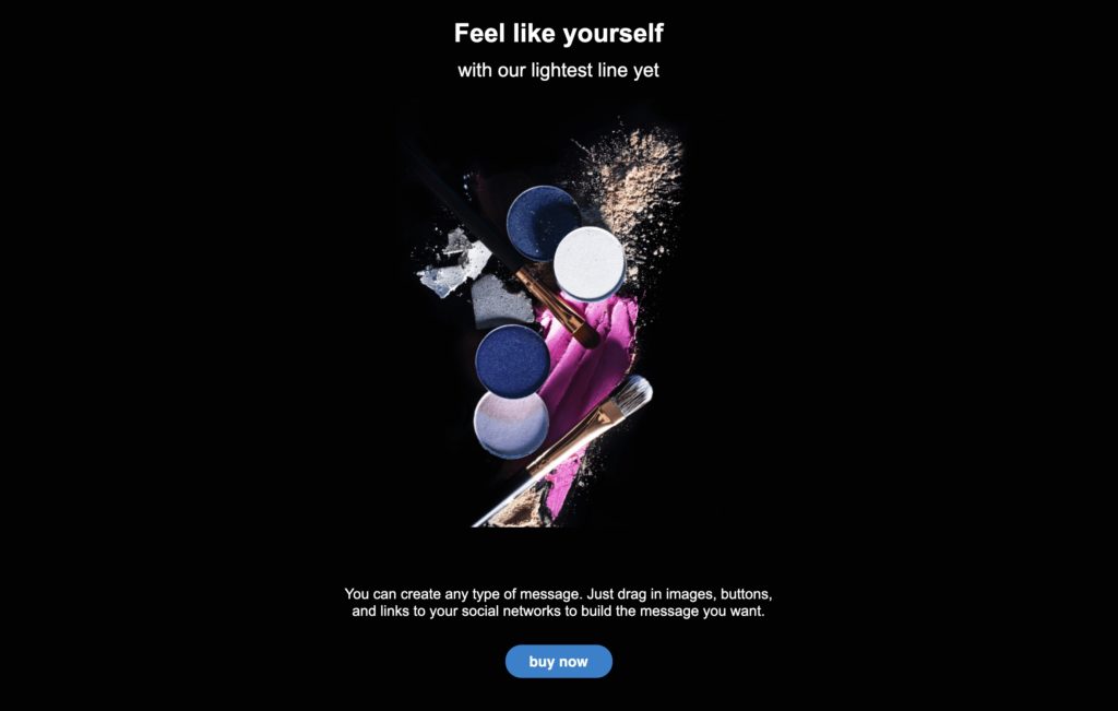
Do you have a particular image or product that you want to bring attention to? A black background provides amazing contrast to make your products “pop.”
You don’t need intense colors to make a cool email like this. Think about Apple — they often use black backgrounds to highlight white or light colored devices.
Add your image to a dark background email to see how it looks.
2. Show off your designs
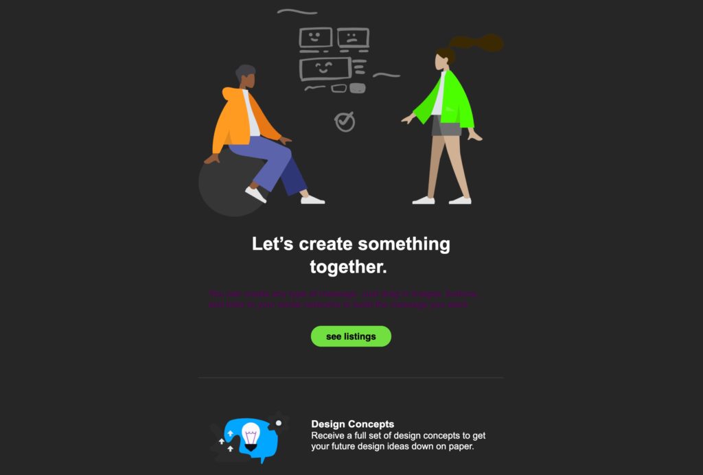
Do you have some cool graphics that represent your company? Or, do you want some? Either take creative graphics from your site — or use one of the thousands provided in Canva — and add them onto a dark background.
Putting brightly colored imagery — like the people pictured above — can give depth and emotion to your email. Try it out! If a dark email with bright graphics feels right for your brand, send it and see what your audience thinks.
3. Create a mood
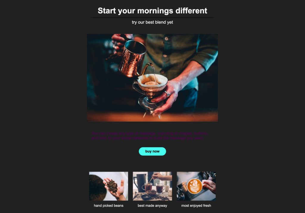
Black and dark colors indicate sophistication, elegance, mystery, power and style. Any of those moods can be created in your email simply by designing it with a dark background.
Whether you have a premium service or course to promote, you want to show off a sophisticated design, or you’re trying to create mystery around an upcoming event, an email with a dark background will give the right impression.
4. Grab attention
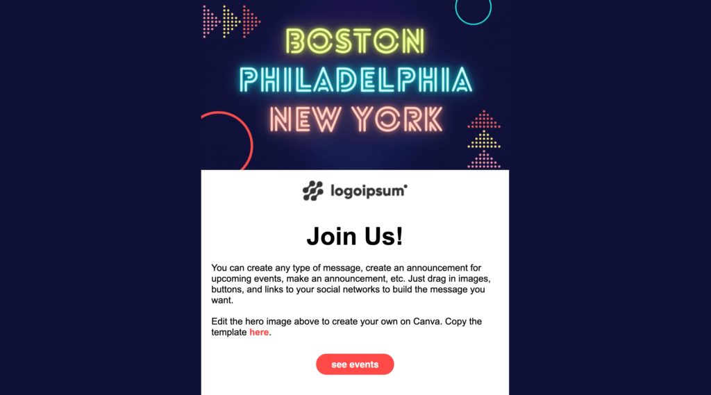
In a sea of white backgrounds, the dark will stand out. Look through your own inbox — you’ll likely see that most of your transactional, personal, and promotional emails are designed with dark text on a light background.
Draw attention to your event, product, or promotion with an email that is dark-colored across the background with a white overlay. You’ll catch the eye of your audience with your alternate look, and their focus will be on your headline and CTA.
5. Imply nighttime
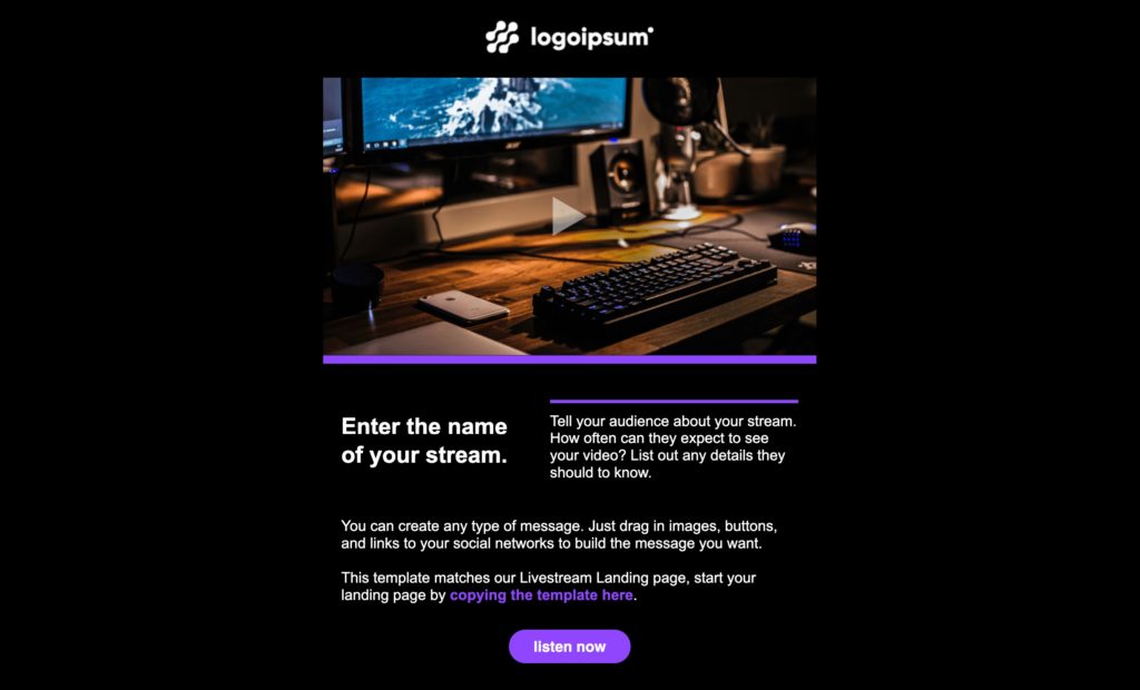
What do DJs, music venues, brewpubs, nightclubs, security guards, stand up comedians, restaurants, astrologists, and party buses have in common? They all work at night.
If your business runs almost entirely at night, use a dark background to match your customers’ experience and expectations. Choosing dark over light is a subtle difference that can result in better email engagement and more sales.
6. Match a holiday theme

Dark-themed events like Halloween or New Year’s Eve are traditionally promoted with dark backgrounds for a reason — that’s exactly what your subscribers want to see.
Holidays are tied to memories and emotions from the past. Dive into the emotions of these darker festivities with dark emails. An email on a dark background will engage your subscribers and get them excited about your event or promotion.
A tip for emails with dark backgrounds: Keep the text to a minimum. A dark email is, by nature, design-heavy. Don’t go overboard with what you write — whatever is left will pack a punch.
Start your next email with “Fresh” — our dark background template
No need to spend time designing your next dark background email from scratch. We just updated our email template “Fresh” with 7 new color variations, all with dark backgrounds. They look like the images in this post — so go check them out for yourself.
Sign up for a free account or sign in now start a new drag-and-drop message, click “choose a template” and you can find “Fresh” under the category “Home.” Let us know how your email turned out in the comments below.
 87% off ends soon!
