Product landing pages: a step-by-step guide to boosting sales
By Rhonda Bradley December 13, 2023
Product landing pages are a budget-friendly marketing tool that can help increase product sales and provide valuable data and insights on customer behavior.
Landing pages also provide a smooth customer experience that guides people through the most critical part of your marketing funnel: making the sale.
So why don’t more small companies use landing pages?
If you’re a small business owner, you may struggle with the idea of creating your own design elements. Or maybe you’re unsure how to write the content and choose the best images. You might even think you don’t have the technical know-how to create a successful landing page.
Sound familiar? No problem! This guide shows you how to write and create a professional landing page in minutes — no design experience necessary.
Creating a high-converting product landing page may be the best marketing investment you’ll ever make, so we want to make it easy for you.
We’ve included over 20 product landing page examples to inspire you, plus a step-by-step guide to creating a 10-minute, high-converting landing page.
Keep reading to discover how easy it can be to develop a high-performing landing page for your product!
Small business person’s guide to product landing pages:
- What is a product landing page?
- What’s in a product landing page?
- Product landing page examples
- How to create a product landing page step-by-step
What is a product landing page?
A product landing page is a dedicated webpage designed with a single focus: showcasing your product and compelling visitors to buy it.
Unlike other landing pages designed to capture leads (email subscribers) by offering free content or promotional specials, the purpose of a product landing page is to sell a product.
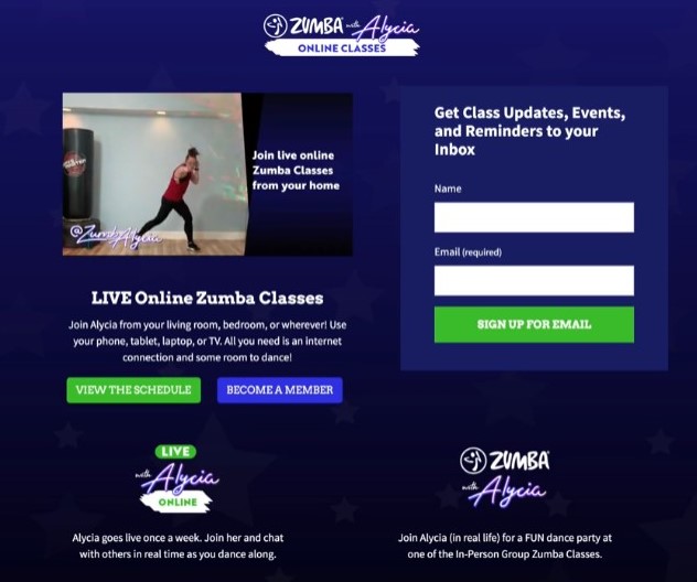
For example, when fitness instructor Alycia McFarlin transitioned from in-person to online Zumba workouts, she decided to use a landing page to sell her new digital classes.
In ten minutes, Alycia created a landing page for her online Zumba classes, which ended up being twice as profitable as her in-person classes.
There are many types of product landing pages. Yours may be a physical product, digital product, service, or even a subscription product. Whether you’re selling webinars, ebooks, coaching services, cupcakes — or anything in between, a product landing page can help boost your sales.
Landing pages can be used as a home page or another page on your website, or they can also be standalone pages hosted independently.
For example, startup companies often begin with a standalone product landing page so they can begin selling products even before their website is built.
Why are product landing pages important?
Think of a product landing page as your digital salesperson, dedicated to converting visitors into paying customers. It’s a one-page space to showcase your product in the best light, with copywriting and visuals designed to inform and sell.
Product landing pages are important for several reasons:
- They’re an excellent way to make the most of your social media following. Include the landing page link in your bio and share it in posts so you can sell your product directly to followers without paying additional commissions to secondary platforms.
- They can help you turn email subscriber lists into paying customers by adding a CTA with the product page link to the bottom of your email newsletters.
- They provide valuable marketing insights. The data you glean from landing page software lets you know what platforms send the most traffic and which audiences are most likely to purchase.
What tools do you need to create a product landing page?
Many free and paid tools can help you create a landing page without any coding knowledge.
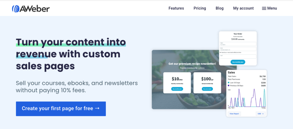
If you’re a solo creator, entrepreneur, or coach responsible for creating your own materials, look for these features when shopping for a landing page builder:
- Easy-to-use software that lets you quickly create a landing page.
- Plenty of templates, so you can find one that fits your vision.
- Analytics that show how well your landing page is performing.
- Integration with your email marketing platform and website.
What’s in a product landing page?
Whether you’re selling coaching services, bakery products, fuzzy socks, or any other product, the elements of a high-converting landing page are similar.
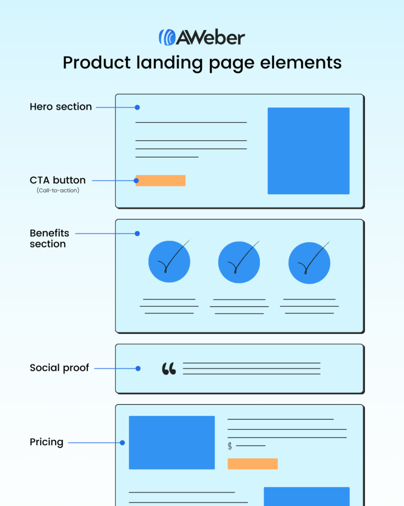
A single-product landing page contains six elements:
- Hero section
- Benefits section
- Product details
- Call to action button (CTA)
- Social proof
- Pricing
These six elements may be placed in any order, except the hero section remains at the top. The CTA is typically placed repeatedly throughout the page.
#1 – Hero section:
You only have about 8 seconds to persuade your visitors to remain on your landing page and consider purchasing. That means your writing, visuals, and page load times must be on point — easily scannable and laser-targeted to a precise audience.
The #1 secret to creating a product landing page that sells lies in clearly showcasing your product and its benefits in a way that’s precisely tailored to your target customer.
Here’s how it’s done.
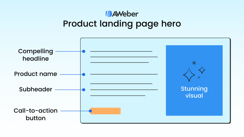
A good hero section contains:
- Product name
- Compelling headline
- Subheader or 2-3 sentences of descriptive text
- Stunning visuals
- Call-to-action button (CTA)
- Price (optional)
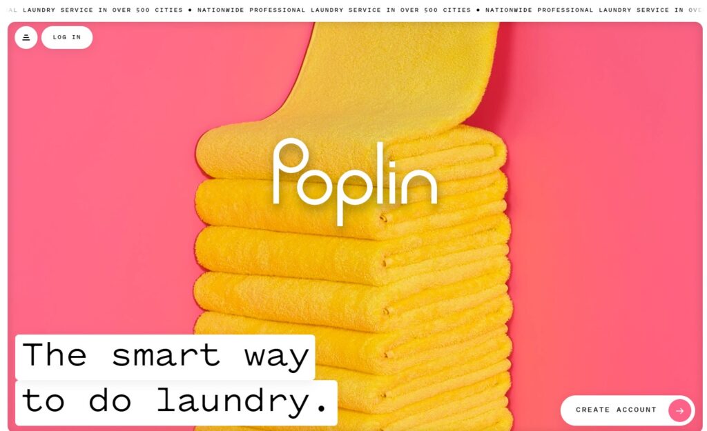
For example, the hero section on Poplin laundry service includes a vivid image, its company name, and a brief headline that describes its product, “The smart way to do laundry.”
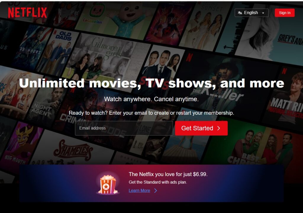
Despite the fact that nearly everyone is familiar with Netflix, the streaming giant comes through with a classic high-converting landing page that includes its name, brief headline and description, descriptive image, and clear CTA.
“Unlimited movies, TV shows, and more. Watch anywhere. Cancel anytime.”
#2 – Call-to-action button (CTA)
The CTA is a button that tells visitors what to do next — using only a few words. “Buy now,” “Book a call,” and “Start your free trial” are popular CTA phrases.
In most cases, each section of your landing page will include the (same) CTA. Make sure it “pops” with color or a large font.
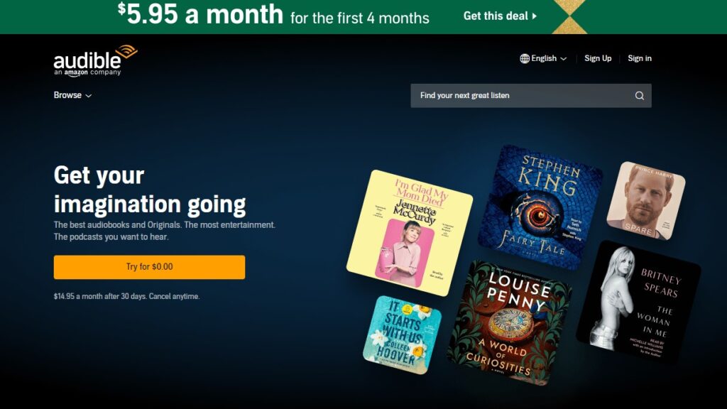
For example, Audible’s landing page prominently displays its CTA, “Try for $0.00,” on a bright gold button.
#3 – Product details
The product details section includes a crystal-clear description of your product in as few words as possible.
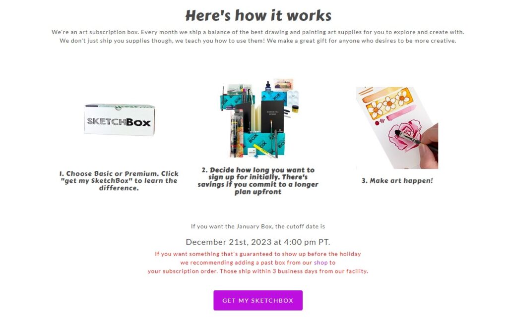
Art supplies company Sketchbox follows its hero section with a description of what the service is and how it works. It uses three images with three short sentences to provide a clear description.
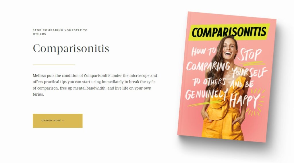
Author Melissa Ambrosini describes her book, Comparisonitis, in one sentence beneath the title and headline, “Stop comparing yourself to others.”
#4 – Benefits section
The benefits section highlights the benefits of your product — things that people feel or enjoy as a result of buying your product.
For example, if you’re a wellness coach, the benefits of your service may include enjoying more energy and freedom of movement. If you’re selling jewelry, the benefits may be that you’ll dazzle a room full of people.
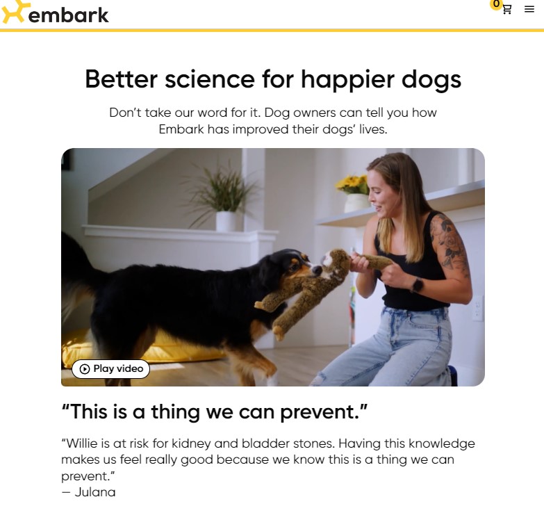
Embark Dog DNA Test lists happier dogs and preventable health issues as benefits of its product.
Understanding and communicating your product’s benefits to your target audience is one the most important things you’ll do to boost the success of your landing page. If you’re unsure of its benefits, don’t be shy about asking your customers (or even friends and colleagues) about the benefits they enjoy as a result of your product.
#5 – Social proof
Social proof, such as customer reviews and testimonials, builds the trust you need to make people feel comfortable purchasing from you.
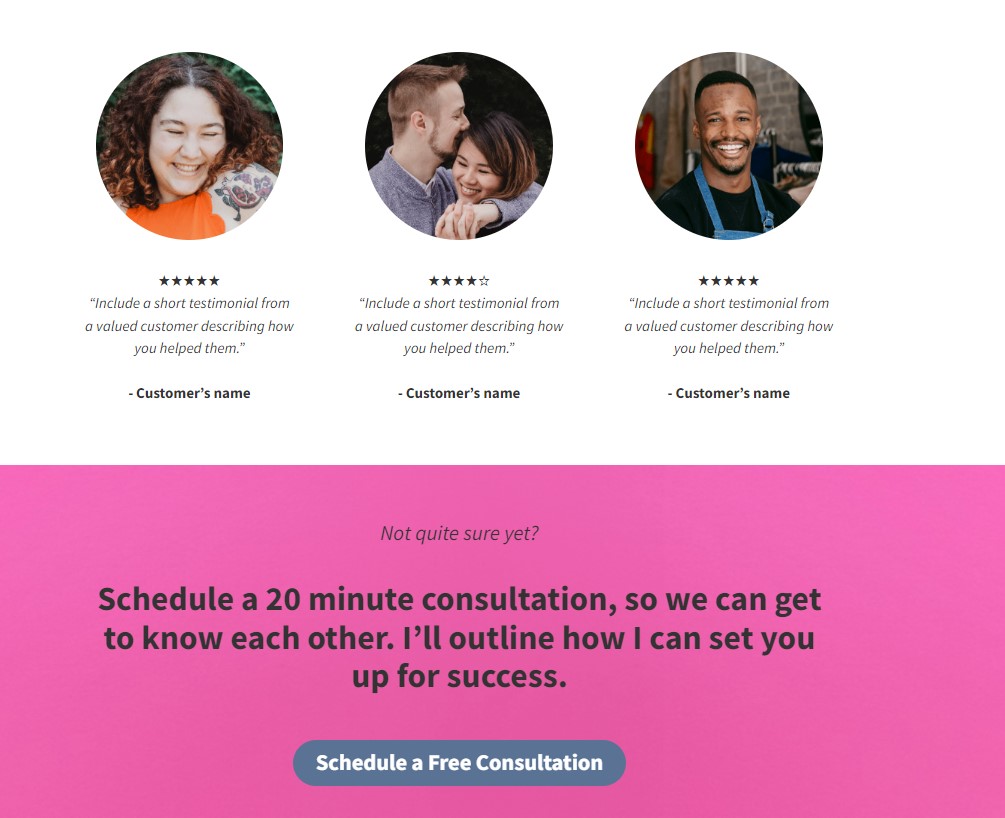
You can place customer reviews in any standard design template.
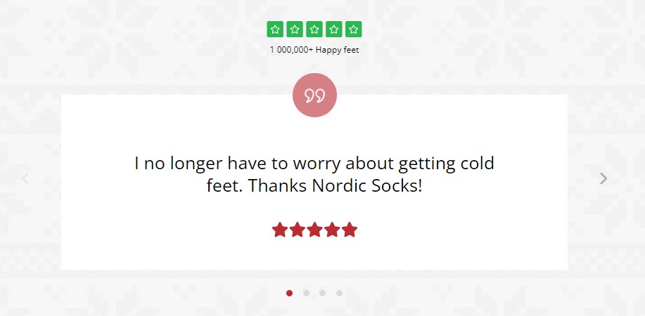
Or, create a carousel to share reviews and testimonials.
For example, Nordic Socks proudly displays a carousel of customer reviews, including a one-liner that reads, “I no longer have to worry about getting cold feet. Thanks Nordic Socks!”
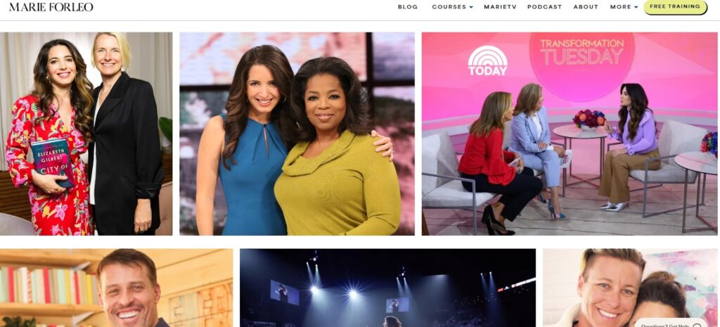
Thought leader Maria Forleo displays images of herself with celebrities as a social proof section on her landing page.
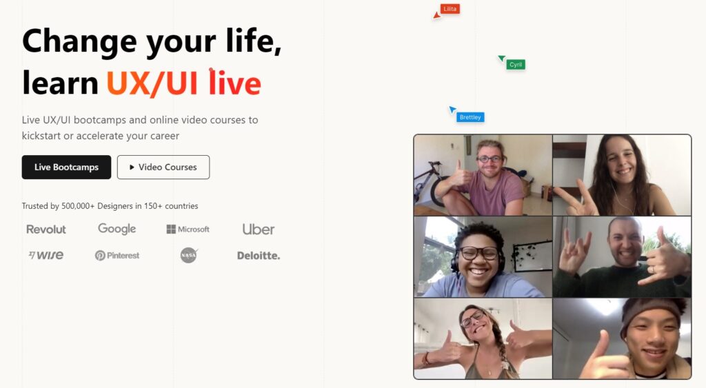
If your product is business-oriented and you’ve worked with well-known companies, logo displays are another great way to include social proof.
#6 – Price
In most cases, you’ll want to include the price of your product on your landing page. Sometimes, such as when you offer differently-priced versions of a product, you may put pricing on the order page instead. It helps to include the price because it’s a key part of describing your product to readers.
Landing pages are creative content, so the elements you use on yours may vary. One of the best things you can do before you begin designing is to browse landing pages in your industry for ideas.
Product landing page examples
Here are a few more examples of outstanding landing pages designed for high conversions.
Preply
Language Tutor service Preply knocks it out of the park with a landing page that’s ready to sell.
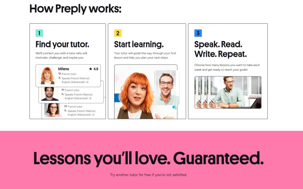
Its headline, “Unlock your potential with the best language tutors,” clearly states what the product is and how it benefits its customers. The hero image shows two people chatting in what seems like a user-friendly video conferencing app, which immediately tells visitors that Preply is an online tutorial service.
The section accomplishes what takes many others hundreds of words and several sections to achieve. It conveys the product description and benefits, explains how it works, and tells readers what to do next — using only ten words and an image.

Preply’s hero section is followed by social proof ( mentions “300,000+ 5-star reviews”), a “how it works” section, and more social proof (customer testimonials) and benefits.
Barkbox
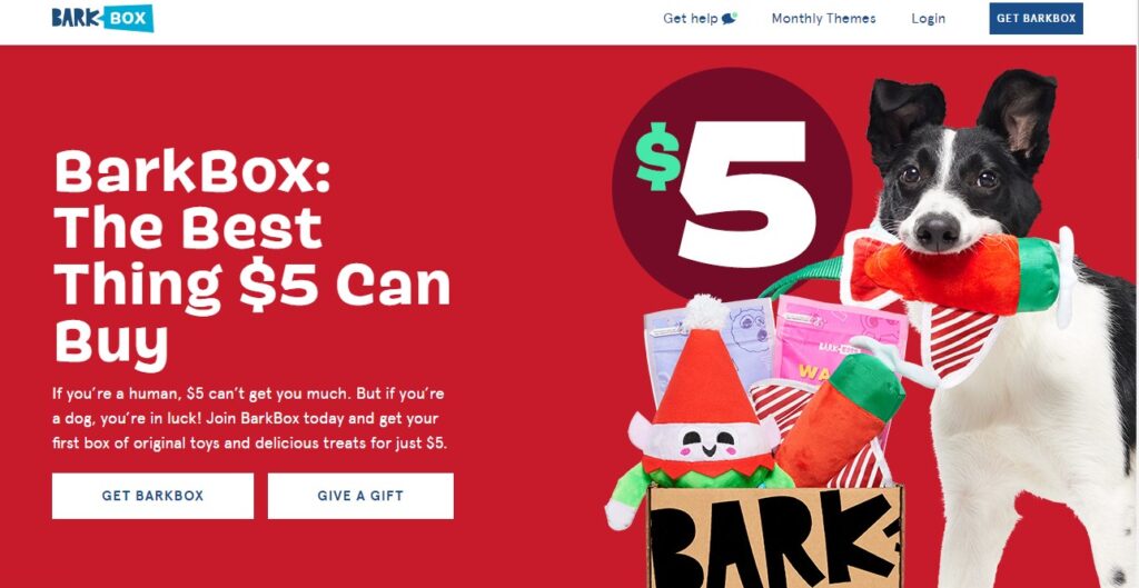
Dog subscription service BarkBox begins its landing page with a hero section that includes a compelling headline, “BarkBox: The Best Thing $5 Can Buy.” It’s followed by a couple of lines of text and a clear CTA. Next to it is an image of the product and target customer (a cute dog).
The page goes on to provide more details in its “What’s in a BarkBox” section.
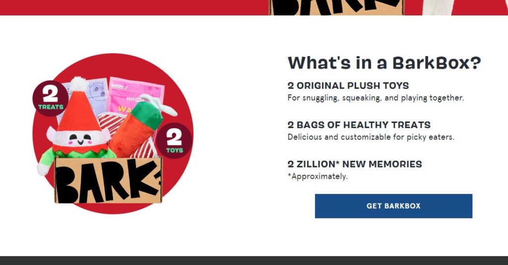
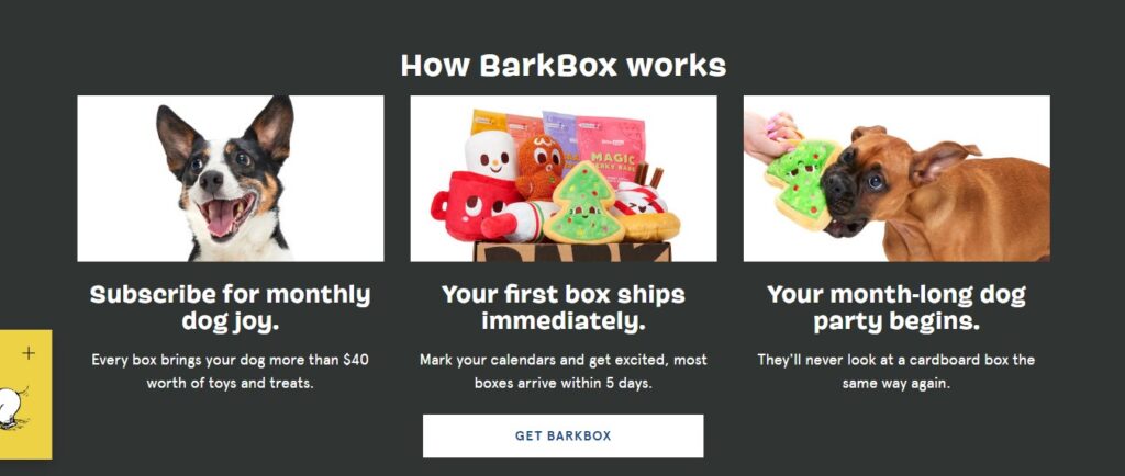
It then moves on to a product benefits section titled “How BarkBox works.” This section lists “dog joy,” “month-long pet party,” and immediate shipping as the product benefits. Again, it places its “Get BarkBox” CTA.
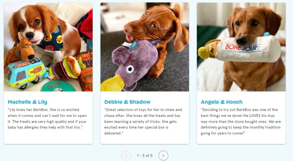
The landing page moves on to social proof, featuring customer testimonials and images of dogs enjoying their products.
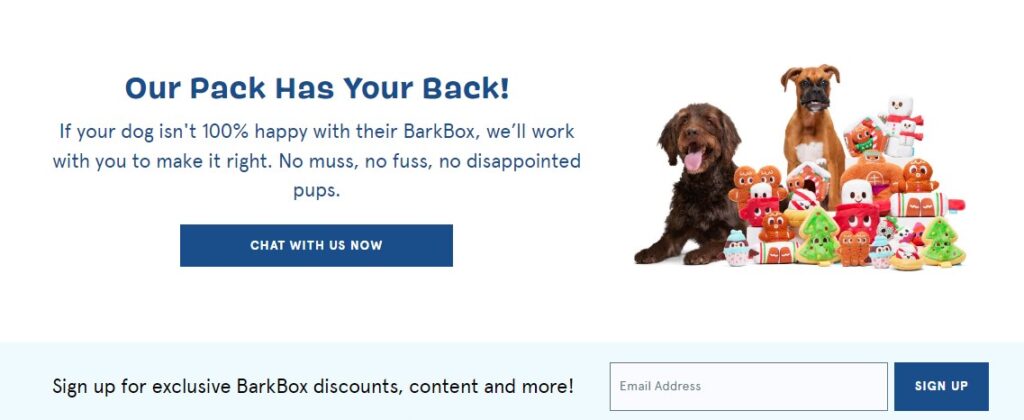
To further build trust, the page builds on its social proof by adding an additional trust factor — a 100% money-back guarantee.
Daily Burn
Streaming workouts service Daily Burn incorporates video on its hero section to showcase the different types of people (all ages and backgrounds) that use its service.
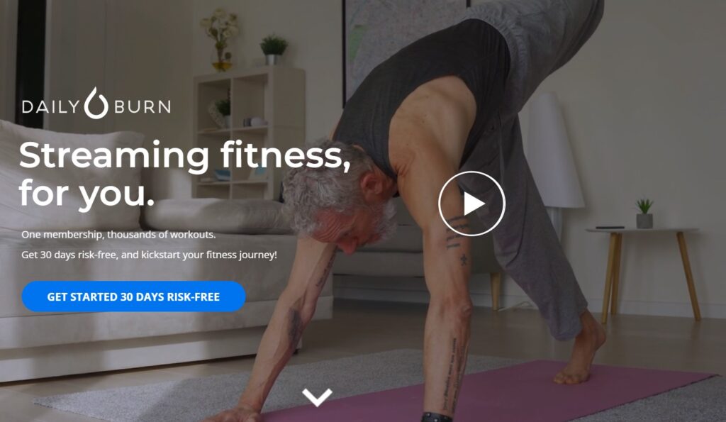
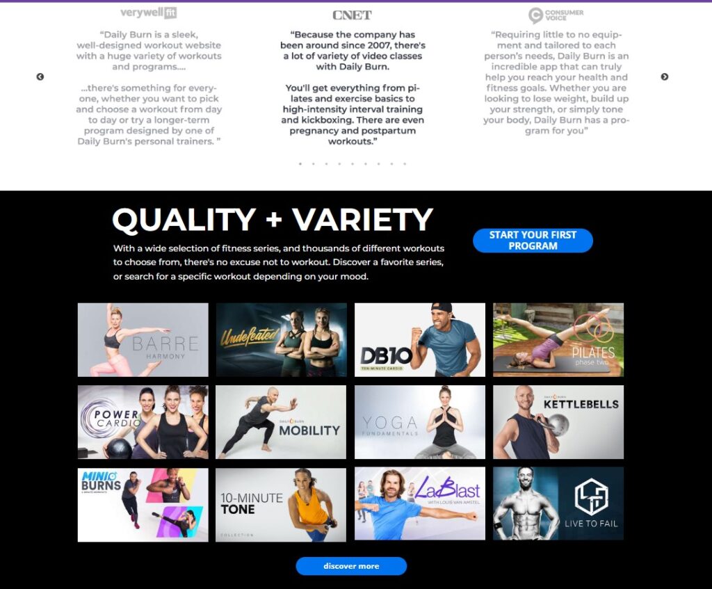
With a keen understanding of its target audience, the company appeals to its readers with a highly visual landing page, using images to communicate product descriptions.
We’ve included a few more landing page examples in the step-by-step instructions below.
How to create a product landing page step-by-step
In this section, we show you how to create a landing page and walk you through using a landing page builder to create one in minutes.
Step 1: Write the copy for your landing page
Before you begin designing, take a few moments to write the copy for your landing page. Remember that the most important thing you’ll do on this page is showcase your product and describe it with clarity.
You don’t have to be a professional copywriter to write high-converting content. If you’re an expert at understanding your audience and product, you can write good copy!
Here’s what you’ll want to write before you begin designing your landing page:
- Hero section: A compelling headline and subheader that clearly describes your product.
- Product details: A crystal-clear description of your product in as few words as possible.
- Benefits: How your product affects people’s feelings, lifestyle, pocketbook, or other aspect of their lives.
- CTA: 2-3 simple words that tell readers what to do next, such as “Buy Now” or “Sign up for a free trial.”
Step 2: Choose images for your landing page
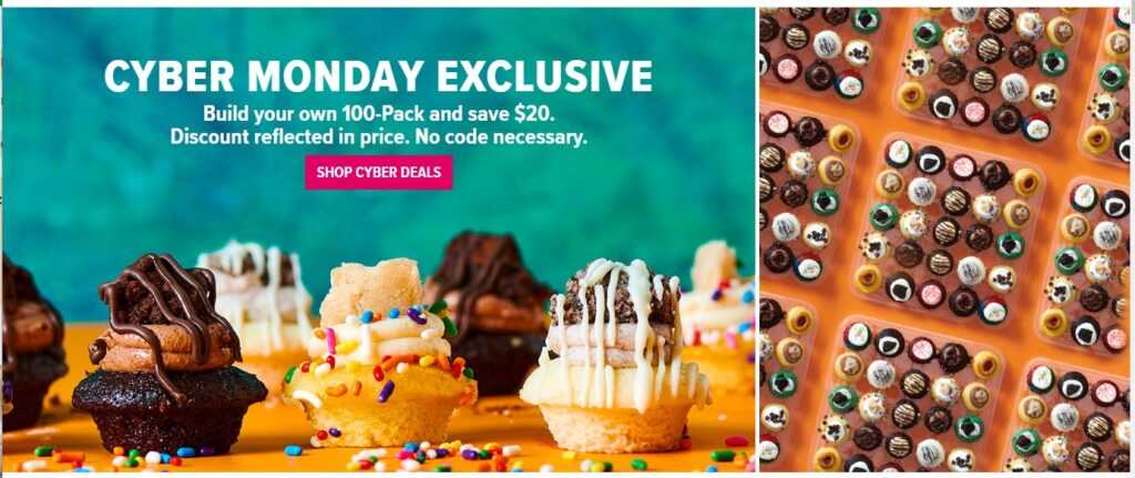
If you have to pick one place to spend money, a good photographer or high-quality camera is an investment you’ll thank yourself for later.
For example, the cupcake company Baked by Melissa does a beautiful job using images to show off its product.
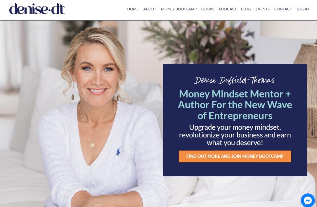
If you operate a coaching or business service, you’re likely to use an image of yourself. Coach Denise Duffield-Thomas uses a high-quality image of herself that immediately sets the tone for her Money Bootcamp.
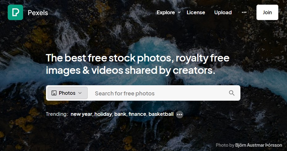
If you don’t have the budget to invest in quality photography, you can browse sites such as Unsplash, Pexels, and LifeOfPix to find public images to use for free.
Step 3: Design your landing page
Putting your writing and visuals into a seamless landing page that looks great, responds to different devices, and loads quickly can get complicated — unless you use a drag-and-drop landing page builder.
You can simplify the design process with a user-friendly design tool such as Canva.
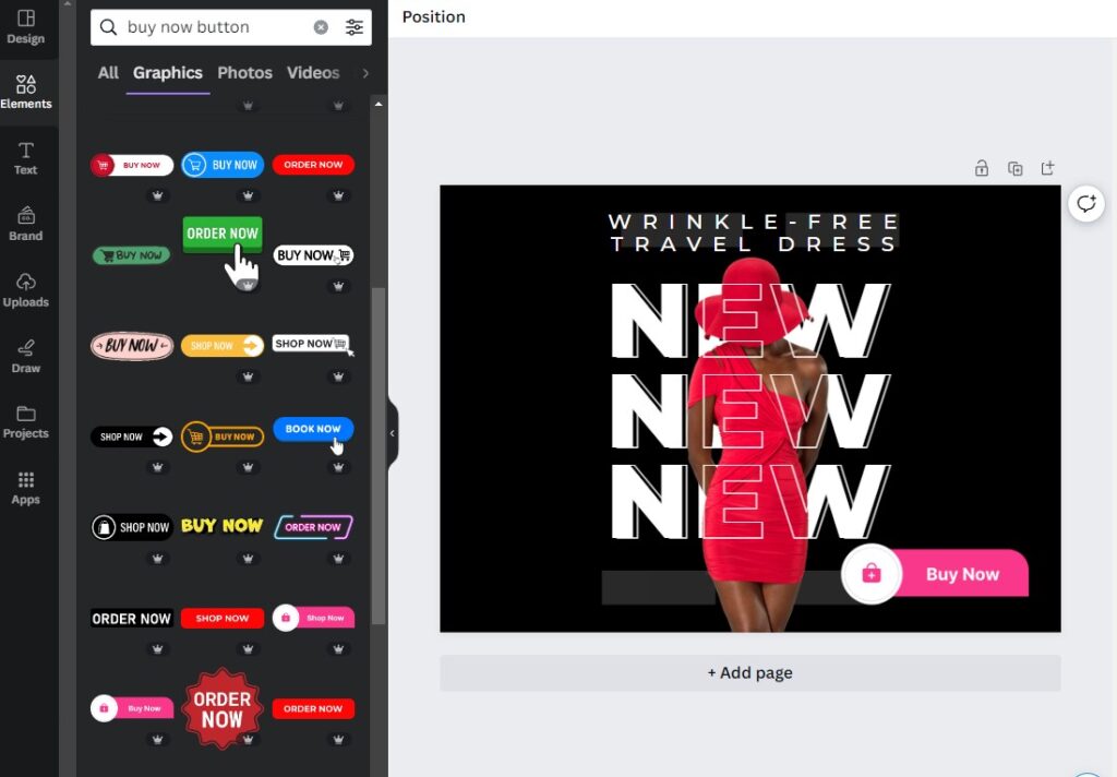
Or, if you’re like me and have no design skills, you may prefer a dedicated landing page builder.
A dedicated landing page tool provides the exact elements you need, such as basic CTA buttons and drag-and-drop formatting, to build your entire page.
For example, if you’re using AWeber, you can choose from countless landing page templates that allow you to quickly build a professional landing page (no design experience or coding needed). You can also access the design power of Canva anytime since it’s built into all of AWeber’s design tools.
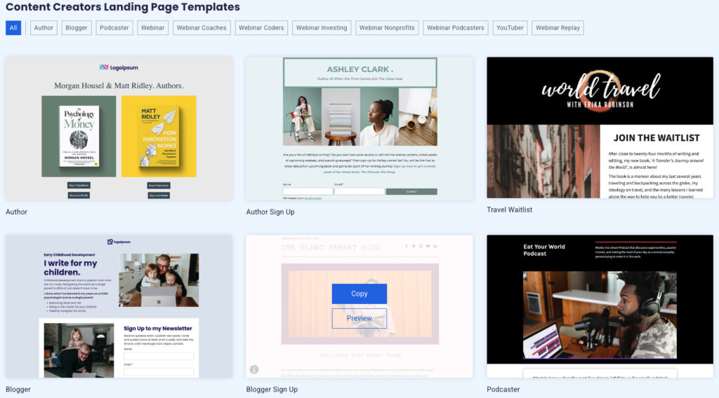
Here’s how I, a person with no inclination for design (but a tendency to get sidetracked for hours trying), built a landing page in under five minutes using AWeber.
Give it a try as you follow along! Head over to AWeber and create a free account (no credit card needed), then navigate to pages and forms>landing pages. Select “Create a Landing Page” and browse through the templates to find one you like.
I chose the musician’s landing page because I like its simplicity and focus on the hero image.
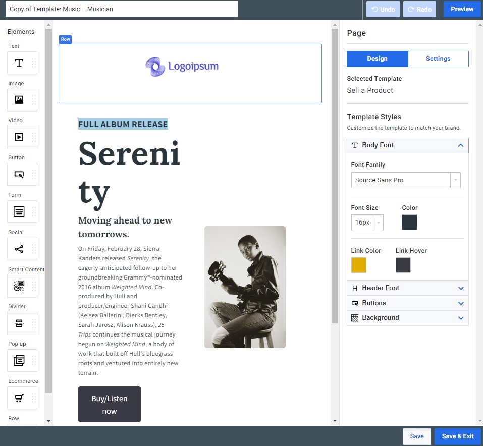
I used the drag-and-drop feature to replace the existing image with an upload of my own. Then, I kept the font and sizing but edited the text to fit my (imaginary) product.
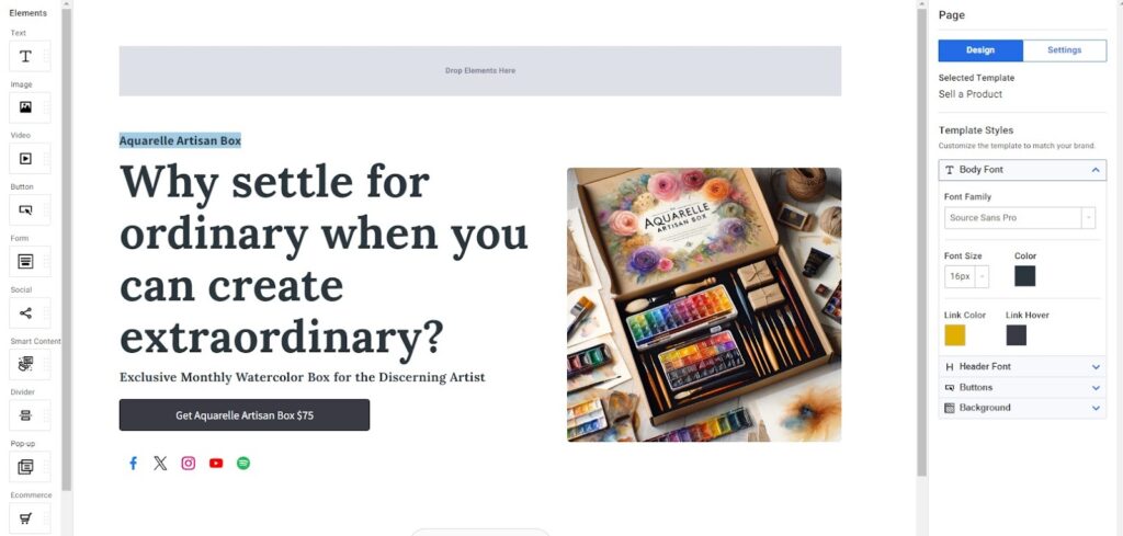
My hero section was complete in less than 5 minutes, and I could instantly view my landing page by tapping the preview button.
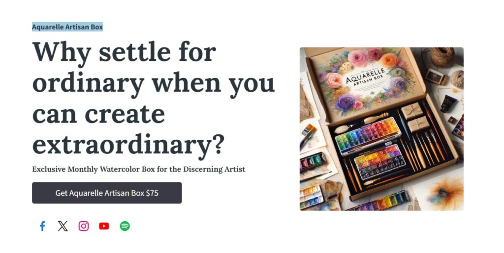
Product landing pages can be easy to create, yet highly effective at selling your product.
Easy peasy landing pages designed to sell
There are many things to stress about when running your own business. Product landing pages don’t have to be one of them.
Even if you’ve never created a landing page, you can build a professional-quality page that turns visitors into paying customers. And you don’t need to break the bank or carve out much time to do it.
If you’re not a designer, remember to choose a landing page tool that provides plenty of templates and a drag-and-drop builder to simplify the design process.
AWeber makes landing pages easy (and the “free” part is nice, too). Open a free AWeber account today (no credit card needed), and you can begin designing your product landing page immediately.
 87% off ends soon!

Brand Animators
12/15/2023 11:44 amThanks for the valuable tips!