How to create interactive product images with AMP for Email
By Dave Stys October 4, 2022
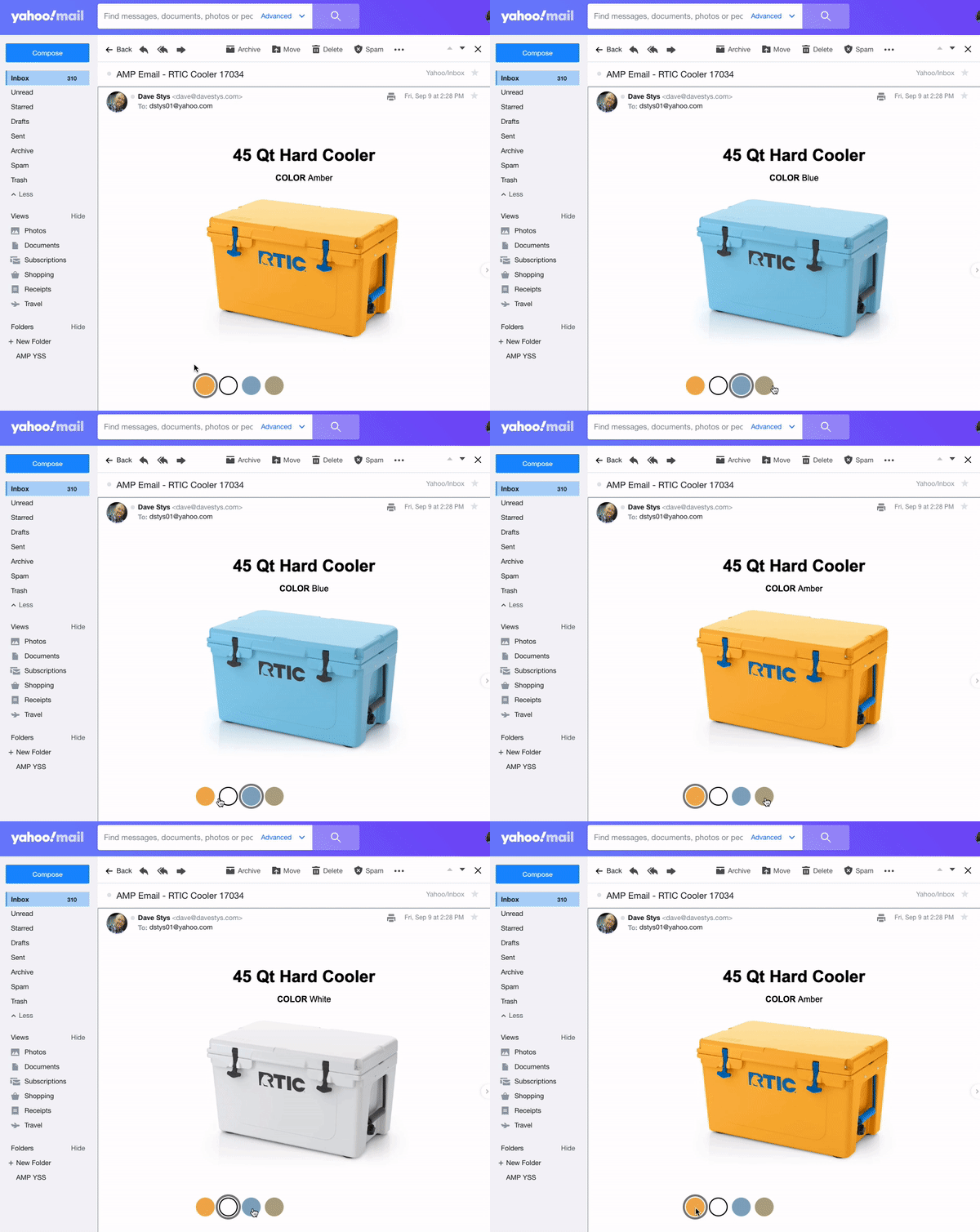
In this this tutorial you will learn how to create an interactive e-commerce email message. We’ll display a product with several color options. The reader will be able to press each color and dynamically update the product image. Here’s what it looks like (see the full code example):
While it’s a relatively simple example, you will become familiar with a few important AMP for Email components such as:
- amp-img an AMP replacement for the html5 img tag.
- amp-selector a control for selecting one or more options
- amp-bind responds to user actions such as hovers, clicks, form submissions, etc.
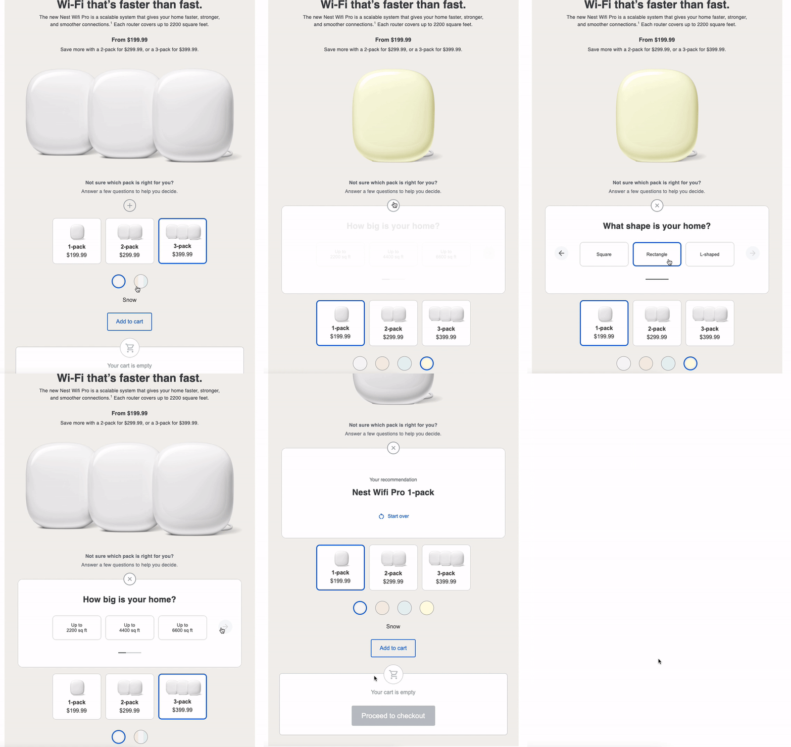
To give you an idea of what else can be with these components, here’s a more sophisticated example from Google. This adds the extra complexity of showing different products (the 1-pack, 2-pack, and 3-pack) and lets people see those products in different colors, but the principle of what you’ll learn below is the same.
Step 1 – Quick Start with the AMP Playground
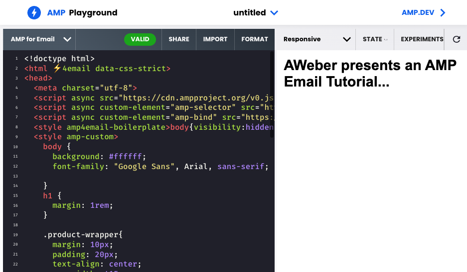
We will use the official AMP Playground for this tutorial. I’ve gone ahead and included some basic CSS for laying out our product image and the color selectors so you can focus on learning how the AMP components work.
Visit this custom AMP Playground for a quick way to get started.
Step 2 – Add The Product Details
Let’s begin laying out the message. We’ll start with the product tile, description (just color in this case), and the product images. Add the following inside the <body>.
<div class="product-wrapper">
    <h1>45 Qt Hard Cooler</h1>
    <p><b>COLOR </b><span [text]=colorChoice>Amber</span></p>
</div>
Note, we’re using [text]=colorChoice. This is a hook that we can use later on in the tutorial to update the product description with the chosen color. For example, when the user chooses “Blue”, the text will dynamically update from “COLOR Amber” to “COLOR Blue”.
Next let’s add our first product image. Let’s start with our default color, Amber.
<div [hidden]="!(colorChoice == 'Amber')">
      <amp-img width="600" height="440" layout=responsive src="https://hostedimages-cdn.aweber-static.com/MTM0NjMxNQ==/optimized/4244bcee9ff14adcbaa0807c71f4386e.png"></amp-img>
</div>
The <amp-img> is contained within a div with a little bit of logic, [hidden]="!(colorChoice == 'Amber') which means that the Amber product image will only be seen when the user selects the Amber color.
Next, add the remaining product images, one for each color. Each of these will initially be hidden, as the Amber color will be the default product variation.
<div hidden [hidden]="!(colorChoice == 'White')">
      <amp-img width="600" height="440" layout=responsive src="https://hostedimages-cdn.aweber-static.com/MTM0NjMxNQ==/optimized/d15718d91bf247db90707c06d4f2cc30.png"></amp-img>
</div>

<div hidden [hidden]="!(colorChoice == 'Blue')">
      <amp-img width="600" height="440" layout=responsive src="https://hostedimages-cdn.aweber-static.com/MTM0NjMxNQ==/optimized/20f3386a5df049548a23ef2651fca7ad.png"></amp-img>
</div>

<div hidden [hidden]="!(colorChoice == 'Tan')">
      <amp-img width="600" height=440 layout=responsive src="https://hostedimages-cdn.aweber-static.com/MTM0NjMxNQ==/optimized/1975268637ed42ea9172288f3d90b6b1.png"></amp-img>
</div>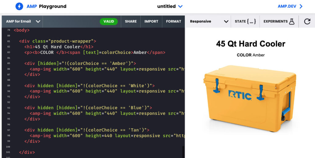
Step 3 – Adding the Color Choices
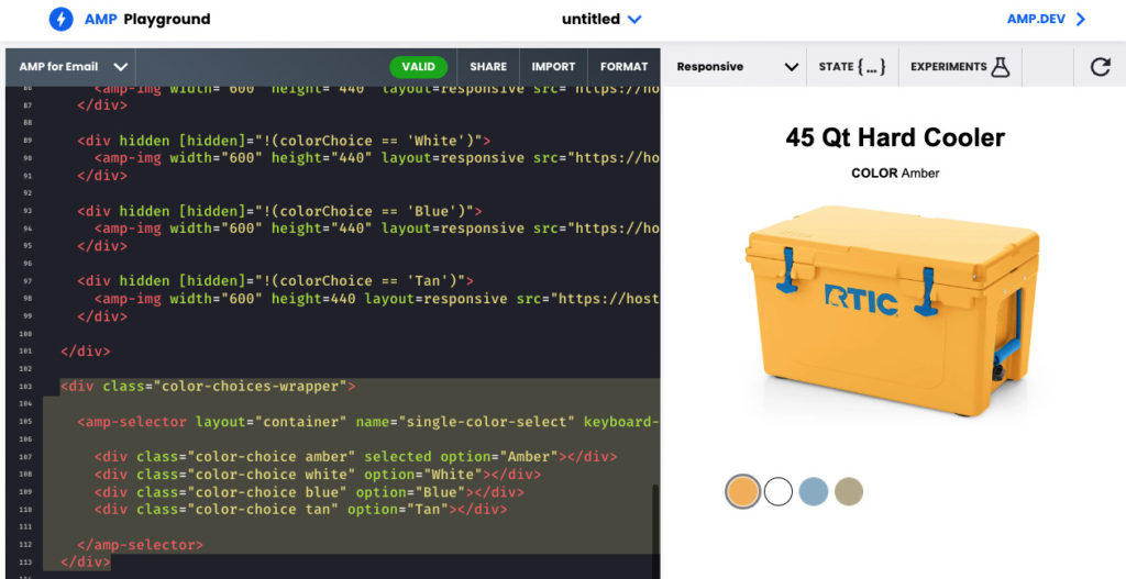
It’s finally time to add a selector for each of the color options. We’ll use <amp-selector> with the default, single-choice setting so that they work much like a radio button. And upon selecting a color choice, the amp-state will be updated to reflect that color choice. The change to amp-state lets the rest of our document know to change the product image and the color description. Add the following below the product details.
<div class="color-choices-wrapper">

    <amp-selector
        layout="container"
        name="single-color-select"
        keyboard-select-mode="select"
        on="select: AMP.setState({colorChoice: event.targetOption})" >

        <div class="color-choice amber" selected option="Amber"></div>
        <div class="color-choice white" option="White"></div>
        <div class="color-choice blue" option="Blue"></div>
        <div class="color-choice tan" option="Tan"></div>

    </amp-selector>
  </div>
The <amp-selector> has an event trigger. When it is selected, it updates the colorChoice variable. This variable is used to display the appropriate product image and to update the color description text in the product details.
on="select: AMP.setState({colorChoice: event.targetOption})"
At this point, go ahead and try selecting each color choice. You should see your product details update accordingly.
Understanding How it Works
Here is a summary of the basic concepts used in this example.
Color Selectors: The color selector, <amp-selector>, has a “select” event. When the action occurs, it updates the colorChoice variable throughout the document. (<amp-bind> is what associates an action with one or more updates to the document.)
on="select: AMP.setState({colorChoice: event.targetOption})"
Product Images: The product images have basic logic to hide or show each image based on the value of the colorChoice variable. Example: hidden = True when colorChoice is not equal to ‘Amber’.
[hidden]="!(colorChoice == 'Amber')"Product Description: The product description text also updates to the value of the colorChoice variable.
<span [text]=colorChoice>Amber</span>Show us what you created!
Next, I recommend sending yourself a copy of the message you created from this tutorial. Use an email service provider that supports AMP for Email such as AWeber or use the Gmail AMP Playground.
If you were inspired by this post, I’d love to see what you created! Share in the comments below or send me an email and ask me to take a look.
 87% off ends soon!
