 87% off ends soon!
 New Menu Navigation Makes AWeber Easier and Faster
By Meghan Nesta May 25, 2021
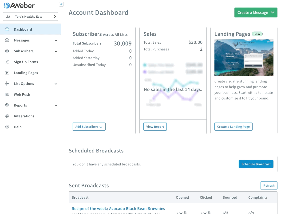
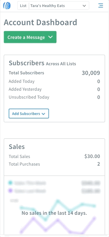
We’ve updated the navigation menus in AWeber. Plus, the majority of AWeber is now fully mobile responsive so you have a great experience whether you use a computer, tablet or mobile phone.
Why did we set up a new menu navigation?
You have a busy business to run, and marketing your business is just one small part of your day.
We’ve made these changes to give you an even better marketing experience with AWeber, so you can get back to focusing on your business.
Some of our customers have used this new menu across different devices and browser types and have had great things to say.
“I like that it sticks to the side, I can switch to something else without having to scroll a lot.”
Adrienne H., AWeber Customer
“Very user friendly for sure, it makes it easier to learn a new platform.”
Amanda G., AWeber Customer
“Even if this saves me just a tiny bit of time, that allows me to spend time somewhere else.”
Ramona R., AWeber Customer
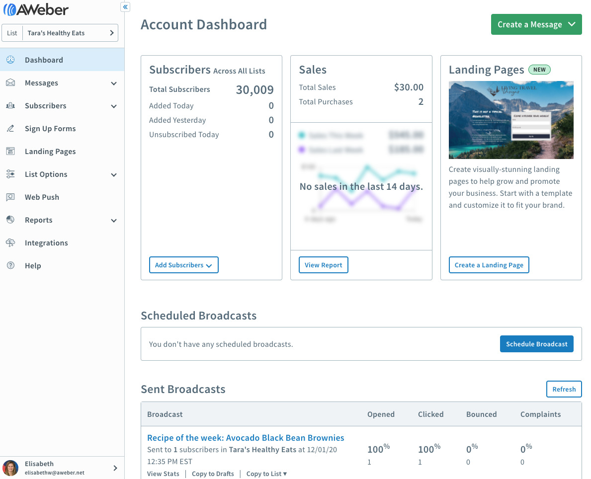
The new menu navigation is faster and easier to use
Zip around your account in no time with the new menu navigation. You’ll find it’s even easier to send emails, create new landing pages, check out your open rates and view your list growth in a few clicks of a button.
- Faster navigation — no matter what you’re working on. The menu is now a constant companion that is always visible as you scroll up and down, making it easy to move around AWeber. It also makes it easier for you to discover and explore new features to help your business grow.
- Always know where you are. Simple visual indicators of the page you are on help you learn and navigate AWeber like a pro.
- Take advantage of your full browser screen. There are now two different views of the menu, so you can customize the experience to your preference. If you want to have full menu labels visible at all times, you can keep the menu expanded. If you want to remove distractions and use more of your screen, you can collapse the menu. You’ll still be able to see all your menu labels just by hovering over them.
It’s easier to navigate AWeber on any mobile device
Work anywhere you go, on any device. The new menu navigation makes it even easier to work on your landing pages and email marketing from a phone, tablet, desktop or laptop.
- Pages fit on any screen. Building a business doesn’t always happen at a desk using a computer, so pages will resize to fit on your phone, tablet, laptop or desktop. When you have a big screen, more information will be displayed at once. On smaller screens, non-essential information will be hidden.
- Simple mobile navigation menu. On smaller screens, move around easily without having the menu in the way. The menu expands when you need it and is tucked away when you don’t.
Give the new menu navigation a whirl
Try out the new menu. The new menu navigation is available for everyone on June 1, 2021.
We made these changes based on feedback from AWeber customers. We are always interested in hearing how we can help you find more success with AWeber.
