87% off ends soon!
 How to create a single-page website that leads to a conversion
By Phil Norris February 29, 2024
When you think of a website, you probably imagine a homepage with a menu linking to various categories and sub-pages.
But not every business or creator needs a classic multi-page website. For many, a long-scrolling, single-page website could be the perfect solution.
Which approach is right for you? And if you decide to create a one-page website, what crucial elements do you need to include?
Read on to answer those questions (and more)…
What is a one-page website?
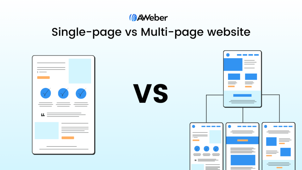
A one-page website is exactly what it sounds like: a site containing a single HTML page, with no links to additional pages (like a blog, contact page, or About Us page).
These clutter-free, easy-to-navigate websites are designed to provide just the right amount of detail to persuade visitors to take some sort of action, such as:
- Buying a physical or digital product
- Completing a contact form to receive a price quote
- Signing up for an online event or course
That makes them a great fit for businesses and creators promoting one type of product or action — like a photographer with a portfolio website showcasing their best work, or an online course creator selling a single course.
Because they only comprise a single page, many one-page websites don’t bother with a navigation menu like you’d find on a classic site.
However, it’s still possible to add navigational elements to a single-page website. It’s just that when the visitor clicks a link or menu button, they’ll instantly be transported to the relevant destination on the page, rather than being sent to a totally different page.
When to consider a one-page website
Let’s consider the main reasons why you might choose a one-page website template over a classic website.
👍 One-page websites could work for you if:
- Your content fits naturally onto a single page
- You want to showcase your professional skills through an online portfolio
- You want website visitors to complete a specific action (like buying a single product or service, or completing a contact form)
- You don’t have the time or budget to build a full, multi-page website
- Your product or service is simple enough to explain in one page of content
On the flip side, there are some scenarios in which a single-page website almost certainly isn’t the right fit for you.
👎 One-page websites probably won’t work for you if:
- You want to publish blog content to bring people to your website
- You’re planning to invest heavily in search engine optimization (more on this later)
- You sell a wide range of products and services across multiple categories
- You want to build dedicated web pages for different customer types
- Your product or service is too complex to explain on a single page
- You want a scalable website that you can easily expand when you enter new markets, target new customers, or launch new products
Benefits of a single-page website
By this stage, it should be clear whether or not a single-page website is a viable solution for your business. Now, let’s consider some of the key advantages these stripped-back sites offer over classic, multi-page sites:
Easy to navigate
Sick of aimlessly clicking around websites to find what you’re looking for? So is everyone else.
Confusing navigation is a big issue for many websites, making it tough for visitors to track down relevant information. If they can’t find that information, they’ll almost certainly bounce — and they probably won’t come back.
This isn’t such a problem for single-page websites, where everything is laid out on one page. No more grappling with confusing navigation menus; you just need to scroll down to find out more.
It’s the simplest possible user experience.
Clear user journey
One-page websites are typically built around one action — like persuading visitors to buy a single product or sign up for a specific online course.
That makes for a simple, clean user journey where you reveal more information as potential customers scroll further down the page. It often looks something like this:
- Top of page: Briefly explain your offer and who it’s for.
- Middle of page: Introduce further features and benefits.
- Further down page: Demonstrate social proof through testimonials and customer reviews.
- Bottom of page: Persuade the user to take action through a “Buy Now” button or a lead capture form.
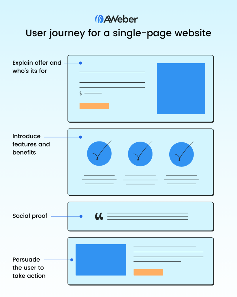
It all feels very natural.
Mobile-friendly experience
Since late 2019, mobile users have accounted for at least 50% of total global website traffic.
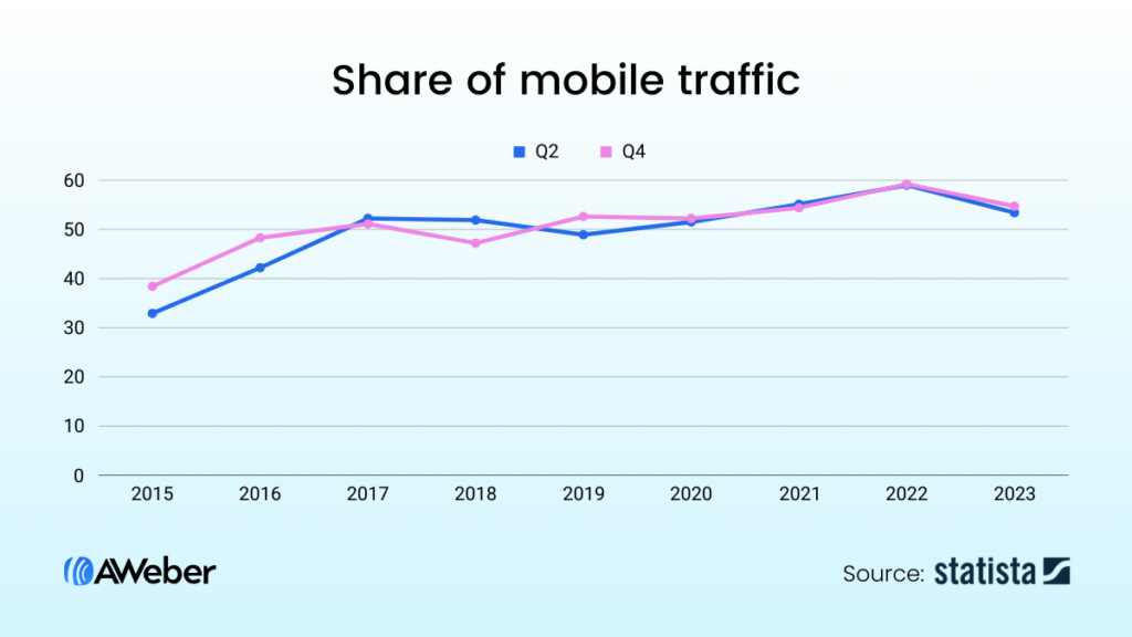
That’s a big tick in the box of one-page websites.
Why? Because mobile browsing is built for scrolling — and that’s exactly what you get with a single-page site.
With no complex menus to navigate or links to click, they’re often easier to get around on mobile than their multi-page equivalents.
Higher conversions
Classic websites are built around a wide range of different goals and actions.
For instance, consider a typical e-commerce store. At any given time, it might want visitors to…
- Learn about the organization’s commitment to sustainability
- Apply for vacant jobs at the company
- Sign up for the brand’s newsletter
- Follow the brand’s various social media channels
- Read their latest blog post
…and that’s without even mentioning the store’s main, overarching purpose of driving sales.
By contrast, single-page websites tend to be laser-focused on driving a specific action, which can help them generate more (and more valuable) conversions.
Perfect for Storytelling
An astonishing 94% of consumers agree that high-quality content “tells a good story”.
Again, single-page websites thrive here. They have a clear start, middle, and end (AKA the top, middle, and bottom of the page), which makes it comparatively easy to weave a compelling narrative.
It’s far harder to achieve the same thing across a classic website with hundreds, or even thousands, of pages and practically infinite possible user journeys.
Drawbacks of single-page websites
Of course, a one-page website isn’t a silver bullet guaranteed to work for every business type. There are some significant drawbacks to the single-page approach, including:
Limited SEO potential
Search engine optimization (SEO) strategies rely heavily on identifying high-value keywords, then targeting them through individual category, service, and product pages and blog posts.
With a single-page website, you’ve only got — guess what? — one page to play with, giving you far fewer opportunities for effective keyword targeting.
Also, you can’t take advantage of one of the most effective SEO tactics: internal linking.
Internal linking is about improving the search performance of your most important pages by linking to them from lots of other pages.
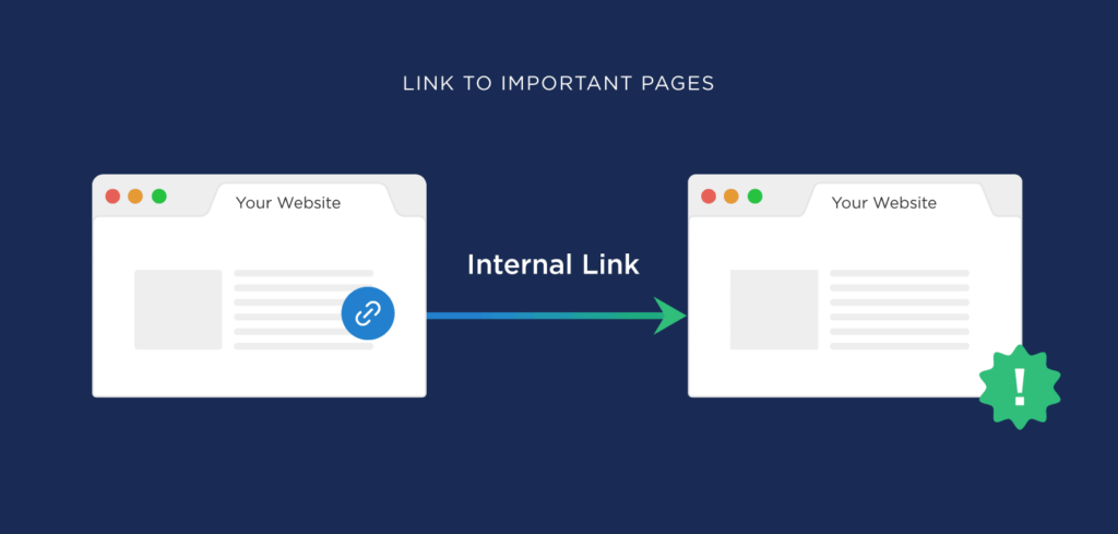
Clearly, if your website only comprises a single page, there’s no scope for internal linking.
Lack of flexibility
Another major drawback of single-page websites: they give you minimal scope for entering new markets or targeting new customers.
Why? Because they’re designed to promote a single action for a certain type of customer. Once you branch out to different actions and customers, they can become unworkable, fast.
Of course, if you’ve got no plans to step outside of your current niche, this isn’t a problem.
But it’s impossible to say what your business will look like in 12 months or five years, and you might not want to feel like your website’s holding you back.
Intimidating layout
Because you’ve got to incorporate all your valuable content in a single place, one-page websites often look pretty… long.
This can be a little intimidating to first-time visitors, who are immediately presented with a seemingly never-ending column of text and visual elements.
If they’re looking for a specific piece of information about your product or service, they might not want to scroll down through several screens of content to find it.
6 essential elements of a one-page website
Convinced that a single-page website is right for you? Here are six key elements to inform your design:
A clear goal
The first step when creating any website or landing page is to define a clear objective.
Are you selling a product or service? Showcasing your experience in a specific field? Promoting an online course or event?
Setting a goal helps to guide the design and content creation processes.
Logical, linear structure
If visitors have to constantly scroll up and down the page to find all the information they need to make a buying decision, you haven’t built an effective one-page website.
Plan your structure to ensure would-be customers are sufficiently clued-up by the time they reach the bottom of the page.
Prominent CTA
Think of a call to action (CTA) as a signpost on your website that tells visitors what to do next, like buying a product or signing up for an online course.
Add CTAs in prominent locations throughout your single-page website, like this example from instant coffee brand st33p:
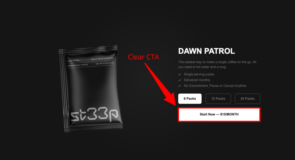
Failing to include clear CTAs can leave visitors confused, which will likely harm your conversion rate.
Product/service description
Without wishing to state the obvious, it’s hard to sell a product or service without an adequate description. Think of this section as the “pitch” for your product or service: why should people buy it?
Focus on benefits rather than features. For example, check out all the benefits in these copy samples from sleep technology company Somvai:
- “Somvai uses radar sensing to gently wake you up at the perfect point in time to make you feel most energized”
- “You can tell Somvai when you need to be up by, and it will give you the best possible nap within that time”
- “Somvai will rhythmically pulse its lights for you to follow with your breathing, helping you fall asleep faster”
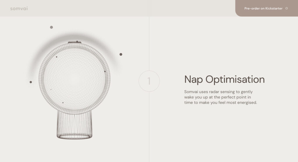
That makes for a far more attractive “sell” than simply explaining that the product has flashing lights and a built-in countdown timer.
Social proof
Visitors to your site don’t want to hear you endlessly discussing the brilliance of your product or service — they want to know what real customers think.
Indeed, 98% of shoppers say reviews are an “essential resource” when making purchase decisions.
As well as reading customer reviews and testimonials, consumers want to hear from authority figures like:
- High-profile publishers
- Influencers and thought leaders
- Accreditation bodies (like the Better Business Bureau)
All that stuff is known as “social proof”, and it plays a key role in persuading potential customers that your business is legit.
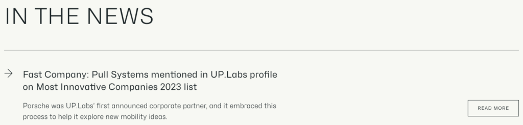
There are lots of ways to display social proof beyond the obligatory Trustpilot or G2 logo.
For instance, Pull Systems incorporates the logos of its high-profile industry partners…

…and also shares news stories from big-name publishers like Bloomberg and Fast Company:
Contact information
Last but not least, don’t forget to include your contact details.
To be clear, that doesn’t just mean linking to your social media profiles. Sure, you can do that too — but first and foremost, you need to give people a direct line to your support team, like an email address, phone number, or contact form.
If you don’t, there’s a real risk that would-be customers will simply look elsewhere, with three-fifths of consumers saying it’s “critical” for businesses to add contact information to their websites.
5 one-page website examples to inspire you
Keen to build your first one-pager, but not sure where to start? Check out five of our favorite single-page website examples:
KNOB
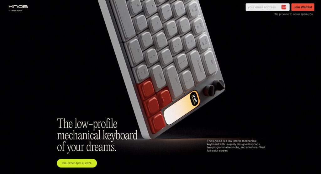
- Niche: Consumer tech
Get over the terrible name, because KNOB gives us a superb example of how to build a single-page website to promote a product launch.
This site builds anticipation by highlighting the product’s eye-catching design through attractive imagery. And it incorporates a simple, striking CTA urging visitors to sign up for the brand’s newsletter to join the “waitlist” ahead of the launch date.
That way, the brand can keep in touch with prospective customers.
Concept Capers
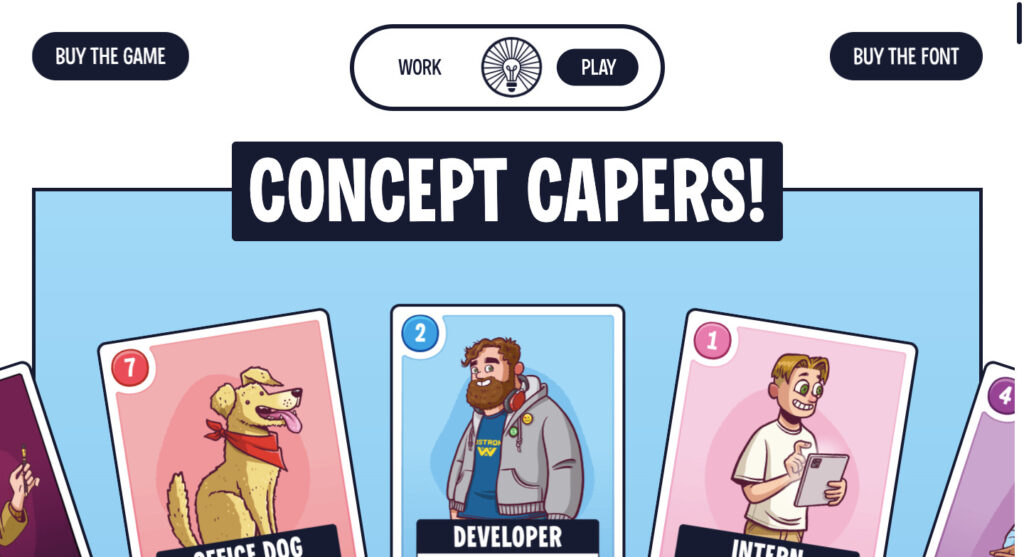
- Niche: Physical games
Think one-page websites have to be simple? Think again, because this one-pager for the creative card game Concept Capers is both beautiful and highly sophisticated.
Practically every element of the page is interactive, from the example playing cards at the top of the page to the draggable blocks in the footer. It’s honestly a pleasure clicking around to see what happens next, which means you actually enjoy learning about the product.
Importantly, this site also gets the basics right by incorporating multiple prominent CTAs throughout the page.
KreativePro

- Niche: Online courses
Selling online courses is all about building trust with your audience by demonstrating your skills and credentials.
KreativePro clearly understands this. Its one-page website is crammed full of social proof, including awards and accreditations, customer testimonials, and the brand’s Trustpilot review score.
The site also effectively pitches KreativePro’s courses through subheadings discussing:
- The “problem” of other creative design courses
- The “solution” that KreativePro provides
- Who would benefit from KreativePro’s courses
This makes it easy for would-be customers to figure out whether KreativePro is right for them.
Moritz Petersen
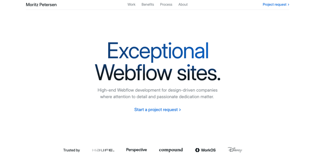
- Niche: Web development
Moritz Petersen is a web developer who’s built a portfolio-style single-page website to showcase his best work.
Attention to detail is clearly a big deal for Moritz: he mentions it in the above-the-fold introductory copy, but it’s also evident through the design of his one-page site — from the stylish scrolling testimonial banner to the interactive cards in the portfolio section.
Importantly, the aesthetics never interrupt the site’s functionality. Whichever section you’re reading, the “Project request” CTA is always visible at the top-right of the screen.
Arts District Kitchen
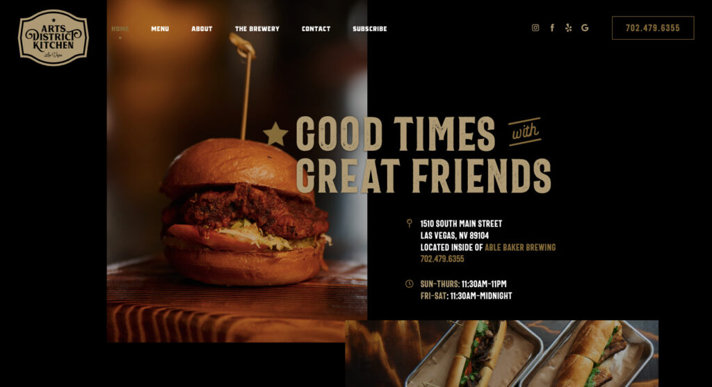
- Niche: Hospitality
At first glance, Arts District Kitchen’s website looks like a classic, multi-page site thanks to the top-of-the-page navigation menu.
In reality, it’s a skillfully designed single-page website that contains everything a potential restaurant visitor needs to know: location, opening hours, the menu, and even a little back-story about how the business started.
We also love how Arts District Kitchen gives would-be customers multiple ways to get in touch by including its social handles, phone number, and a built-in contact form.
Build your single-page website with AWeber
Looking for a one-page website builder? AWeber’s landing page builder is the perfect solution, allowing you to:
- Get started fast by choosing from 100+ mobile-responsive landing page templates
- Grow your marketing list through on-site lead capture forms
- Monetize your single-page site with checkout functionality for one-off or recurring payments
- Measure and optimize your performance by integrating Google Analytics and Meta’s tracking pixel
- Connect or buy a custom domain to establish trust and build your brand
- Design beautiful images using our built-in Canva integration
Ready to build your first single-page website?
Sign up for your free AWeber account today!