How to Brand Your Business in 6 Steps
By Nicole Mascola April 2, 2019
What company immediately pops into your mind when you see this image?

Coca-Cola. And that’s thanks to great branding. Even if Coca-Cola doesn’t show their logo in an advertisement, you still know it’s them. And you associate certain feelings and emotions with their branding.
When you successfully brand your own company, you build trust with your audience, become recognizable, and stand out. And since billions of emails hit the inbox every day, your email marketing needs to stand out.
Howard Schultz, the former CEO of Starbucks, says, “Great companies that build an enduring brand have an emotional relationship with customers that has no barrier. And that emotional relationship is on the most important characteristic, which is trust. “
Here’s how to brand your business and email marketing.
What is branding?
Your brand is your business’ personality. You define your branding by how you design or talk about parts of your business, like your:
- product
- audience
- logo
- colors
- messaging
- perception
Great branding is consistent. Every time your audience hears, sees, or buys from you, they should recognize your brand.
Step 1: Create your mission statement.
Your mission statement tells the world what your business does and why it’s important. It will give you more insight about what type of customers you want to attract and will set the tone for how you speak to them.
To create a mission statement, think about how your product or service can positively transform your audience’s life. How do you want your audience to feel or what problems will you solve for them? Your statement should include aspirational language that speaks to your overall goal.

Sweetgreen states their mission clearly. They talk about what they strive to do for their customers (connecting people to real food) and why they want to do so (to inspire healthier communities).
Step 2: Research what other brands do.
Research companies you admire or aspire to be like. Identify what draws you toward their design, product, or voice and write down your observations.
You might jot down:
- the fonts they use
- their color palette
- what types of photos they use
- how they describe themselves on their about page
Step 3: Identify what makes you unique.
You’re most likely not the only company in your space. So it’s pivotal to communicate this to your audience. To find out what makes you unique, ask yourself:
- How are you different from everyone else?
- Do you serve a niche audience?
- Do you help your local community?
- Do you have great customer service?
- Are you the first in your space?
- Why should your audience look to you and not other brands?
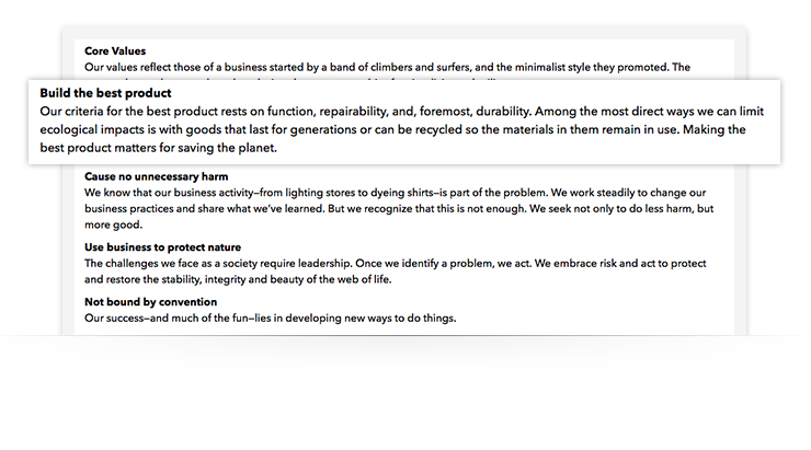
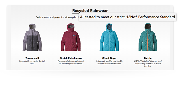
Patagonia sets themselves apart from other clothing brands by talking about their superior standards. One of their core values is “Build the best product.” And their jackets meet their strict “H2No(R) Performance Standard.” Their high standards set them apart from other retailers and show how much they care about the consumer and their product
Related: How to Pinpoint Your ‘Hook.’ Find Your Unique Selling Proposition in 6 Simple Steps
Step 4: Be consistent with typography.
Although it may seem unimportant, typography — or a specific set of fonts — is essential to a stand-out brand. Typography helps your customers identify your company at a glance, and it says a lot about who you are.
For example, Sweetgreen uses simple, rounded letters, which convey friendliness and openness, as opposed to a sharper font with harsher, straighter lines. The simple, rounded font works well with their mission statement: “To inspire healthier communities by connecting people to real food.”
When choosing a typeface, select fonts which are easy to read at any size and with long or short paragraphs and sentences.
Only select 1 to 3 total fonts to use across your brand, and choose a primary font that you’ll use 85% to 90% of the time.

For example, Nike does a great job of consistently using one font on their homepage. To highlight the most important text, Nike displays headlines in bold, large, capitalized letters. They display sub-headlines, which are less important, in unbolded, smaller, sentence-case type. This is called design hierarchy, and it helps you find the most important text on a page at a glance.
Be sure to define font styles for the following things:
- Body copy (text that is standard on all paragraphs)
- This text should be easy to read at a smaller size.
- Headline copy (text that describes what you are about to read in the paragraph below)
- This font size should be larger and most likely bolder so that it stands out.
- Button or links
- Don’t think too hard about this one. Your buttons should be simple. They should be either text over top of a color box or underlined text of a certain color to indicate that you should click. Setting a standard for these will help create consistency throughout all of your web marketing materials.
Pro tip: Not sure how to choose your fonts? If you already have a website and logo, you should have a dominant font already. Reuse it on all your marketing materials. If you don’t have either, read this article from Canva to learn how to choose the right fonts.
Step 5: Choose colors for your brand.
Color theory is the science behind color and how it can affect your audience’s choices. Your colors should look good and express your brand’s personality.
If you’re new to branding and color theory, I suggest reading this article by 99 designs to get more insight on how to choose colors that express the right feelings
If you already have brand colors, don’t reinvent the wheel. Use the colors you’ve already chosen.
You should start by examining your logo. What colors are in it and what colors will complement it?
Related: How to Choose Colors That Work Together
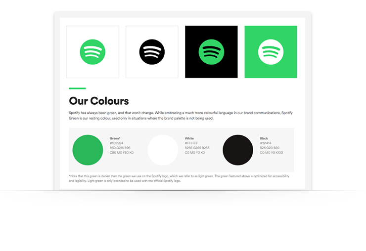
Spotify’s colors are limited, but also iconic. When you see this specific green combined with black or white you can easily identify the Spotify brand
You can also use the colors from other marketing content to guide your color choices, like your:
- emails
- website
- landing pages
- mailers
- product packaging
For example, if you are using black or gray for all text on your website, use the sames colors in your email text.
How to easily identify colors
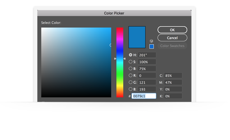
For web content, you can identify colors by their hexadecimal color (or hex code), which will contain a hashtag followed by a combination of letters and/or numbers.
Pro tip: To identify a color’s hex code, you can use this HTML Color Picker tool.
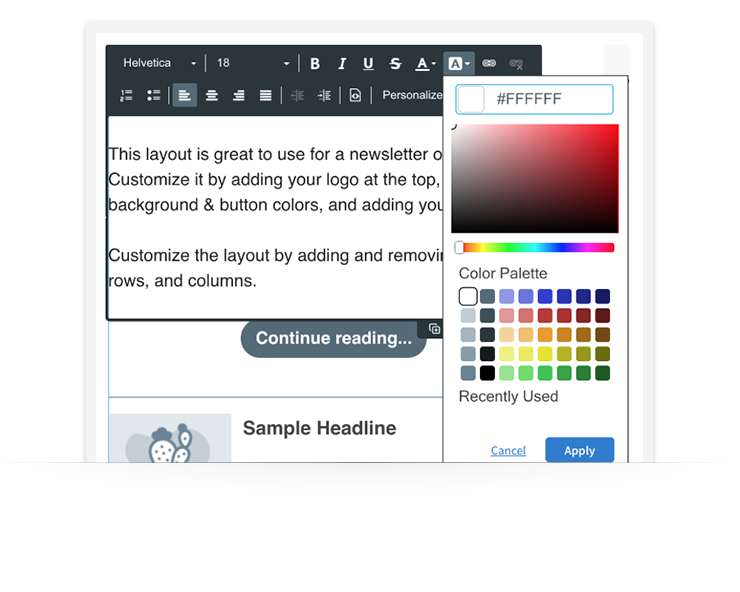
In AWeber and many software platforms, you can enter your custom hex code to display your exact brand colors. Below, the hex code #FFFFFF is used to display white text.
For print, you can define a color by its CMYK, or Cyan, Magenta, Yellow, and Black, values.
Be sure to define colors for the following things:
- Body copy
- This should be a shade of black or dark gray so that it is easy to read on most color backgrounds.
- Headline Copy
- Background colors
- I suggest using white in most cases so that your pages, emails, or printed items are easy to read. If you need to add color, neutrals like light gray or tan are typical as well.
- Button or link color
- This should always stand out from the rest of the palate to attract the viewer to take an action.
This article by OptinMonster gives you some insight on what the best colors are for “calls to action” or buttons
Step 6: Choose a photography style.
Take cues from some of the inspirational brands you identified in step 2. What kind of photos do they use? Analyze how their photos appear using the follow criteria:
- Lighting
- Are they outside or inside?
- Composition
- Are the photos overhead or looking straight on?
- Are they centered or off center?
- Is there motion or are they still?
- Is it close up and abstract or far away and full picture?
- Subject matter
- Do the images consist of people or still life?
- Coloring
- Are the photos black and white?
- Is there some sort of filter or consistent coloring that make them all feel the same?
Pro tip: Don’t have a photographer or nice camera? Here’s How to Create Amazing Photos on Zero Budget
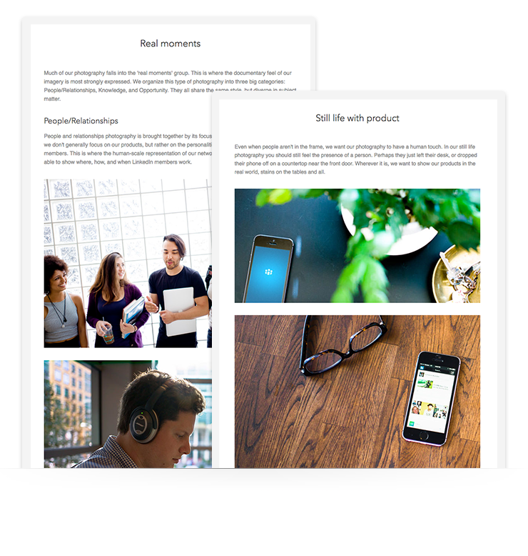
LinkedIn does a great job of using a consistent photography style. Within the LinkedIn style guide, they speak to how they represent different parts of their marketing.
When they show photography of their app, they use images of a phone laying flat among everyday objects that “represent human touch,” (a.k.a. It should look like a person left the objects there.).
When they show people working and collaborating, they use images of people in candid moments.
Document your decisions.
Now, write down everything you learned and guidelines for how you portray your brand. The best way you can start to implement these ideas is keeping a document that states all of your findings so that you can always reference it when you go to create something new.
 87% off ends soon!
