87% off ends soon!
 Taking Email Template Design to the Next Level
By Kim Robbins July 27, 2017
Somewhere along the way, creating and sending emails turned into a repetitive cycle of adding content, dropping in an image and sending.
But over the last few years, we’ve seen new trends in email design that pushes the limits of what’s possible and creates a more delightful experience for subscribers.
Interactive emails, emojis, gifs, video and behavioral content are only some of the awesome design elements senders are trying. After all, email is an essential way for brands to communicate with their audiences, so why not make it fun?
As someone who works at an email marketing technology company, I can safely say that we really do talk about emails a lot. Like every single day.
We’re often on the search for cool emails, too, because we gain inspiration from them and love to see what entrepreneurs like you are doing to engage subscribers.
As AWeber’s Email Designer, I spend an extra amount of time thinking about emails and how to make it even easier for our customers to send ones they love.
That’s why every month I add a new template or two to our Email Template Gallery (located in the Drag and Drop Editor). And there are some that were recently released that I wanted to share with you because I think they really provide some cool features and flexibility that customers are looking for when designing emails for their audience.
Taking our email templates to the next level
In order to make our templates really cool, I push myself to include at least one progressive enhancement in each new design.
If you’re not familiar with the phrase, don’t worry (not many are outside of the design community!). Progressive enhancement is a fancy way of saying there’s more technically advanced elements being utilized that will work in certain email clients, apps and browsers. Those same elements may not work in less advanced clients, apps and browsers, but they will fall back gracefully in a way that doesn’t degrade the overall experience.
These elements in email allow me to do some really cool things with our email templates, so our customers can easily replicate what they’d normally only see on the web, within an app or in a custom-built email.
Here’s a snapshot of some of the progressive enhancements we’ve included in our templates.
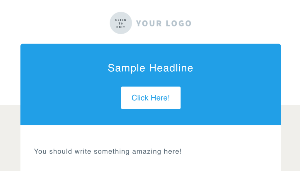
Rounded corners
Rounded corners, or border radius, is a style that can be added to the corners of buttons, images or other elements. Most email clients will support this style, but some will display square corners.
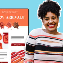
Many templates I create use border radius on buttons, but the Max template in particular uses border radius on images, content blocks and buttons.
Skewed buttons
The West template uses a transform style that makes the buttons appear to be skewed or slanted. In email clients where the transform style is not supported, the buttons will appear as a rectangle with right angles.

Hover effects
Hovers can be a way to add delight to a design. Hover effects won’t work on mobile devices or in some email clients, so I made sure the button is well-designed, even without the effect. The buttons in the Gibson template lessen the opacity slightly when you hover over them, making them appear a bit lighter.
Box shadows
Box shadows, like the one used in the Drop template, can be used to add depth and dimension. I also made sure it works well with and without the box shadow – if the style is not supported by an email client, it’ll fall back to a “flat” design instead.
Background images
Background images can be placed behind text or other elements in an email. It’s important to consider how an email will appear without the background images, though, since they will not appear in every email client.
The Two-Tone template, designed by our Creative Director, Chris Vasquez, uses a background image at the top of the email, which allows us to achieve the offset look below.
Gradients
The Wane template uses a linear gradient and opacity to achieve the look you see in the full-width section of the template. Similar to box shadows, this style will fall back to a solid color where it’s not supported by an email client.
The gradient in the Wane template goes from opaque to transparent, and will allow for a color to show through the transparent areas.
Duo-toned images
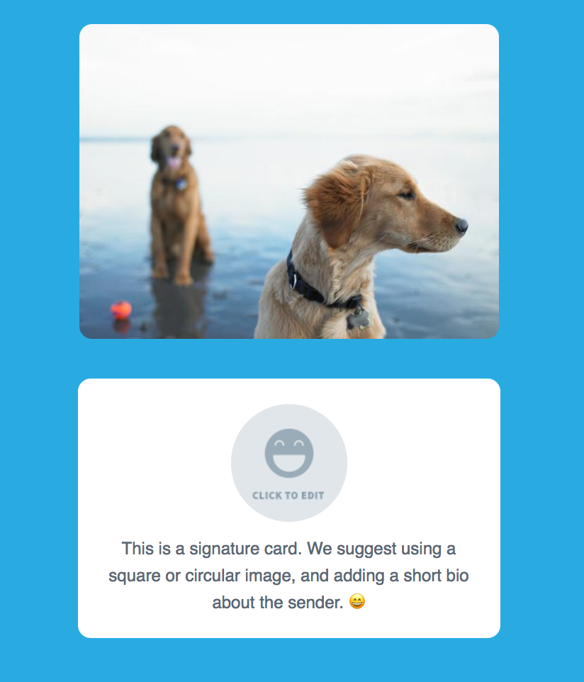
The West template was inspired by our new style guidelines for our What to Write in Your Emails course . This includes a treatment where images have a two-toned look.
Even though I created this effect for our course emails, I didn’t want to leave our customers unable to recreate these types of images. So, Chris and I built a tool to help our customers achieve this look in just a few simple steps.
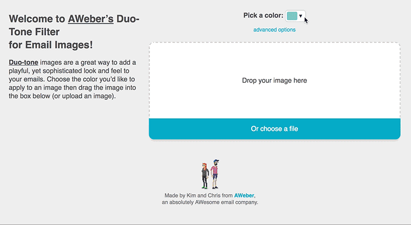
Click here to create your own two-toned images!
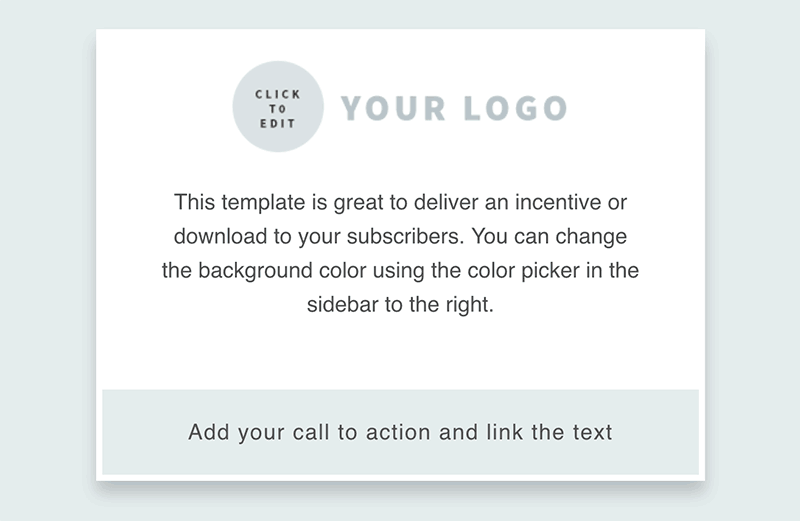
Background colors
Our background color picker allows people to send more unique looking emails, while still matching their brand. I also experimented with creative ways to use the color picker, this way it appears to do more than just the background color.
The West template uses a transparent image with a background color behind it. When a background color is selected, it appears that the divider is changing colors.
When selecting a background color, it’s important to make sure there is contrast between the background color and the text. This is why we created a dark and light version of our templates. The dark versions use a lighter text color on the background colors, while the light version uses a darker color text on the background colors.
Common layouts and patterns
From newsletters to courses to nurture campaigns, we send a lot of emails at AWeber! So we decided to turn them into tried-and-tested templates our customers can use.
Baking familiar patterns into our template gallery makes it a lot easier to drag and drop your content right into a template, without having to decide on the proper layout or pattern.
With all of these cool new features, customers now have more options when designing their emails. If you’re not well-versed in HTML, these templates make it a lot easier to create and send beautiful emails.
Now that you have the templates and tools you need to craft emails that look great, there are some email design principles I’d also recommend, based on the type of email you plan on sending:
Newsletters
If you’re creating a newsletter, whitespace and line height is your friend.
Newsletters can contain a lot of information, so it’s your job to make it easy to scan. Whitespace gives your content and images some room to breath, which will make it easier for subscribers to scan through your content. Although it’d be great if subscribers read every word from top to bottom, many people will just scan your email.
Also keep line height in mind. Line height is the space between your lines of text. Too little or too much line height can make your content difficult to read.
Best AWeber templates for Newsletters: Tranquil, Flat White
Digests
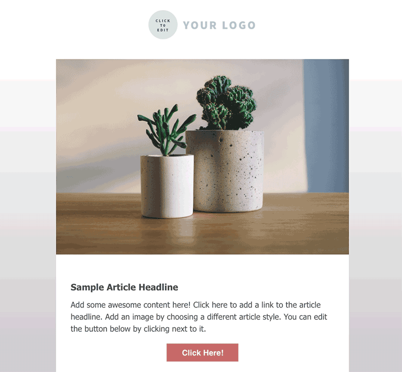
When creating a digest of content (such as your most recently published blog posts), break out your content into individual cards.
Cards will help you organize your content in a way that is scannable and easy to digest.
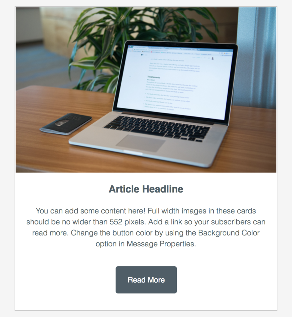
Each card will relate to the same concept, and can contain multiple elements, like a headline, descriptive text and button. For example, if you create a monthly digest of your blog posts, each blog post you feature will get its own card.
Cards are used across a variety of digital platforms, like apps, web pages and email, so your subscribers should be familiar with this pattern.
Best AWeber templates for Digests: Digest, Gibson, Max
Letters
Whether you send a long or short letter-style email, the design should be simple and allow for your brand to be recognizable. Adding your brand logo to the header of your email, for example, will make it easy for subscribers to recognize you.
Letters should also take line height into consideration. While letters are literally a block of text, it shouldn’t feel like that.
Make sure the text is easy to read and avoids eye strain. Here are some things to keep in mind:
-
- Consider the size of the text (Is it too small or too large? How will it appear on different devices?)
- Try dark grey text on a white background, rather than pure black text on a white background
- Avoid using bright colors for backgrounds or text colors, or layering colors on top of colors
Best AWeber templates for Letters: Drop, Tidal, Pure
Build the email of your dreams
Now that you have the tools and tips to design an email your subscribers will love, what’s stopping you?
Now’s the time to go check out the templates in your AWeber account and play around with them until you find one that works for you. Not an AWeber customer? Sign up for AWeber free today.