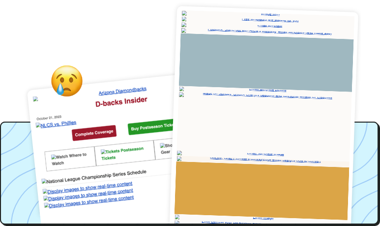
Are image-only emails good for reader experience or problematic?
By Chelsea Hurst August 22, 2024
I’m gonna take things way back. During my senior year of high school, I served as the entertainment editor for our school magazine. For my fellow Gilmore Girls fans out there, I felt like Rory writing and editing for her school’s newspaper, The Franklin (minus the uniforms and a character like Paris out to make my life miserable).
Unfortunately, in my very first issue, I learned an incredibly important lesson the super hard way. 🫠
I designed the entertainment page, which incorporated several images of movies and TV shows that we reviewed that month. I was so happy with how everything turned out—but that happiness turned into utter dismay when we received our copies from the printer. All of the images on the entertainment page were missing.
I rushed to check my InDesign file. Sure enough, I had neglected to embed the images before sending it to the printer. The page looked incomplete and unprofessional, with tiny image icons and alt text where so many awesome images should have been.
This experience is similar to what happens when images get turned off in emails. Just like how my entertainment page looked incomplete (and, IMO, silly) without its images, your marketing emails can look odd if images don’t load, especially if your email is image heavy, or worse, image only.

🫣 The Problems with Image-Heavy Emails
Loading Issues: Image-heavy emails can take longer to load, especially on mobile devices or slower internet connections, leading to frustrated recipients who may abandon your email before it fully loads.
Accessibility: Many email clients block images by default, which means your message might not be conveyed as intended. Without proper alt text, your recipients might miss out on key information.
Deliverability: Emails that contain a high ratio of images to text are often flagged by spam filters, reducing your chances of reaching the inbox.
🖼️ Best Practices for Using Images in Emails
Balance Content: Ensure a good mix of images and text. This not only makes your email more readable, it also improves deliverability.
Use Alt Text: Always add descriptive alt text to your images. This ensures that your message gets across even if the images don’t load.
Optimize Image Size: Compress your images to reduce loading times without sacrificing quality. This enhances the user experience and keeps your audience engaged. A good rule of thumb is to keep your images under 200KB. In AWeber, we help optimize your images to ensure they will display properly in most mail clients!
Why AWeber’s Templates are the Perfect Solution
We understand the importance of balancing visual appeal with functionality. Our email templates are designed to provide a harmonious mix of images and text, ensuring your emails are not only beautiful but also effective and accessible.
With our templates, you can:
Easily Customize: Personalize your emails to reflect your brand while maintaining a professional look.
Ensure Compatibility: Our templates are mobile-responsive and optimized for all devices and email clients.
Enhance Engagement: By following best practices embedded in our designs, you can improve your email performance and engagement rates.
Experiment with our templates and see how a balanced approach can enhance your email marketing efforts today!
 87% off ends soon!
