18 Email marketing ideas to boost opens, clicks and sales
By Phil Norris November 28, 2023
You know email marketing is a super effective way to nurture leads, turn them into paying customers, and retain existing customers.
But achieving your goals requires sending emails consistently and frequently — likely at least once per week. And coming up with that many email marketing campaign ideas is tough.
Maybe you’ve hit a creative dead-end. Maybe your previous activity hasn’t delivered the desired results. Maybe you’re new to email and just don’t know where to start.
Either way, you’re experiencing a major case of writer’s (or emailer’s) block.
Don’t worry, because we’ve rounded up 18 email marketing ideas to inspire your next campaign, backed up with real-world examples and segmented across the following common goals:
- Generating more sales
- Increasing email open rates
- Getting more clicks
- Nurturing leads
- Increasing sign-ups
- Boosting customer retention
Relax, take a deep breath, and let’s get into it…
Goal: Generate more sales
Promote a sale
Before we start discussing how to promote your latest sale through email marketing, let’s make one thing clear:
Sales aren’t a silver bullet.
Run too many and you risk devaluing your brand. Also, consumers base their buying decisions on a range of factors, not just price. The biggest motivators are:
- Customer ratings and reviews (cited by 94% of respondents)
- Price of product (91%)
- Free shipping (78%)
- Brand preference (65%)
- Friend/family recommendations (60%)
So there are no guarantees a sale will even move the needle.
However, used effectively, sales can still be extremely impactful, with a high proportion of consumers across age groups saying they wait for discounts before buying online.
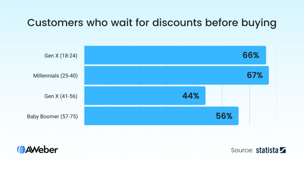
Now, let’s look at a real sales promotion email from interior decor brand Bougié, which effectively combined two of the top five buying factors we mentioned above by:
- Offering a discount on the product price
- Providing free shipping
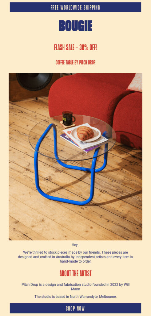
Of course, a lot of sales span multiple product categories (or even entire websites), rather than focusing on a single product like in Bougié’s example. If you’re planning such a specific promotion, your best bet is to target customers who’ve shown interest in a relevant product category.
In Bougié’s case, this could be people who:
- Browsed other coffee tables
- Browsed other Pitch Drop products
- Browsed or recently purchased other living room furniture
Send cart abandonment emails
An astonishing 70.19% of online shopping carts end up being abandoned. It’s a tragedy for ecommerce stores; just think of all that lost revenue.
But it’s not all bad news, because cart abandonment emails consistently see open rates of 43% or more.
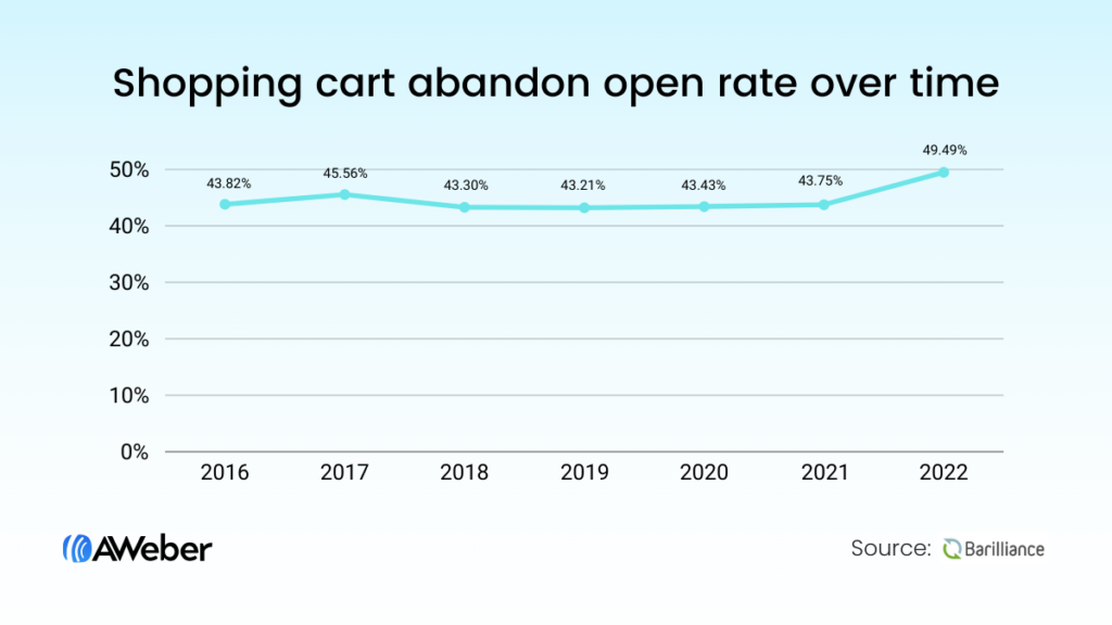
Not only that, but these emails convert at a rate of 18.64% — way higher than the average email conversion rate of around 8%.
The best abandoned cart emails contain the following elements:
- Order summary
- Product pricing
- Product imagery
- At least one CTA to complete the transaction
Let’s look at an example from menswear brand Huckberry:
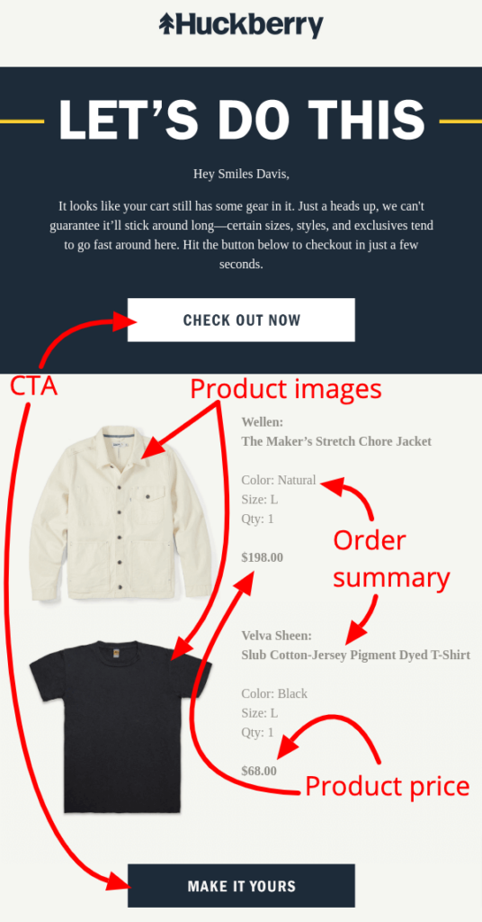
As well as getting the basics right, Huckberry goes a step further by promoting “more good stuff”, just in case the recipient isn’t interested in buying the products they abandoned:
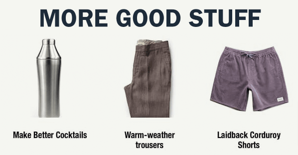
Use this tactic to recommend other products or categories the customer has previously browsed, or just to point them toward your top sellers.
Share social proof
Social proof is a massive source of buying inspiration. For instance, three-quarters of consumers “always” or “regularly” read reviews when browsing for businesses in their area.
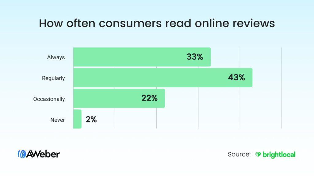
But social proof isn’t just about customer reviews. Other types include:
- Testimonials
- Industry awards
- Recommendations from influencers, thought leaders, or industry publications
- Customer success stories
- Accreditations
In our next example, furniture brand Keeps Home rounded up some of its most glowing press coverage from interior design and consumer review sites:
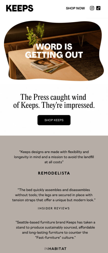
As you can see, this email also featured a prominent CTA. So if the email recipient is won over by all those impressive industry reviews, they can easily click through and shop the Keeps range.
Use scarcity and urgency
Want to motivate your audience to buy right now? Try adding scarcity or urgency (or both) to your messaging.
Scarcity and urgency are similar, but they’re not the same:
- Urgency is about limited time. For instance, you might tell customers they only have 24 hours to take advantage of a discount.
- Scarcity is about limited quantity. For example, you could say there are only 50 spaces available on your next course.
In our next example, Wix created a sense of urgency by making it clear the discount was a limited-time offer, as visualized by the countdown timer beneath the introductory copy:
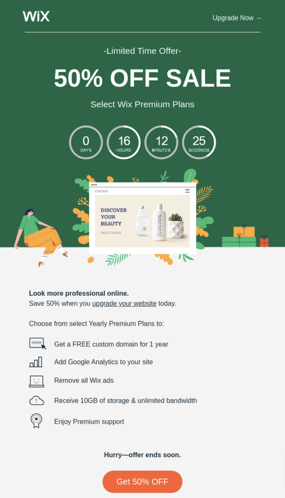
Wix could have made this email even more impactful by combining urgency and scarcity, such as limiting the 50% discount to the first 100 customers who signed up. That would have created a real rush to the checkout.
Goal: Increase email opens
Split-test email subject lines
Email subject lines are your #1 tool for boosting open rates, with almost half of email recipients opening emails based on the subject line alone.
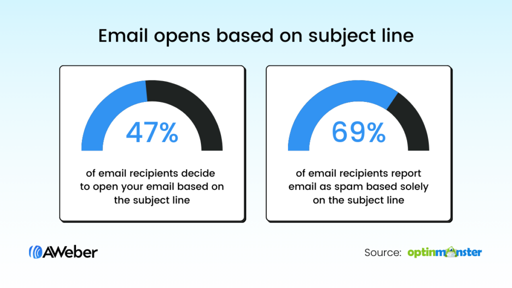
So if you’re trying to increase email opens, the subject line should be your first port of call. But while we can offer you dozens of inspirational email subject line examples, the only reliable way to figure out what works for you is to run a split-test.
That’s precisely what the folks at online marketing education company Authority Hacker did. Across 78 email outreach campaigns, they trialed three slightly different subject lines:
- Question?
- Quick question?
- Question for you?
Similar as those options sound, the three top-performing campaigns in terms of email open rates all had the same subject line:
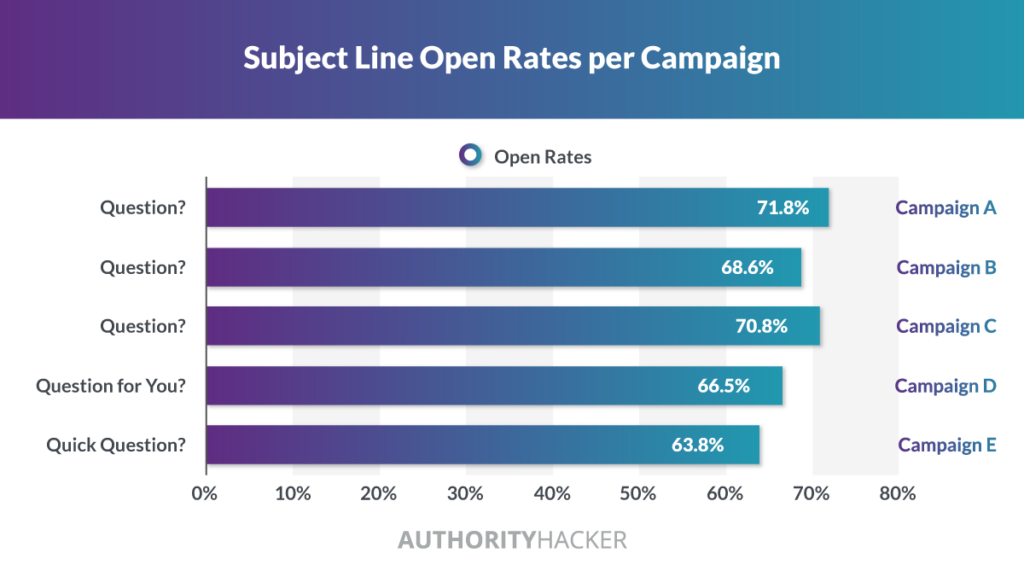
That’s right: between Campaign A and Campaign E, they managed to increase their open rate by 12.5%, just by removing the word “quick” for the subject line!
Before you start your own subject line split-test, remember not to change the other elements that affect email open rates (namely the email preheader and sender name — more on them later). That way, you can be sure any changes you see to the open rate are down to the subject line alone.
Use a complementary email preheader
The email preheader is a snippet of text that appears next to or underneath an email subject line, depending on your device and inbox provider. Confusingly, it’s also known as the Johnson Box or preview text. But whatever you call it, you can use it to increase your open rate by reinforcing or expanding on your subject line messaging.
For example, Sensi Graves Swim used the subject line to promote limited-availability products, then increased the feeling of scarcity with a preheader explaining there were “only one or two” left in stock:

Test different sender names
We’ve covered subject lines and preheaders, but there’s another — often-overlooked — element that can have a big impact on email open rates: the email sender name.
Should you use your brand name, like in this example…

…or choose a personal name plus your brand name to create a more human feel?

There’s plenty of evidence to suggest small changes to your sender name can yield massive impacts, with one organization reporting 50% higher open rates after adding a real person to its sender names.
But the simple answer is: you won’t know the right approach for your brand and audience until you test it yourself.
Pro tip: For best results, test subject lines, preheaders, and sender names to find the combination that delivers the highest open rates.
Goal: Get more clicks
Build emails around one CTA
When brainstorming email marketing ideas, you should identify one clear “goal” for each email you send. Use that goal to create a single CTA that prompts readers to take the desired action.
Add conflicting calls-to-action to an email and you risk leaving people confused — which means fewer clicks and conversions.
Adobe got it right in this email, which was solely geared toward driving downloads of a specific piece of content:
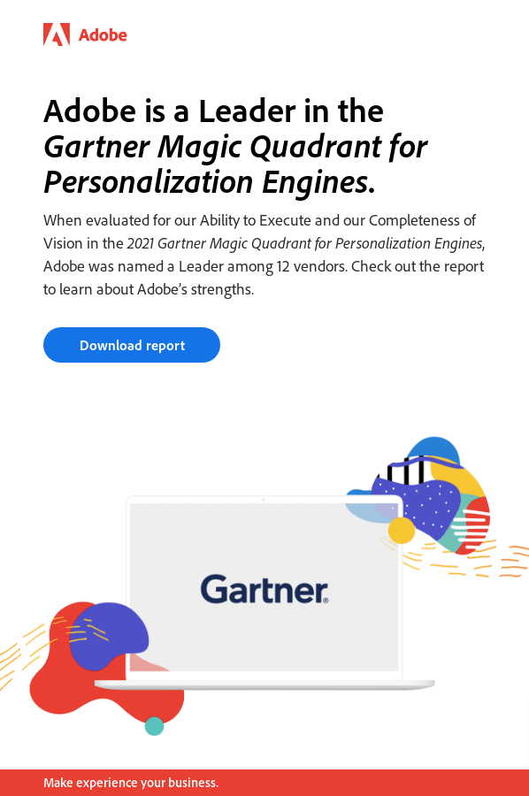
The lack of “noise” increases the chances of people clicking and downloading.
Use negative space in email design
Some emails make you feel like you’ve got a migraine.
I’m not talking about that out-of-the-blue message from your boss asking if you’ve got time for a “quick chat”.
Instead, I mean those marketing emails that are crammed with different GIFs, colors, fonts, images, emojis, and other visual bells and whistles.
When it comes to email design, less is more. Create more impactful emails by using negative space (also known as “white space”): empty areas in an email that help other design elements to stand out.
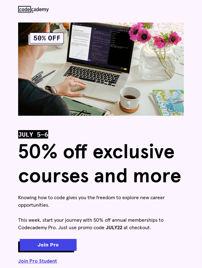
This example from Codecademy is an exercise in email design restraint, with the wealth of negative space naturally drawing your eye toward the offer and the CTA button:
Pro tip: Not sure where to start with email design? Don’t worry, because AWeber has a library of 600+ customizable email templates to inspire your next campaign.
Describe how your product will change the reader’s life
In a world that’s obsessed with audio and visual content, it’s easy to overlook the importance of email copywriting.
But the words in your emails play a key role in helping would-be customers picture what their lives would be like after buying your product or service. Which, in turn, makes them more likely to click through to learn more.
SectionSchool uses this tactic in our next example:
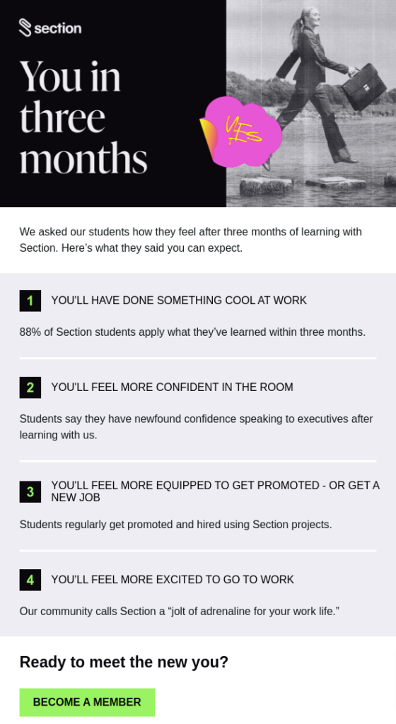
The email copy encourages readers to imagine themselves after three months of learning with Section and spells out the benefits they can expect. It’s exactly the sort of messaging that would resonate with someone interested in self-improvement.
Pro tip: As a general rule, your email copy should contain lots of “you” and “your”, and not so much “we” or “our”. Remember, it’s all about the customer, not you.
Goal: Nurture leads
Provide personalized product recommendations
Consumer expectations around personalization are increasing, with 73% of respondents to a 2022 survey expecting brands to understand their unique needs and expectations, up from 66% in 2020.
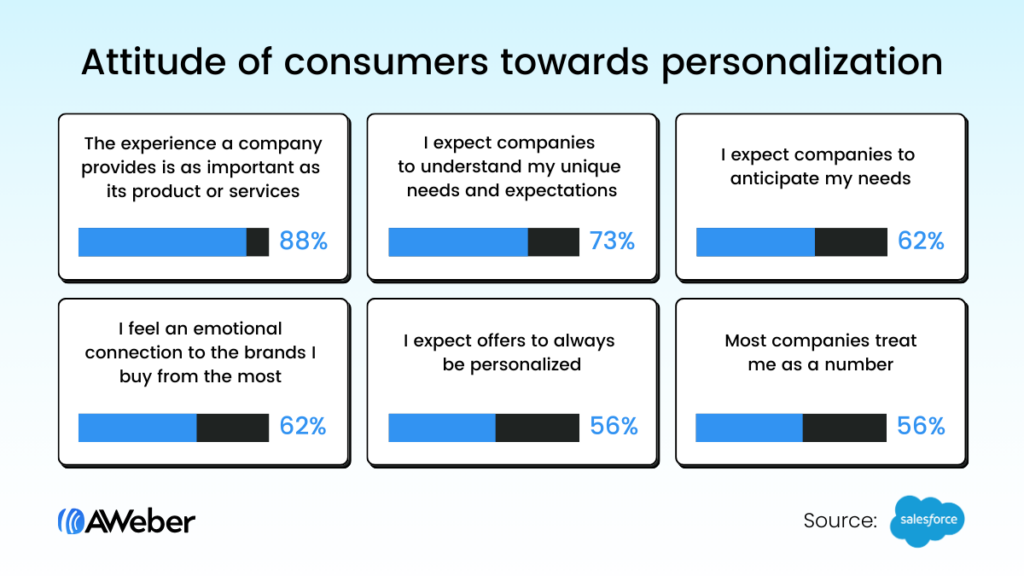
Which means one of the most effective email marketing ideas for nurturing leads is to provide personalized product recommendations.
Luggage and accessories brand Bellroy evidently understands this. In this email, it rounded up a bunch of relevant products based on the recipient’s browsing and buying behavior:
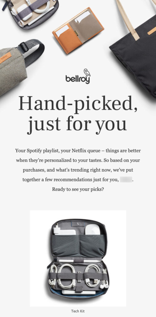
Importantly, Bellroy made it clear that these weren’t generic recommendations by using phrases like:
- Just for you
- Personalized to your tastes
- Your picks
- Hand-picked
Because why go to all the trouble of providing dynamic product recommendations if you’re not going to tell people about it?
Share relevant content
Email personalization isn’t just about introducing your audience to products they might love. It’s also about pointing them in the direction of content they’ll find interesting or useful (or, ideally, both).
For example, imagine you’re an HR manager looking to get more value from your organization’s learning and development spend.
During your research, you sign up for Filtered’s email list, but you’re not quite ready to request a product demo.
Then you receive this email:

There’s a good chance you’d join the webinar to learn more. Which, in turn, makes it more likely that Filtered will be front of mind when you’re ready to buy.
Celebrate milestones
Milestones are a tailor-made opportunity to nurture leads (and maybe persuade them to purchase something). There are various types of milestones, including:
- Customer / lead birthdays
- Company birthdays
- Anniversaries since a specific user action (such as subscribing to your newsletter)
Our next example, from language learning platform Busuu, demonstrates how milestone emails can be used to encourage a lead to upgrade from a freemium product to a paid account:
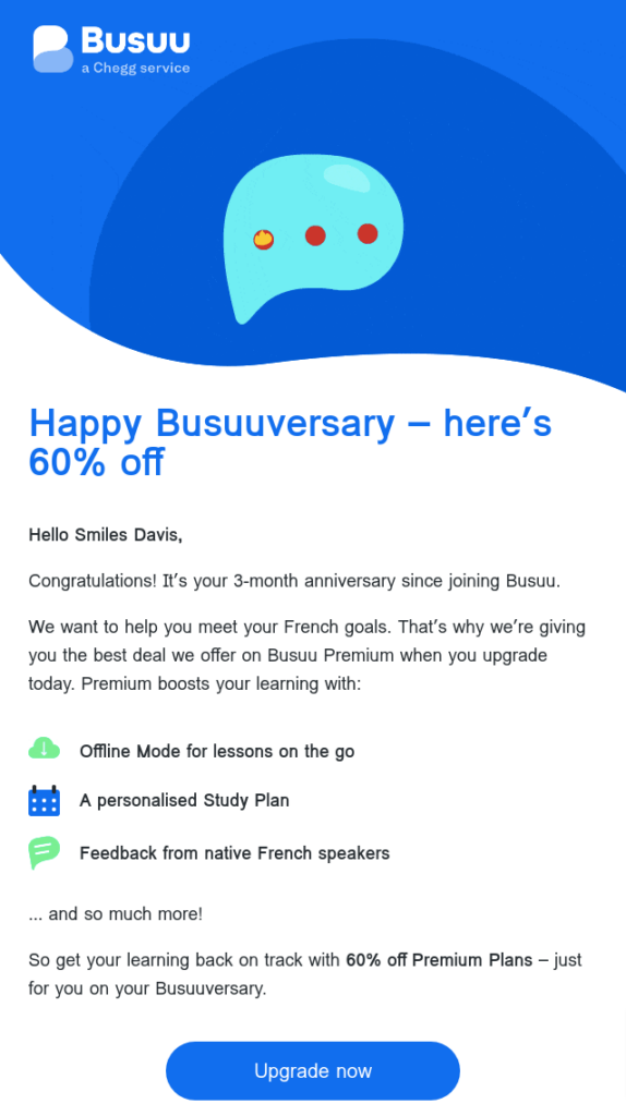
Busuu essentially uses the three-month “anniversary” as an excuse to offer a big discount off its premium plans.
Goal: Increase sign-ups
Send referral emails
If I tell you to buy something, you’ll probably think: “Why should I listen to this guy? I don’t even know him. And how did he get my phone number?”
But if your mom or your partner or your best friend recommends a product or service, there’s a decent chance you’ll listen. In fact, consumers trust referrals more than any other channel:
- Referrals (trusted by 40% of respondents)
- TV adverts (31%)
- Influencer recommendations (1%)
For that reason, referral emails are one of the most effective ways to increase sign-ups for an online course, event, or webinar. But if they’re going to deliver the desired results, you need to come up with incentives for both the referrer and the person they’re referring, just like online training company GeeksforGeeks.
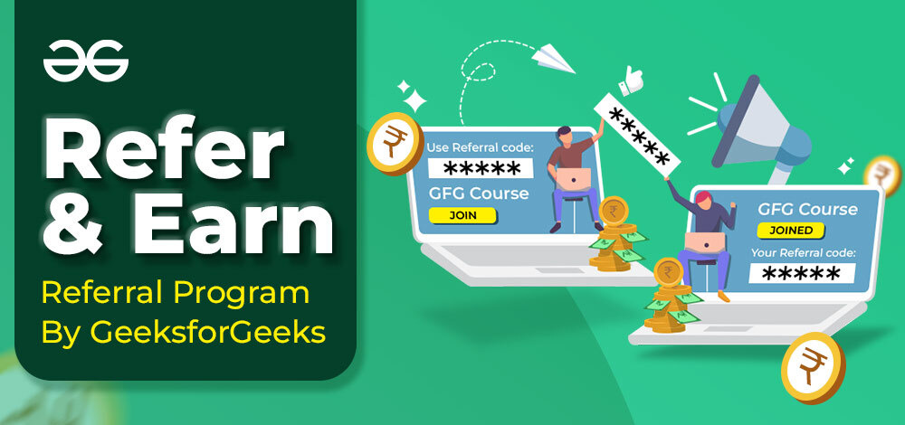
The brand built a simple but effective referral scheme that rewarded both parties:
- The referred customer got a 10% discount on any GeeksforGeeks course
- The referrer earned a 5% commission on the sale
That’s a real win-win.
Tease new course content
Just as an ecommerce company might launch a new product to boost sales, online course sellers can drive sign-ups by introducing and promoting new course content.
In our next example, the Content Marketing Institute teased its new content marketing certification, created in partnership with the American Marketing Association:
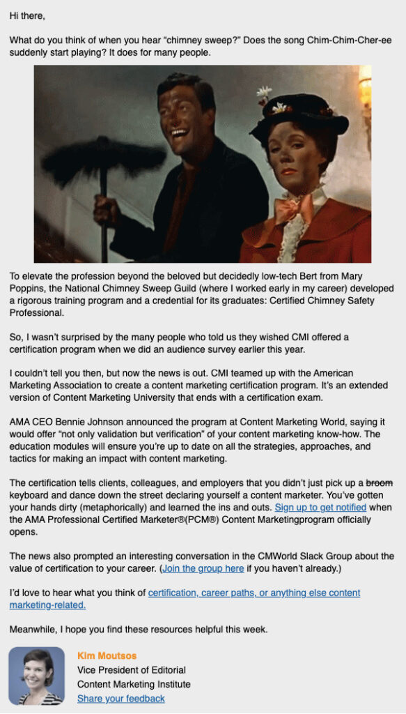
Don’t worry if you don’t fancy reading all that copy, because it basically says: this new course is launching soon, sign up to get notified when it drops.
Goal: Boost customer retention
Run win-back campaigns
Between 2013 and 2022, the average ecommerce customer acquisition cost rose by a staggering 222%, so retaining customers has never been more important.
Which brings us neatly to win-back campaigns. Also known as re-engagement or reactivation campaigns, they can help you keep hold of leads or customers who’ve stopped engaging with your emails or buying your products.
There are various types of win-back campaigns, but one of the most impactful is the last-chance email, which basically forces customers to opt back into your marketing list. If they don’t, they’ll be unsubscribed, so they’ll stop spoiling your email engagement metrics.
Let’s look at a last-chance email example from temporary tattoo brand Tattly:
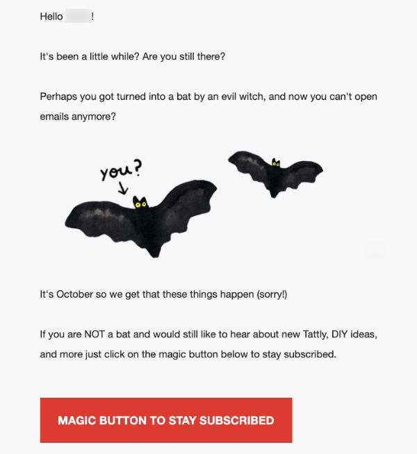
Sure, this feels kind of counterintuitive: why would you encourage subscribers to leave your marketing list?
But when someone chooses to stay subscribed, that’s a clear sign they’re interested in what you have to say. And remember: it’s better to have a smaller pool of engaged customers than a massive list full of people who barely remember your name.
Reiterate your value proposition
The customers you’re trying to retain liked you enough to buy from one once upon a time. With a gentle reminder of why you’re so amazing, they might be persuaded to do it again.
Beauty brand AILLEA shows us what that reminder might look like:
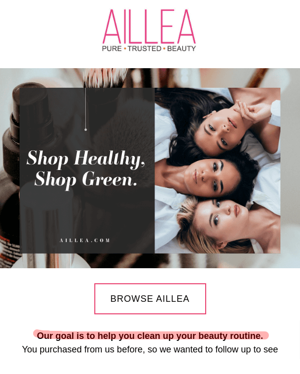
First up, this email reiterates the brand’s value proposition, which is all about helping customers develop a more sustainable, eco-friendly beauty routine.
AILLEA goes on to ask the recipient two questions that are directly related to its value proposition:
By doing this, it subtly encourages the recipient to consider why they might want to shop with AILLEA. This messaging is supported by CTAs that prompt customers to browse the brand’s collections.
It’s all about persuading people to take another look at the AILLEA store, where they’ll hopefully find something they love.
Ask for feedback
There are two ways to figure out why a customer has stopped engaging with your emails, using your product, or buying from you:
- Consult a soothsayer
- Ask them
Personally, I prefer option #2.
Asking for customer feedback has a couple big benefits for brands:
- Customers like being asked for feedback (provided you act on it). Four in five consumers say they feel more loyal to brands that respond to and resolve their complaints.
- Even if a customer leaves, you can learn from their experience. Find out what put them off about your product or marketing — and fix it.
Here’s a textbook customer survey email example from dairy brand Tillamook:
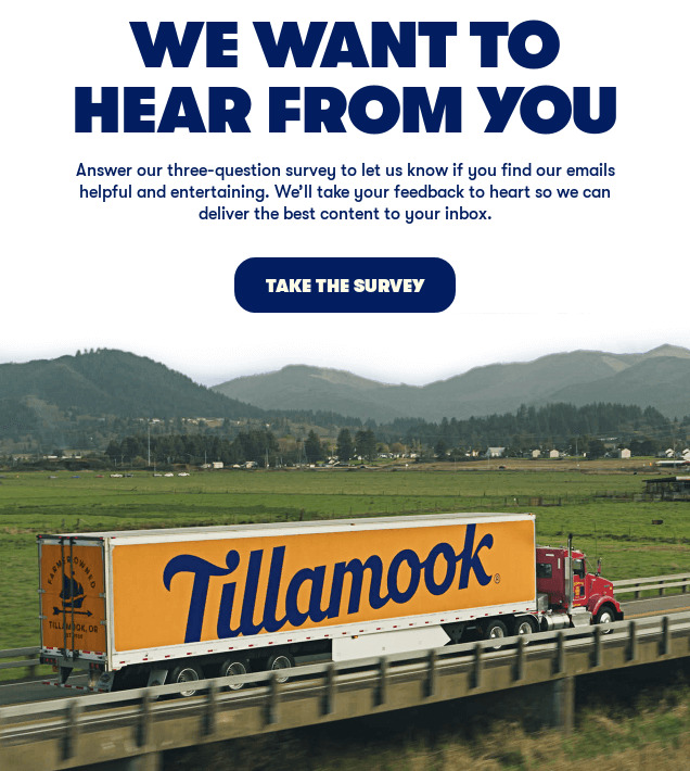
Tillamook gets three things right in this email:
- It tells the recipient what’s expected of them (i.e. answering three questions)
- It clearly states the purpose of the survey (finding out if recipients find the brand’s emails useful and interesting)
- It promises some sort of benefit (using the feedback to deliver better content)
Stick with this formula to get more responses from your feedback emails.
Successful email marketing requires the personal touch
Whether you’re encouraging a new email subscriber to make their first purchase, asking existing customers to recommend you to their friends and family, or trying to stop a previously loyal customer from leaving, one thing applies:
You stand a far better chance of success if you speak to people as individuals.
What are their pain points? What do they like about your product? What would persuade them to perform the desired action right now?
That sort of personalized messaging is impossible to deliver without the right email marketing platform.
With AWeber, you can use tags and custom fields to create dynamic segments that update automatically based on individual customer actions like:
- Browsing a product page
- Making a purchase
- Opening a specific email
That way, you can send the right email content to the right person exactly when they need it, which can increase your profitability and sales.
See for yourself by signing up for a free AWeber account.
Get started here!
 87% off ends soon!
