Best fonts for emails: How to make your emails look great and easy to read
By Dmitry Kudrenko June 14, 2022
Coming up with the best fonts for emails can be a challenging and time-consuming task. Which typeface will improve the readability of your message? What color combinations and font size should you use to hold your subscribers’ attention?
We’ve got you covered! By the end of this article, you’ll know how to choose the best typeface and font settings for your brand. Plus, we’ll give you an expert’s list of email-friendly fonts. Read on to learn the basic principles of typography for your emails.
Why fonts matter
People usually spend about 10 seconds looking through brand emails. Besides a catchy subject line and attention-grabbing imagery, typography is one of the critical elements users notice about your message. To make the most of these 10 seconds, it’s crucial to use the best fonts for emails that you can.
Email-friendly fonts that render correctly in all the major email providers will make your messages easier to read. Fonts can also affect the tone of your company’s message.
Here are two principles to follow so your emails have the same vibe as your company, look great, and are easy to read:
Align your font with your brand
Did you know that fonts can be professional, casual, technical, etc.? It’s true! Choosing a font that represents your company’s voice and style is crucial — and not just on your website. In your emails, too!
If you don’t know where to start, choose a font that complements your visual branding. It will make your messages feel more familiar and help you gain trust with your audience, leading to better engagement.

Make it easy to read
If your emails are hard to read, they’re less likely to be read. Legible fonts help readers scan your email, identify key points, and make quick sales decisions.
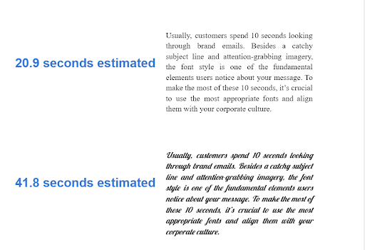
Even something as minor as italics can affect your emails’ readability. Research shows that people need 50% more time to read italic font styles in contrast to regular typefaces.
Serif vs. sans-serif fonts
There are two major types of fonts to consider when designing your messages: serif and sans serif.
Serif fonts are equipped with a small tail or “serif” at the end of every symbol. The most common representatives of this family are Times New Roman and Georgia.
Sans-serif fonts come without such a “tail.” The most recognizable examples of these fonts include Arial and Helvetica.

15 email-safe fonts
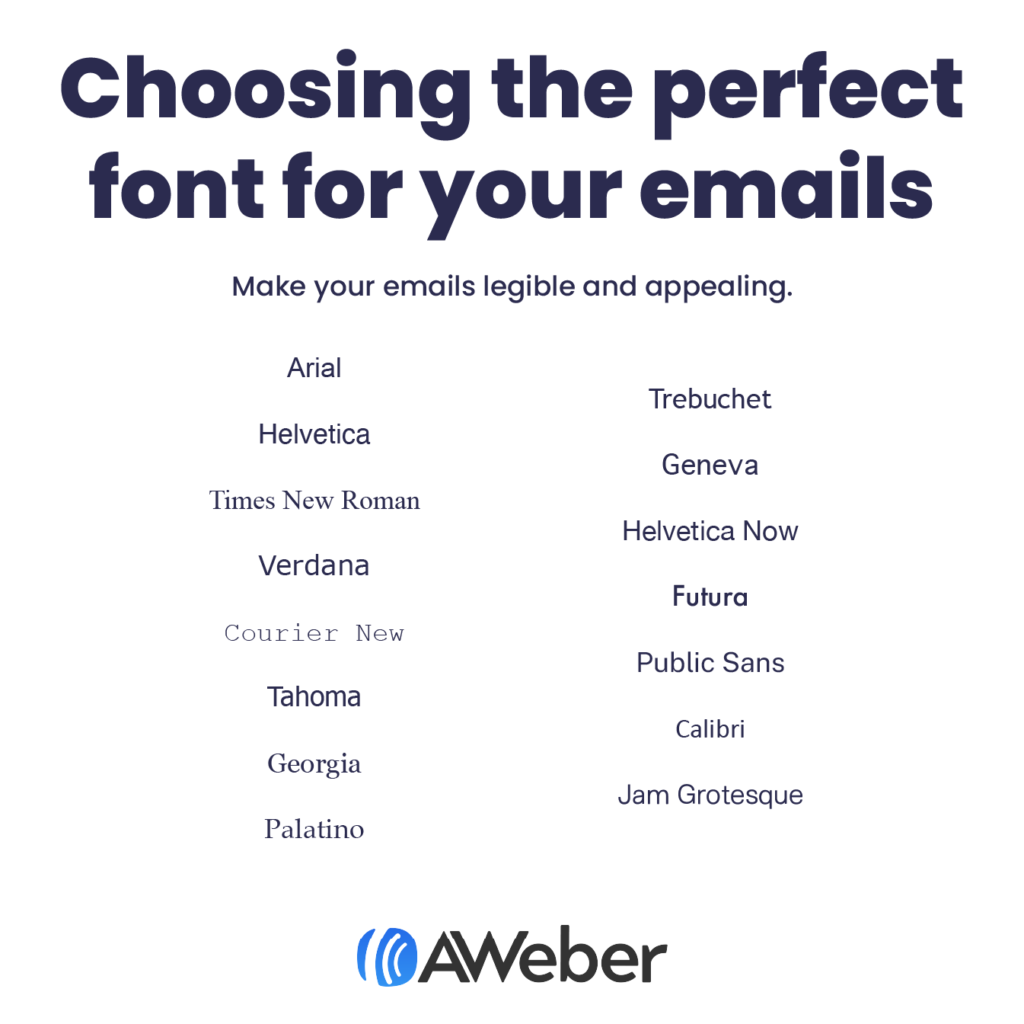
The best fonts for emails can be viewed properly across all email providers. Whether your customers use Gmail, Apple Mail, Yahoo, or Microsoft Outlook, these fonts will look the same.
Here’s a list of email-safe typefaces that will look consistent, no matter which email client your subscribers view them in:
1. Arial

Font family: sans-serif
Arial’s soft curves make this typeface look less stiff. It may not be the perfect match if you require something extra special, but it’s a fantastic option for users looking for a classy font to complement their emails.
2. Helvetica

Font family: sans-serif
This trendy font is an excellent pick for catchy titles and slogans. But its letters are placed close together, making it tough to read for longer texts.
3. Times New Roman

Font family: serif
Well, you are definitely familiar with this one. Times New Roman is a default option safe to use anywhere. Because of its narrow letters, we recommend you apply this typeface to headings only. You can also combine it with edgy imagery to develop a mix of traditional and trendy styles.
4. Verdana

Font family: sans-serif
Verdana was designed for low-resolution screens. With its wide low-case letters, the font is an excellent pick for email body copy.
5. Courier New

Font family: slab-serif (a form of the serif typeface)
This font has an authentic typewriter-like appearance. It’s more suitable for screenwriting and manuscripts, but Courier New can be a nice match for your emails if it aligns with your niche.
6. Tahoma

Font family: sans-serif
Designed for on-screen use, this typeface has the same length of its upper and lower case characters. It resembles Verdana, but Tahoma has narrower symbols and tighter letter spacing.
7. Georgia

Font family: serif
You’ve probably seen Georgia in newspapers or books. It’s a perfect option if you want your content to look official and trustworthy. You can also use it for longer emails as its wide-spaced characters provide a high level of legibility.
8. Palatino

Font family: serif
This sophisticated font with thin lines was made for titles and ads. Palatino makes it easy to read longer text passages combined with visual content.
9. Trebuchet MS

Font family: sans-serif
Equipped with subtle curves, this typeface will give your email an artistic touch. Its decorative features don’t look distracting, but we still recommend you use Trebuchet MS for short copy as it’s crucial not to overload your readers.
10. Geneva

Font family: sans-serif
This traditional font with a modern twist is an enhanced interpretation of Helvetica. Its thin lines and elegant appearance make Geneva look great in email body copy.
11. Helvetica Now

Font family: sans-serif
Released in 2019, it’s an excellent choice for those looking for a contemporary and stylish option.
12. Futura

Font family: sans-serif
We have an absolute classic here for you. Designed in 1927, Futura is one of the best fonts for emails. It will help you grab your readers’ attention in no time. Its great readability enables people to process longer passages much faster.
13. Public Sans

Font family: sans-serif
A stylish font with thick lines. It was developed for the U.S. to ensure their online resources delivered a unified visual message.
14. Calibri

Font family: sans-serif
This attention-grabbing and elegant typeface with rounded stems and corners is one of the most legible options for your messages. Whether you want to use it for CTA buttons or for an email body, Calibri will give your words more impact.
15. Jam Grotesque

Font family: sans-serif
Looking amazing both in print and online, this outstanding font combines a captivating style with legibility. A great choice if you want to add a special touch to your emails.
Avoid custom fonts in emails
You might be tempted to use custom fonts to accentuate your style or hold readers’ attention. In any case, it’s vital to remember that if a particular email client doesn’t support your custom font, it will be substituted with a default typeface.
Here’s the list of default typefaces for the most popular email clients:
- Gmail — Arial;
- Microsoft Outlook — Calibri;
- Apple Mail — Helvetica.
Here’s how a font can look when an email client doesn’t support it, or “render” it correctly:
This is an email with the custom “Great Vibes” font for the heading and the regular Arial font for bullet points:

Here’s how it renders in Gmail:

Here’s how it renders in Outlook:
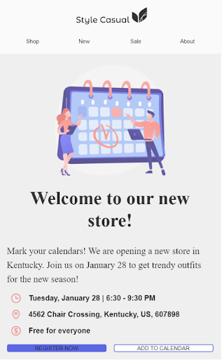
Here’s how it renders in Apple Mail:
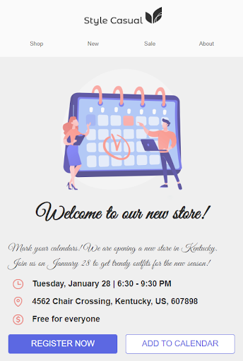
Sometimes, email clients may render a custom font correctly. You never know which fonts will be replaced with the default ones and which will render correctly. So, you need to test them.
Email typography best practices
Size matters
An unsuitable font size can ruin an email campaign. An overly large typeface will look oppressive and disarranged. A tiny font will make recipients squint to read it. We recommend choosing 22-28 px for headings and 16-18 px for an email body for both web and mobile users. Don’t forget to send yourself test variants to make sure they look appealing and display properly.

Use bold font to emphasize key points
But, don’t make your content messy by combining bold, italic, and underlined font styles.
This distracting text is bold, italicized, and underlined.
Usually, a single font style is just what you need, but you can use bold if you want to make certain phrases pop. Still, don’t underline anything in your email and avoid applying italic typeface because of email accessibility issues.
Use contrasting colors
Contrasting colors make for attention-grabbing and easy-to-read emails.
Make your emails accessible to color-blind readers by avoiding red letters on a green background.
Stay away from white text on a gray background. We suggest sticking to black or dark gray colors on a white background and a white font on a black background.
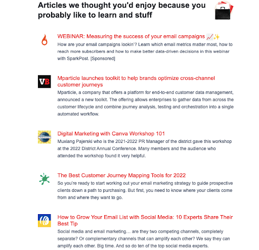
Don’t underline links
Underlined links distract dyslexic recipients and make it challenging for them to read your emails. Instead, make your links bold. Readers will understand that they need to click or tap on it to get more information.
(Source: Email from Really Good Emails)
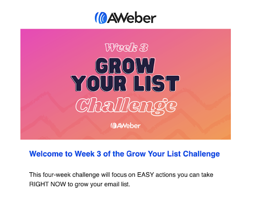
Choose two font colors only
Use colors to reflect your branding, and don’t combine more than two font colors in your emails. By including just two colors, your text will be more readable and clean.
Looking to draw readers’ attention? Try a bold font instead of more colors.
(Source: Email from AWeber)
Left-align all text
Left-align your messages to make them easy to scan. If your audience includes customers speaking a language with right-to-left alignments like Persian, Urdu, or Arabic, you can right-align your emails to suit your recipients’ needs.
Final thoughts on the best fonts for your emails
Using legible and eye-catching fonts will make your email stand out from the crowd of competitors and bring value to your audience. Once your message is opened, the proper font style becomes one of the main factors that persuade recipients to continue reading.
With our list of the best fonts for emails and how to use them, you can create appealing and responsive messages in no time.

