Test Results: How to Quadruple Your Opt In Rate

If you’ve been doing email marketing for over a week, you’ve probably heard all about split testing: why you should, easy split tests you can implement today, split testing your web forms and calls to action, and so on.


If people liked email as much as they like cats, “test it!” would be our “I can has cheezburger?” (It practically is around AWeber.)

You’d think there’s no way we wouldn’t be testing everything possible around here, right?

Wrong.

I just got done running a test and it reminded me why we go back to this topic over and over.

If you’d like to build your list over 321% faster, take a couple minutes to read this post.

The Sad Story of a Neglected Landing Page

Thanks to loyal readers like you who read, comment and tell other people about the email marketing tips here, this blog and its readership have grown steadily over the years.

We’ve done a number of things to make it grow faster. One important thing that has made it easier to build our blog newsletter is our subscribe page, which we link up in our emails and also push people to from the signup form in the blog’s sidebar.

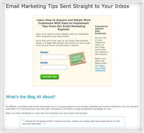
Below is a screenshot of what this page used to look like, before our test.

email marketing tips sent straight to inbox example

As you can see, it’s not amazing, but it’s an OK page. It encourages people to subscribe and gives them an idea of what they’ll get for doing so.

It meets the basic requirements of a subscribe page.

Which is probably why the page hadn’t been updated since 2008.

Holy Hypocrisy, Batman!

It was pretty embarrassing to realize how old that page was, especially when we talk about how big a deal testing is.

Clearly it was time for some changes – or at least, to test them.

We looked at our subscribe page and a bunch of other ones to see what changes might be worth testing.

One style that made a lot of sense to us was the “X Reasons to Subscribe” format that we found on a number of websites.

So we created a version of our subscribe page that followed this format, and added a few wrinkles of our own that we thought might improve the opt-in rate.

The New Version: 7 Reasons to Subscribe

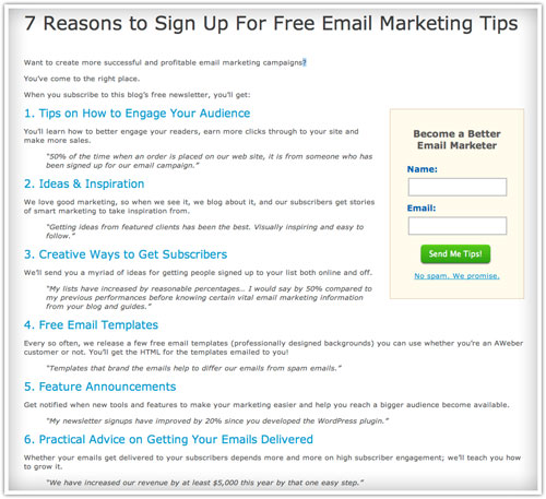
Here’s the page we created for the test.

Seven reasons to sign up for free email marketing tips

This version is a complete change from what was there, so we were pretty confident that we’d get a large, statistically significant change fast… for better or worse.

Results: 321% Increase in Confirmed Opt-Ins

We ran the split test via Visual Website Optimizer, which is an easy-to-use website testing tool.

In less than a week, the outcome was clear: the new “7 Reasons to Subscribe” page was outperforming the old version by over 321%.

So that page, which had just been plugging along, is now getting over 4 times as many people to subscribe as it used to. To put it another way: for every 1000 people to that page, we’re now getting 114 of them to sign up, instead of just 27 of them.

Why Did The New Page Do So Much Better?

Looking at the pages side by side, it seems obvious that the 2nd one would do better.

The “X Reasons to Subscribe” format is powerful stuff. And if that’s all you need to take away from this to go test your own subscribe page, that’s fine by me.

But for those of you who want to see the “why” behind these results, let’s dig a little deeper.

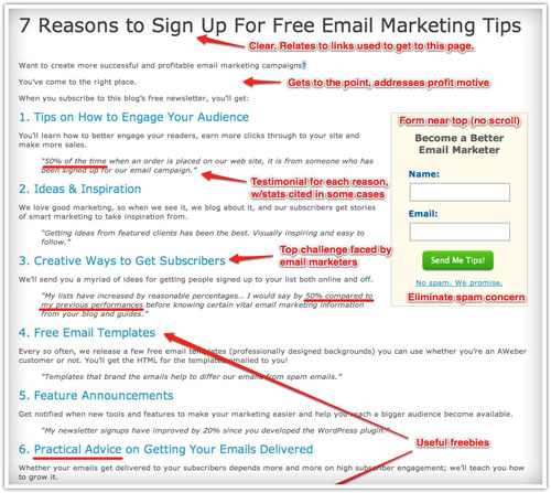
Click on the screenshot to see the new subscribe page, annotated with my thoughts on why it worked:

new subscribe page with comments

A few points I want to underscore:

  • Testimonials make this page really rock. For each reason, we have a real testimonial from a reader so that visitors can see that the promises we’re making on this page are authentic.How’d we get those testimonials? We surveyed subscribers late last year and asked them this question:”Please share one way you’ve improved your email campaign results after reading this blog. What did you learn from the blog, what did you do, and how did it help your campaign?”
  • Focused copy that addresses why people read our blog. At the end of the day, improving your email campaigns is about making more money with them. So we speak directly to the profit motive in the introduction and with our choice of testimonials.
  • It’s easy to subscribe, with multiple chances to do so. We have a form at the end for people who need to read all 7 reasons before signing up. At the same time, we have an option to subscribe near the top for people who are sold after the first 1 or 2 reasons.

What Can Testing Do For Your Business?

Think about how much traffic your subscribe page (or your about or contact page) gets in a month.

What if you could turn a tenth (or more!) of them into subscribers? How many more people on your email list would that be?

Now, multiply that number by 12.

That’s how many people you’re losing by not testing your subscribe page.

Time to Go Test For Yourself

OK, now that you’ve seen what we did and how it has improved our results, I have 2 suggestions for you:

  1. Test it! 🙂
  2. When you do, come back and share your results.

One last thing: if you haven’t subscribed to this blog yet, and you want advice like this on how to make your email marketing more successful and profitable, you should subscribe to our newsletter today.

44 Comments

  1. Jim Cockrum

    4/11/2012 9:15 am

    Great article!

    Drop in a graphic of someone making a friendly gesture toward the opt-in box and I’ll bet you can beat the new baseline opt-in rate!

  2. Aaron Schulman

    4/11/2012 9:25 am

    Testing (and piloting / sampling) was certainly the method that made Claude Hopkins so wildly successful back in the early half of the 1900’s. Great article – will take a new look at some of our landing pages!

    Thanks again Justin and Aweber-
    Aaron

  3. Ted Hessing

    4/11/2012 9:36 am

    Great advice! Simply adding a dedicated subscribe page to my top Nav paid off big time but I need to go beyond the basics and start telling the Why instead of just the How. Bookmarked and added to my to-do list.

  4. Aaron Schulman

    4/11/2012 9:45 am

    Hey Justin,

    Any chance we could use a page like this with our affiliate link tracked through this form? What would be the best practice for using this lp for affiliate registration increase?

    Thanks
    Aaron

  5. Joseph D. Shiller

    4/11/2012 9:48 am

    great tips, the only thing I still like better about the old format is the chalkboard.

  6. Justin Premick

    4/11/2012 9:49 am

    Jim,

    That’s an interesting idea – might have to be my next test. 🙂

    Ted,

    Getting the page linked in the nav is a great idea that a lot of people overlook. Glad the article is helpful… be sure to come back & share your results!

    Aaron,

    “Scientific Advertising” should be required reading for any marketer. As for affiliate tracking, just add a ? and your affiliate ID number at the end of any URL on aweber.com and we’ll tag visits to that page just like a visit to your affiliate link.

  7. Johnn Four

    4/11/2012 9:57 am

    Great format! I will test this out on one of my sites.

    I’ll also try Jim’s tip with the image, too. Great tip, Jim.

  8. Denise O'Berry

    4/11/2012 10:00 am

    This is a really great idea given that people have become more hesitant at giving away their email address.

    I like the new page, but will say that it was not intuitively obvious to me that the statements in italics were customer quotes.

  9. Gidon

    4/11/2012 10:02 am

    Justin, your message to Aaron about Scientific Marketing (link, please?) and ? and affiliate ID… deserve a “All This Stuff For Dummies” article or series.

  10. Justin Premick

    4/11/2012 10:03 am

    Joseph,

    I liked the chalkboard as well; maybe it’ll make it into a future test of this page. 🙂

    Denise,

    Good point. Maybe drawing that out in another way would improve the results further. Thanks!

  11. Aaron Schulman

    4/11/2012 10:16 am

    Hey Justin,

    “My Life in Advertising” has some great nuggets as well!

    I guess my question may be a poor one as I am not thinking very clearly this morning- but I was wondering how/ if we can use a version of your new “7 Reasons to Sign Up for Free Email Marketing Tips” as you have it laid out above.

    I am thinking about writing a post about email marketing and then having the links go over to that page you created with affiliate tracking id info- Does this make sense or am I missing something?

    Where can we find that Opt-in page?

    Blessings-
    Aaron

  12. Gidon

    4/11/2012 10:16 am

    I just looked at http://blog-cdn.aweber-static.com/blog/wp-content/uploads/2012/03/blog-sub-page-7-reasons-version-2-1.jpg

    I would add:
    1. I would bold “more successful” and “profitable” in the intro
    2. If #3 is the top challenge, why isn’t it #1?
    3. Your sign up box does not say Aweber (nor does this entire page!) I think you guys can stop being unecessarily humble. Aweber imho is a top brand (imho, THE top brand) in opt in email marketing. People should be proud to have a tag “powered by Aweber” wherever it makes sense. It took me a while to realize this, but my forms always support this since then.
    4. I think you can (and should) emphasize “No Risk – super easy, no questions asked unsubscribe option at any time”
    5. “No Spam – we promise” is an answer to a serious concern – I think you should emphasize it much more in this page (while I am on the subject, I still have burned into me a different service’s “Instant removal with SafeUnsubscribe

  13. Muhsin

    4/11/2012 10:19 am

    Wow this is a great post and this is something
    that I am excited to try out!
    I will update on my blog about this once I tried this out. 🙂

  14. Aaron Schulman

    4/11/2012 10:30 am

    Woops Justin

    You answered my question in your response to Gidon above! As for the Claude Hopkins book- there is actually a copy being sold at Amazon I believe that has both editions in 1 print (that’s the one I requested for Christmas about 4 years ago – my wife got it for me).

    You can find Scientific Advertising for free all over the internet – I just like having a hard copy for the planning, studying and writing days spent away from the laptop (which should be more often than I practice).

    Thanks again,
    Aaron

  15. Aaron Schulman

    4/11/2012 10:38 am

    Justin- Will it work just to add ?affiliate number after the slash?

    I was looking at some of my other affiliate links and saw them to say

    www.Aweber.com/some-article-post.htm?id=affiliate-number-here

    Where it has ?id= instead of just the “?affiliate-number-here” as you posted above. . .

    Will both work or is it best to use it as you posted above?

    Thanks for your time-
    Aaron

  16. Salvatore McDonagh

    4/11/2012 10:57 am

    This shows that regular testing is (or should be) part of the business system of every website owner. Fashion (in terms of “look and feel”) on the internet changes fast, and it doesn’t take long for a web page to look aged. Add the almost exponential increase in web traffic, changing demographics, and the ability to target prospects and deliver them to different landing pages based on their location, language, referring website, by age, sex, and even by income and education or marital status (depending on the ad network you use), and all the lessons learned in the multitude of competing web pages, it seems that there is an ever higher ladder of improvement in landing page performance to climb. Of course, resources need to be allocated sensibly, but I’ll be making a resolution to revisit and split test any landing pages I previously “optimized” no more than a year later.

  17. Sajan Elanthoo

    4/11/2012 1:00 pm

    Thank you very much for sharing this valuable information. I was really in a thinking that the big squeeze pages have less conversion. Now you’ve proven that I am totally wrong. Let me try it:)

  18. Jarom

    4/11/2012 8:24 pm

    I’ll add a list to my subscribe page!

    One thing I have that gives my subscribe page a steady 37% signup rate is comments and testimonials from people saying how much they like my content.

    But these aren’t just any comments and testimonials–they’re more effective than standard testimonials because they are in the format of regular blog comments. People tend to accept them as genuine and unedited because of it (and there are over 400 positive comments too, which doesn’t hurt).

    I’m not sure if I’m describing this well, but take a look on my subscribe page here and you’ll see what I’m getting at: http://www.internetmarketingforbusinessowners.com/join.php

    I think Aweber, with it’s huge following of raving fans, would have no trouble amassing a huge number of positive comments–adding yet more credibility to your subscribe page.

  19. Justin Premick

    4/12/2012 8:18 am

    Aaron,

    Yes, it’ll work with just the question mark & affiliate number.

    Gidon,

    Thanks for the suggestions!

    Salvatore,

    I agree – pages can get “stale” after a while. It’s good to go back and test them regularly (as I re-learned when testing our subscribe page) 🙂

    Jarom,

    That’s an interesting approach – thanks for sharing it!

  20. Robert

    4/12/2012 10:41 am

    Excellent article! I love you how you showed the results of the changes, and why they worked. Impressive.

  21. Michael

    4/12/2012 11:05 am

    We are doing all these things! 🙂 Cheers for the read!

  22. Remco

    4/12/2012 11:12 am

    Will try this new page out, together with this plugin, which basically is better than any popup.

    http://www.quicksprout.com/welcome-redirect-plugin/

  23. Tara

    4/12/2012 11:14 am

    I have a dedicated landing page with a different layout but similar pieces: social proof in the form ofI testimonials, bullet points with obvious key points, two signup forms for those who sign up right away or after reading the page. I also have two other signup forms on my site: the homepage and te blog sidebar.

    My homepage and blog forms get the average 2-5% signup rate. The landing page gets a combined total of over 50-60% of all traffic signing up!

    I direct social media traffic to my landing page and have a banner at the bottom of each of my blog posts that directs readers to it as well.

    I appreciate the thought of changing my other signup forms to an image/button that directs them to my landing page instead since its the high converter. I’ll test that out and see how it goes.

  24. Terry Gill

    4/12/2012 11:36 am

    You said, “I just got done running a test”……LOL. How about, “I just finished running a test.” From your writing, it seems as though you “just got done” with the hillbilly first grade!

  25. Robert Klinga

    4/12/2012 12:41 pm

    Thank you for these great online marketing tips, regarding changing and split testing your marketing efforts for example the landing page.

    The proof in your result is that you do not always need fancy pictures or flashy videos… Lead with the benefit for the subscriber and the proof
    element of testimonials is the key.

    Thanks,

    Robert Klinga

  26. Gary

    4/12/2012 1:14 pm

    Hey yonder thar Gill,

    Gilt gilt, i heard bout them thar samon tics som where tween secon an therd reeder.

    Git a reel book, cilly boy!

  27. Justin Premick

    4/13/2012 10:22 am

    Tara,

    That’s an interesting test – normally you’d expect an embedded form to outperform a button that redirects to another page to subscribe, but if the landing page converts that much better, you could indeed increase overall signups. Would love to hear how the test turns out!

  28. Eoin

    4/15/2012 7:37 am

    About easy split testing, am I right in saying this is only possible if you are mailing a single list? All my broadcasts get a sent to the primary list, plus to subscribers to a separate list (who are getting a different follow-up sequence).

  29. Gustavo Castro

    4/25/2012 10:32 am

    Thanks Justin for the excellent information.
    I will try it in one of my websites and will return to discuss the results.

    Thks again.
    GC.

  30. Victor Schultz

    4/25/2012 4:01 pm

    I have found that the friendly smiling photo doubled the trust factor for opt-ins and sales. After much testing the photo is now a standard to all tested pages. I always used a smiling blonde…have not tried a male or a red-head. Hmm guess I will get back to testing! Anyone see if the male vs. female photo has any effect?

  31. Jeff

    4/29/2012 10:01 am

    Tara – that’s a great idea about putting the banner under each blog post to direct traffic to your landing page…I have had very good conversion on my dedicated landing pages but am always looking for ways to get more blog traffic to the dedicated page. I have the same 2-5% with in-line forms on the blog and no matter what I try can’t seem to boost this (exit pop-ups, footer opt-in, in-line sidebar with various styles/headlines)

    I too have been thinking about trying the click-through image to dedicated opt-in page…really would like to hear anyone else’s results that has done that.

    Cheers,

    Jeff

  32. Lovenus Goh

    5/24/2012 4:25 am

    Hi Aweber,

    Thank you for this amazing post.

    I agree that tracking is extremely important to determine which marketing campaign works so that we can always get better and faster results.

    Cheers,
    Lovenus Goh

  33. Joel Zaslofsky

    7/24/2012 11:41 am

    I finally got off my butt and completely redesigned my newsletter sign up page. Thanks for the tips and explanation of what worked for you (and what didn’t). The comments on this post are super useful too!

    What do you folks think about my 8 reasons to subscribe to Value of Simple? http://valueofsimple.com/newsletter/

  34. Justin Premick

    7/24/2012 12:45 pm

    Joel,

    Congrats! The page looks great. I love that you took the extra step of removing site navigation & other possible distractions/clutter from the page.

    Stop back and let us know how it performs!

  35. Ivan

    1/31/2013 1:51 am

    Excellent article! Thanks Justin for the excellent information.

  36. Josue

    2/22/2013 4:14 pm

    Justin, This information has been very helpful thank you for sharing this with us
    Thanks,
    Josue

  37. Anirudh Bahadur

    5/3/2013 10:19 am

    Excellent article. Will implement these tips now. Opt in rates for my form really is not that great, may be my traffic is too generic. I don’t know. But these tips are really going to work, I can feel it. Thanks! 🙂

  38. Leanne

    12/7/2013 6:04 pm

    I’m in the early stages of my blog and have found this article useful but I’m unsure of where I’m supposed to use the landing page. I have an opt-in box on all pages but when would visitors see the landing page? At what point? Where do you direct them from as I’m guessing if they’re already on a page with an opt-in box I shouldn’t then direct to the landing page?

  39. Rachel Acquaviva

    12/9/2013 8:33 am

    Hi Leanne,

    In the example we shared, this is the page where visitors are taken when they want to learn more information about our newsletters before signing up. We have a link to the page in the sign up form on our blog, and we often include a link in our emails as well. You could certainly try both of these out and see what works for you!

  40. umphress

    2/26/2014 11:45 pm

    Hi this is somewhat of off subject but I was wanting to understand if blogs use WYSIWYG editors or if you need to manually code with HTML. I’m beginning a website soon but have no coding skills so I wanted to have advice from somebody with experience. Any support could be drastically appreciated!

  41. Amanda Gagnon

    2/27/2014 1:47 pm

    Hi Umprhess, For the most part, blogs let you work in whichever format you’re most comfortable with. We often recommend WordPress, where you can switch back and forth right in each post as needed. We also tend to recommend W3Schools for coding lessons. Best of luck with your site!

  42. Clara Strough

    3/11/2014 4:42 am

    Thanks for your post. What I want to comment on is that when looking for a good on-line electronics shop, look for a internet site with complete information on critical factors such as the privacy statement, basic safety details, any payment options, along with terms plus policies. Often take time to read the help in addition to FAQ pieces to get a much better idea of how the shop functions, what they can do for you, and just how you can make the most of the features.

  43. HydRadiance Review

    3/18/2014 9:08 am

    Hello! I could have sworn I’ve been to this website before but soon after browsing by way of some with the post I realized it is new to me. Nonetheless, I’m surely happy I identified it and I’ll be book-marking and checking back frequently!

  44. Brandon Olson

    3/18/2014 10:20 am

    Thanks for your comment… and welcome! You can also subscribe to our blog newsletter to get our blog posts delivered to your email inbox.