How to create a newsletter signup form that grows your list
Sean Tinney
A newsletter signup form is the single point of entry between a visitor and your email list. It collects a subscriber’s information and adds them to your email platform so you can start sending your newsletter.
Most small businesses put a form on their site and stop thinking about it. That is a mistake. Most forms ask too much, say too little, and sit in one spot on the site. That is three chances to lose a subscriber before they ever get your first email.
Here is how to fix each one.
Fields that belong on a newsletter signup form
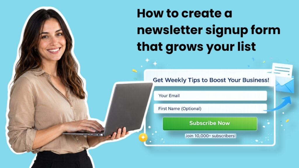
Start with the minimum: an email address field and a subscribe button.
That is the baseline for a reason. Every additional field you add creates friction, and friction reduces signups. For most small business newsletters, an email address is all you need to deliver value.
When to add a first name field
A first name field earns its place when you plan to use personalization in your newsletter. Addressing someone as “Hey Sean” instead of “Hey there” can increase open rates, but only if your email content actually uses the merge tag.
If you do not plan to use the subscriber’s name in your emails, leave it off the form. One fewer field means one less reason for a visitor to abandon the signup.
Fields you should almost never include on a newsletter form
Phone number, company name, job title, physical address. These belong on lead capture forms for gated content or sales inquiries. On a newsletter form, they signal that you want something from the subscriber before you have given anything in return. If you cannot use the data you collect, do not collect it.
Best placements for your newsletter signup form
Placement determines visibility. A well-designed form that nobody sees will not grow your list. Here are the most effective placements, ranked by conversion potential for small business sites.
Above the fold on your homepage
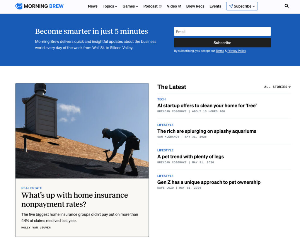
This placement depends on what your business is. If your newsletter is the product, like Morning Brew or The Hustle, then your homepage signup form belongs above the fold because the form is the entire point of the page. Visitors arrived specifically to subscribe.
For businesses where the newsletter supports a product or service, a homepage form still works, but it competes with other calls to action. Place it where it complements your primary message rather than overriding it.
Sidebar on your blog
A sidebar signup form stays visible as readers scroll through your content. They came to your site for a specific topic. If your newsletter covers similar territory, a persistent sidebar form keeps the option to subscribe in view without interrupting the reading experience.
On desktop, sidebar forms are effective because they sit alongside the content throughout the page. On mobile, most themes collapse the sidebar below the main content, so pair this placement with at least one other location for mobile visitors.
Dedicated signup page
A standalone page dedicated to your newsletter gives you room to sell the value of subscribing without competing with other calls to action. Link to this page from social media bios, podcast show notes, guest post bylines, and anywhere you mention your newsletter.
Alexandra Franzen, a business strategist who built her audience entirely through email without social media, describes her newsletter as “an art project.” She shared in an AWeber webinar: “The goal here, if you’re going to create a newsletter, is to make it so good that every reader goes and tells ten friends about it.” That is the mindset a dedicated signup page should reflect. Sell the experience, not just the subscription.
Site header or navigation bar
A persistent form in the header or top navigation bar keeps the signup option visible across every page of your site. This works especially well for content-heavy sites where visitors browse multiple pages per session. Keep the form compact. An email field and a button is enough.
Footer
The footer is where visitors look when they have finished reading and want more. A newsletter signup form here captures people who scrolled through your entire page and are interested enough to keep going. Think of it as a safety net for visitors who were not ready to subscribe when they first arrived.
Exit-intent popups
An exit-intent popup triggers when a visitor moves their cursor toward the browser’s close or back button. It is a last chance to present your newsletter before they leave.
The key to making exit-intent work without annoying visitors: show it once per session, make the close button obvious, and offer something specific. “Get weekly email tips for your small business” performs better than “Subscribe to our newsletter.”
Writing newsletter signup form copy that converts
Three elements drive conversions: what you promise, how often you promise it, and how little effort you ask for.
Lead with the benefit, not the action
Most signup forms default to copy like “Subscribe to our newsletter.” That tells the reader what to do, but it gives them no reason to do it. The word “subscribe” describes a mechanical action. It does not answer the question running through a visitor’s head: what is in it for me?
A benefit-driven line does the opposite. “Get one email per week with strategies to grow your small business” answers three questions at once: What will I get? How often? Is it relevant to me? The visitor can make a decision in seconds because you gave them something to decide on.
Here is the difference in practice. “Subscribe to our newsletter” puts the burden on the reader to imagine what they will receive. “Get our Tuesday email: one tactic to grow your list this week” removes that burden entirely. The second version gives a day, a promise, and a topic. Nothing left to guess.
Set frequency expectations at signup
This is one of the most overlooked elements on a newsletter signup form. Telling subscribers upfront that you send every Tuesday, or twice a month, or weekly reduces unsubscribes after the first email.
When someone subscribes and then receives an email they were not expecting, the instinct is to unsubscribe. Frequency expectations prevent that reaction. A subscriber who opted in knowing you send weekly is far less likely to feel caught off guard when your email arrives on Wednesday morning.
Frequency expectations also set a contract between you and the reader. You are committing to a schedule, and they are agreeing to receive it. That mutual understanding builds trust from the first interaction.
Use a specific call-to-action button
Your button is the last thing a visitor reads before deciding to subscribe. Generic text like “Submit” tells the reader nothing. “Subscribe” is better but still vague.
The strongest button text mirrors the benefit you promised above the form. If your headline says “Weekly email marketing strategies for small businesses,” your button could say “Get weekly strategies” or “Send me the tips.” The button becomes a confirmation of the value, not just a mechanical action.
Social proof works here too. “Join 1,200 readers” tells the visitor that other people already found this worth subscribing to. If you have a subscriber count worth mentioning, put it on the button.
One thing to avoid: do not use button text that creates ambiguity. “Learn more” or “Get started” could mean anything. Your button should make the outcome of clicking it obvious.
Newsletter signup form templates
For years, the standard advice was to pick a newsletter signup form template, swap in your colors and logo, and publish it. The problem: templates are built for someone else’s business. They assume a generic layout, generic copy, and generic field structure. You end up working backward from a design instead of forward from what your newsletter actually offers.
A template does not know that your newsletter goes out every Tuesday. It does not know that you write for freelance designers or small business owners in the food industry. It does not know your brand colors, your tone, or your audience. You fill in the blanks, but the blanks were drawn by someone who has never seen your business.
That is why the AI Signup Form Builder in AWeber takes a different approach. Describe what your newsletter is about, and it generates a complete form matched to your brand. It reads your website, understands your content and voice, and produces a form that fits your site without starting from a blank template.
Watch this video as AWeber’s Chief Product Officer, Chris Vasquez, transforms Keenya Kelly’s standard newsletter signup form, into something that better fits her brand.
You can embed the form on any page, use it as a standalone landing page, or deploy it as a popup. You can display it anywhere on your site by just telling the AI. Each form connects directly to your subscriber list, so new signups are ready to receive your next newsletter immediately.
Measuring your newsletter signup form performance
Creating the form is step one. Tracking its performance tells you whether your placement, copy, and field choices are working.
Conversion rate by placement
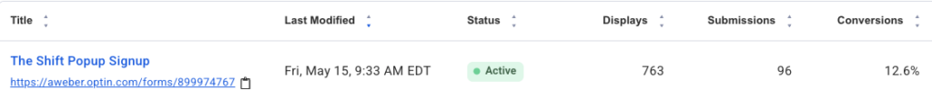
Track signups per form placement to identify which locations drive the most subscribers. A form embedded in your top-performing blog post may convert at 3% while your footer form converts at 0.5%. That data tells you where to invest more attention.
The AI Signup Form Builder in AWeber tracks this data for you.
Unsubscribe rate in the first 30 days
If subscribers leave within the first month, your form may be setting the wrong expectations. Review your form copy against your actual email content and frequency. A mismatch between what you promised and what you deliver is the most common cause of early unsubscribes.
FAQs
What is a newsletter signup form?
A newsletter signup form is an embedded or standalone web form that captures visitor information for the purpose of subscribing them to a recurring email newsletter. Unlike broader email signup forms that may feed into automated sequences, product updates, or transactional emails, a newsletter form has one job: get the right person on your newsletter list.
The distinction matters because the form’s design, copy, and field choices should reflect what the subscriber is actually signing up for. If your form says “Get our weekly tips” but you send daily promotions, you have a trust problem before the first email lands.
How do I add a newsletter signup form to my website?
In AWeber, open the AI Signup Form Builder, describe your newsletter, and it generates a form matched to your brand. Once you approve the design, copy the embed code and paste it into your site’s HTML wherever you want the form to appear. WordPress, Squarespace, Wix, and most website builders accept embed codes in a custom HTML block.
How do I add a newsletter signup to Facebook?
Create your signup form in AWeber, then copy the form’s hosted URL. Add that link to your Facebook page’s action button, your bio, or pin it in a post. Visitors click the link, land on your hosted form, and subscribe without leaving their browser.
How do I create a newsletter signup form in HTML?
Build the form in AWeber first. Every form generates an HTML version you can copy and edit directly. This gives you clean, functional code with the subscription logic already wired to your email list. You can customize the styling, field labels, and layout in the HTML without rebuilding the backend from scratch.
Sean Tinney is a content marketer at AWeber with 15+ years working directly with small business owners on email strategy, list building, and automation. He focuses on what actually moves the needle for businesses without large marketing teams.Connect with Sean on LinkedIn
A newsletter signup form is the single point of entry between a visitor and your email list. It collects a subscriber’s information and adds them to your email platform so you can start sending your newsletter.

Most small businesses put a form on their site and stop thinking about it. That is a mistake. Most forms ask too much, say too little, and sit in one spot on the site. That is three chances to lose a subscriber before they ever get your first email.

Here is how to fix each one.

Fields that belong on a newsletter signup form

Start with the minimum: an email address field and a subscribe button.

That is the baseline for a reason. Every additional field you add creates friction, and friction reduces signups. For most small business newsletters, an email address is all you need to deliver value.

When to add a first name field

A first name field earns its place when you plan to use personalization in your newsletter. Addressing someone as “Hey Sean” instead of “Hey there” can increase open rates, but only if your email content actually uses the merge tag.

If you do not plan to use the subscriber’s name in your emails, leave it off the form. One fewer field means one less reason for a visitor to abandon the signup.

Fields you should almost never include on a newsletter form

Phone number, company name, job title, physical address. These belong on lead capture forms for gated content or sales inquiries. On a newsletter form, they signal that you want something from the subscriber before you have given anything in return. If you cannot use the data you collect, do not collect it.

Best placements for your newsletter signup form

Placement determines visibility. A well-designed form that nobody sees will not grow your list. Here are the most effective placements, ranked by conversion potential for small business sites.

Above the fold on your homepage

This placement depends on what your business is. If your newsletter is the product, like Morning Brew or The Hustle, then your homepage signup form belongs above the fold because the form is the entire point of the page. Visitors arrived specifically to subscribe.

For businesses where the newsletter supports a product or service, a homepage form still works, but it competes with other calls to action. Place it where it complements your primary message rather than overriding it.

Sidebar on your blog

A sidebar signup form stays visible as readers scroll through your content. They came to your site for a specific topic. If your newsletter covers similar territory, a persistent sidebar form keeps the option to subscribe in view without interrupting the reading experience.

On desktop, sidebar forms are effective because they sit alongside the content throughout the page. On mobile, most themes collapse the sidebar below the main content, so pair this placement with at least one other location for mobile visitors.

Dedicated signup page

A standalone page dedicated to your newsletter gives you room to sell the value of subscribing without competing with other calls to action. Link to this page from social media bios, podcast show notes, guest post bylines, and anywhere you mention your newsletter.

Alexandra Franzen, a business strategist who built her audience entirely through email without social media, describes her newsletter as “an art project.” She shared in an AWeber webinar: “The goal here, if you’re going to create a newsletter, is to make it so good that every reader goes and tells ten friends about it.” That is the mindset a dedicated signup page should reflect. Sell the experience, not just the subscription.

Site header or navigation bar

A persistent form in the header or top navigation bar keeps the signup option visible across every page of your site. This works especially well for content-heavy sites where visitors browse multiple pages per session. Keep the form compact. An email field and a button is enough.

Footer

The footer is where visitors look when they have finished reading and want more. A newsletter signup form here captures people who scrolled through your entire page and are interested enough to keep going. Think of it as a safety net for visitors who were not ready to subscribe when they first arrived.

Exit-intent popups

An exit-intent popup triggers when a visitor moves their cursor toward the browser’s close or back button. It is a last chance to present your newsletter before they leave.

The key to making exit-intent work without annoying visitors: show it once per session, make the close button obvious, and offer something specific. “Get weekly email tips for your small business” performs better than “Subscribe to our newsletter.”

Writing newsletter signup form copy that converts

Three elements drive conversions: what you promise, how often you promise it, and how little effort you ask for.

Lead with the benefit, not the action

Most signup forms default to copy like “Subscribe to our newsletter.” That tells the reader what to do, but it gives them no reason to do it. The word “subscribe” describes a mechanical action. It does not answer the question running through a visitor’s head: what is in it for me?

A benefit-driven line does the opposite. “Get one email per week with strategies to grow your small business” answers three questions at once: What will I get? How often? Is it relevant to me? The visitor can make a decision in seconds because you gave them something to decide on.

Here is the difference in practice. “Subscribe to our newsletter” puts the burden on the reader to imagine what they will receive. “Get our Tuesday email: one tactic to grow your list this week” removes that burden entirely. The second version gives a day, a promise, and a topic. Nothing left to guess.

Set frequency expectations at signup

This is one of the most overlooked elements on a newsletter signup form. Telling subscribers upfront that you send every Tuesday, or twice a month, or weekly reduces unsubscribes after the first email.

When someone subscribes and then receives an email they were not expecting, the instinct is to unsubscribe. Frequency expectations prevent that reaction. A subscriber who opted in knowing you send weekly is far less likely to feel caught off guard when your email arrives on Wednesday morning.

Frequency expectations also set a contract between you and the reader. You are committing to a schedule, and they are agreeing to receive it. That mutual understanding builds trust from the first interaction.

Use a specific call-to-action button

Your button is the last thing a visitor reads before deciding to subscribe. Generic text like “Submit” tells the reader nothing. “Subscribe” is better but still vague.

The strongest button text mirrors the benefit you promised above the form. If your headline says “Weekly email marketing strategies for small businesses,” your button could say “Get weekly strategies” or “Send me the tips.” The button becomes a confirmation of the value, not just a mechanical action.

Social proof works here too. “Join 1,200 readers” tells the visitor that other people already found this worth subscribing to. If you have a subscriber count worth mentioning, put it on the button.

One thing to avoid: do not use button text that creates ambiguity. “Learn more” or “Get started” could mean anything. Your button should make the outcome of clicking it obvious.

Newsletter signup form templates

For years, the standard advice was to pick a newsletter signup form template, swap in your colors and logo, and publish it. The problem: templates are built for someone else’s business. They assume a generic layout, generic copy, and generic field structure. You end up working backward from a design instead of forward from what your newsletter actually offers.

A template does not know that your newsletter goes out every Tuesday. It does not know that you write for freelance designers or small business owners in the food industry. It does not know your brand colors, your tone, or your audience. You fill in the blanks, but the blanks were drawn by someone who has never seen your business.

That is why the AI Signup Form Builder in AWeber takes a different approach. Describe what your newsletter is about, and it generates a complete form matched to your brand. It reads your website, understands your content and voice, and produces a form that fits your site without starting from a blank template.

Watch this video as AWeber’s Chief Product Officer, Chris Vasquez, transforms Keenya Kelly’s standard newsletter signup form, into something that better fits her brand.

You can embed the form on any page, use it as a standalone landing page, or deploy it as a popup. You can display it anywhere on your site by just telling the AI. Each form connects directly to your subscriber list, so new signups are ready to receive your next newsletter immediately.

Measuring your newsletter signup form performance

Creating the form is step one. Tracking its performance tells you whether your placement, copy, and field choices are working.

Conversion rate by placement

Track signups per form placement to identify which locations drive the most subscribers. A form embedded in your top-performing blog post may convert at 3% while your footer form converts at 0.5%. That data tells you where to invest more attention.

The AI Signup Form Builder in AWeber tracks this data for you.

Unsubscribe rate in the first 30 days

If subscribers leave within the first month, your form may be setting the wrong expectations. Review your form copy against your actual email content and frequency. A mismatch between what you promised and what you deliver is the most common cause of early unsubscribes.

FAQs

What is a newsletter signup form?

A newsletter signup form is an embedded or standalone web form that captures visitor information for the purpose of subscribing them to a recurring email newsletter. Unlike broader email signup forms that may feed into automated sequences, product updates, or transactional emails, a newsletter form has one job: get the right person on your newsletter list.

The distinction matters because the form’s design, copy, and field choices should reflect what the subscriber is actually signing up for. If your form says “Get our weekly tips” but you send daily promotions, you have a trust problem before the first email lands.

How do I add a newsletter signup form to my website?

In AWeber, open the AI Signup Form Builder, describe your newsletter, and it generates a form matched to your brand. Once you approve the design, copy the embed code and paste it into your site’s HTML wherever you want the form to appear. WordPress, Squarespace, Wix, and most website builders accept embed codes in a custom HTML block.

How do I add a newsletter signup to Facebook?

Create your signup form in AWeber, then copy the form’s hosted URL. Add that link to your Facebook page’s action button, your bio, or pin it in a post. Visitors click the link, land on your hosted form, and subscribe without leaving their browser.

How do I create a newsletter signup form in HTML?

Build the form in AWeber first. Every form generates an HTML version you can copy and edit directly. This gives you clean, functional code with the subscription logic already wired to your email list. You can customize the styling, field labels, and layout in the HTML without rebuilding the backend from scratch.

Sean Tinney is a content marketer at AWeber with 15+ years working directly with small business owners on email strategy, list building, and automation. He focuses on what actually moves the needle for businesses without large marketing teams. Connect with Sean on LinkedInSean Tinney

Keep reading:14 Types of landing pages: What each one does and when to use itHow to use the psychology of color in marketing to increase your results