


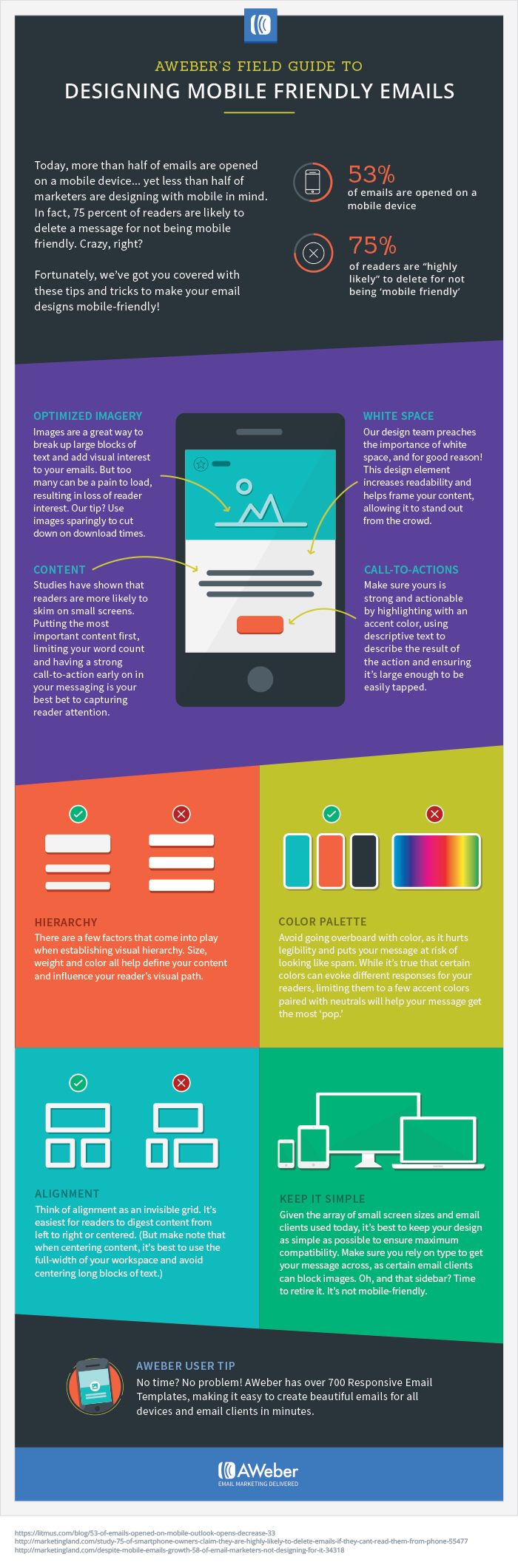
Today, more than half of emails are opened on a mobile device… yet less than half of marketers are designing with mobile in mind. In fact, 75 percent of readers are likely to delete a message for not being mobile friendly. Crazy, right?
Fortunately, we’ve got you covered with these tips and tricks to make your email designs mobile friendly. Like did you know that white space helps to increase the readability of your content? Or that the size, weight and color of your text all help to influence what readers focus on first?
From color palettes to visual hierarchy, here are the elements you should get familiar with:
Get Started
With over 700 Responsive Email Templates, AWeber makes it easy to create beautiful emails for all email clients and devices in minutes. Find out more about our email templates.
Need help designing your emails? The AWeber design team can create a custom template just for you! Whether you want to modify an existing template or develop one from scratch, we’ve got you covered. Click here to request a custom template.